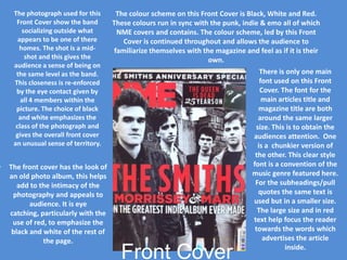
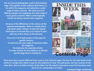
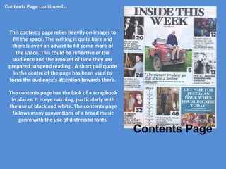
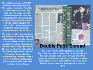
Download to read offline

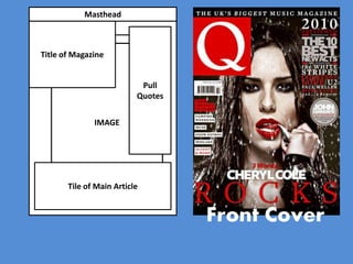
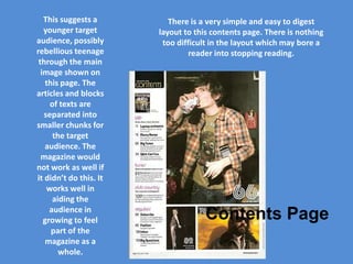
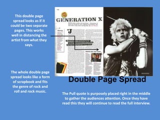

The document analyzes the design elements of a music magazine's front cover and contents page, focusing on the use of color schemes, fonts, and photography to create a connection between the audience and the band. It discusses how the visuals encourage familiarity and intimacy while adhering to conventions of punk, indie, and rock music genres. The arrangement and style of text and images are critiqued to enhance readability and attract the target audience of predominantly young music fans.


