
Recommended
More Related Content
What's hot
What's hot (18)
Similar to Teaser poster outlines portrait
Similar to Teaser poster outlines portrait (20)
More from JamesSlator1
More from JamesSlator1 (17)
Recently uploaded
Recently uploaded (20)
Teaser poster outlines portrait
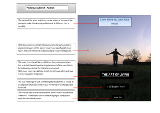
- 1. It all begins here June 5th Withthisposterin portraititlooksmuch betterasI am able to place more layersonthe postersince Ihave significantlymore room.The fontstill needstobe foundandexperimentedwith. The sub-headingwill looksomethinglikethisbutthisissimplyan example of whatIcan and will put.The fontwill be changedand finalised. The release date atthe bottomof the postermakesitlookmore authentic.The fontandcolourneedchangingto correspond withthe lookof the poster. THE ART OF LIVING The main filmtitle will be inadifferentfont,colourand place but as a draft I wouldsaythat the placementof the maintitle is bestplacesjustbelowthe characterand sunset. Withmore roomI am able to stretchthe title outwhichwill give it more impacton the poster. The name of the actor anddirectcan be placesat the top of the posterto make itlookmore professional.A differentfontis needed. Calvin Bishop and James Slator Present Poster Layout Draft : Portrait