
Recommended
Recommended
More Related Content
What's hot
What's hot (20)
Similar to Construction of poster
Similar to Construction of poster (20)
More from KatieJeBrown
Recently uploaded
Recently uploaded (20)
Construction of poster
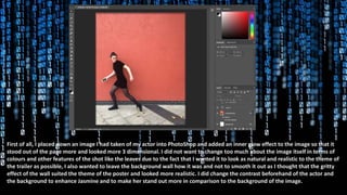
- 1. First of all, I placed down an image I had taken of my actor into PhotoShop and added an inner glow effect to the image so that it stood out of the page more and looked more 3 dimensional. I did not want to change too much about the image itself in terms of colours and other features of the shot like the leaves due to the fact that I wanted it to look as natural and realistic to the theme of the trailer as possible, I also wanted to leave the background wall how it was and not to smooth it out as I thought that the gritty effect of the wall suited the theme of the poster and looked more realistic. I did change the contrast beforehand of the actor and the background to enhance Jasmine and to make her stand out more in comparison to the background of the image.
- 2. Next, I went straight in with the title of the film at the top of the poster so that it would frame the rest of the page and help me to plan out where I wanted to place things afterwards – as the title is the most important part. I chose the font off of ‘TypeKit’ on the app and decided to use the font called “Vortice” – as this suited the theme of my poster best and also came under the action style of fonts, which is why I thought it would suit my poster best; as it is based off of an action movie. I placed the title at the top of the page in large, black lettering so that it would stand out against the rest of the page and contrast the red in the background which would therefore draw attention to this area and cause people to notice this almost immediately upon looking at the poster, which means that they would recognise the name and be enticed by the name of it to read more.
- 3. Thirdly, I used the app ‘Paint’ to draw out my own symbol for part of the title and I wanted to create this myself as it is my own design and was not something that I could find anywhere else – this also makes the overall poster much more original as I have created the ”S” myself. I wanted it to be bigger on the page than the rest of the title so that it stood out and created the title whilst adding some excitement to it, as it is not just a basic title and features a key part of the trailer; which I think may attract a lot of people as they will be intrigued by the symbol. I wanted to name my movie Restrainment to emphasise the storyline of the movie trailer and also to give the audience an idea as to what the trailer is about – I also think that it adds dramatic effect as it will intrigue people as to what will happen in the movie.
- 4. After that I decided to add the release date of the movie, as this is a key aspect of a poster and is the main focus point that people will look at when reading a movie poster, as then they are aware of the release and will be excited to watch it. I made the font much smaller than the title so that it did not distract from the title and people would not notice this first – however I still made it fairly noticeable and next to the main image so that it could be seen easily. I used a font of “Krungthep Regular” as I thought that this really suited the style of the poster and also I wanted to use a font different to the title so that they did not distract from each other and the title was still the main focus point on the page, but I kept the font of the release date black as this linked with the colour scheme and helped it to blend in with the theme of the page. As well as this, I made sure to place the release date on the line at the bottom of the wall so that it looked symmetrical and was not off-putting to a reader – as it is pleasing to look at and does not look out of place or unprofessional.
- 5. Once placing down the title and release date, I decided that they did not perhaps stand out as effectively as they could on the page and I wanted them to look more 3D. Therefore, I added drop shadows to both of the texts using black as this created the effect of them standing out of the page and coming away from the poster – which will attract more people’s attention and also looks more professional; as the poster does not look as flat now. I made the drop shadow for the title have a wider spread of direction than the release date as I wanted this text to stand out slightly more and to have a larger point of focus than the release date.
- 6. Then I decided to add a actor name to the poster, as considering Jasmine is an amateur actor and has not been featured in any major films before, I wanted her name to be featured on the poster at the top so that people would notice it quickly upon reading the poster and may remember it. However, I made the opacity of the text lower so that it faded into the background a bit more and looked slightly more transparent. I did this so that, even though it uses the same colour as the title – to match the colour scheme – it does not distract from the title and is not an aspect of the poster that is noticed first. I decided to use the same font for the actor name as the release date as this linked the two together and kept a theme fluent; as I did not want the poster to be too confusing with too many different features going on. Again, I used a drop shadow so that it stood out a bit more and was not completely flat to the page, as this adds depth and dramatic effect to the poster more.
- 7. I then decided to add some movie reviews to my poster so that people would be more interested if the reviews were written from well known move industry brands. I also chose to put some awards that the movie could have potentially won on the front of the poster so that it would give people an insight into whether or not the film was successful and attract them into watching it. I wanted to put this under the title so that it would be something that could easily noticeable and would therefore entice people into watching the movie. I wanted to incorporate some light grey colours to match the colour scheme and the background as this makes the overall poster look more fluent and links together, which looks slightly more professional.
- 8. Next I added another film review from a well known magazine brand which I thought would attract attention to the poster, as well as an award for the movie which tells the audience that the movie is successful and worth watching. Also, I then added my tag line at the bottom of the poster using the same font as the release date and actor name so that it would all link together and match the theme. I wanted to make the tag line exciting and enticing for the readers which is why I placed them down leading up to the actor and made them appear as steps – this draws attention to Jasmine as well as the tag line. I also wanted to place this at the bottom of the poster to fill up the empty space and to make the poster look more busy, which suits the theme as this is typical of an action movie poster.
- 9. Lastly, I added the billing block to the poster as this is an important feature of a movie poster and gives information including cast and crew members which may appeal to people as famous names may be featured. I wanted the billing block and release date to have a low opacity so that they did not distract from other text on the page but I put them in the middle of the page so that they was still noticeable. However, I initially began with a lower opacity for the billing block and decided to make it darker as it is one of major contributing factors to a movie poster and I thought that it was important for this to stand out more than it did. As well as this, I reduced the size of the release date and slightly enhanced the opacity to 80% rather than 70%, after changing my mind of lowering it, to match the change in billing block so that they did not contrast but it was not too vivid also. I think that this definitely softens the overall poster and causes the title and tag line to stand out much more, which is what I wanted.