1. TASK C: ANNOTATED DIGIPAK AND ADVERT RESEARCH
CHRIS BROWN CD COVER
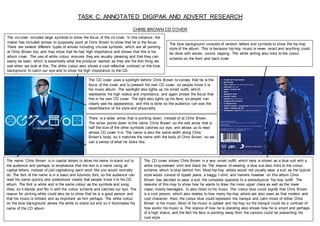
The cd cover includes large symbols to show the focus of the cd cover. In this instance, the
maker has included arrows to purposely point at Chris Brown to show that he is the focus.
There are several different types of arrows including circular symbols, which are all pointing
at Chris Brown too, and may show that he has high importance and shows that this is his
album cover. The use of white colour, ensures they are visually pleasing and that they can
easily be seen, which is essentially what the producer wanted as they are the first thing we
see when we look at this. The white colour also shows a cool reflective contrast on the blue
background to catch our eye and to show his high importance to the CD.
There is a wider arrow that is pointing down, instead of at Chris Brown.
The arrow points down to the name ‘Chris Brown’ so the odd arrow that is
half the size of the other symbols catches our eye, and allows us to read
whose CD cover it is. The name is also the same width along Chris
Brown’s body, so it matches the name with the body of Chris Brown, so we
can a sense of what he looks like.
The blue background consists of random letters and symbols to show the hip-hop
style of the album. This is because hip-hop music is never exact and anything could
be done with voices, sound, rapping. The white writing also links to the colour
scheme on the front and back cover.
The CD cover shows Chris Brown in a very smart outfit, which here is shown as a blue suit with a
white long-sleeved shirt and black tie. The reason of wearing a blue suit also links to the colour
scheme, which is blue behind him. Most hip-hop artists would not usually wear a suit, as the typical
style would consist of ripped jeans, a baggy t-shirt, and trainers however on this album Chris
Brown has decided to wear a suit, the complete opposite to a stereotypical ‘hip-hop outfit’. The
reasons of this may to show how he wants to draw the more upper class as well as the lower
class, mostly teenagers, to also listen to his music. The colour blue could signify that Chris Brown
is a cool person, which also relates to how many hip-hop artists are also seen as that modern and
cool character. Also, the colour blue could represent the tranquil and calm mood of either Chris
Brown or his music. Most of his music is upbeat and hip-hop so the tranquil could be a contrast of
how exotic his music is. The stance of how he is standing also shows how he is smart and perhaps
of a high status, and the fact his face is pointing away from the camera could be presenting his
cool style.
The CD cover uses a spotlight behind Chris Brown to convey that he is the
focus of the cover and to present his own CD cover, so people know it is
his music album. The spotlight also lights up his smart outfit, which
represents his high status and importance, and again shows the focus that
this is his own CD cover. The light also lights up his face, so people can
clearly see his appearance, and this is done so the audience can see the
resemblance of his style and physicality.
The name ‘Chris Brown’ is in capital letters to allow his name to stand out to
the audience and perhaps to emphasise that the text is a name using all
capital letters, instead of just capitalising each word like you would normally
do. The font of the name is in a basic and futuristic font, so the audience can
read his name quickly and understood clearly that people know it is his CD
album. The font is white and is the same colour as the symbols and song
titles, so it blends and fits in with the colour scheme and catches our eye. The
reason for picking white could also be to show that he is a good person and
that his music is brilliant and as important as him perhaps. The white colour
on the blue background allows the white to stand out and so it illuminates his
name of the CD album.
2. TASK C: ANNOTATED DIGIPAK AND ADVERT RESEARCH
Chris Brown is still wearing his very formal suit to match his
album cover so the scheme is continued throughout this
album advert. The formal suit persuades people to look at
the advert because he has purposefully worn something to
engage women to look at him and his good looks.
Chris Brown has included three good
looking girls to help promote his CD
album. The girls are wearing very short
black shorts to make people look at their
visible legs making people engaged in the
advert. The shorts chosen are black
because black can represent mysterious,
sexy, and sophisticated. Black is a visually
slimming colour for clothing and like other
dark colours, in interior design, black can
make a room appear to shrink in size,
making the girls look very slim and
attractive. The girls are also positioned in
inappropriate ways, for instance the
woman next to Chris Brown has her legs
open, sat on a duvet on the bed, to
perhaps suggest to the audience that the
CD album could be explicit to some
people. The other two girls are stood
facing with their back to the camera but
one with their face facing the front and the
other facing to the front but on a different
perspective, so she is not looking to the
front of the camera, but to the front of the
room perhaps. This could show that their
stance is very mature to show they are old
teenage girls, suggesting that the CD
album should only be targeted at older
teenagers. The use of the girls with Chris
Brown shows that he is popular, and he
has his hand on the girl’s leg, showing
inappropriate contact, again engaging the
target audience to buy the album.
The album advert has included the CD cover in the bottom
left of the advert to perhaps make the audience look closer
and know what the album looks like, so they are more likely
to buy the right album. They have also added text next to the
cover of some of the most popular songs in the album. This
alerts the audience of some of the songs, the most popular,
so the audience should know some of the songs, which
would hopefully persuade them to buy the CD.
The advert also contains contact
information and an email, so the album can
be bought online, or the audience can find
more about the album and the artist on
Chris Brown’s website perhaps. This is
good for persuading the audience as they
must look closely at the advert and then
they can look at buying the CD. Also, this
information is kept small in the bottom
corner, so people know it is contact
information and would have to look closely
to find out more. If this advert was up big,
then the font would be big anyway so the
extra information would be visible, but it
doesn’t interfere with the main object
advertised.
CHRIS BROWN CD ALBUM ADVERT The title of the album is kept big in the top
right of the advert, so the album is being
very well promoted so people know what
the album is called. The colour scheme of
the advert and the logo also helps this
because the colour of the CD cover has the
same colours of the blue, so the colour is
consistent between the advert and the
album. This helps promote the album, so
people know what the album will look like
similarly and can therefore buy it. The
album cover is also added in bottom left so
if the audience are interested in the advert,
they can see the album cover on the advert.
Also, Chris Brown’s name is also kept the
same under the title of the album, so it is all
kept the same as the album cover and the
theme of coolness of the blue colour is still
portrayed through the advert.
3. TASK C: ANNOTATED DIGIPAK AND ADVERT RESEARCH
JAY-Z CD COVER
The name, Jay-Z, is in all capital letters, as well as the album name, but the font
size of the album name is smaller than the artist’s name, perhaps emphasising
the importance of the artist in this album. The audience’s attention is focused on
the name, ‘Jay-Z’, more than the album name so the artist is noticed first, and
people are aware whose album it is, before looking closer at the album title. The
font of Jay-Z is also in a relaxed and modern font to suggest the artist is a hip-
hop and stylish character.
p-hop
The text is very small on the cover, but the viewer is automatically drawn to the big subject of the man with the
cigarette, making the viewer wonder what the album is all about, meaning that the ‘rule of thirds’ was used well in
this cover. The font styles for both the artist and the album name are completely different. This could be due to the
artists wanting his name being more powerful and noticeable than the album name. In addition, the colour of the
fonts are white to allow them to stand out on the blue/grey background and picture. The white colour of the text
could also link to the sharp lighting the shot is showing because to the human eye, white is a bright and brilliant
colour that can cause headaches and could even cause blinding. The colour white is believed to create new
beginnings, remove prejudice and pre-conceived notions, to see the innocence in others, and to clear emotional
clutter and silence the inner critic. This could have been used to show how Jay-Z has used words that could
potentially improve how others live.
The album cover is mainly a blue and grey toned colour, with
the man’s black clothes and the other objects, including the
objects on the metal case on the front cover and on both
covers, the cigarette the man is smoking has high
importance. The use of a cigarette could reflect how the
music is not appropriate for listeners who do not approve of
swearing and rapping. The reason of using a cigarette is to
show how smoking is wrong for some people and their own
opinions so the use of using someone smoking could
perhaps warn people that the music may not be suitable for
the ears of some, as could come across as very striking.
Also, the use of the cigarette also reflects the hip-hop genre
of the music because most rappers may stereotypically
smoke, so it could be summing up all rappers and other
artists of this genre.
The camera shot is at a high angle looking down onto the main
objects and the person, perhaps showing the audience how the
person is smoking on an angle and to show his back facing the
audience. This could suggest how the artist wants to let the
audience know that his music may not be suitable for some
listeners and that it may include explicit words or scenes in the
music videos. This may show that the words he uses to rap, or sing
may be rude but to him he has used these types of words to reflect
his anger or true feelings he feels strong about mostly. On the back
cover, the angle has changed from a high angle to a side close-up
shot of the man smoking to emphasise that he is smoking and to
again alert people that inappropriate words may be used or to
highlight that the genre of the music is current hip-hop.
The font style is cool and relaxed but also very bold and consists of curved letters. The artist
may have used this type of font to show his artistic and stylish character and this may reflect on
his artistic music. This also looks like a cool and modern font, which may represent his cool
hip-hop style of music and will draw younger, more teenage listeners into his music because it
is a modernized font. This may also link to the type of music as his hip-hop music is most
probably recognised more by the lower class and teenagers, more than older adults who would
be more interested in a different kind of genre.
The lighting on the album is very bright, as if it is standing out from all other CD
covers, suggesting that Jay-Z wants his album to stand out and sell lots of copies.
The bright lighting is shining onto the metal cabinet enhancing the objects and the
main person on the album to be noticed by the audience. This is done to perhaps
emphasise who Jay-Z is and what he looks like, if the person on the front is
presumably him. The lighting presents his album by enhancing the main objects
on the front cover, so people are more obliged to buy the CD.
4. TASK C: ANNOTATED DIGIPAK AND ADVERT RESEARCH
The artists name is all in capitals, and the album
name is in capitals. However, the font size of the
album name is smaller than the artist’s name, to
perhaps emphasising the artist’s importance. The
name of the artist is in the centre of the advert, so
people are full aware of whose album it is,
persuading them to look further into it and perhaps
buying the album. The font styles for the artist’s and
album name are different, this could be due to the
performer wanting his name being more powerful
and noticeable than the album name.
In this album cover there is no artist on the
front, maybe because Jay-Z has already had
10 albums before and he is a well-known
hip-hop artist. Also, this could reinforce why
the font size is so small on his album name
compared to his name, suggesting he is
famous and largely recognised.
The text is very small on the cover, but the viewer is
automatically drawn to the big subject of the
instruments, making the viewer wonder what the
album is all about, meaning that the ‘rule of thirds’
was used well in this cover. The artist’s name is the
biggest text, so the audience is drawn to the artist’s
name as well as the big central object, so people
know what the album is all about and whose it is. The
album name is under the name, so the audience can
straight away notice what the album is named after
looking at the artist’s name. The colour used is still
black, so the information is bold, and perhaps to
show that Jay-Z is well-known and is dominant on the
album advert.
The album advert is mainly white, except for three
red bold lines. This keeps the album simple,
perhaps emphasising that Jay-Z is precise and
wants a neat album cover, so the advert promotes
a much organised cover. This could promote his
album well because it could suggest that his music
has been very thought through and organised
compared to other albums. It could also emphasise
how his music is appropriate to any target audience
compared to his album ‘The Blueprint’, where he
includes a man smoking a cigarette which shows a
different target audience than these instruments on
this advert.
This advert also adds song titles that would be
contained in this album to help persuade people to
buy the CD with the most well-known songs on
show. Also, the date of when it is released also
allows people to know when they can buy the
album from.
JAY Z CD ALBUM ADVERT
The lighting of the album advert is kept very bright
and very white like the album cover, which could
potentially be very bright and could cause headaches
and blinding. This advert is bright, so the audience
can visibly notice the instruments in the middle, so
they are more intrigued to know what it is all about.
The camera shot is very basic with the album cover,
as if it is straight forward long shot, with the object
central in the screen, while the red lines are also
central, almost suggests that everything is very
precise and neat. The object that is central is lots of
instruments put together, ranging from keyboard, to
drums, to saxophones and music equipment. This
can suggest that Jay-Z is passionate about the music
he makes and what his music consists of. The cover
has been used as the whole album advert, so the
audience knows what the album looks like, so they
can perhaps buy the album.