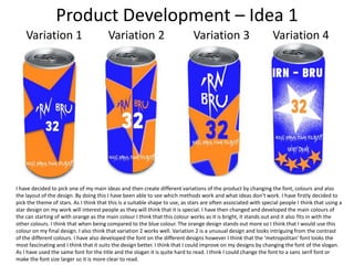
The document provides details on the development of copy and packaging design ideas for a new energy drink called Irn-Bru 32. It includes potential slogans, ingredients, and descriptions of the drink. The author experiments with different fonts and font sizes to see which pairings work best for the packaging design. Color combinations are also tested to determine which allow for clear readability. Two potential packaging design ideas are presented with four variations each to showcase different layouts, colors, and fonts. The author analyzes which designs are most successful based on themes, fonts, and ability to catch attention.