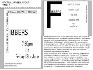
The document discusses two poster designs for a band venue called Fibbers. The first design attempted to use band names to frame an 'F' logo but the different fonts made it unclear. The second simplified design used a large bold 'F' with the word 'Fibbers' below in a consistent font. Band names were placed next to the logo. This second design was deemed clearer and more professional looking than the first more complex attempt.