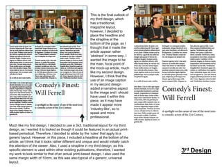
Task 4
This is the exported JPEG of my
final image, without the aid of the
gridlines. This layout mimics that of
a traditional newspaper or
magazine layout, with the text, the
side bar, as well as the main, focal
image fitting the guidelines in
which I initiated, as opposed to it
‘breaking the rules’, so to speak.
The viewer would be able to
identify this iconic house style, as it
appears in a high abundance of
different periodicals on a printbased platform.

This specific image displays the gridlines in
which I established within my work (3x3), with a
margin of 10mm. This standard layout worked
well for the elements within my work, as I was
enabled to manoeuvre around the text boxes in
an orderly fashion, as well as the side bar being
included, which is useful, as it helps to break up
the text in conjunction with the image so that the
consumer will hold their concentration on the
article. The image at the bottom of the page
accounts for the whole row and adds a sense of
dimension onto the layout and makes it look as
though it could potentially look like a
professional article.

Also, I have decided to include a
pull quote into my work, as that is
traditional of a typical print-based
periodical. Therefore, I thought that
it would be appropriate for use
within my work. Also, it grabs the
attention of the viewer greatly and
it may convince them to read the
article in full.
This ‘side bar’ has been used as a
way of breaking up the text, as well
as providing an extra aspect into
my work. Typically, a side bar in a
publication could include more
information regarding the subject of
the article, as well as links to
webpages.

1st Design
I have used a 5x4 aspect for my work, as
opposed to abiding by the traditional layout, as
I wanted to experiment with different sizes to
see if the outlook of my ‘magazine-like’ article
looked much different than the previous design
in which I created. The margins have been
altered to 2mm also, which makes the overall
layout appear more concise than that of the
traditional layout.

This is the final design
without the gridlines, where
my aim to create a
‘magazine-like’ style layout
turned out rather successful
in the sense that I utilised
the common conventions
that are found in a printbased periodical, such as
the use of drop capitals, a
headline, as well as a
structured text column
sector. This design is
different to my previous
piece in the sense that the
image is the main, focal
point, where as in my other
existing piece, there was a
high amount of emphasis
on a text aspect. Also, I
used a significant amount of
‘white space’ within my
work, (which lacked in my
other design), where I have
included one section with a
small image caption. I think
that this is effective as it
breaks up the main body of
text in a sense and makes
the layout more appealing
in general. Furthermore, my
second design uses a
headline, which helps to
frame the article, which also
lacked in my previous
design.

2nd Design
This is the final outlook of
my third design, which
has a traditional,
magazine layout,
however, I decided to
place the headline and
the strapline at the
bottom of the page, as I
thought that it made the
article appear rather
‘abstract’ in some way. I
wanted the image to be
the main, focal point of
the mock-up article, much
like my second design.
However, I think that the
use of an image caption
in my second design
added a narrative aspect
to the image and I should
have used it within this
piece, as it may have
made it appear more
‘industry-like’, so to
speak and more
professional.
Much like my first design, I decided to use a 3x3, traditional layout for my third
design, as I wanted it to looked as though it could be featured in an actual printbased periodical. Therefore, I decided to abide by the ‘rules’ that apply to a
generic layout. However, in this piece, I included a headline at the bottom of the
article, as I think that it looks rather different and unique and would initially catch
the attention of the viewer. Also, I used a strapline in my third design, as this
specific element is used within other existing publications, therefore, I wanted
my work to look similar to that of an actual print-based design. I also used the
same margin width of 10mm, as this was also typical of a generic, universal
layout.

3rd Design
I think that this specific
design is rather abstract to
that of my other three
existing designs, due to the
fact that it does not include a
traditional layout. I do not
think that I would use a
layout like this in the future,
as I think that it is rather
untidy and unprofessional
looking. If I was to create a
magazine article, I would use
the generic 3x3 gridline
aspect, as it is useful in the
sense that any audience
would be able to identify it as
being a ‘traditional article’, so
to speak, as it is universal in
the sense that it is
recognised on a large scale,
as opposed to a layout like
this, which may not be
preferred by the audience
themselves.
This design uses a more ‘adverse’ layout, where the gridlines have been altered significantly different,
appearing much more thinner. I set the layout like this on purpose as I wanted to challenge myself with a ‘free’
structure, that enabled me to push the boundaries and place text that would cross the margin line. This differs
significantly to that of a traditional magazine layout, however, it allowed me to explore how I could alter my final
layout to make it a unique piece that could possibly be interpreted by the audience as being individual, in a way.
I decided to place one of the quotation text sections into the margin, so that it would overlap and not match up to
the typical layout. The text in which I used stands out to the viewer, as it is featured in all different typefaces and
sizes, which makes it appear more quirky. However, the images in which I have used are rather structures, as
they fit the dimensions provided by the gridlines, although, they feature vertical text, which makes them appear
more eye-catching as well as different, in a sense.

Extension
Task
Design

Task 4 evaluations

  • 1.
  • 2.
    This is theexported JPEG of my final image, without the aid of the gridlines. This layout mimics that of a traditional newspaper or magazine layout, with the text, the side bar, as well as the main, focal image fitting the guidelines in which I initiated, as opposed to it ‘breaking the rules’, so to speak. The viewer would be able to identify this iconic house style, as it appears in a high abundance of different periodicals on a printbased platform. This specific image displays the gridlines in which I established within my work (3x3), with a margin of 10mm. This standard layout worked well for the elements within my work, as I was enabled to manoeuvre around the text boxes in an orderly fashion, as well as the side bar being included, which is useful, as it helps to break up the text in conjunction with the image so that the consumer will hold their concentration on the article. The image at the bottom of the page accounts for the whole row and adds a sense of dimension onto the layout and makes it look as though it could potentially look like a professional article. Also, I have decided to include a pull quote into my work, as that is traditional of a typical print-based periodical. Therefore, I thought that it would be appropriate for use within my work. Also, it grabs the attention of the viewer greatly and it may convince them to read the article in full. This ‘side bar’ has been used as a way of breaking up the text, as well as providing an extra aspect into my work. Typically, a side bar in a publication could include more information regarding the subject of the article, as well as links to webpages. 1st Design
  • 3.
    I have useda 5x4 aspect for my work, as opposed to abiding by the traditional layout, as I wanted to experiment with different sizes to see if the outlook of my ‘magazine-like’ article looked much different than the previous design in which I created. The margins have been altered to 2mm also, which makes the overall layout appear more concise than that of the traditional layout. This is the final design without the gridlines, where my aim to create a ‘magazine-like’ style layout turned out rather successful in the sense that I utilised the common conventions that are found in a printbased periodical, such as the use of drop capitals, a headline, as well as a structured text column sector. This design is different to my previous piece in the sense that the image is the main, focal point, where as in my other existing piece, there was a high amount of emphasis on a text aspect. Also, I used a significant amount of ‘white space’ within my work, (which lacked in my other design), where I have included one section with a small image caption. I think that this is effective as it breaks up the main body of text in a sense and makes the layout more appealing in general. Furthermore, my second design uses a headline, which helps to frame the article, which also lacked in my previous design. 2nd Design
  • 4.
    This is thefinal outlook of my third design, which has a traditional, magazine layout, however, I decided to place the headline and the strapline at the bottom of the page, as I thought that it made the article appear rather ‘abstract’ in some way. I wanted the image to be the main, focal point of the mock-up article, much like my second design. However, I think that the use of an image caption in my second design added a narrative aspect to the image and I should have used it within this piece, as it may have made it appear more ‘industry-like’, so to speak and more professional. Much like my first design, I decided to use a 3x3, traditional layout for my third design, as I wanted it to looked as though it could be featured in an actual printbased periodical. Therefore, I decided to abide by the ‘rules’ that apply to a generic layout. However, in this piece, I included a headline at the bottom of the article, as I think that it looks rather different and unique and would initially catch the attention of the viewer. Also, I used a strapline in my third design, as this specific element is used within other existing publications, therefore, I wanted my work to look similar to that of an actual print-based design. I also used the same margin width of 10mm, as this was also typical of a generic, universal layout. 3rd Design
  • 5.
    I think thatthis specific design is rather abstract to that of my other three existing designs, due to the fact that it does not include a traditional layout. I do not think that I would use a layout like this in the future, as I think that it is rather untidy and unprofessional looking. If I was to create a magazine article, I would use the generic 3x3 gridline aspect, as it is useful in the sense that any audience would be able to identify it as being a ‘traditional article’, so to speak, as it is universal in the sense that it is recognised on a large scale, as opposed to a layout like this, which may not be preferred by the audience themselves. This design uses a more ‘adverse’ layout, where the gridlines have been altered significantly different, appearing much more thinner. I set the layout like this on purpose as I wanted to challenge myself with a ‘free’ structure, that enabled me to push the boundaries and place text that would cross the margin line. This differs significantly to that of a traditional magazine layout, however, it allowed me to explore how I could alter my final layout to make it a unique piece that could possibly be interpreted by the audience as being individual, in a way. I decided to place one of the quotation text sections into the margin, so that it would overlap and not match up to the typical layout. The text in which I used stands out to the viewer, as it is featured in all different typefaces and sizes, which makes it appear more quirky. However, the images in which I have used are rather structures, as they fit the dimensions provided by the gridlines, although, they feature vertical text, which makes them appear more eye-catching as well as different, in a sense. Extension Task Design