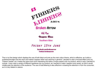
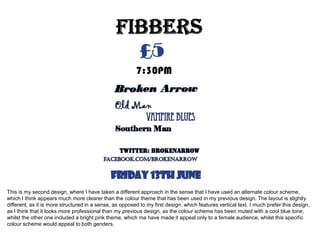
2. This is my first design which displays the use of both black and pink as the main colour theme, which is effective, as it adds a
professional edge onto the work and makes it appear rather eye-catching in general. I decided to add a mirrored-effect onto my
‘Fibbers’ header, as it makes the piece look more interesting and adds a unique aspect onto my product, which is why I decided to
include. I have used a variety of different typefaces into my product, as I wanted to make it appear more varied, so that it would
initially grab the attention of the audience. The use of bold lettering is also effective in drawing the attention in from the consumer,
as it is very blatant in stature.
3. This is my second design, where I have taken a different approach in the sense that I have used an alternate colour scheme,
which I think appears much more clearer than the colour theme that has been used in my previous design. The layout is slightly
different, as it is more structured in a sense, as opposed to my first design, which features vertical text. I much prefer this design,
as I think that it looks more professional than my previous design, as the colour scheme has been muted with a cool blue tone,
whilst the other one included a bright pink theme, which ma have made it appeal only to a female audience, whilst this specific
colour scheme would appeal to both genders.