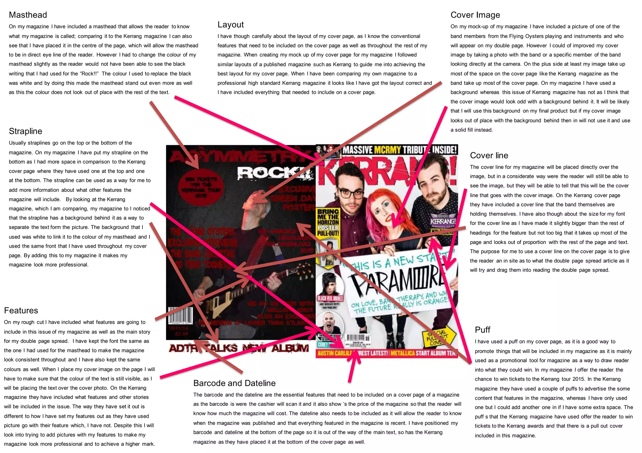
The document discusses the layout and design elements of a magazine cover page that the author created for a school project. It compares various aspects of the author's mock-up cover to a published issue of Kerrang magazine. The author analyzed the placement of the masthead, cover image, features list, puffs, straplines, cover line, barcode, and dateline. Feedback is provided on ways to improve the cover, such as adding pictures to the features or having the cover image subject look at the camera. Overall, the layout follows magazine conventions and is comparable to the professional Kerrang cover.