The document discusses the graphics and styles used in various media. Several pieces discuss the use of graphics to set a point of focus in the middle of the screen. Graphics aim to represent the subject matter in a realistic style, using things like maps, game elements, or restaurant designs. Additional graphics along the bottom of the screen provide useful information like scores, timers, or interactions with other users to enhance the experience.
💰Call Girl In Bhubaneswar☎️9777949614💰 Call Girl service in Bhubaneswar☎️Bhub...
TASK 1C
1. The graphics are put in the middle of the screen so the point of focus is the visual. The style of this product is
pop art; We can tell by the use of colour and the shapes that are put together to make one big image. There
is a colour scheme where they use dark colours only. As big brother is seen as surveillance, the graphics in the
background used are computer components, promoting the idea of technology.
The genre of these moving images are entertainment.
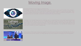
The style of this is photo realism as it is a real map and it is made and drawn to look real. There has also been
text added onto the picture. The text has a shadow behind which makes it stand out more and makes it look
like it is placed not on the picture but in front of it. There has also been the channel added underneath the Title
of the show to also let the viewers know where to watch the programme. The map lets the audience know
which part of London the show is representing.
At the bottom of the screen, there is text added on to let the viewers know something that they may not know
when they tune into the channel. The colours are kept the same to promote consistency and professionalism.
2. The genre for this is entertainment as the user can interact with other people whereas the style is . This is a logo for a
game website. The text has been reflected underneath it making it seem like it’s so bright. The text has also been placed
in the middle of the screen so that it is point of focus. There has been contrasting colours used so the text stands out.
The website is called Stardoll and the text is in Gold which links to fame. It also follows the idea of stars being gold and
shiny.
The website style is photorealism. This is shown through the use of the buildings in the background made to look like
there is a city behind her and the characters features are made so it looks like a real person. This type of graphics are
used to link to the idea of being a star in the city. the city has been added in the background to make the page look
nice and also so it looks realistic. although the city is in the background it is still a point of focus as the colours are
bright so they attract the audiences eyes. The point of focus on this website is the avatars house. There is a lot of
naturalistic colours used. This makes the website look neat.
The EA sports website has graphics from the fifa games as their background. This is the point of focus as the
viewer would first spot that the background is moving. The website is also based on a d ark colour scheme which
connotes elegance. It also makes the graphics look like they are a flash back rather than actual footage.
3. There are many graphics used in Fifa. The score board is added in whilst playing and changes as the game progresses.
There is also a timer there to count down the time. In the corner of the screen, there is a little graphic added at the
bottom. This has the players name on it. The use of this is so the gamer knows which player they are controlling and to
also make it look realistic. The style of the game is photorealism as the players are made to look exactly like the
professional football players in game form.
The background is green. This relates to gambling in casinos where the table is green. Green is also connotes
growth and money. The point of focus is the cards laid out. When the gamer wants to play they look at the cards
and see what moves they are able to make. This is effective as the viewer has full view of their cards. At the bottom
of the screen there is a score board and timer added which changes as the game progresses. The use of this
makes the gamer know how long they are taking and also their points.
The point of focus is the restaurant. There is a lot of colours used which indicates that the style is pop art.
At the bottom of the screen, there is a bar where the user can see other users who are in the room and their needs.
This graphic is added which controls the game and makes the user do certain things according to the bar.