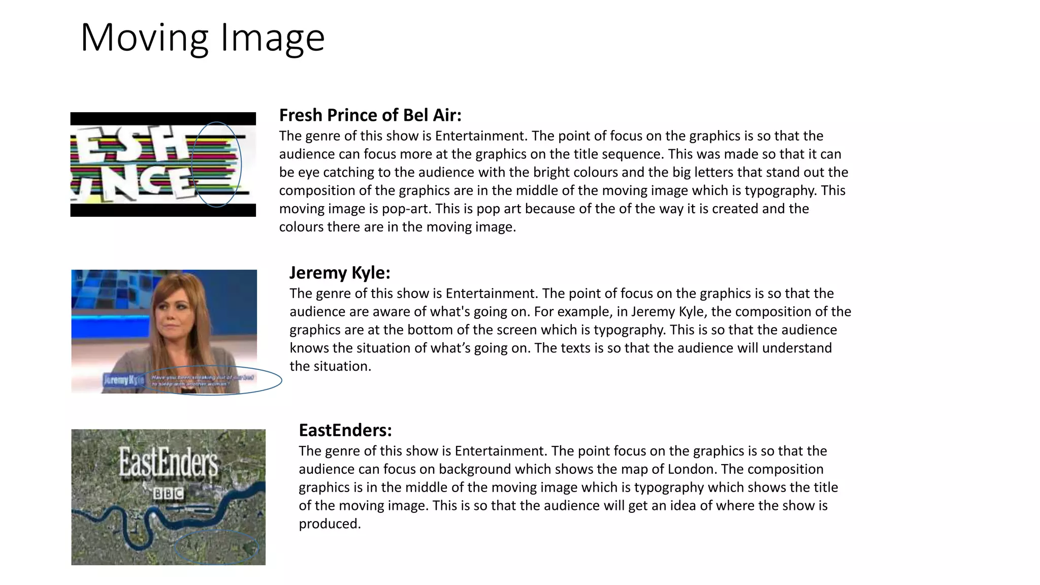
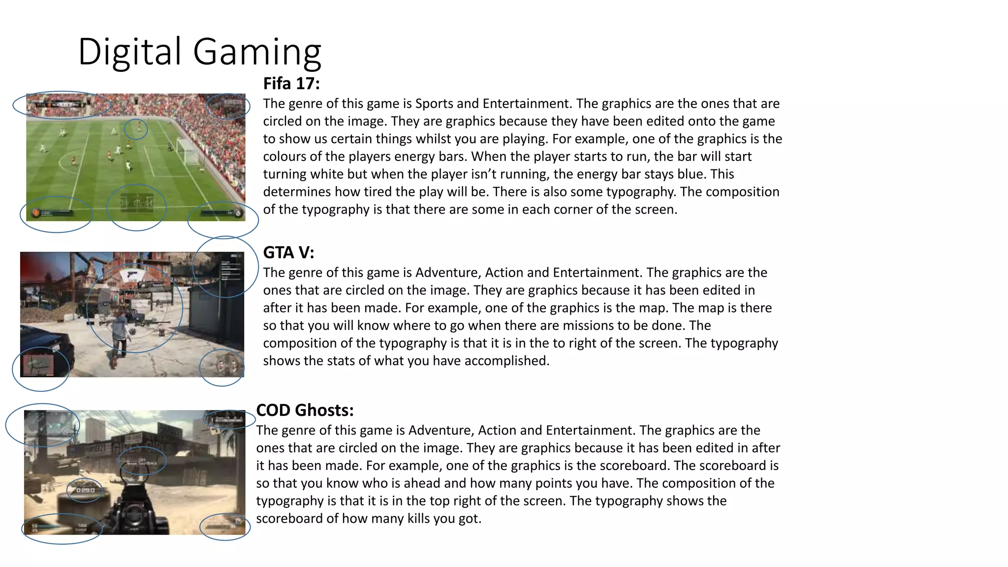
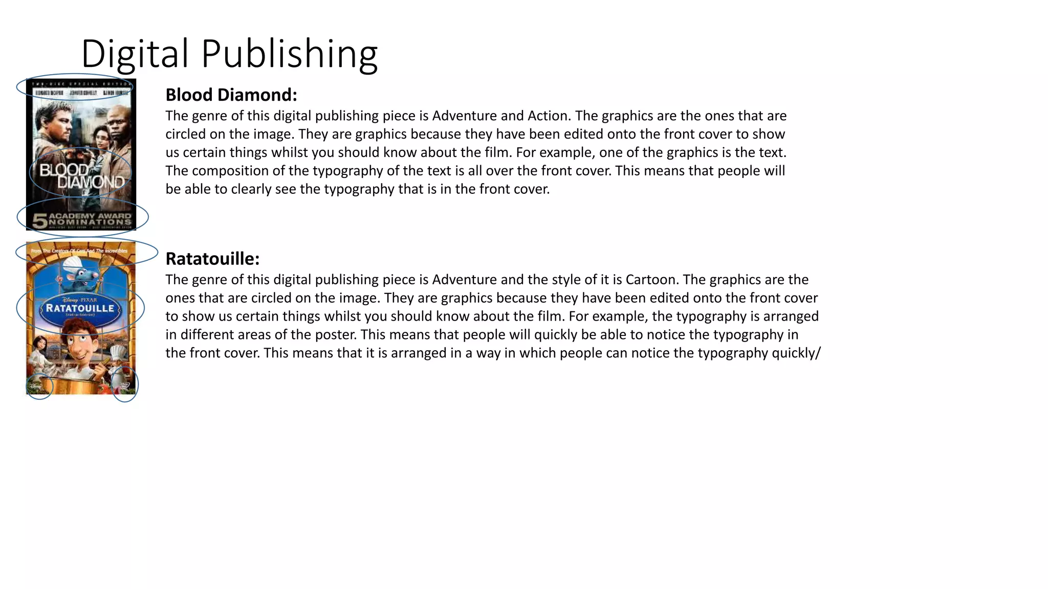
1. Task 1C
You are to choose at least 3 different media sectors and compare and analyse the use
of different digital media graphics within those media sectors. You are to choose from
the following.
โข Moving image: motion graphics, e.g. title sequences for films, television and
digital gaming
โข Digital publishing graphics, e.g. e-magazines, DVD or CD covers, promotional
materials
โข Website design graphics, e.g. educational, corporate, entertainment
OR
โข Digital gaming graphics, e.g. PC, handheld, consoles or mobile gaming.
2. Moving Image
Fresh Prince of Bel Air:
The genre of this show is Entertainment. The point of focus on the graphics is so that the
audience can focus more at the graphics on the title sequence. This was made so that it can
be eye catching to the audience with the bright colours and the big letters that stand out the
composition of the graphics are in the middle of the moving image which is typography. This
moving image is pop-art. This is pop art because of the of the way it is created and the
colours there are in the moving image.
Jeremy Kyle:
The genre of this show is Entertainment. The point of focus on the graphics is so that the
audience are aware of what's going on. For example, in Jeremy Kyle, the composition of the
graphics are at the bottom of the screen which is typography. This is so that the audience
knows the situation of whatโs going on. The texts is so that the audience will understand
the situation.
EastEnders:
The genre of this show is Entertainment. The point focus on the graphics is so that the
audience can focus on background which shows the map of London. The composition
graphics is in the middle of the moving image which is typography which shows the title
of the moving image. This is so that the audience will get an idea of where the show is
produced.
3. Digital Gaming
Fifa 17:
The genre of this game is Sports and Entertainment. The graphics are the ones that are
circled on the image. They are graphics because they have been edited onto the game
to show us certain things whilst you are playing. For example, one of the graphics is the
colours of the players energy bars. When the player starts to run, the bar will start
turning white but when the player isnโt running, the energy bar stays blue. This
determines how tired the play will be. There is also some typography. The composition
of the typography is that there are some in each corner of the screen.
GTA V:
The genre of this game is Adventure, Action and Entertainment. The graphics are the
ones that are circled on the image. They are graphics because it has been edited in
after it has been made. For example, one of the graphics is the map. The map is there
so that you will know where to go when there are missions to be done. The
composition of the typography is that it is in the to right of the screen. The typography
shows the stats of what you have accomplished.
COD Ghosts:
The genre of this game is Adventure, Action and Entertainment. The graphics are the
ones that are circled on the image. They are graphics because it has been edited in after
it has been made. For example, one of the graphics is the scoreboard. The scoreboard is
so that you know who is ahead and how many points you have. The composition of the
typography is that it is in the top right of the screen. The typography shows the
scoreboard of how many kills you got.
4. Digital Publishing
Blood Diamond:
The genre of this digital publishing piece is Adventure and Action. The graphics are the ones that are
circled on the image. They are graphics because they have been edited onto the front cover to show
us certain things whilst you should know about the film. For example, one of the graphics is the text.
The composition of the typography of the text is all over the front cover. This means that people will
be able to clearly see the typography that is in the front cover.
Ratatouille:
The genre of this digital publishing piece is Adventure and the style of it is Cartoon. The graphics are the
ones that are circled on the image. They are graphics because they have been edited onto the front cover
to show us certain things whilst you should know about the film. For example, the typography is arranged
in different areas of the poster. This means that people will quickly be able to notice the typography in
the front cover. This means that it is arranged in a way in which people can notice the typography quickly/