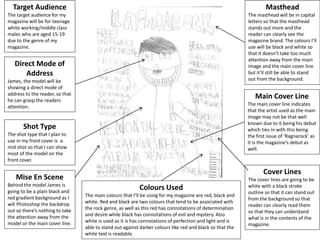
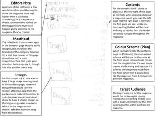
Shot Type
The shot type that I plan to
use in my front cover is a
mid shot so that I can show
most of the model on the
front cover.
Mise En Scene
Behind the model James is
going to be a plain black and
red gradient background as I
will Photoshop the backdrop
out so there’s nothing to take
the attention away from the
model or the main cover line.
Direct Mode of
Address
James, the model will be
showing a direct mode of
address to the reader, so that
he can grasp the readers
attention.
Target Audience
The target audience for my
magazine will be for teenage
white working/middle class
males who are aged 15-19
due to the genre of my
magazine.
Masthead
The masthead will be in capital
letters so that the masthead
stands out more and the
reader can clearly see the
magazine brand. The colours I’ll
use will be black and white so
that it doesn’t take too much
attention away from the main
image and the main cover line
but it’ll still be able to stand
out from the background.
Main Cover Line
The main cover line indicates
that the artist used as the main
image may not be that well
known due to it being his debut
which ties in with this being
the first issue of ‘Ragnarock’ as
it is the magazine’s debut as
well.
Colours Used
The main colours that I’ll be using for my magazine are red, black and
white. Red and black are two colours that tend to be associated with
the rock genre, as well as this red has connotations of determination
and desire while black has connotations of evil and mystery. Also
white is used as it is has connotations of perfection and light and is
able to stand out against darker colours like red and black so that the
white text is readable.
Cover Lines
The cover lines are going to be
white with a black stroke
outline so that it can stand out
from the background so that
reader can clearly read them
so that they can understand
what is in the contents of the
magazine.
A picture of the editor and a few
words from him could be used to
make the magazine more real.
Rather then it just being
something just put together it
shows someone who worked on
the magazine and made it all
happen giving some life to the
magazine they’ve created.
The target audience for this magazine
would be for teenagers (mainly
males) who are working-middle class
with a disposable income so that they
could subscribe and/or purchase the
magazine.
The Masthead is also shown again
in the contents page which is easily
recognisable and shows the
branding of the company, however
it’s a lost less clearer on this page
since there isn’t a main
image/cover line that grabs your
attention before you see it, though
it is a lot smaller then it was
Contents
For the contents itself I chose to
place it at the very right of the page
as normally when opening a book or
a magazine even if you read the left
page first the right page is normally
the first page you see. Unlike my
hand-writing the text will be clear
and easy to read so that the reader
can easily navigate throughout the
magazine.
Images
For the images my 1st idea was to
have 1 large image covering most
of the contents page, however I
thought that would take the
readers attention away from the
contents and make it too similar to
a double page spread, so instead I
chose to have 3 smaller images so
that it gives a greater preview to
what’s in the magazine and
doesn’t take the attention away
from the contents.
Colour Scheme (Plan)
When I actually create the contents
page on Photoshop the main colour
scheme will be exactly the same as
the front cover. I chose to do this so
that the magazine has it’s own house
theme and branding and because if I
differed the design too much from
the front cover then it would look
like the pages are from 2 completely
different magazines.
As previewed by the front cover Skiadrum (Made up name for my model) is
the one being featured in the double page spread for this magazine which
shows that this article is one of the most important parts of the magazines
due to how much it’s been advertised. Like the front cover Skiadrum is
showing a direct mode of address, however he is still turned away from the
audience and has turned slightly so he is able to see them.. The shot type used
here is a mid-shot as only half of the artists body is in view of the picture.
There are two props that are used in the double page spread and both
of them are being worn/used by the model The first prop is the
skeleton neck scarf which has been used by him on the front cover
and by another artist in the magazine to advertise the free mask that
is being given away in the magazine. The other prop that is used in the
magazine is the guitar prop which is slung around Skiadrum’s back
which ties in with the genre of the magazine as it’s a rock music
themed magazine and a guitar is a musical instrument and is
frequently used in rock music.
Masthead
The Masthead is also used again
in the double page spread to
show the branding of the
company, however it is a lot
smaller this time around so it
doesn’t attract attention away
from the main image or the
article itself.
The overall impression of the
double page spread article
shows the genre of the
magazine due to the Mise En
Scene since Skiadrum’s dark
clothing line and skeleton face
scarf both show the rock theme
as well as the colour scheme
that is used as the background
also ties in with the rock genre.
The story headline for the
double page spread hasn’t
been decided yet and will be
decided during the
construction process. However
the general idea of the headline
will be to show that Skiadrum is
a new artist and how well he is
doing even though he has only
released his first album.
Article Layout
For the layout of the article I
have decided to first write an
introduction showing who the
artist and going into more
detail about them and then
following up with a question
and answer styled article, the
actual writing shall be created
during the construction
process.
The colour red that is used in the
background has connotations of
aggression and destruction which ties
into the concept behind the magazines
name as it’s a pun of ‘Ragnarok’ which
is Armageddon in Norse mythology
and rock which is the genre of the
magazine. The colour black which is
also used in the background has
connotations of death and evil which
makes it link with the masthead’s
themes as well.

Task 10 cover, contents and double page spread plan analysis

  • 1.
    Shot Type The shottype that I plan to use in my front cover is a mid shot so that I can show most of the model on the front cover. Mise En Scene Behind the model James is going to be a plain black and red gradient background as I will Photoshop the backdrop out so there’s nothing to take the attention away from the model or the main cover line. Direct Mode of Address James, the model will be showing a direct mode of address to the reader, so that he can grasp the readers attention. Target Audience The target audience for my magazine will be for teenage white working/middle class males who are aged 15-19 due to the genre of my magazine. Masthead The masthead will be in capital letters so that the masthead stands out more and the reader can clearly see the magazine brand. The colours I’ll use will be black and white so that it doesn’t take too much attention away from the main image and the main cover line but it’ll still be able to stand out from the background. Main Cover Line The main cover line indicates that the artist used as the main image may not be that well known due to it being his debut which ties in with this being the first issue of ‘Ragnarock’ as it is the magazine’s debut as well. Colours Used The main colours that I’ll be using for my magazine are red, black and white. Red and black are two colours that tend to be associated with the rock genre, as well as this red has connotations of determination and desire while black has connotations of evil and mystery. Also white is used as it is has connotations of perfection and light and is able to stand out against darker colours like red and black so that the white text is readable. Cover Lines The cover lines are going to be white with a black stroke outline so that it can stand out from the background so that reader can clearly read them so that they can understand what is in the contents of the magazine.
  • 2.
    A picture ofthe editor and a few words from him could be used to make the magazine more real. Rather then it just being something just put together it shows someone who worked on the magazine and made it all happen giving some life to the magazine they’ve created. The target audience for this magazine would be for teenagers (mainly males) who are working-middle class with a disposable income so that they could subscribe and/or purchase the magazine. The Masthead is also shown again in the contents page which is easily recognisable and shows the branding of the company, however it’s a lost less clearer on this page since there isn’t a main image/cover line that grabs your attention before you see it, though it is a lot smaller then it was Contents For the contents itself I chose to place it at the very right of the page as normally when opening a book or a magazine even if you read the left page first the right page is normally the first page you see. Unlike my hand-writing the text will be clear and easy to read so that the reader can easily navigate throughout the magazine. Images For the images my 1st idea was to have 1 large image covering most of the contents page, however I thought that would take the readers attention away from the contents and make it too similar to a double page spread, so instead I chose to have 3 smaller images so that it gives a greater preview to what’s in the magazine and doesn’t take the attention away from the contents. Colour Scheme (Plan) When I actually create the contents page on Photoshop the main colour scheme will be exactly the same as the front cover. I chose to do this so that the magazine has it’s own house theme and branding and because if I differed the design too much from the front cover then it would look like the pages are from 2 completely different magazines.
  • 3.
    As previewed bythe front cover Skiadrum (Made up name for my model) is the one being featured in the double page spread for this magazine which shows that this article is one of the most important parts of the magazines due to how much it’s been advertised. Like the front cover Skiadrum is showing a direct mode of address, however he is still turned away from the audience and has turned slightly so he is able to see them.. The shot type used here is a mid-shot as only half of the artists body is in view of the picture. There are two props that are used in the double page spread and both of them are being worn/used by the model The first prop is the skeleton neck scarf which has been used by him on the front cover and by another artist in the magazine to advertise the free mask that is being given away in the magazine. The other prop that is used in the magazine is the guitar prop which is slung around Skiadrum’s back which ties in with the genre of the magazine as it’s a rock music themed magazine and a guitar is a musical instrument and is frequently used in rock music. Masthead The Masthead is also used again in the double page spread to show the branding of the company, however it is a lot smaller this time around so it doesn’t attract attention away from the main image or the article itself. The overall impression of the double page spread article shows the genre of the magazine due to the Mise En Scene since Skiadrum’s dark clothing line and skeleton face scarf both show the rock theme as well as the colour scheme that is used as the background also ties in with the rock genre. The story headline for the double page spread hasn’t been decided yet and will be decided during the construction process. However the general idea of the headline will be to show that Skiadrum is a new artist and how well he is doing even though he has only released his first album. Article Layout For the layout of the article I have decided to first write an introduction showing who the artist and going into more detail about them and then following up with a question and answer styled article, the actual writing shall be created during the construction process. The colour red that is used in the background has connotations of aggression and destruction which ties into the concept behind the magazines name as it’s a pun of ‘Ragnarok’ which is Armageddon in Norse mythology and rock which is the genre of the magazine. The colour black which is also used in the background has connotations of death and evil which makes it link with the masthead’s themes as well.