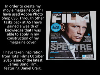
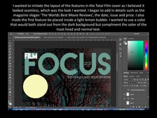
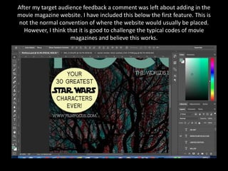
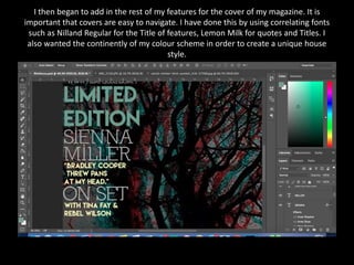
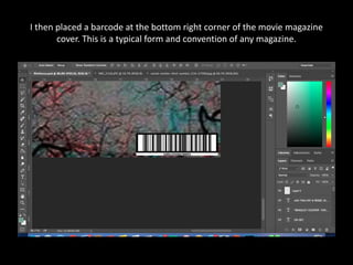
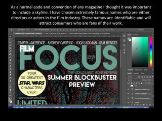
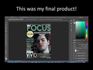
The document describes the process of creating a movie magazine cover in Adobe Photoshop CS6. Key steps included:
1) Uploading a background image and applying a 3D lens effect to mimic the teaser trailer.
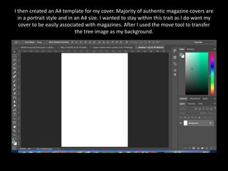
2) Creating an A4 template and transferring the background image.
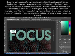
3) Choosing colors inspired by Total Film magazine, including a green/blue for the masthead.
4) Laying out features inspired by Total Film's seamless layout, including the magazine name "Film Focus".
5) Adding details like the slogan, date, issue number, and first feature bubble with Star Wars font inspired by the franchise.