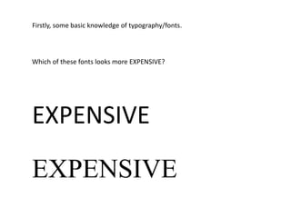
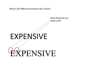
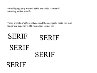
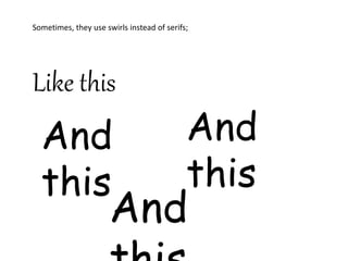
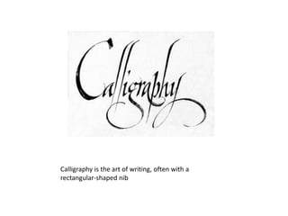
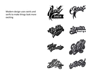
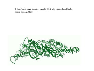
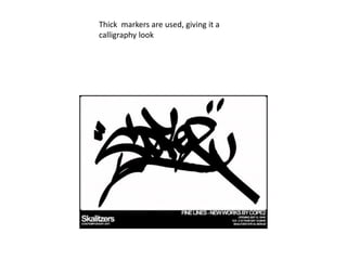
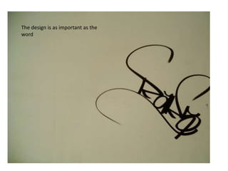
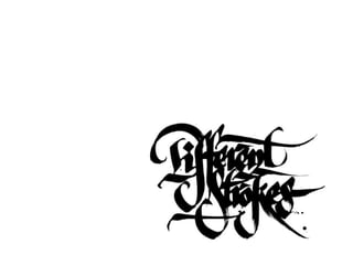
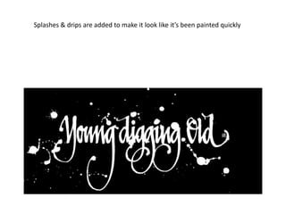
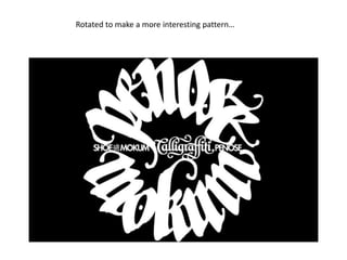
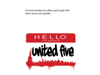
This document discusses typography and calligraphy. It explains that serif fonts generally look more expensive and formal than sans serif fonts which lack small lines or swirls at the ends of letters. Calligraphy involves writing with a rectangular nib and modern design uses swirls and serifs to make text more exciting. Street art uses thick markers, rotations, drips and splashes to mimic calligraphy and make typography into interesting patterns.


![Things I Know About Type [Field Guide]](https://cdn.slidesharecdn.com/ss_thumbnails/thingsiknowabouttype-fieldguide-121030022134-phpapp02-thumbnail.jpg?width=640&height=640&fit=bounds)


