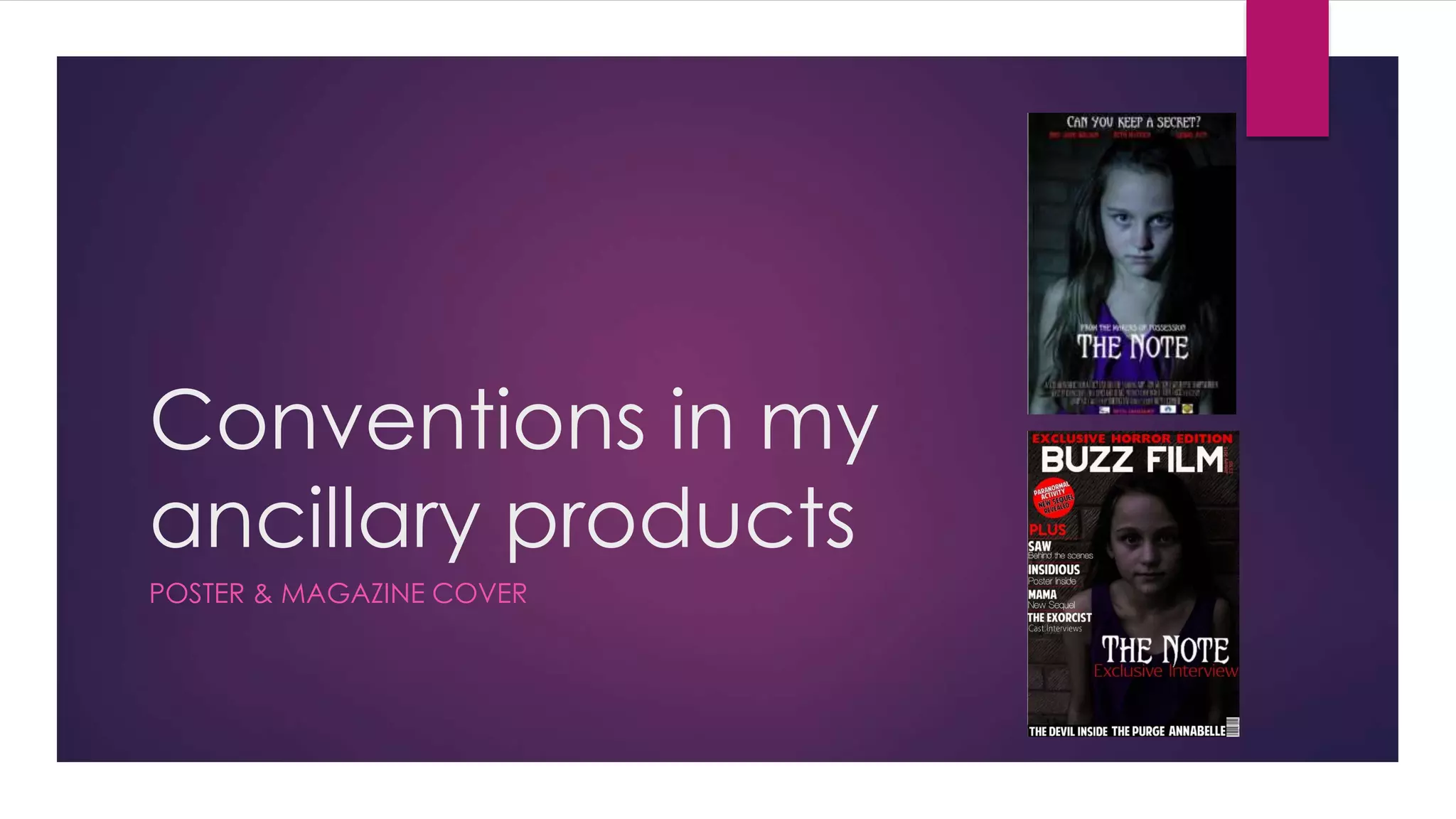
This document discusses conventions used in movie posters and magazine covers for horror films.
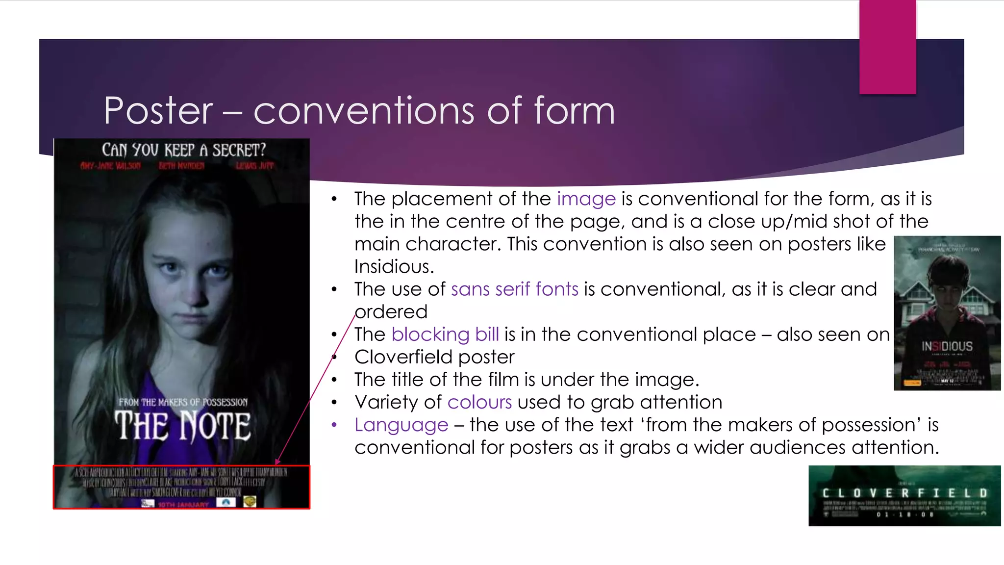
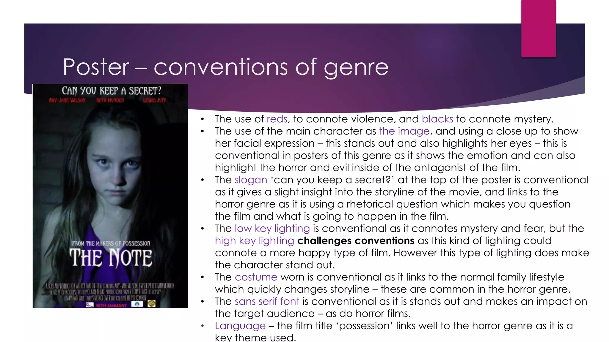
For posters, it notes conventions like placing the central image in the middle, using sans-serif fonts, including the film title and credits. Color, lighting, costumes and imagery are also used conventionally to signify genre.
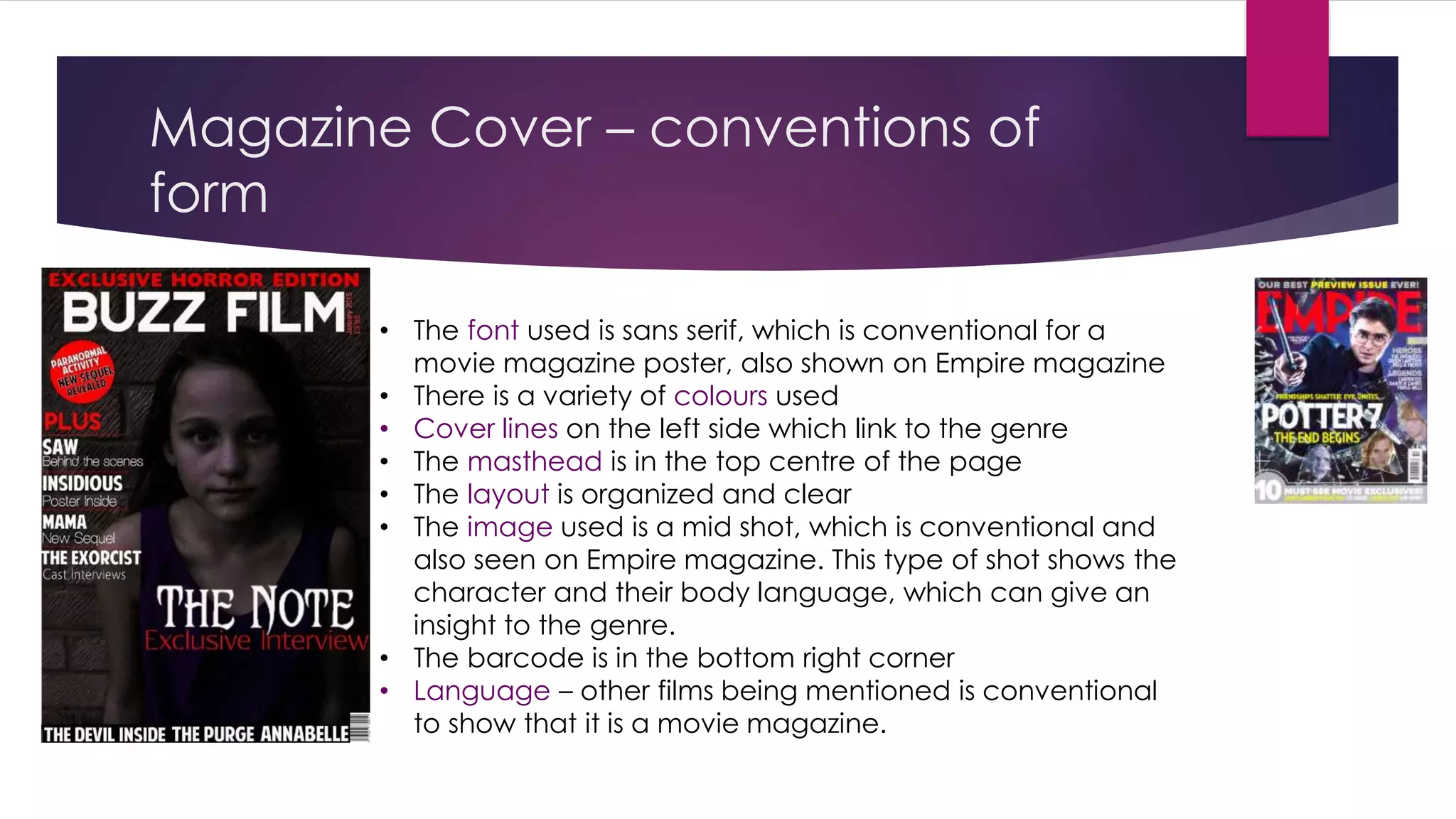
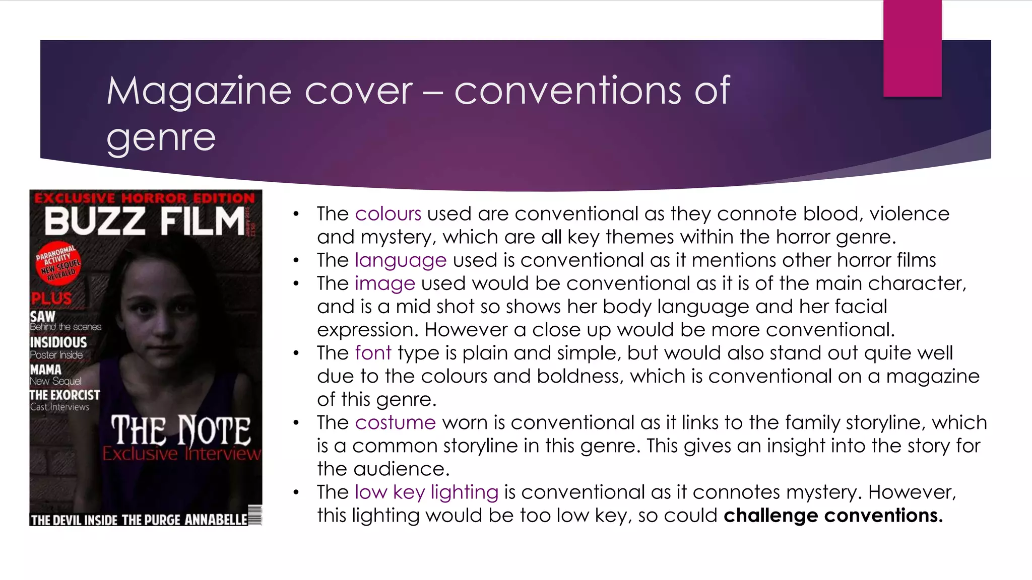
For magazine covers, conventions discussed include sans-serif fonts, organized layout, film credits and other references to establish it as a movie publication. Imagery, lighting, color and costumes again signal the horror genre.
The effects of applying genre and format conventions are said to help audiences quickly identify the medium and film type, but some unconventional aspects may challenge expectations or clarity.