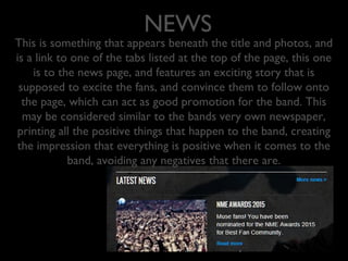
Download to read offline
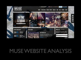


The Muse website background uses the iconic album cover from "Absolution" to be instantly recognizable to fans. The background can also be customized to different album covers. This provides a personal touch without blank spaces. The title section at the top has a sleek, uncomplicated design that has evolved with the music industry. It features the band's logo and consistent fonts. The different tabs entice visitors with news and tour dates to encourage learning more and attending shows. Photos showcase the band both professionally and personally to give insight beyond other sites. The email list grows the band's relationship with fans by keeping them informed of exclusive new information.


