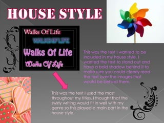
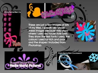
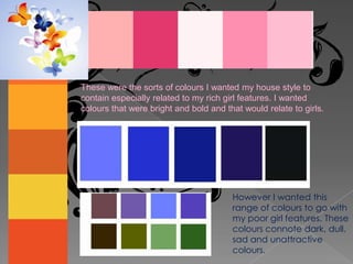
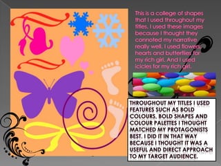
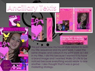
The document discusses the effectiveness of combining main products and ancillary texts through a consistent house style. The creator wanted bold, eye-catching text elements in titles along with specific colors, fonts, and shapes to represent rich and poor protagonists. These same visual elements were then carried over into print materials to create a recognizable brand identity and marketing strategy across all parts of the work.


![Magazine media[1]](https://cdn.slidesharecdn.com/ss_thumbnails/magazinemedia1-111013024946-phpapp02-thumbnail.jpg?width=640&height=640&fit=bounds)


