Question 2
•Download as PPTX, PDF•
0 likes•41 views
The document discusses the effectiveness of combining main products and ancillary texts through a consistent house style. The creator wanted bold, eye-catching text elements in titles paired with specific imagery and colors to represent rich and poor protagonists. Shapes like flowers, hearts, and butterflies denoted rich girls while icicles represented poor girls. This cohesive style using matching colors, shapes, and design elements carried through both titles and printed materials to create a recognizable brand for the product.
Report
Share
Report
Share

Recommended
Analysis of digipak 1
The digipak layout cleverly uses the back three pages to create one connected image while also working individually, adding depth. The color scheme ties the whole thing together with a theme of red representing love and roses. There is limited bold writing, keeping it simple yet effective for a famous artist like Rihanna where the images are bold enough without needing much text. The CD patterns stand out with a different color while still keeping the floral theme, drawing in the audience. The whole design appeals to young females as the target audience through colors and themes they can relate to.
Analysis of digipak 1
The digipak layout cleverly uses the back three pages to create one connected image while also working individually, giving more depth. The color scheme ties the whole thing together with a theme of red representing love and roses. There is limited bold text, keeping it simple yet effective to showcase the famous artist Rihanna without needing much writing. The CD pattern stands out with a different color that still keeps the floral theme, drawing in the audience. The entire design appeals to young females through colors and themes they can relate to like roses.
Music Magazine inspiration
The document discusses techniques for magazine cover design, including overlapping the masthead with a full-page artist photo, using a limited color palette, and featuring an artist from the magazine's music genre. It also notes using text and images to form the masthead and creating a face out of multiple images as ideas to make the masthead unique.
Magazine presentation
This draft focuses on font choices and layout techniques. The background was blurred to make the foreground clearer. Stencil std was used for the title to stand out boldly, while komika axis was used for kickers to still stand out but not as boldly. Feedback was considered to improve the second draft, which established a pink and black theme. Drop shadows were added behind fonts to make the writing stand out with dimension while keeping the effective fonts that draw the eye.
Digital graphics evaluation finished pro forma
The document provides a template for evaluating a graphic narrative project. It prompts the creator to summarize their project, praise strong elements, identify areas for improvement, and reflect on how well their final product achieved their original intentions. It also includes questions about constructing images, using text to support images, suitability for the intended audience, and techniques used.
Digital graphics evaluation pro forma
The document provides a template for evaluating a graphic narrative project. It prompts the creator to summarize their project, praise strong elements, identify areas for improvement, and reflect on how well their final product achieved their original intentions. It also includes questions about constructing images, using text to support images, suitability for the intended audience, and techniques used.
Lili brewin development pro forma
The document outlines a storyboard for a children's book adapting the fairy tale of Puss in Boots. The storyboard shows key events in the tale, including the miller leaving his sons different items upon his death, Puss obtaining clothes and traps to catch food for the king, and Puss securing a home and money for the youngest son. The storyboard provides a visual layout of the adapted tale for a graphic novel format.
What aspects of your work are you pleased media
This document summarizes the aspects of a magazine front cover that the author is pleased and displeased with. The author is happy with the main image featuring the model's location, costumes, makeup and pose. They are also pleased with the placement, font and colors of the magazine title, issue number, price and barcode as they look professional. However, the author is unhappy that they were unable to change the model's hair color as intended. They are also displeased with the model's blurry face and the placement, color and font of the puff piece as it does not fit the intended tone.
Development pro forma 2
The document provides an evaluation of different digital graphic narrative development tasks completed by Lili Brewin, including shaping animals with simple lines, rotoscoping, creating text-based images, combining comic book styles with rotoscoping, and taking photos to use for expressions. For each task, Lili notes what they liked about the results and how they could be improved. Some key points included keeping animals cute with simple rounded shapes, spending more time on facial features like eyes and lips for realism, and taking more photos with plain backgrounds for future rotoscoping.
My music magazine
The document discusses photos chosen for the front cover of a music magazine. The author analyzes several photos of a model, noting issues like busy backgrounds, the model's positioning and facial expressions. One photo is selected as the cover because the model makes direct eye contact, the background is plain, and her expression seems suitable. Feedback on a draft cover is provided, suggesting changes like enlarging the title and adding identifying details. The author addresses the feedback in a second draft.
Evaluation question 5
The document describes the design process for a music magazine cover and contents pages. It summarizes:
- The magazine is titled "NE" to represent new edge music and feature upcoming artists, music, and events.
- The cover features a model wearing glasses with a fierce expression to convey power and attitude, fitting the magazine's style. Additional images were edited into the model's sunglasses.
- The contents pages are organized into columns with varied fonts, colors, and boxed text sections to attract different audiences. Images of artists are included to appeal to both male and female readers.
- An exclusive feature on the cover model continues across pages to keep readers engaged with her story throughout the magazine.
Different Fonts And Positioning Of Fonts
Robyn Gibson evaluates different font styles and positioning options for a digipak design. She likes a handwritten font that contrasts nicely with one image but not a bold white font on another image. She also comments on fonts being too bold or balanced, and text positioning drawing attention away from or being central to various images.
Lady gaga photoshoot ---
The document discusses how a photo of Lady Gaga helped the author find poses, makeup styles, hairstyles, and outfit ideas to emulate for a photo shoot modeling their subject after Lady Gaga. Specific elements like lightning streak eye makeup, peace sign tattoos, backcombed hair, and quirky fashion choices were recreated. The author chose one photo for their contents page that featured these elements and showed the subject against a plain background with good lighting that complemented the look and feel professional.
Music Magazine Mood Board
The document discusses design elements the author found inspiring for their magazine design, including photos with different poses, fonts to stand out as headings, geometric shapes that work well together, soft colors, hand-drawn arrows to break up text, simple rug patterns that are not distracting, a pull quote layout with a different colored background, and an interesting way of using a drop cap to present an article. The author considered including natural poses, concerts photos, different fonts, big quotation marks, geometric shapes, photo frames, soft colors, hand-drawn arrows, simple rug patterns, a centered pull quote with different background color, and a drop cap style in their own magazine design.
Cover layout decisions
The document describes the design process for a magazine cover. The designer experimented with different fonts, colors, effects and graphics to develop an appealing masthead, coverlines, pull quote and other elements. Key decisions included changing the masthead and model shirt colors to purple and red for better coordination, adding effects like bevel and emboss to elements to make them pop more, and adjusting text colors like changing the number 5 from white to black so it stood out more clearly. The goal was to follow magazine design conventions while developing a cohesive visual design.
My Music Magazine
The document discusses photos chosen for the cover of a music magazine. Several photos are rejected for reasons like busy backgrounds, models not looking at the camera or smiling awkwardly. One photo is chosen because the model makes direct eye contact, the background is plain, and her serious expression is suitable. Feedback on the first draft cover suggests making the title bigger, adding details like the issue number, and toning down the lips. Changes are made for the second draft in response.
Magazine analysis
The document describes the design choices made for a magazine mock-up, including using a consistent color scheme of white, black, gold, purple and grey. Fonts like University were used for headings and mastheads to stand out while being readable. Image choices showed a color photo paired with a black and white one to provide contrast. Consistent fonts and colors maintained a unified design throughout the magazine.
Contents pages
The document provides an analysis of a magazine contents page layout. It notes that the magazine publisher Vibe is known for using the color red, as red naturally draws the human eye. The title text is in a strong, readable font that complements the red background. The main image is of a rapper decorated with jewelry and gold teeth. However, the layout is criticized for having too much distracting text cluttered around the image in colors that do not contrast or complement each other well. The overall layout is deemed not to flow properly and the image is not given enough prominence as the main visual attraction.
Planning of Images
The document discusses planning images for a magazine, including settings, props, costumes, and techniques. The author considers shooting at their home, a studio, park, and town. Props mentioned include a mirror, makeup, guitar, piano, and hairbrush. For costumes, casual clothes are suggested for most images, with a smarter outfit used for the front cover. Techniques like reflections, leading lines, indirect eye contact, shallow focus, and black and white are discussed.
Digital graphics evaluation pro forma
The document provides guidelines for evaluating a graphic narrative project. It instructs the reader to provide specific details about their work by giving both written and visual examples to explain the project. It also says to find areas of the project to praise by being specific about what is good or could be improved, and to add additional slides as needed. Blank slides should be deleted before submission.
Magazine media[1]
The document discusses planning a school magazine, including analyzing images to understand composition and meaning. It compares two magazine covers, noting differences in design and feel. Photoshop editing techniques are explained, like removing blemishes and changing eye color. Potential cover photos from a photoshoot are evaluated, with one chosen for having the ideal composition and model expression to represent the magazine. Feedback on an initial cover draft prompts design revisions to improve readability.
Double page spread
The document describes the author's process of creating multiple drafts of a double-page magazine spread. In the first draft, the author placed images and text to fill the pages and planned to add a title. Subsequent drafts involved moving elements, adjusting image and text placement, and experimenting with different title designs. The final draft featured an attractive title, text color contrasting with the background, a "P" behind the text, and consistent color scheme between elements and images. The author determined this version best displayed information clearly and attractively.
Music Magazine Photo's :
The document discusses photos taken for a music magazine. While one photo was blurry and tilted, the photographer liked it but decided not to use it as it would not fit the magazine genre or article. Another photo showed two musicians making eye contact, suggesting they were both important artists. The photographer used a spot remover on another photo to better see the model's face. Reference magazines were used throughout the project for layout and design ideas.
Question Seven
For their preliminary task, the student did not put much thought into where photos were taken or who was in them, and did not get variety or good shots. However, for their music magazine, they thought more about images, dressing models and positioning. They also put more effort into coordinating colors. The preliminary contents page was unattractive using the same font and logo, while research helped create a better contents page for the music magazine with more relevant pictures and information. For the preliminary task, a double page spread was unnecessary, but research and other magazines helped the student design an effective double page spread for the music magazine.
Question Seven
For their preliminary task, the student did not put much thought into where photos were taken or who was in them, and did not get variety or good shots. However, for their music magazine, they thought more about images, dressing models and positioning. They also put more effort into coordinating colors. The preliminary contents page was unattractive using the same font and logo, while research helped create a better contents page for the music magazine with more relevant pictures and information. The preliminary task did not require a double page spread, so research and other magazines helped the student design one for the music magazine that coordinated colors and layout.
Final power point!
The document summarizes the design choices made for three magazine covers and a fashion spread for a magazine targeted at teenagers. For each element, the designer considered how to represent teenagers stylishly while incorporating the planned cover lines. Across all elements, the designer used a consistent color scheme of red, black and white and font to tie the magazine and fashion spread together visually. The covers feature models in poses and outfits relevant to the planned cover lines. For the fashion spread, the designer chose outfits and photos that fit an overall "dolls" theme and used matching makeup, hair, and photo effects to achieve flow across the spread.
Spr dn 2011 ppt final
The document thanks sponsors and donors for their support of Great Circle's Diamond Night event, which helps fund Great Circle's mission to reshape vulnerable lives through education and support programs. It provides examples of how $200 donations can support services like meals, books, transportation and life skills training to help children and families build confidence and bright futures. Quotes and facts about diamonds are included to draw parallels between transforming rough stones into brilliance and Great Circle's work transforming the lives of those it serves.
Question One Evaluation
This document discusses how a media product was influenced by and relates to real media forms and conventions. It summarizes:
1) Several title sequences and screen grabs inspired the overlapping images and text, stereotypical representations of social classes, and girly aesthetics used.
2) Conventions from magazines, DVD cases, and TV shows were employed to create a cohesive marketing strategy and relate different parts of the media product.
3) Feedback indicated the product contained redundancies and could have benefited from more creativity, but it effectively targeted the audience and used shapes inspired by other title sequences.
/Media/Kingston/Presentacion Guadalinfo
Este documento presenta la programación de marzo del centro comunitario Guadalinfo Lahiguera. Incluye cursos de formación básica sobre las TIC, mecanografía y creación de blogs, así como talleres para niños, conmemorando el Día de la Mujer y sobre el portal de la comunidad. El objetivo a largo plazo es acercar a los ciudadanos a Internet a través de cursos de formación y acompañamiento personalizado.
More Related Content
What's hot
Development pro forma 2
The document provides an evaluation of different digital graphic narrative development tasks completed by Lili Brewin, including shaping animals with simple lines, rotoscoping, creating text-based images, combining comic book styles with rotoscoping, and taking photos to use for expressions. For each task, Lili notes what they liked about the results and how they could be improved. Some key points included keeping animals cute with simple rounded shapes, spending more time on facial features like eyes and lips for realism, and taking more photos with plain backgrounds for future rotoscoping.
My music magazine
The document discusses photos chosen for the front cover of a music magazine. The author analyzes several photos of a model, noting issues like busy backgrounds, the model's positioning and facial expressions. One photo is selected as the cover because the model makes direct eye contact, the background is plain, and her expression seems suitable. Feedback on a draft cover is provided, suggesting changes like enlarging the title and adding identifying details. The author addresses the feedback in a second draft.
Evaluation question 5
The document describes the design process for a music magazine cover and contents pages. It summarizes:
- The magazine is titled "NE" to represent new edge music and feature upcoming artists, music, and events.
- The cover features a model wearing glasses with a fierce expression to convey power and attitude, fitting the magazine's style. Additional images were edited into the model's sunglasses.
- The contents pages are organized into columns with varied fonts, colors, and boxed text sections to attract different audiences. Images of artists are included to appeal to both male and female readers.
- An exclusive feature on the cover model continues across pages to keep readers engaged with her story throughout the magazine.
Different Fonts And Positioning Of Fonts
Robyn Gibson evaluates different font styles and positioning options for a digipak design. She likes a handwritten font that contrasts nicely with one image but not a bold white font on another image. She also comments on fonts being too bold or balanced, and text positioning drawing attention away from or being central to various images.
Lady gaga photoshoot ---
The document discusses how a photo of Lady Gaga helped the author find poses, makeup styles, hairstyles, and outfit ideas to emulate for a photo shoot modeling their subject after Lady Gaga. Specific elements like lightning streak eye makeup, peace sign tattoos, backcombed hair, and quirky fashion choices were recreated. The author chose one photo for their contents page that featured these elements and showed the subject against a plain background with good lighting that complemented the look and feel professional.
Music Magazine Mood Board
The document discusses design elements the author found inspiring for their magazine design, including photos with different poses, fonts to stand out as headings, geometric shapes that work well together, soft colors, hand-drawn arrows to break up text, simple rug patterns that are not distracting, a pull quote layout with a different colored background, and an interesting way of using a drop cap to present an article. The author considered including natural poses, concerts photos, different fonts, big quotation marks, geometric shapes, photo frames, soft colors, hand-drawn arrows, simple rug patterns, a centered pull quote with different background color, and a drop cap style in their own magazine design.
Cover layout decisions
The document describes the design process for a magazine cover. The designer experimented with different fonts, colors, effects and graphics to develop an appealing masthead, coverlines, pull quote and other elements. Key decisions included changing the masthead and model shirt colors to purple and red for better coordination, adding effects like bevel and emboss to elements to make them pop more, and adjusting text colors like changing the number 5 from white to black so it stood out more clearly. The goal was to follow magazine design conventions while developing a cohesive visual design.
My Music Magazine
The document discusses photos chosen for the cover of a music magazine. Several photos are rejected for reasons like busy backgrounds, models not looking at the camera or smiling awkwardly. One photo is chosen because the model makes direct eye contact, the background is plain, and her serious expression is suitable. Feedback on the first draft cover suggests making the title bigger, adding details like the issue number, and toning down the lips. Changes are made for the second draft in response.
Magazine analysis
The document describes the design choices made for a magazine mock-up, including using a consistent color scheme of white, black, gold, purple and grey. Fonts like University were used for headings and mastheads to stand out while being readable. Image choices showed a color photo paired with a black and white one to provide contrast. Consistent fonts and colors maintained a unified design throughout the magazine.
Contents pages
The document provides an analysis of a magazine contents page layout. It notes that the magazine publisher Vibe is known for using the color red, as red naturally draws the human eye. The title text is in a strong, readable font that complements the red background. The main image is of a rapper decorated with jewelry and gold teeth. However, the layout is criticized for having too much distracting text cluttered around the image in colors that do not contrast or complement each other well. The overall layout is deemed not to flow properly and the image is not given enough prominence as the main visual attraction.
Planning of Images
The document discusses planning images for a magazine, including settings, props, costumes, and techniques. The author considers shooting at their home, a studio, park, and town. Props mentioned include a mirror, makeup, guitar, piano, and hairbrush. For costumes, casual clothes are suggested for most images, with a smarter outfit used for the front cover. Techniques like reflections, leading lines, indirect eye contact, shallow focus, and black and white are discussed.
Digital graphics evaluation pro forma
The document provides guidelines for evaluating a graphic narrative project. It instructs the reader to provide specific details about their work by giving both written and visual examples to explain the project. It also says to find areas of the project to praise by being specific about what is good or could be improved, and to add additional slides as needed. Blank slides should be deleted before submission.
Magazine media[1]
The document discusses planning a school magazine, including analyzing images to understand composition and meaning. It compares two magazine covers, noting differences in design and feel. Photoshop editing techniques are explained, like removing blemishes and changing eye color. Potential cover photos from a photoshoot are evaluated, with one chosen for having the ideal composition and model expression to represent the magazine. Feedback on an initial cover draft prompts design revisions to improve readability.
Double page spread
The document describes the author's process of creating multiple drafts of a double-page magazine spread. In the first draft, the author placed images and text to fill the pages and planned to add a title. Subsequent drafts involved moving elements, adjusting image and text placement, and experimenting with different title designs. The final draft featured an attractive title, text color contrasting with the background, a "P" behind the text, and consistent color scheme between elements and images. The author determined this version best displayed information clearly and attractively.
Music Magazine Photo's :
The document discusses photos taken for a music magazine. While one photo was blurry and tilted, the photographer liked it but decided not to use it as it would not fit the magazine genre or article. Another photo showed two musicians making eye contact, suggesting they were both important artists. The photographer used a spot remover on another photo to better see the model's face. Reference magazines were used throughout the project for layout and design ideas.
Question Seven
For their preliminary task, the student did not put much thought into where photos were taken or who was in them, and did not get variety or good shots. However, for their music magazine, they thought more about images, dressing models and positioning. They also put more effort into coordinating colors. The preliminary contents page was unattractive using the same font and logo, while research helped create a better contents page for the music magazine with more relevant pictures and information. For the preliminary task, a double page spread was unnecessary, but research and other magazines helped the student design an effective double page spread for the music magazine.
Question Seven
For their preliminary task, the student did not put much thought into where photos were taken or who was in them, and did not get variety or good shots. However, for their music magazine, they thought more about images, dressing models and positioning. They also put more effort into coordinating colors. The preliminary contents page was unattractive using the same font and logo, while research helped create a better contents page for the music magazine with more relevant pictures and information. The preliminary task did not require a double page spread, so research and other magazines helped the student design one for the music magazine that coordinated colors and layout.
Final power point!
The document summarizes the design choices made for three magazine covers and a fashion spread for a magazine targeted at teenagers. For each element, the designer considered how to represent teenagers stylishly while incorporating the planned cover lines. Across all elements, the designer used a consistent color scheme of red, black and white and font to tie the magazine and fashion spread together visually. The covers feature models in poses and outfits relevant to the planned cover lines. For the fashion spread, the designer chose outfits and photos that fit an overall "dolls" theme and used matching makeup, hair, and photo effects to achieve flow across the spread.
What's hot (18)
Viewers also liked
Spr dn 2011 ppt final
The document thanks sponsors and donors for their support of Great Circle's Diamond Night event, which helps fund Great Circle's mission to reshape vulnerable lives through education and support programs. It provides examples of how $200 donations can support services like meals, books, transportation and life skills training to help children and families build confidence and bright futures. Quotes and facts about diamonds are included to draw parallels between transforming rough stones into brilliance and Great Circle's work transforming the lives of those it serves.
Question One Evaluation
This document discusses how a media product was influenced by and relates to real media forms and conventions. It summarizes:
1) Several title sequences and screen grabs inspired the overlapping images and text, stereotypical representations of social classes, and girly aesthetics used.
2) Conventions from magazines, DVD cases, and TV shows were employed to create a cohesive marketing strategy and relate different parts of the media product.
3) Feedback indicated the product contained redundancies and could have benefited from more creativity, but it effectively targeted the audience and used shapes inspired by other title sequences.
/Media/Kingston/Presentacion Guadalinfo
Este documento presenta la programación de marzo del centro comunitario Guadalinfo Lahiguera. Incluye cursos de formación básica sobre las TIC, mecanografía y creación de blogs, así como talleres para niños, conmemorando el Día de la Mujer y sobre el portal de la comunidad. El objetivo a largo plazo es acercar a los ciudadanos a Internet a través de cursos de formación y acompañamiento personalizado.
Create Solutions Training Portfolio 2010
Create Solutions provides training courses and workshops for the general insurance industry. They were formed in 2002 to help brokers prepare for regulation and train their staff. They have a team of experienced insurance professionals and provide bespoke, creative training tailored to each client's needs. Their courses cover topics like compliance, sales, supervision and technical insurance subjects. Courses range from half to full days and can be taken individually or combined into a structured program.
まち歩きプラットホーム20111116
This document provides a role playing guide for using augmented reality technology to create interactive experiences across different platforms like iOS, Android and Windows. It discusses using 3D modeling software like Autodesk Maya to design virtual objects and environments that can be overlaid on the real world through a device's camera using AR capabilities, GPS data and other sensors to make the virtual experience respond to the physical environment.
研究発表会講演資料20121029
クラウド環境を活用した地域情報運用による地域メディアづくり
地域活性化のための観光資源が名所旧跡などの景勝地ではなく、地域文化に根ざした文化交流へと移行しつつある地域再生を踏まえて、地域観光資源の発掘と情報発信のための情報運用手法開発を手がけ、ライフログの解析及び位置情報と時間情報を付加したソーシャルメディアによる地域情報のクラウド化と利活用手法のシナリオ研究を行っている。三淵研究室・香田研究室と共同プロジェクトによる街の劇場化プラットフォームについて発表する。
2012年10月29日(月)「近未来教育フォーラム2012 ~デジタルコミュニケーションで加速するオープンエデュケーションによる教育革命~」および「2012年度デジタルハリウッド大学メディアサイエンス研究所研究発表会」
Mylist
This document contains a list of theatrical productions with their dates and cast members. It includes Broadway shows, tours, regional productions, and television broadcasts spanning from 2001 to 2007. A wide range of musicals and plays are represented, from 1776 and 9 to 5 to A Chorus Line and Aida.
Peace and Autonomy
The document discusses three choices that people have in relationships when differences arise: 1) extinguishing differences by arguing, interrupting, and using force; 2) hiding differences by being silent or avoiding conflict; and 3) relaxing with differences by openly and respectfully sharing perspectives through dialogue. It suggests the third option is best for building understanding and maintaining peaceful relationships.
2013メディアサイエンス研究所発表会資料
2013年6月に施行されたクールジャパン法に基づく潜在的価値を顕在化するための情報運用手法開発により、まちに眠る記憶を再構築し、新たな価値に変え、資産化する多次元コミュニケーション構築の必要性の検証とメディア開発による広域連携のためのプラットフォームの実証実験を行っている。今年度のテーマである、中央線文化の遺伝子に観るアジアのサブカルチャーの未来と都市型観光開発とインバウンド施策についての中間報告。
Learning needs assessment 1.pptx
A learning needs assessment is conducted before developing a training event to ensure that the training meets participants' needs, verifies assumptions about needs and perceptions, and makes best use of resources. The assessment identifies the target audience's demographics, previous knowledge and skills, the human rights context, and gaps to address. Information is gathered through reading existing documents, conducting interviews with stakeholders like sponsors and participants, and using pre-training questionnaires with learners.
Viewers also liked (15)
Similar to Question 2
Style sheet
The document discusses font and color scheme choices for a magazine cover. It states that the font needs to be both handwritten and elegant to appeal to female readers. The chosen font, Gabrielle, keeps femininity while being clear and readable. For colors, shades of light pink and grey were selected as feminine and sophisticated. Specifically, a dark rose pink, light grey and white combination was chosen that complement a potential black and white cover photo. Examples from other magazine covers are referenced that use similar stylized fonts, bold colors that draw attention, and close-up photos with hair as a backdrop.
5. pre production
The document discusses the font and color scheme choices for a magazine focused on pregnancy, children's fashion, and motherhood. It analyzes fonts and colors used in existing magazines in these categories. Key points:
- Childlike alphabet fonts and thin, delicate styles are considered for headlines and taglines to appeal to mothers and link to topics.
- Pink is proposed for fonts to signify love and maternal instincts, though some gender-neutral colors are desired too.
- Gold is suggested for a bold font to represent celebration of new life.
- Earth tones, whites, and pastels are analyzed from existing magazines and proposed to portray purity, innocence, and youth for topics like children's fashion.
Digital graphics evaluation pro forma(1)
The document summarizes the student's graphic narrative evaluation. It discusses how their final product reflects their original planning, how well they constructed images using color and texture, how text anchors the images, the suitability of the product for its target audience of 3-5 year olds, likes and dislikes of techniques used, the inclusion of specific content, representations in the work, visual style influences, and strengths and weaknesses of pre-production planning.
Evaluation
- The document reflects on how the creator's final graphic narrative product reflects their original intentions as shown in planning materials like storyboards and digital flats.
- The creator aimed to keep key story elements, characters, and techniques the same between planning and final products. Backgrounds and rotoscoping were also consistent.
- Storyboards helped test character positioning and connotations, which carried through to the final work.
- The creator evaluates how well they constructed images using appropriate colors, textures, and details to match the narrative. Feedback is also provided on areas for improvement.
- Text is used to clearly depict scenes from the narrative through techniques like character versions and opacity adjustments. Images work to anchor and exemplify the accompanying text
Digital graphics evaluation pro forma
The document provides a template for evaluating a graphic narrative project. It instructs the user to provide both written and visual examples to explain the project. It suggests praising strong areas of the work and identifying areas for improvement. The template states that additional slides can be added as needed and blank slides should be deleted before submission.
Contents evaluation
The document discusses the design choices made for the contents page of a magazine on Bhangra music. Key points include:
1) Conventions from other magazines were followed such as placing the contents title, issue date, and masthead in consistent locations with the same fonts and colors.
2) The cover story was emphasized through a larger image, different formatting, and overlaying text.
3) A subscription and social media links were included per industry standards.
4) Images varied in type and subject matter to showcase the cultural aspects of Bhangra music.
Development pro forma(3)
The proposal outlines a 10-page children's storybook about two friends, including a story overview where one bakes a cake for the other but encounters a bear on the way. Photoshop will be used to create pages through rotoscoping and shapes. The strengths are a clear story overview and production plan using rotoscoping and shapes. Further details could be added on the audience and development of the bear character. Idea generation includes story elements and colors but could provide more character details.
Development pro forma improved
The proposal outlines a 10-page children's storybook about two friends, including a story overview, production methods using Photoshop, and target audience of 3-6 year old girls. Strengths include a clear story overview and understanding of the end goal. Further work could provide more audience details and expand on the bear character in the idea generation. Production methods and idea generation are well developed, while the audience section and bear idea could use more elaboration. Overall the proposal and idea generation demonstrate a thoughtful approach, with minor areas identified for additional details.
Digital graphics evaluation pro forma
The document provides a template for evaluating a graphic narrative project. It prompts the student to summarize their original intentions, analyze how well they constructed images and used text, evaluate whether their final product is suitable for the intended audience, reflect on techniques used, and identify representations in the work. The student responds to each prompt, praising aspects of their work while also noting areas for improvement, such as making characters more detailed and the overall production more accurate.
Digital graphics evaluation pro forma
The document provides a template for evaluating a graphic narrative project. It prompts the user to provide specific details and examples about the strengths and weaknesses of their work, including how well images and text were constructed and integrated. It also asks the user to consider how well their final product achieved their original intentions and was suitable for their intended audience.
Digital graphics evaluation pro forma
The document provides a template for evaluating a graphic narrative project. It prompts the creator to summarize their work, provide examples from their project to explain it, identify areas that went well and could be improved, and reflect on how well their final product achieved their original intentions. It includes questions about the construction of images, use of text, suitability for the intended audience, and techniques used. The creator provides detailed responses analyzing various aspects of their graphic narrative book project for a young audience.
Evaluation of Children's book pro forma - personal reflection
The document provides a template for evaluating a graphic narrative project. It prompts the user to summarize their original intentions, compare their planning documents to the final product, evaluate how well they constructed images and used text to anchor the images, and assess whether the product is suitable for the intended audience. The user provides responses analyzing the development of their 9-page graphic narrative for boys aged 4-6. They discuss aligning with their original plans, using consistent colors and styles, room for improving text-image alignment, and similarities to other books for their audience.
Development pro forma improved
- The proposal is for an 8 page children's storybook in PDF format targeting 3-6 year old girls.
- The story is about two friends, one who is sick, and their journey through the woods to visit each other while wearing matching riding hoods and encountering a bear.
- Photoshop will be used to create the book, utilizing techniques like rotocoping for details and shapes for simpler elements. Fonts, houses, and characters will be crafted through these methods to achieve a cartoony style suitable for young readers.
Digital graphics evaluation pro forma
A classmate provided feedback on my graphic narrative project. They praised the bright colors and cartoon style that would appeal to children. However, they noted that the text could be better integrated with the images to help tell the story. They also felt some of the character designs could be improved. I agreed that the text placement could be stronger but felt the character designs effectively conveyed the story.
Question one
The document discusses adhering to and challenging conventions in magazine design for a pop genre magazine. It describes using typical layouts, color schemes, and graphic elements commonly seen in pop magazines. However, it also aims to create a unique edge by using a gender-neutral band as the focus, atypical facial expressions and poses, and an interview-style article that subverts expectations. The goal is to engage the target teenage audience while putting a fresh spin on typical pop magazine conventions.
How I have used, developed and challenged media conventions
The document discusses adhering to and challenging conventions in magazine design for a pop genre magazine. It describes using typical layouts, color schemes, and graphic elements commonly seen in pop magazines. However, it also aims to create a unique edge by using a gender-neutral band as the cover feature, atypical facial expressions, and an interview-style article that subverts expectations. The goal is to engage the target teenage audience through both familiar conventions and unexpected design choices.
Pre production
This document provides details on the planning for a fanzine project focused on feminism and mental wellbeing. Some key points:
- The fanzine will be titled "Euvoia" and feature photography, illustrations, and articles on topics like feminism, mental health, and life as a student.
- Photoshoot ideas are described, including one for the front cover featuring a model looking through a hole in a paper with an intense expression.
- Equipment needs are outlined, including a camera, lights, paper/card, and a studio space. The estimated costs are low since the photographer has access to equipment and will use a model free of charge.
- The second page is
Digital graphics evaluation pro forma
The student evaluated their graphic narrative project using a provided template. They praised areas of their work, found areas for improvement, and compared their initial plans and storyboards to the final product. They discussed how well they constructed images using color and texture, how text was used to support images, and whether the content was suitable for their intended young audience. The student also reflected on the techniques used, strengths and weaknesses of planning, cultural representations in their work, and their work's style and historical context.
Evaluation question 2
The document discusses how the media product represents a specific social group of teenage and young adult females aged 16-25 with interests in music, fashion, and celebrity news. Photographs were chosen to represent this group, including images of an attractive female model in on-trend clothing and poses. Color was also carefully selected, with pink and purple used throughout to appeal to the target demographic. The goal was to create a magazine that closely matched the interests of this social group.
Planning for advertisement
This document discusses planning an advertisement for an electro-pop song. It focuses on:
1) Choosing electro-pop as the genre and providing background on the genre's origins and popularity.
2) Analyzing examples of advertisements for electro-pop artists and how they represent the genre through bright colors and bold imagery.
3) Developing concepts for the advertisement including cartoon frog and lizard characters and color schemes inspired by the genre.
Similar to Question 2 (20)
Evaluation of Children's book pro forma - personal reflection
Evaluation of Children's book pro forma - personal reflection
How I have used, developed and challenged media conventions
How I have used, developed and challenged media conventions
Recently uploaded
The APCO Geopolitical Radar - Q3 2024 The Global Operating Environment for Bu...
The Radar reflects input from APCO’s teams located around the world. It distils a host of interconnected events and trends into insights to inform operational and strategic decisions. Issues covered in this edition include:
Part 2 Deep Dive: Navigating the 2024 Slowdown
Introduction
The global retail industry has weathered numerous storms, with the financial crisis of 2008 serving as a poignant reminder of the sector's resilience and adaptability. However, as we navigate the complex landscape of 2024, retailers face a unique set of challenges that demand innovative strategies and a fundamental shift in mindset. This white paper contrasts the impact of the 2008 recession on the retail sector with the current headwinds retailers are grappling with, while offering a comprehensive roadmap for success in this new paradigm.
Brian Fitzsimmons on the Business Strategy and Content Flywheel of Barstool S...
On episode 272 of the Digital and Social Media Sports Podcast, Neil chatted with Brian Fitzsimmons, Director of Licensing and Business Development for Barstool Sports.
What follows is a collection of snippets from the podcast. To hear the full interview and more, check out the podcast on all podcast platforms and at www.dsmsports.net
Structural Design Process: Step-by-Step Guide for Buildings
The structural design process is explained: Follow our step-by-step guide to understand building design intricacies and ensure structural integrity. Learn how to build wonderful buildings with the help of our detailed information. Learn how to create structures with durability and reliability and also gain insights on ways of managing structures.
Innovation Management Frameworks: Your Guide to Creativity & Innovation
Innovation Management Frameworks: Your Guide to Creativity & InnovationOperational Excellence Consulting
[To download this presentation, visit:
https://www.oeconsulting.com.sg/training-presentations]
This PowerPoint compilation offers a comprehensive overview of 20 leading innovation management frameworks and methodologies, selected for their broad applicability across various industries and organizational contexts. These frameworks are valuable resources for a wide range of users, including business professionals, educators, and consultants.
Each framework is presented with visually engaging diagrams and templates, ensuring the content is both informative and appealing. While this compilation is thorough, please note that the slides are intended as supplementary resources and may not be sufficient for standalone instructional purposes.
This compilation is ideal for anyone looking to enhance their understanding of innovation management and drive meaningful change within their organization. Whether you aim to improve product development processes, enhance customer experiences, or drive digital transformation, these frameworks offer valuable insights and tools to help you achieve your goals.
INCLUDED FRAMEWORKS/MODELS:
1. Stanford’s Design Thinking
2. IDEO’s Human-Centered Design
3. Strategyzer’s Business Model Innovation
4. Lean Startup Methodology
5. Agile Innovation Framework
6. Doblin’s Ten Types of Innovation
7. McKinsey’s Three Horizons of Growth
8. Customer Journey Map
9. Christensen’s Disruptive Innovation Theory
10. Blue Ocean Strategy
11. Strategyn’s Jobs-To-Be-Done (JTBD) Framework with Job Map
12. Design Sprint Framework
13. The Double Diamond
14. Lean Six Sigma DMAIC
15. TRIZ Problem-Solving Framework
16. Edward de Bono’s Six Thinking Hats
17. Stage-Gate Model
18. Toyota’s Six Steps of Kaizen
19. Microsoft’s Digital Transformation Framework
20. Design for Six Sigma (DFSS)
To download this presentation, visit:
https://www.oeconsulting.com.sg/training-presentationsAnny Serafina Love - Letter of Recommendation by Kellen Harkins, MS.
This letter, written by Kellen Harkins, Course Director at Full Sail University, commends Anny Love's exemplary performance in the Video Sharing Platforms class. It highlights her dedication, willingness to challenge herself, and exceptional skills in production, editing, and marketing across various video platforms like YouTube, TikTok, and Instagram.
Building Your Employer Brand with Social Media
Presented at The Global HR Summit, 6th June 2024
In this keynote, Luan Wise will provide invaluable insights to elevate your employer brand on social media platforms including LinkedIn, Facebook, Instagram, X (formerly Twitter) and TikTok. You'll learn how compelling content can authentically showcase your company culture, values, and employee experiences to support your talent acquisition and retention objectives. Additionally, you'll understand the power of employee advocacy to amplify reach and engagement – helping to position your organization as an employer of choice in today's competitive talent landscape.
Dpboss Matka Guessing Satta Matta Matka Kalyan Chart Satta Matka
Dpboss Matka Guessing Satta Matta Matka Kalyan Chart Satta Matka➒➌➎➏➑➐➋➑➐➐Dpboss Matka Guessing Satta Matka Kalyan Chart Indian Matka
Dpboss Matka Guessing Satta Matta Matka Kalyan Chart Indian Matka Indian satta Matka Dpboss Matka Kalyan Chart Matka Boss otg matka Guessing Satta Unveiling the Dynamic Personalities, Key Dates, and Horoscope Insights: Gemin...
Explore the fascinating world of the Gemini Zodiac Sign. Discover the unique personality traits, key dates, and horoscope insights of Gemini individuals. Learn how their sociable, communicative nature and boundless curiosity make them the dynamic explorers of the zodiac. Dive into the duality of the Gemini sign and understand their intellectual and adventurous spirit.
Business storytelling: key ingredients to a story
Storytelling is an incredibly valuable tool to share data and information. To get the most impact from stories there are a number of key ingredients. These are based on science and human nature. Using these elements in a story you can deliver information impactfully, ensure action and drive change.
Zodiac Signs and Food Preferences_ What Your Sign Says About Your Taste
Know what your zodiac sign says about your taste in food! Explore how the 12 zodiac signs influence your culinary preferences with insights from MyPandit. Dive into astrology and flavors!
Satta Matka Dpboss Matka Guessing Kalyan Chart Indian Matka Kalyan panel Chart
Satta Matka Dpboss Matka Guessing Kalyan Chart Indian Matka Kalyan panel Chart➒➌➎➏➑➐➋➑➐➐Dpboss Matka Guessing Satta Matka Kalyan Chart Indian Matka
SATTA MATKA SATTA FAST RESULT KALYAN TOP MATKA RESULT KALYAN SATTA MATKA FAST RESULT MILAN RATAN RAJDHANI MAIN BAZAR MATKA FAST TIPS RESULT MATKA CHART JODI CHART PANEL CHART FREE FIX GAME SATTAMATKA ! MATKA MOBI SATTA 143 spboss.in TOP NO1 RESULT FULL RATE MATKA ONLINE GAME PLAY BY APP SPBOSSCompany Valuation webinar series - Tuesday, 4 June 2024
This session provided an update as to the latest valuation data in the UK and then delved into a discussion on the upcoming election and the impacts on valuation. We finished, as always with a Q&A
The 10 Most Influential Leaders Guiding Corporate Evolution, 2024.pdf
In the recent edition, The 10 Most Influential Leaders Guiding Corporate Evolution, 2024, The Silicon Leaders magazine gladly features Dejan Štancer, President of the Global Chamber of Business Leaders (GCBL), along with other leaders.
Event Report - SAP Sapphire 2024 Orlando - lots of innovation and old challenges
Holger Mueller of Constellation Research shares his key takeaways from SAP's Sapphire confernece, held in Orlando, June 3rd till 5th 2024, in the Orange Convention Center.
Understanding User Needs and Satisfying Them
https://www.productmanagementtoday.com/frs/26903918/understanding-user-needs-and-satisfying-them
We know we want to create products which our customers find to be valuable. Whether we label it as customer-centric or product-led depends on how long we've been doing product management. There are three challenges we face when doing this. The obvious challenge is figuring out what our users need; the non-obvious challenges are in creating a shared understanding of those needs and in sensing if what we're doing is meeting those needs.
In this webinar, we won't focus on the research methods for discovering user-needs. We will focus on synthesis of the needs we discover, communication and alignment tools, and how we operationalize addressing those needs.
Industry expert Scott Sehlhorst will:
• Introduce a taxonomy for user goals with real world examples
• Present the Onion Diagram, a tool for contextualizing task-level goals
• Illustrate how customer journey maps capture activity-level and task-level goals
• Demonstrate the best approach to selection and prioritization of user-goals to address
• Highlight the crucial benchmarks, observable changes, in ensuring fulfillment of customer needs
Digital Transformation Frameworks: Driving Digital Excellence
[To download this presentation, visit:
https://www.oeconsulting.com.sg/training-presentations]
This presentation is a curated compilation of PowerPoint diagrams and templates designed to illustrate 20 different digital transformation frameworks and models. These frameworks are based on recent industry trends and best practices, ensuring that the content remains relevant and up-to-date.
Key highlights include Microsoft's Digital Transformation Framework, which focuses on driving innovation and efficiency, and McKinsey's Ten Guiding Principles, which provide strategic insights for successful digital transformation. Additionally, Forrester's framework emphasizes enhancing customer experiences and modernizing IT infrastructure, while IDC's MaturityScape helps assess and develop organizational digital maturity. MIT's framework explores cutting-edge strategies for achieving digital success.
These materials are perfect for enhancing your business or classroom presentations, offering visual aids to supplement your insights. Please note that while comprehensive, these slides are intended as supplementary resources and may not be complete for standalone instructional purposes.
Frameworks/Models included:
Microsoft’s Digital Transformation Framework
McKinsey’s Ten Guiding Principles of Digital Transformation
Forrester’s Digital Transformation Framework
IDC’s Digital Transformation MaturityScape
MIT’s Digital Transformation Framework
Gartner’s Digital Transformation Framework
Accenture’s Digital Strategy & Enterprise Frameworks
Deloitte’s Digital Industrial Transformation Framework
Capgemini’s Digital Transformation Framework
PwC’s Digital Transformation Framework
Cisco’s Digital Transformation Framework
Cognizant’s Digital Transformation Framework
DXC Technology’s Digital Transformation Framework
The BCG Strategy Palette
McKinsey’s Digital Transformation Framework
Digital Transformation Compass
Four Levels of Digital Maturity
Design Thinking Framework
Business Model Canvas
Customer Journey Map
-- June 2024 is National Volunteer Month --
Check out our June display of books on voluntary organisations
Easily Verify Compliance and Security with Binance KYC
Use our simple KYC verification guide to make sure your Binance account is safe and compliant. Discover the fundamentals, appreciate the significance of KYC, and trade on one of the biggest cryptocurrency exchanges with confidence.
Recently uploaded (20)
The APCO Geopolitical Radar - Q3 2024 The Global Operating Environment for Bu...
The APCO Geopolitical Radar - Q3 2024 The Global Operating Environment for Bu...
Brian Fitzsimmons on the Business Strategy and Content Flywheel of Barstool S...
Brian Fitzsimmons on the Business Strategy and Content Flywheel of Barstool S...
Structural Design Process: Step-by-Step Guide for Buildings
Structural Design Process: Step-by-Step Guide for Buildings
Innovation Management Frameworks: Your Guide to Creativity & Innovation
Innovation Management Frameworks: Your Guide to Creativity & Innovation
Anny Serafina Love - Letter of Recommendation by Kellen Harkins, MS.
Anny Serafina Love - Letter of Recommendation by Kellen Harkins, MS.
Dpboss Matka Guessing Satta Matta Matka Kalyan Chart Satta Matka
Dpboss Matka Guessing Satta Matta Matka Kalyan Chart Satta Matka
Unveiling the Dynamic Personalities, Key Dates, and Horoscope Insights: Gemin...
Unveiling the Dynamic Personalities, Key Dates, and Horoscope Insights: Gemin...
Zodiac Signs and Food Preferences_ What Your Sign Says About Your Taste
Zodiac Signs and Food Preferences_ What Your Sign Says About Your Taste
Satta Matka Dpboss Matka Guessing Kalyan Chart Indian Matka Kalyan panel Chart
Satta Matka Dpboss Matka Guessing Kalyan Chart Indian Matka Kalyan panel Chart
Company Valuation webinar series - Tuesday, 4 June 2024
Company Valuation webinar series - Tuesday, 4 June 2024
The 10 Most Influential Leaders Guiding Corporate Evolution, 2024.pdf
The 10 Most Influential Leaders Guiding Corporate Evolution, 2024.pdf
Event Report - SAP Sapphire 2024 Orlando - lots of innovation and old challenges
Event Report - SAP Sapphire 2024 Orlando - lots of innovation and old challenges
Digital Transformation Frameworks: Driving Digital Excellence
Digital Transformation Frameworks: Driving Digital Excellence
Easily Verify Compliance and Security with Binance KYC
Easily Verify Compliance and Security with Binance KYC
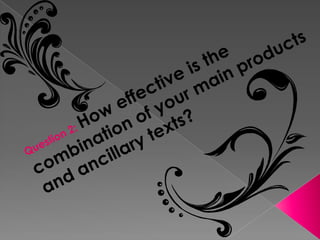
Question 2
- 1. Question 2: How effective is the combination of your main products and ancillary texts?
- 2. House Style This was the text I wanted to be included in my house style. I wanted the text to stand out and have a bold shadow behind it to make sure you could clearly read the text over the images that would be behind them. This was the text I used the most throughout my titles. I thought that the swirly writing would fit in well with my genre so this played a main part in the house style.
- 3. These are just a few images of bits of my titles. I specifically chose these images because they show where I used my house style best. They show the text fonts I used, the colours I used for rich and poor, and the shapes I included from Photoshop.
- 4. These were the sorts of colours I wanted my house style to contain especially related to my rich girl features. I wanted colours that were bright and bold and that would relate to girls. However I wanted this range of colours to go with my poor girl features. These colours connote dark, dull, sad and unattractive colours.
- 5. This is a college of shapes that I used throughout my titles. I used these images because I thought they connoted my narrative really well. I used flowers, hearts and butterflies for my rich girl. And I used icicles for my rich girl. Throughout my titles I used features such as bold colours, bold shapes and colour palettes I thought matched my PROTAGONISTS best. I did it in that way because I thought it was a useful and direct approach to my target audience.
- 6. Ancillary Texts This just shows how my house style related to both my title sequence and my print work. I used the same shapes and colours in my print work as I did in my titles. I did this because I wanted it to have a brand image and I wanted Walks Of Life to be noticed because everything would relate to one another. I also thought that it was a good marketing strategy.