The document discusses the layout design process for a magazine article spread across two pages. The designer created slugs with identifying information on each page. They adjusted the layout to fit an image entirely on one page when the original spanned the gutter. Additional graphics were added to the bottom of each page. The designer is pleased with the final layout that engages readers with a feel for the summer music festivals featured in the article.
Zaznavni procesi, Predavanje na Oddelku za psihologijo, Univerza v Mariboru
Perception Lecture at the Department of Psychology, The University of Maribor
AS media evaluations question 1.
In what ways does your media product use, develop or challenge forms and conventions of real media products? - Josh Webb
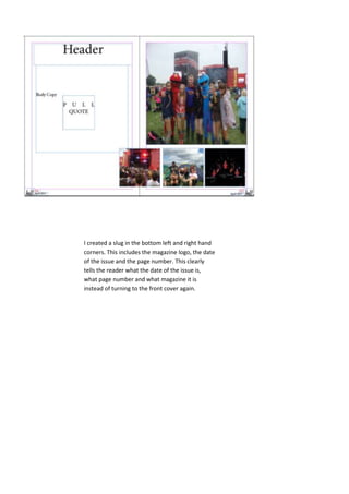
1. I created a slug in the bottom left and right hand
corners. This includes the magazine logo, the date
of the issue and the page number. This clearly
tells the reader what the date of the issue is,
what page number and what magazine it is
instead of turning to the front cover again.
2. I was deciding whether to have the
header straight or at an angle. I
think that having the header straight
makes it too formal for the type of
magazine I am making and for its
readers, as the readers are at a
youngish age. Also it is for a music
magazine, which is not something
formal.
3. As you can see I had
to slightly adjust my
layout. I did this due
to the main image
was not possible to
have across the two
pages as one of the
people in the photo
was in the fold.
Therefore I made
the image fit into
one page and added
two more smaller
graphic features
along the bottom. I
am pleased with this
layout as it goes
well with the article,
and gives the reader
more of a feel to
what the festivals
will be like and how
fun it can be. This
will then make them
feel more part of
the article so they
can relate to it.
4. I have included “sounds of summer” as a header sell. This is in a different font so it
stands out, it relates to the article as its about festivals in summer and its catchy! I
have added my body copy now, it is a simple font minion pro, but it looks good. I
have included the logos for each festival so the readers can easily identify the
festivals. I am happy with the final outcome of my double page spread.