
Recommended
More Related Content
What's hot
What's hot (19)
Viewers also liked
Similar to 3 contents page development
Similar to 3 contents page development (20)
More from lucysmix
Recently uploaded
Recently uploaded (20)
3 contents page development
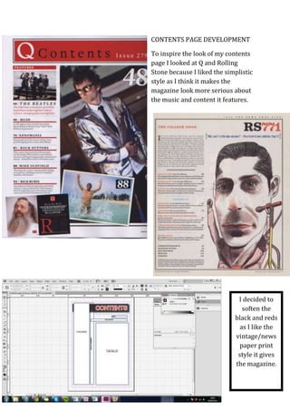
- 1. CONTENTS PAGE DEVELOPMENT To inspire the look of my contents page I looked at Q and Rolling Stone because I liked the simplistic style as I think it makes the magazine look more serious about the music and content it features. I decided to soften the black and reds as I like the vintage/news paper print style it gives the magazine.
- 2. I put my columns in a box with a border with a cream coloured background to flow with the newspaper print style, I used double lines to separate the different features to add to the simplicity. I used yellow text on the ‘Reading & Leeds’ heading as it goes with my colour scheme and these are the colours associated with reading festival – I did this to broaden my target audience as when readers see this and make the link to R&L festival goers will be more encouraged to read my magazine. For my columns section I took inspiration from Q magazine in the way the columns are separated and inspiration from NME with the headings used. I took inspiration from aspects of similar magazines to my own to help make my magazine look more professional, buyable and ‘real’.
- 3. ~ I gave the contents page a creamy background to add to the newspaper print style. I brought down the exposure of the photo on the contents page to go with the vintage style. I made the image a bit larger and brought it behind the columns to make the page look more flowing and I gave it a black border to make it stand out and go with the newspaper print style.
- 4. I changed the font of the date to match the font of the smaller text in the columns part so that the combination of the large font and the smaller font would go together on both parts. I added the editor’s note to fill the empty looking space in the right bottom corner and to make the page look more professional.