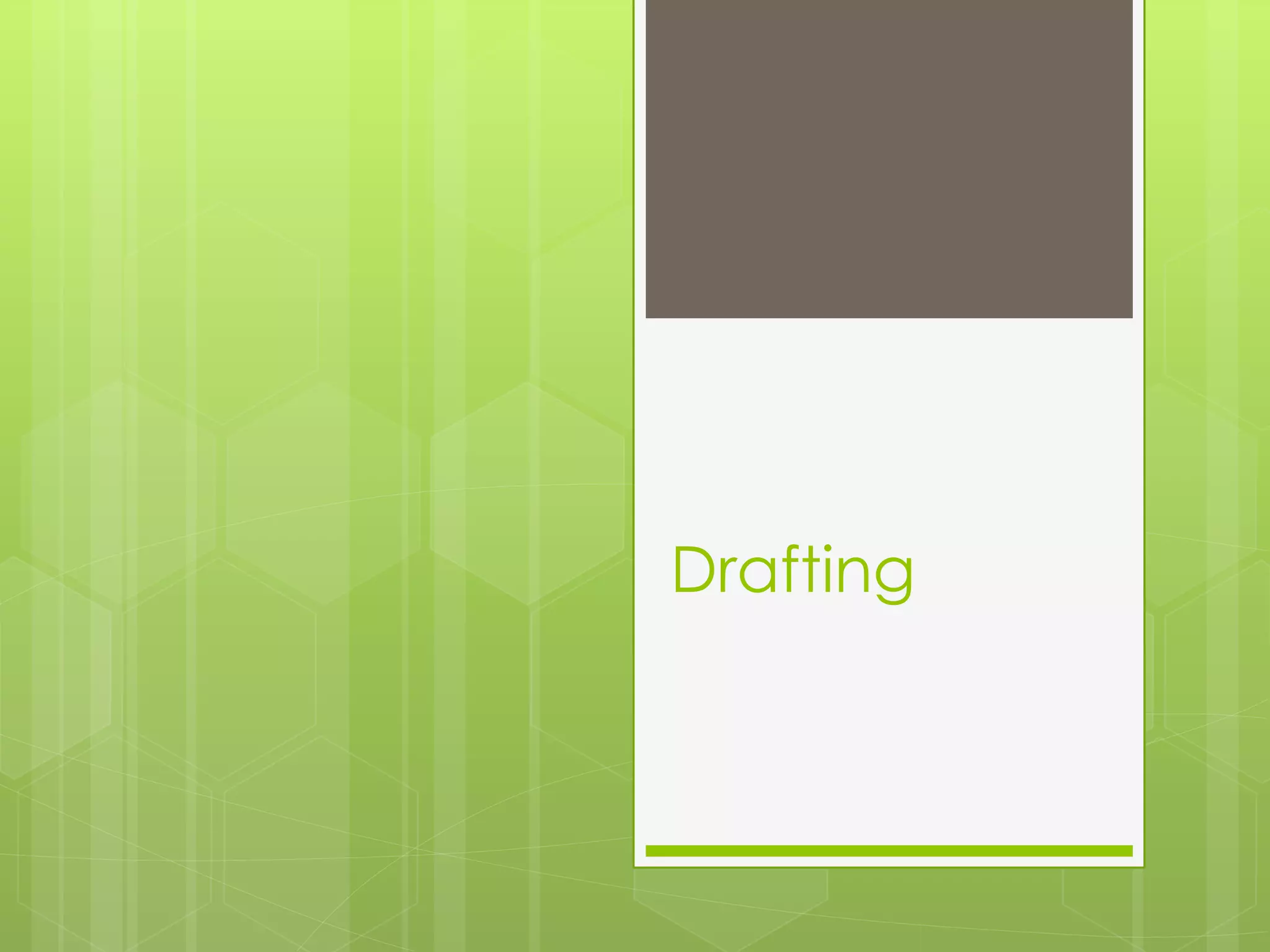
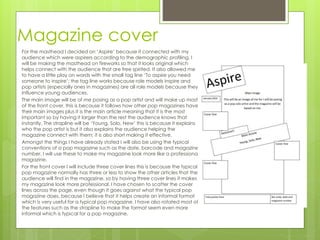
Drafting
Magazine cover
For the masthead I decided on ‘Aspire’ because it connected with my
audience which were aspirers according to the demographic profiling, I
will be making the masthead on fireworks so that it looks original which
helps connect with the audience that are free spirited. It also allowed me
to have a little play on words with the small tag line ‘To aspire you need
someone to inspire’; the tag line works because role models inspire and
pop artists (especially ones in magazines) are all role models because they
influence young audiences.
The main image will be of me posing as a pop artist and will make up most
of the front cover, this is because it follows how other pop magazines have
their main images plus it is the main article meaning that it is the most
important so by having it larger than the rest the audience knows that
instantly. The strapline will be ‘Young, Solo, New’ this is because it explains
who the pop artist is but it also explains the audience helping the
magazine connect with them; it is also short making it effective.
Amongst the things I have already stated I will also be using the typical
conventions of a pop magazine such as the date, barcode and magazine
number. I will use these to make my magazine look more like a professional
magazine.
For the front cover I will include three cover lines this is because the typical
pop magazine normally has three or less to show the other articles that the
audience will find in the magazine, so by having three cover lines it makes
my magazine look more professional. I have chosen to scatter the cover
lines across the page, even though it goes against what the typical pop
magazine does, because I believe that it helps create an informal format
which is very useful for a typical pop magazine. I have also rotated most of
the features such as the strapline to make the format seem even more
informal which is typical for a pop magazine.
Contents page
For the contents page I decided to have a banner
that goes across the top of the page which will
include the title ‘contents’ the word contents will be
like the masthead because I will be making it as well
so that it looks original which would follow the typical
pop magazine.
Down the left hand side of the page there will be a
section that shows all of the main articles of the
magazine and what page they are on. This is
because it is a typical feature of a magazine.
Down the right hand side there will be some of the
bigger articles and they are separate because they
are more important or interesting than the others so
they need to stand out because they are potential
selling points of the magazine.
In the middle of the contents page there will be a
large image of men posing as a pop star and it will
take up most of the page because it is the main
article of the magazine so by it being in the middle
and larger than the other articles it will show it is the
most important.
Double-page spread page 1
For the contents page I decided to have a banner
that goes across the top of the page which will
include the title ‘contents’ the word contents will be
like the masthead because I will be making it as well
so that it looks original which would follow the typical
pop magazine.
Down the left hand side of the page there will be a
section that shows all of the main articles of the
magazine and what page they are on. This is
because it is a typical feature of a magazine.
Down the right hand side there will be some of the
bigger articles and they are separate because they
are more important or interesting than the others so
they need to stand out because they are potential
selling points of the magazine.
In the middle of the contents page there will be a
large image of men posing as a pop star and it will
take up most of the page because it is the main
article of the magazine so by it being in the middle
and larger than the other articles it will show it is the
most important.
Double-page spread page 2
For the first page of the double page spread I
decided to include a large image that will take up
most of the page. The image will be an original
image of me posing as a pop solo artist because the
article next to it will be about this and this also is
typical in most of the magazines I looked at in my
research.
Above the image there will be a large heading
which will be similar to the one on the front page
and this just introduces the article.
Under the heading there will be a pull quote from
the article, I decided to include a pull quote
because most of the magazines I looked at included
on too.

Drafting

  • 1.
  • 2.
    Magazine cover For themasthead I decided on ‘Aspire’ because it connected with my audience which were aspirers according to the demographic profiling, I will be making the masthead on fireworks so that it looks original which helps connect with the audience that are free spirited. It also allowed me to have a little play on words with the small tag line ‘To aspire you need someone to inspire’; the tag line works because role models inspire and pop artists (especially ones in magazines) are all role models because they influence young audiences. The main image will be of me posing as a pop artist and will make up most of the front cover, this is because it follows how other pop magazines have their main images plus it is the main article meaning that it is the most important so by having it larger than the rest the audience knows that instantly. The strapline will be ‘Young, Solo, New’ this is because it explains who the pop artist is but it also explains the audience helping the magazine connect with them; it is also short making it effective. Amongst the things I have already stated I will also be using the typical conventions of a pop magazine such as the date, barcode and magazine number. I will use these to make my magazine look more like a professional magazine. For the front cover I will include three cover lines this is because the typical pop magazine normally has three or less to show the other articles that the audience will find in the magazine, so by having three cover lines it makes my magazine look more professional. I have chosen to scatter the cover lines across the page, even though it goes against what the typical pop magazine does, because I believe that it helps create an informal format which is very useful for a typical pop magazine. I have also rotated most of the features such as the strapline to make the format seem even more informal which is typical for a pop magazine.
  • 3.
    Contents page For thecontents page I decided to have a banner that goes across the top of the page which will include the title ‘contents’ the word contents will be like the masthead because I will be making it as well so that it looks original which would follow the typical pop magazine. Down the left hand side of the page there will be a section that shows all of the main articles of the magazine and what page they are on. This is because it is a typical feature of a magazine. Down the right hand side there will be some of the bigger articles and they are separate because they are more important or interesting than the others so they need to stand out because they are potential selling points of the magazine. In the middle of the contents page there will be a large image of men posing as a pop star and it will take up most of the page because it is the main article of the magazine so by it being in the middle and larger than the other articles it will show it is the most important.
  • 4.
    Double-page spread page1 For the contents page I decided to have a banner that goes across the top of the page which will include the title ‘contents’ the word contents will be like the masthead because I will be making it as well so that it looks original which would follow the typical pop magazine. Down the left hand side of the page there will be a section that shows all of the main articles of the magazine and what page they are on. This is because it is a typical feature of a magazine. Down the right hand side there will be some of the bigger articles and they are separate because they are more important or interesting than the others so they need to stand out because they are potential selling points of the magazine. In the middle of the contents page there will be a large image of men posing as a pop star and it will take up most of the page because it is the main article of the magazine so by it being in the middle and larger than the other articles it will show it is the most important.
  • 5.
    Double-page spread page2 For the first page of the double page spread I decided to include a large image that will take up most of the page. The image will be an original image of me posing as a pop solo artist because the article next to it will be about this and this also is typical in most of the magazines I looked at in my research. Above the image there will be a large heading which will be similar to the one on the front page and this just introduces the article. Under the heading there will be a pull quote from the article, I decided to include a pull quote because most of the magazines I looked at included on too.