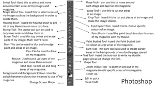
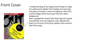
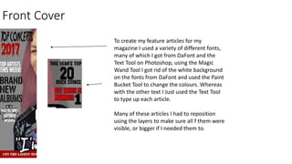
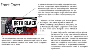
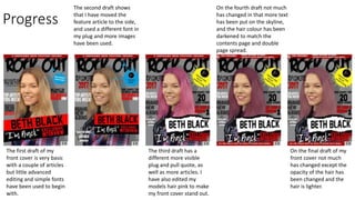
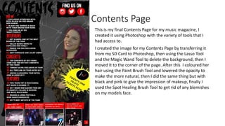
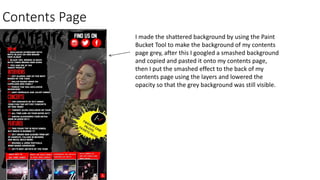
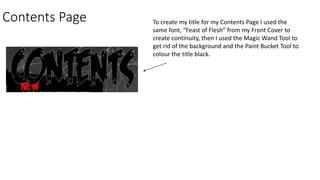
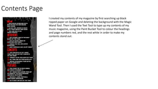
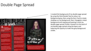
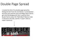
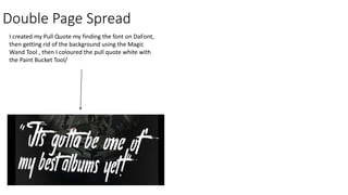
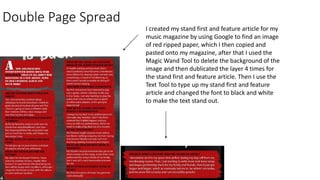
Move Tool- I can use this to move around
each image and layer on my magazine.
Select Tool- Used this to select and move
around certain areas of my images and
magazine. Lasso Tool- I use this to cut out areas
of an image.
Magic Wand Tool- I used this to select areas of
my images such as the background in order to
delete them.
Crop Tool- I used this to cut out pieces of an image and
make the image smaller.
Eyedropper Tool- I used this to choose specific
colours of an image.
Healing Brush- I used the healing brush to get
rid of any blemishes on my artists face.
Paint Brush- I used the paint brush to colour in areas
of my magazine with my mouse.
Stamp Tool- The stamp tool can be used to
copy over areas and draw them in.
Eraser Tool- I used this top delete and erase
parts of my images that I didn’t need.
Paint Bucket Tool- I used the Paint Bucket tool
to colour in large areas of my magazine.Blur- This can be used to blur and smudge
paint and areas of an image. Burn Tool- The burn tool was used to create darker
areas in the backgrounds of my double page spread.Pen- Can be used to draw
on my magazine. Text Tool- I used the text tool to write my double
page spread ad change the font.Mouse- Used to pick up layers of my
magazine and move them around. Shape Tool
Hand Tool- To pick up and drag
areas of my magazine.
Zoom In/Out Tool- To zoom in and out of my
magazine to edit specific areas of my magazine
closer up.Foreground and Background Colour- Used to
switch between colours that I wanted to use in my
magazine.
Edit in quick
mask modeChange Screen Mode Photoshop
Front CoverThis is my final front cover for my music magazine, I created it using
Photoshop with the variety of tools that I had access to.
When I uploaded my image onto Photoshop I used the Spot
Healing Brush Tool to get rid of any blemishes on my models
face, then I used the Magic Wand Tool and the Lasso Tool to
edit and cut out the background of my image so that I could
use my model by herself, after that I used a variety of colours
such as black and pink to make eyeliner and lipstick, then
lowered the opacity to make it appear more natural.
After I finished this I began to change the colour of her hair to
make her stand out against the other colours of my magazine I
did this by colouring over her hair with the pink paint brush
on a separate layer, then lowing the opacity to make the
colour appear more realistic. The colour of her hair went
through multiple changed in order to get the colour how it is
now by layering multiple colours on top of each other.
Front Cover
In order to create the Skyline for my Magazine I drew a box
at the top of the screen, then coloured it red using the Paint
Bucket Tool, after this I used the Text Tool to draw a text box
and type, I changed the colour of the text using the coloured
boxes at the bottom of the screen and changed the font to
Stencil Std to make it stand out.
To make my title, I got my font from the site DaFont, the
font is called Feast of Flesh, I chose this because I felt it
matched the theme of my magazine and it took out to the
rest of my magazine, after copying and pasting the font
onto my magazine, I used the Magic Wand Tool to delete
the white background.
Front Cover I created the plug of my magazine by finding an image
of a yellow paint splatter from Google and used copy
and paste to transfer it onto my magazine, after that I
used the Magic Wand Tool to get rid of the white
background.
Next, I googled the Twenty One Pilots logo and copied
and pasted it onto my magazine, then adjusted the
layers so it fit onto of the paint splatter, then used the
Text Tool to type.
Front Cover
To create my feature articles for my
magazine I used a variety of different fonts,
many of which I got from DaFont and the
Text Tool on Photoshop, using the Magic
Wand Tool I got rid of the white background
on the fonts from DaFont and used the Paint
Bucket Tool to change the colours. Whereas
with the other text I Just used the Text Tool
to type up each article.
Many of these articles I had to reposition
using the layers to make sure all f them were
visible, or bigger if I needed them to.
Front Cover To create my feature article title for my magazine I used a
font from DaFont called High School and used the Magic
Wand Tool to get rid of the white background, afterwards
I found images of white and black ripped paper and got
rid of the background using the Magic Wand Tool, then I
organised the layers so that the title was on top of the
paper.
I made the “Excusive Interview” part of my magazine
by using the same font as my feature article title
which is called High School, however after getting rid
of the background using the Magic Wand Tool, I used
the Paint Bucket Tool to change the colour of the text
to red.
The Pull Quote of my magazine was created using a font from
DaFont, which I used the Magic Wand Tool to get rid of the white
background, after that I used the Paint Bucket Tool to change the
colour of the text to white.
To create the Footer for my Magazine I drew a box at
the bottom of the screen, then coloured it red using
the Paint Bucket Tool, after this I used the Text Tool to
draw a text box and type, I changed the colour of the
text using the coloured boxes at the bottom of the
screen and changed the font to Stencil Std to make it
stand out. Then I got an image of a barcode from
Google and put it on top of the Footer by moving the
layers around.
Progress
The first draft of my
front cover is very basic
with a couple of articles
but little advanced
editing and simple fonts
have been used to begin
with.
The second draft shows
that I have moved the
feature article to the side,
and used a different font in
my plug and more images
have been used.
The third draft has a
different more visible
plug and pull quote, as
well as more articles. I
have also edited my
models hair pink to make
my front cover stand out.
On the fourth draft not much
has changed in that more text
has been put on the skyline,
and the hair colour has been
darkened to match the
contents page and double
page spread.
On the final draft of my
front cover not much
has changed except the
opacity of the hair has
been changed and the
hair is lighter.
Contents Page
This is my final Contents Page for my music magazine, I
created it using Photoshop with the variety of tools that I
had access to.
I created the image for my Contents Page by transferring it
from my SD Card to Photoshop, then using the Lasso Tool
and the Magic Wand Tool to delete the background, then I
moved it to the corner of the page. After this I coloured her
hair using the Paint Brush Tool and lowered the opacity to
make the more natural, then I did the same thing but with
black and pink to give the impression of makeup, finally I
used the Spot Healing Brush Tool to get rid of any blemishes
on my models face.
Contents Page
I made the shattered background by using the Paint
Bucket Tool to make the background of my contents
page grey, after this I googled a smashed background
and copied and pasted it onto my contents page,
then I put the smashed effect to the back of my
contents page using the layers and lowered the
opacity so that the grey background was still visible.
Contents Page To create my title for my Contents Page I used the
same font, “Feast of Flesh” from my Front Cover to
create continuity, then I used the Magic Wand Tool to
get rid of the background and the Paint Bucket Tool to
colour the title black.
Contents Page
I created my contents of my magazine by first searching up black
ripped paper on Google and deleting the background with the Magic
Wand Tool. Then I used the Text Tool to type up my contents of my
music magazine, using the Paint Bucket Tool to colour the headings
and page numbers red, and the rest white in order to make my
contents stand out.
Contents Page
To make the social media area of my
magazine I Googled black ripped paper
and used the Magic Wand Tool to get rid
of the white background, then I Googled
each of the Instagram, Twitter and
Facebook and chose each of the logos
that matched each other, after that I used
the Magic Wand Tool to get rid of the
background and then the Paint Bucket
Tool to colour them red as white to watch
the house style of my music magazine.
Finally I used the Text Tool to type “Find
us on” and then coloured the text white.
Content Page
To create the other articles for my music magazine I transferred images
from my phone to the computer using Google Images, then I cropped all of
the images so that they are the same size using the Crop Tool, next, I
Googled red ripped paper and got rid of the background using The Magic
Wand Tool, and copied and pasted the paper multiple times. Afterwards, I
used the text tool to type descriptions for each image and coloured the text
white and I did the same for the page numbers, finally I organised the layers
to make sure each image was in the right order and in the correct place.
Progress
For my contents page there has not been many drafts made, on the second draft of
my contents page the house style and colour scheme has been carried on from the
front cover onto the contents page, with the model having pink hair as before, social
media links and a variety of different articles for my target audience.
On the final draft of my front cover the opacity of the
hair colour has been lowered to look more natural on the
model, additionally, descriptions have been added onto
the other articles of my magazine so that the reader than
have visuals and a brief description of some of the
articles in the magazine.
On my Contents Page I have included the main
time, contents, plug, social media links and a
title, the artist does not have pink hair yet
however, like on the contents page. The same
colour scheme from the front page has been
carried onto the contents page.
Double Page Spread
This is my final Double Page Spread for my music
magazine, I created it using Photoshop with the variety
of tools that I had access to.
I created the image for my Double Page
Spread by transferring it from my SD Card to
Photoshop, then using the Lasso Tool and the
Magic Wand Tool to delete the background,
then I moved it to the corner of the page.
After this I coloured her hair using the Paint
Brush Tool and lowered the opacity to make
the more natural, then I did the same thing
but with black and pink to give the impression
of makeup, finally I used the Spot Healing
Brush Tool to get rid of any blemishes on my
models face.
Double Page Spread
I created the background of my double page spread
by using the Paint Bucket Tool to colour my
background grey, then using the Burn Tool to create
shadows on my background, then I Googled a metal
background and copying and pasting it onto my
double page spread, finally I moved it to the back of
my double page spread using the layers and
lowering the opacity to make the grey background
visible.
Double Page Spread
I created the title of my double page spread by
finding the font from the site DaFont, I screenshotted
the fonts and used the Lasso and Magic Room Tool to
get rid of the background, then I used the Paint
Bucket Tool to colour the “Beth Black” Black to make
it relevant to the title, and the “is back” white to
make it stand out.
Double Page Spread
I created my Pull Quote my finding the font on DaFont,
then getting rid of the background using the Magic
Wand Tool , then I coloured the pull quote white with
the Paint Bucket Tool/
Double Page Spread
I created my stand first and feature article for my
music magazine by using Google to find an image
of red ripped paper, which I then copied and
pasted onto my magazine, after that I used the
Magic Wand Tool to delete the background of the
image and then dublicated the layer 4 times for
the stand first and feature article. Then I use the
Text Tool to type up my stand first and feature
article and changed the font to black and white
to make the text stand out.
Progress
On the first draft of my double page
spread the colour scheme and house
style has been carried out on all of my
magazine, with in interesting
interview, main image, pull quotes and
main title.
On the second draft of my double
page spread the pull quote has been
moved to the side slightly, as well as
the “is back” part of my title has
been moved to the right to make
room for my stand first, which gives a
brief description of my feature
article.
On my final draft of my double page spread I have put
a metal background in the background of my double
page spread with the opacity lowered, the stand first
has been moved to make it easier to read, and the pull
quote and last part of m interview has been oved to
the next page to balance out the conventions on both
pages and to make room for the stand first.

Image Manipulation Process

  • 1.
    Move Tool- Ican use this to move around each image and layer on my magazine. Select Tool- Used this to select and move around certain areas of my images and magazine. Lasso Tool- I use this to cut out areas of an image. Magic Wand Tool- I used this to select areas of my images such as the background in order to delete them. Crop Tool- I used this to cut out pieces of an image and make the image smaller. Eyedropper Tool- I used this to choose specific colours of an image. Healing Brush- I used the healing brush to get rid of any blemishes on my artists face. Paint Brush- I used the paint brush to colour in areas of my magazine with my mouse. Stamp Tool- The stamp tool can be used to copy over areas and draw them in. Eraser Tool- I used this top delete and erase parts of my images that I didn’t need. Paint Bucket Tool- I used the Paint Bucket tool to colour in large areas of my magazine.Blur- This can be used to blur and smudge paint and areas of an image. Burn Tool- The burn tool was used to create darker areas in the backgrounds of my double page spread.Pen- Can be used to draw on my magazine. Text Tool- I used the text tool to write my double page spread ad change the font.Mouse- Used to pick up layers of my magazine and move them around. Shape Tool Hand Tool- To pick up and drag areas of my magazine. Zoom In/Out Tool- To zoom in and out of my magazine to edit specific areas of my magazine closer up.Foreground and Background Colour- Used to switch between colours that I wanted to use in my magazine. Edit in quick mask modeChange Screen Mode Photoshop
  • 2.
    Front CoverThis ismy final front cover for my music magazine, I created it using Photoshop with the variety of tools that I had access to. When I uploaded my image onto Photoshop I used the Spot Healing Brush Tool to get rid of any blemishes on my models face, then I used the Magic Wand Tool and the Lasso Tool to edit and cut out the background of my image so that I could use my model by herself, after that I used a variety of colours such as black and pink to make eyeliner and lipstick, then lowered the opacity to make it appear more natural. After I finished this I began to change the colour of her hair to make her stand out against the other colours of my magazine I did this by colouring over her hair with the pink paint brush on a separate layer, then lowing the opacity to make the colour appear more realistic. The colour of her hair went through multiple changed in order to get the colour how it is now by layering multiple colours on top of each other.
  • 3.
    Front Cover In orderto create the Skyline for my Magazine I drew a box at the top of the screen, then coloured it red using the Paint Bucket Tool, after this I used the Text Tool to draw a text box and type, I changed the colour of the text using the coloured boxes at the bottom of the screen and changed the font to Stencil Std to make it stand out. To make my title, I got my font from the site DaFont, the font is called Feast of Flesh, I chose this because I felt it matched the theme of my magazine and it took out to the rest of my magazine, after copying and pasting the font onto my magazine, I used the Magic Wand Tool to delete the white background.
  • 4.
    Front Cover Icreated the plug of my magazine by finding an image of a yellow paint splatter from Google and used copy and paste to transfer it onto my magazine, after that I used the Magic Wand Tool to get rid of the white background. Next, I googled the Twenty One Pilots logo and copied and pasted it onto my magazine, then adjusted the layers so it fit onto of the paint splatter, then used the Text Tool to type.
  • 5.
    Front Cover To createmy feature articles for my magazine I used a variety of different fonts, many of which I got from DaFont and the Text Tool on Photoshop, using the Magic Wand Tool I got rid of the white background on the fonts from DaFont and used the Paint Bucket Tool to change the colours. Whereas with the other text I Just used the Text Tool to type up each article. Many of these articles I had to reposition using the layers to make sure all f them were visible, or bigger if I needed them to.
  • 6.
    Front Cover Tocreate my feature article title for my magazine I used a font from DaFont called High School and used the Magic Wand Tool to get rid of the white background, afterwards I found images of white and black ripped paper and got rid of the background using the Magic Wand Tool, then I organised the layers so that the title was on top of the paper. I made the “Excusive Interview” part of my magazine by using the same font as my feature article title which is called High School, however after getting rid of the background using the Magic Wand Tool, I used the Paint Bucket Tool to change the colour of the text to red. The Pull Quote of my magazine was created using a font from DaFont, which I used the Magic Wand Tool to get rid of the white background, after that I used the Paint Bucket Tool to change the colour of the text to white. To create the Footer for my Magazine I drew a box at the bottom of the screen, then coloured it red using the Paint Bucket Tool, after this I used the Text Tool to draw a text box and type, I changed the colour of the text using the coloured boxes at the bottom of the screen and changed the font to Stencil Std to make it stand out. Then I got an image of a barcode from Google and put it on top of the Footer by moving the layers around.
  • 7.
    Progress The first draftof my front cover is very basic with a couple of articles but little advanced editing and simple fonts have been used to begin with. The second draft shows that I have moved the feature article to the side, and used a different font in my plug and more images have been used. The third draft has a different more visible plug and pull quote, as well as more articles. I have also edited my models hair pink to make my front cover stand out. On the fourth draft not much has changed in that more text has been put on the skyline, and the hair colour has been darkened to match the contents page and double page spread. On the final draft of my front cover not much has changed except the opacity of the hair has been changed and the hair is lighter.
  • 8.
    Contents Page This ismy final Contents Page for my music magazine, I created it using Photoshop with the variety of tools that I had access to. I created the image for my Contents Page by transferring it from my SD Card to Photoshop, then using the Lasso Tool and the Magic Wand Tool to delete the background, then I moved it to the corner of the page. After this I coloured her hair using the Paint Brush Tool and lowered the opacity to make the more natural, then I did the same thing but with black and pink to give the impression of makeup, finally I used the Spot Healing Brush Tool to get rid of any blemishes on my models face.
  • 9.
    Contents Page I madethe shattered background by using the Paint Bucket Tool to make the background of my contents page grey, after this I googled a smashed background and copied and pasted it onto my contents page, then I put the smashed effect to the back of my contents page using the layers and lowered the opacity so that the grey background was still visible.
  • 10.
    Contents Page Tocreate my title for my Contents Page I used the same font, “Feast of Flesh” from my Front Cover to create continuity, then I used the Magic Wand Tool to get rid of the background and the Paint Bucket Tool to colour the title black.
  • 11.
    Contents Page I createdmy contents of my magazine by first searching up black ripped paper on Google and deleting the background with the Magic Wand Tool. Then I used the Text Tool to type up my contents of my music magazine, using the Paint Bucket Tool to colour the headings and page numbers red, and the rest white in order to make my contents stand out.
  • 12.
    Contents Page To makethe social media area of my magazine I Googled black ripped paper and used the Magic Wand Tool to get rid of the white background, then I Googled each of the Instagram, Twitter and Facebook and chose each of the logos that matched each other, after that I used the Magic Wand Tool to get rid of the background and then the Paint Bucket Tool to colour them red as white to watch the house style of my music magazine. Finally I used the Text Tool to type “Find us on” and then coloured the text white.
  • 13.
    Content Page To createthe other articles for my music magazine I transferred images from my phone to the computer using Google Images, then I cropped all of the images so that they are the same size using the Crop Tool, next, I Googled red ripped paper and got rid of the background using The Magic Wand Tool, and copied and pasted the paper multiple times. Afterwards, I used the text tool to type descriptions for each image and coloured the text white and I did the same for the page numbers, finally I organised the layers to make sure each image was in the right order and in the correct place.
  • 14.
    Progress For my contentspage there has not been many drafts made, on the second draft of my contents page the house style and colour scheme has been carried on from the front cover onto the contents page, with the model having pink hair as before, social media links and a variety of different articles for my target audience. On the final draft of my front cover the opacity of the hair colour has been lowered to look more natural on the model, additionally, descriptions have been added onto the other articles of my magazine so that the reader than have visuals and a brief description of some of the articles in the magazine. On my Contents Page I have included the main time, contents, plug, social media links and a title, the artist does not have pink hair yet however, like on the contents page. The same colour scheme from the front page has been carried onto the contents page.
  • 15.
    Double Page Spread Thisis my final Double Page Spread for my music magazine, I created it using Photoshop with the variety of tools that I had access to. I created the image for my Double Page Spread by transferring it from my SD Card to Photoshop, then using the Lasso Tool and the Magic Wand Tool to delete the background, then I moved it to the corner of the page. After this I coloured her hair using the Paint Brush Tool and lowered the opacity to make the more natural, then I did the same thing but with black and pink to give the impression of makeup, finally I used the Spot Healing Brush Tool to get rid of any blemishes on my models face.
  • 16.
    Double Page Spread Icreated the background of my double page spread by using the Paint Bucket Tool to colour my background grey, then using the Burn Tool to create shadows on my background, then I Googled a metal background and copying and pasting it onto my double page spread, finally I moved it to the back of my double page spread using the layers and lowering the opacity to make the grey background visible.
  • 17.
    Double Page Spread Icreated the title of my double page spread by finding the font from the site DaFont, I screenshotted the fonts and used the Lasso and Magic Room Tool to get rid of the background, then I used the Paint Bucket Tool to colour the “Beth Black” Black to make it relevant to the title, and the “is back” white to make it stand out.
  • 18.
    Double Page Spread Icreated my Pull Quote my finding the font on DaFont, then getting rid of the background using the Magic Wand Tool , then I coloured the pull quote white with the Paint Bucket Tool/
  • 19.
    Double Page Spread Icreated my stand first and feature article for my music magazine by using Google to find an image of red ripped paper, which I then copied and pasted onto my magazine, after that I used the Magic Wand Tool to delete the background of the image and then dublicated the layer 4 times for the stand first and feature article. Then I use the Text Tool to type up my stand first and feature article and changed the font to black and white to make the text stand out.
  • 20.
    Progress On the firstdraft of my double page spread the colour scheme and house style has been carried out on all of my magazine, with in interesting interview, main image, pull quotes and main title. On the second draft of my double page spread the pull quote has been moved to the side slightly, as well as the “is back” part of my title has been moved to the right to make room for my stand first, which gives a brief description of my feature article. On my final draft of my double page spread I have put a metal background in the background of my double page spread with the opacity lowered, the stand first has been moved to make it easier to read, and the pull quote and last part of m interview has been oved to the next page to balance out the conventions on both pages and to make room for the stand first.