
Recommended
More Related Content
What's hot
What's hot (19)
Similar to Rough cut feedback
Similar to Rough cut feedback (20)
More from Zackmv
More from Zackmv (16)
Recently uploaded
Recently uploaded (20)
Rough cut feedback
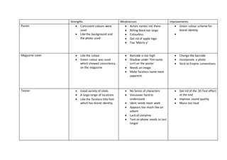
- 1. Strengths Weaknesses Improvements Poster Consistent colours were used Like the background and the photo used Actors names not there Billing block too large Colourless Get rid of apple logo Too ‘Matrix-y’ Green colour scheme for brand identity Magazine cover Like the colour Green colour was used which showed consistency on the magazine Barcode is too high Shadow under filmname isn’t on the poster Needs an image Make faceless name more apparent. Change the barcode Incorporate a photo Stick to Empire conventions Teaser Good variety of shots A large range of locations Like the faceless title font which has brand identity. No Sense of characters Voiceover hard to understand Ident needs more work Appears too much like an advert Lack of storyline Text on phone needs to last longer Get rid of the 3D Text effect at the end Improve sound quality Music too loud