
Recommended
More Related Content
What's hot
What's hot (20)
Similar to Audience feedback
Similar to Audience feedback (20)
Recently uploaded
Recently uploaded (20)
Audience feedback
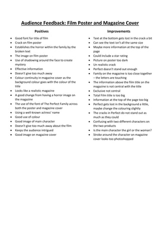
- 1. Audience Feedback: Film Poster and Magazine Cover Positives Good font for title of film Crack on film poster Establishes the horror within the family by the broken text The image on film poster Use of shadowing around the face to create mystery Effective information Doesn’t give too much away Colour continuity in magazine cover as the background colour goes with the colour of the title Looks like a realistic magazine A good change from having a horror image on the magazine The use of the font of The Perfect Family across both the poster and magazine cover Using a well-known actress’ name Good use of colour Good image of main character Doesn’t give too much away about the film Keeps the audience intrigued Good image on magazine cover Improvements Text at the bottom gets lost in the crack a bit Can see the text isn’t all the same size Maybe more information at the top of the page Could include a star rating Picture on poster too dark Un realistic crack Perfect doesn’t stand out enough Family on the magazine is too close together – the letters are touching The information above the film title on the magazine is not central with the title Exclusive not central Total Film title is too big Information at the top of the page too big Perfect gets lost in the background a little, maybe change the colouring slightly The cracks in Perfect do not stand out as much as they could Confusing with two different characters on the two products Is the main character the girl or the woman? Stroke around the character on magazine cover looks too photoshopped