This document discusses creating an accessible and inclusive mobile experience. It begins by noting that while some devices like the iPhone are popular, they only represent a small portion of the overall mobile device market and user population. It then examines the need to make the mobile web accessible to all users, not just those with certain devices, and provides examples of how usage and capabilities vary greatly across the global mobile landscape. The document advocates for an adaptive approach that considers all mobile contexts rather than targeting specific devices or browsers.
Presented by Stephanie Rieger at Breaking Development in Dallas, April 11 2011 and Mobilism in Amsterdam, May 12, 2011.
Context is often cited as the single most important factor in design for the mobile medium. Mobile devices are of course 'mobile', but they are also small, always on, always with us, and can instantly connect us to the people we love. Mobile services must therefore be simple, social, and well-focussed--enabling us to quickly get things done on even the smallest screens.
This is all well and good, but mobile devices have changed. They may be mobile, but many have already stopped being 'phones'—nor do they resemble what we traditionally think of as computers. This presentation will explore how our use, and perception of mobile devices is changing, and how these changes may impact how we should design for them going forward.
Why You Should Make Mobile Your Career | Clark CollegeJason Grigsby
A variation of my talk on mobile strategy given to Clark College to encourage students to pursue mobile and to encourage the college to adopt mobile curriculum.
The time is 2020. The inflection point has long passed. Most web traffic is now coming from some manner of portable device. And if Google Chairman Eric Schmidt (and many others’) predictions have come true, we will have truly reached time where “…[technology] will just be seamless. It will just be there. The web will be everything, and it will be nothing. It will be like electricity.”
This presentation challenges us to think about the role of the web going forward. What steps must we take to build a world where interactions with the web are truly “seamless”? What would a seamless web even look like? How can we ensure the web remains strong amidst all the new technologies that are on the way.
Presented on September 13 in London at Generate.
The landscape of internet-ready devices is quickly growing, allowing people to access content from pocketable devices and big screen TVs alike. But designing usable interfaces for big and small is a challenge, especially when those devices are being used to compliment each other. Hear firsthand from two seasoned designers about the pitfalls and best practices of designing for these unique experiences and the Second Screen. They’ll talk about handling different methods of input and finding room for varying amounts of output, designing within existing UI constraints, and much more.
Midway through a project, a client of ours recently said "One thing I'm learning is that it's ok to give up on the desktop experience once it stops making sense". This wasn't an isolated incident. In fact, i'm beginning to think desktop web sites stopped making sense quite a while ago. We've just had nothing viable to replace them with. Mobile apps have given us a glimpse, but I think they're merely a glimpse into something bigger.
Mobile isn't merely a new stage in the evolution of the web, it's not even merely a new context, it's the very early stages of an entirely new system. A system that has already started to shape our environment, affect the way we live, how we choose to connect with others, and how we're able to spend our time. A system that is also slowly unravelling our assumptions and causing us to question the very reason we build web sites, why people visit them, and where the true value of the web actually lies.
Presented by Stephanie Rieger at Breaking Development in Orlando, Florida on April 17, 2012.
Application Stores and Mobile Social Media : Presentation @ Marketing 2.0 Con...Cedric Giorgi
Presentation given at the Marketing 2.0 Conference in Paris.
This talks explains the good and the bad points of the Apple Appstore, why appstores are not everything and why there is a need of social in the mobile for discovering new content and new services.
Feel free to comment, this presentation is a point of view, not a lesson ;)
Native vs. Web vs. Hybrid: Mobile Development ChoicesJason Grigsby
The iPhone App Store has captured the imagination of entrepreneurs everywhere. There is a gold rush happening.
This presentation explains why we chose not to become full time cocoa developers, the challenges people are currently facing in the iPhone App Store, and the long term picture for mobile web applications.
It also describes an interim strategy of building hybrid applications using web technology so that you can use a common code base and publish your application to the various application stores for iPhone, Android, Blackberrry, etc.
Originally presented at Web 2.0 Expo in San Francisco.
Live streaming: Designing For Multiple Devices - GA, New York, 14 March 2013Anna Dahlström
Slides from my 1 hour live streaming class on March 14th at GA in New York
ABSTRACT
The rise in mobiles and tablets have changed the way we consume and interact with content, but also the way we design and what we base our design approach on. This class will teach you about the shift in user expectations, behaviour- and consumption patterns and what that means for designing products that will be used on multiple devices. Coming out of it you'll be equipped with guiding principles and tools to tackle the multiple device jungle.
Where 2.0 — Native vs Web vs Hybrid: Mobile Development ChoicesJason Grigsby
Examining the landscape of the mobile development, the hidden challenges of the iPhone app store, and the middle way provided by hybrid applications.
Presented at Where 2.0 in San Jose, March 31, 2010
Allan Isfan, CEO of mobile app provided FaveQuest, was invite to present at Festivals and Events Ontario 2013 (FEO).
The one hour workshop covered the latest trends in social and mobile, including photo sharing, mobile payments, contests, RFID ticketing, native vs web apps and other, smartphone adoption by age and income, smartphone based loyalty systems, geofencing, mobile surveys, mobile contests and sponsorship.
It's a strange world after all- Wim JanssensMonkeyshot
Monkeytalk Fall 2014
We leven in een zeer boeiend tijdperk. Zonder dat we het misschien zelf beseffen, zijn we allemaal onderdeel van een enorme verandering in hoe we leven en omgaan met elkaar en onze omgeving. Met enkele handige voorbeelden gaan we eventjes mee in de wereld van Wim die vooral gekenmerkt wordt door het constant in vraag stellen van vanzelfsprekendheden.
Presentation slides from WordCamp Montreal 2015 talk.
In WordPress 4.1 the “Theme Customizer” was changed to the “Customizer” with the intent that it could be used as the interface for any WordPress settings. Very few plugin authors, or even custom theme authors, are taking advantage of this built in options panel. Through some examples, we see how easy it is to use the Customizer API to add settings/options to WordPress for themes, plugins (or anything).
My sister, Pat Kelley, peacefully passed on Sunday afternoon, November 17, 2013 with family members at her side. The following pages give a brief overview of her full and amazing life on earth.
Driving Profits in the Downturn, Using Data to Improve Website Performance an...Marisa Gallagher
Preso from the 2009 Razorfish Client Summit covers a Top 10 list of things you can do with website data to drive better revenue-driving results (like page views, engagement, and audience.)
Algo chaos - Pubcon Vegas 2013 by Jake Bohall of Virante, Inc.Jake Bohall
Frustrated at the world of algorithm updates? Has a Google penalty wiped you out? Do you have an algo-proofed website? Can your online marketing platform sustain the test of time? Obtain answers to these questions as well as solutions for long-term SEO success from this session at Pubcon Vegas 2013.
Beyond The Hamburger Menu - MOBX, 13 Sep 2014Anna Dahlström
Slides from my talk at MOBX in Berlin on 13 Sep 2014 - http://2014.mobxcon.com/
Beyond the hamburger menu - What you need to know about designing for multiple devices.
Abstract: From myths to trends and best practice, actual usage, engagement, design patterns and interactions, we’ll go through the insights behinds the stats and take a look at the reality behind mobile and what really matters when designing for multiple devices.
Mobile UX 101 - current trends, behaviours, design considerations, common mistakes, platform choices and general advice for anyone entering the mobile design and development industry
No matter how much we try to put ourselves into a mobile first mentality, it is hard for us to do so fully. Our access to PCs prevents us from experiencing mobile the way many in the world do.
We're currently fighting for parity among experiences. We're arguing that the mobile version shouldn't be a dumbed down version of the desktop site.
But we've set our sights too low. In a true Mobile First world, the mobile version should be the best experience. Mobile shouldn't just match the desktop experience, it should exceed it.
Slide 1:
Communication in 2023
Ashley Elgin
Slide 2:
What will the communication technology landscape look like in 2023 A.D.?
Slide 3:
Before we look to the future of technology, we must examine the past.
1983: Apple Lisa
The first commercial computer with a graphical user interface (GUI) — the advance that would finally make computers usable by people with no special training. The name was the acronym for “Local Integrated Software Architecture” and possibly the daughter of someone on the development team (Steve Jobs). The computer was $10,000 and only sold 10,000 of them.
1993: Polaroid, Powerbook and pagers
JVC Video Camcorder, Apple PowerBook 160, Polaroid OneStep, Sony Sports Walkman cassette player and a pager.
2003: The iTunes Music Store was launched.
At the time, “For every 99 cents Apple gets from your credit card, 65 cents goes straight to the music label. Another quarter or so gets eaten up by distribution costs. At most, Jobs is left with a dime per track, so even $500 million in annual sales would add up to a paltry $50 million profit. Why even bother? "Because we're selling iPods," Jobs says, grinning.”
Slide 4:
Phones-
iPhone 5
Samsung Galaxy
Computers-
Windows 8
Apple
Tablets-
iPad
Kindle
Nook
Slide 5: Phone
Slide 6: Computers
Slide 7: Tablets
Slide 8: Critical Mass Theory
Slide 9: Moore’s Innovation Adoption Rate
Slide 10: Media System Dependency Theory
Slide 11: Continued
Slide 12: Works Cited
Designing for diversity - how to stop worrying and embrace the Android revol...yiibu
It took 16 years for smartphone penetration to reach 1 billion people. Analysts believe it will take only 3 years to reach the next billion. The devices these consumers buy will be incredibly diverse, yet many will run on Android; a platform that now sees more than 1.5 million activations per day.
In this presentation, we explore the fascinating rise of Android around the globe. From dual SIM phones in Indonesia, to dual screen e-ink devices in Russia and crowd-sourced platform modifications in China, we will discover the role open source has played in Android's popularity and how to design for such a diverse environment.
Securing your Kubernetes cluster_ a step-by-step guide to success !KatiaHIMEUR1
Today, after several years of existence, an extremely active community and an ultra-dynamic ecosystem, Kubernetes has established itself as the de facto standard in container orchestration. Thanks to a wide range of managed services, it has never been so easy to set up a ready-to-use Kubernetes cluster.
However, this ease of use means that the subject of security in Kubernetes is often left for later, or even neglected. This exposes companies to significant risks.
In this talk, I'll show you step-by-step how to secure your Kubernetes cluster for greater peace of mind and reliability.
Builder.ai Founder Sachin Dev Duggal's Strategic Approach to Create an Innova...Ramesh Iyer
In today's fast-changing business world, Companies that adapt and embrace new ideas often need help to keep up with the competition. However, fostering a culture of innovation takes much work. It takes vision, leadership and willingness to take risks in the right proportion. Sachin Dev Duggal, co-founder of Builder.ai, has perfected the art of this balance, creating a company culture where creativity and growth are nurtured at each stage.
Slack (or Teams) Automation for Bonterra Impact Management (fka Social Soluti...Jeffrey Haguewood
Sidekick Solutions uses Bonterra Impact Management (fka Social Solutions Apricot) and automation solutions to integrate data for business workflows.
We believe integration and automation are essential to user experience and the promise of efficient work through technology. Automation is the critical ingredient to realizing that full vision. We develop integration products and services for Bonterra Case Management software to support the deployment of automations for a variety of use cases.
This video focuses on the notifications, alerts, and approval requests using Slack for Bonterra Impact Management. The solutions covered in this webinar can also be deployed for Microsoft Teams.
Interested in deploying notification automations for Bonterra Impact Management? Contact us at sales@sidekicksolutionsllc.com to discuss next steps.
UiPath Test Automation using UiPath Test Suite series, part 3DianaGray10
Welcome to UiPath Test Automation using UiPath Test Suite series part 3. In this session, we will cover desktop automation along with UI automation.
Topics covered:
UI automation Introduction,
UI automation Sample
Desktop automation flow
Pradeep Chinnala, Senior Consultant Automation Developer @WonderBotz and UiPath MVP
Deepak Rai, Automation Practice Lead, Boundaryless Group and UiPath MVP
Neuro-symbolic is not enough, we need neuro-*semantic*Frank van Harmelen
Neuro-symbolic (NeSy) AI is on the rise. However, simply machine learning on just any symbolic structure is not sufficient to really harvest the gains of NeSy. These will only be gained when the symbolic structures have an actual semantics. I give an operational definition of semantics as “predictable inference”.
All of this illustrated with link prediction over knowledge graphs, but the argument is general.
Kubernetes & AI - Beauty and the Beast !?! @KCD Istanbul 2024Tobias Schneck
As AI technology is pushing into IT I was wondering myself, as an “infrastructure container kubernetes guy”, how get this fancy AI technology get managed from an infrastructure operational view? Is it possible to apply our lovely cloud native principals as well? What benefit’s both technologies could bring to each other?
Let me take this questions and provide you a short journey through existing deployment models and use cases for AI software. On practical examples, we discuss what cloud/on-premise strategy we may need for applying it to our own infrastructure to get it to work from an enterprise perspective. I want to give an overview about infrastructure requirements and technologies, what could be beneficial or limiting your AI use cases in an enterprise environment. An interactive Demo will give you some insides, what approaches I got already working for real.
Elevating Tactical DDD Patterns Through Object CalisthenicsDorra BARTAGUIZ
After immersing yourself in the blue book and its red counterpart, attending DDD-focused conferences, and applying tactical patterns, you're left with a crucial question: How do I ensure my design is effective? Tactical patterns within Domain-Driven Design (DDD) serve as guiding principles for creating clear and manageable domain models. However, achieving success with these patterns requires additional guidance. Interestingly, we've observed that a set of constraints initially designed for training purposes remarkably aligns with effective pattern implementation, offering a more ‘mechanical’ approach. Let's explore together how Object Calisthenics can elevate the design of your tactical DDD patterns, offering concrete help for those venturing into DDD for the first time!
Generating a custom Ruby SDK for your web service or Rails API using Smithyg2nightmarescribd
Have you ever wanted a Ruby client API to communicate with your web service? Smithy is a protocol-agnostic language for defining services and SDKs. Smithy Ruby is an implementation of Smithy that generates a Ruby SDK using a Smithy model. In this talk, we will explore Smithy and Smithy Ruby to learn how to generate custom feature-rich SDKs that can communicate with any web service, such as a Rails JSON API.
Key Trends Shaping the Future of Infrastructure.pdfCheryl Hung
Keynote at DIGIT West Expo, Glasgow on 29 May 2024.
Cheryl Hung, ochery.com
Sr Director, Infrastructure Ecosystem, Arm.
The key trends across hardware, cloud and open-source; exploring how these areas are likely to mature and develop over the short and long-term, and then considering how organisations can position themselves to adapt and thrive.
Smart TV Buyer Insights Survey 2024 by 91mobiles.pdf91mobiles
91mobiles recently conducted a Smart TV Buyer Insights Survey in which we asked over 3,000 respondents about the TV they own, aspects they look at on a new TV, and their TV buying preferences.
Smart TV Buyer Insights Survey 2024 by 91mobiles.pdf
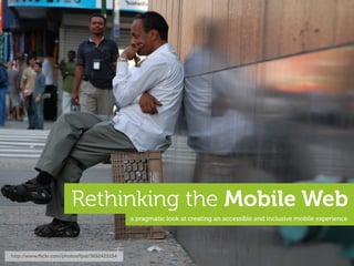
Rethinking the mobile web
1. Rethinking the Mobile Web
a pragmatic look at creating an accessible and inclusive mobile experience
http://www.flickr.com/photos/fpat/3692425154
2. we apps, and...
a lovely, location-b
ased,
social, photo thing
y...
this presentation
is
not about these.
http://www.flickr.com/photos/scobleizer/3985020876
3. Dinosaurs!
we think the iPad is pretty awesome, but...
http://www.flickr.com/photos/goincase/4647893507
5. 1.8 billion
the number of internet
connections in the world today...
26% of the world’s population at the beginning of 2010 – http://www.internetworldstats.com
6. 6.8 billion
the number of people
in the world today...
*2009 estimates put the population around 6.79 billion inhabitants...
7. 3.4 billion
the number of people
with mobile devices today...
or roughly 1/2 the population of the planet, which is...
17. about 6% US market share...
US Population: 307 million
Smartphone penetration: 31% of pop.
iPhone market share: 21% of smp.
enormous Total iPhones in US: 19 million (~6%)
impact
low overall
penetration
The iPhone Reality in Europe: Low Overall Penetration, Enormous Impact
http://moconews.net/article/419-deep-discounts-on-smartphones-drive-u.s.-adoption-rates-to-nearly-a-thi/ and http://www.npd.com/press/releases/press_100510.html
19. only 4% EU5* market share...
enormous EU5* = France, Germany, Italy, Spain and United Kingdom
impact
low overall
penetration
The iPhone Reality in Europe: Low Overall Penetration, Enormous Impact
http://www.comscore.com/layout/set/popup/layout/set/popup/Press_Events/Press_Releases/2010/6/The_iPhone_Reality_in_Europe_Low_Overall_Penetration_Enormous_Impact
20. <4% global market share*
enormous
impact
low overall
penetration
*I suspect it’s actually much less, but finding accurate global figures is a tad difficult...
21. ie: BMW
The ”most popular” devices don’t necessarily
translate to the most used devices.
ie: Ford
22. ”
yeah, but those
devices suck!
http://www.flickr.com/photos/eldret_99/3311540398
24. the first smartphone in 2003...
considered
portable in 1984 fits in your pocket
still widely used...
Released: 1984 Released: 2003
CPU: 8 MHz CPU: 104 MHz
RAM: 128k (512k max) RAM: 6 MB
Storage: 400k (3.5” floppy) Storage: 32 MB MMC Card
Display: 22.9 cm Monochrome Display: 5.3 cm Thousands of colours
Dimensions: 34.5 x 24.4 x 27.7 cm Dimensions: 10.9 x 5.8 x 2.4 cm
Weight: 7.5 kgs Weight: 122 g
25. the music phone in 2008...
again, it was ‘portable’...?
...this runs Flash
not a feature phone,
nor a smartphone...
Released: 1998 Released: 2008
CPU: 233 MHz CPU: 434 MHz
RAM: 32 MB (512 MB max) RAM: 128 MB
Storage: 4 GB (+ optical drive) Storage: 8 GB (16 GB max)
Display: 38.1 cm Millions of colours Display: 8.1 cm Millions of colours
Dimensions: 40.1 x 38.6 x 44.7 cm Dimensions: 11.1 x 5.2 x 1.5 cm
Weight: 17.3 kgs Weight: 109 g
26. the feature phone in 2009...
smartphone from 2005 extremely
popular today...
still widely
used today...
Released: 2005 Released: 2009
CPU: 220 MHz CPU: 369 MHz
RAM: 22 MB RAM: 30 MB
Storage: 64 MB Storage: 1 GB (16 GB max)
Display: 5.3 cm Thousands of colours Display: 5.1 cm Thousands of colours
Dimensions: 10.8 x 5.3 x 2.2 cm Dimensions: 10.6 x 4.7 x 1.5 cm
Weight: 126 g Weight: 88 g
27. the smartphone in 2010...
...playing “catch-up”
raising the “bar”...
Released: 2010 Released: 2010
CPU: 680 MHz CPU: 1 GHz A4 Processor
RAM: 256 MB RAM: 512 MB
Storage: 16 GB (32 GB max) Storage: 16 GB (32 GB max)
Display: 8.9 cm Millions of colours Display: 8.9 cm Millions of colours
Dimensions: 11.4 x 5.9 x 1.3 cm Dimensions: 11.5 x 5.9 x 0.9 cm
Weight: 135 g Weight: 137 g
28. ”
...but folks with those other phones
simply don’t use the Internet.
http://www.flickr.com/photos/carbonnyc/3369424492
29. yeah, and grandma
doesn’t do Facebook... ”
Grandma*
Facebook
http://www.flickr.com/photos/amagill/304701054
*not my Grandma
30. 1.3 billion
the number of mobile internet
users today...
...includes WAP and ‘real web’ via Tomi Ahonen Consulting
31. 1/3
number of global internet
users who access the internet
only via mobile...
...includes WAP and ‘real web’ via Tomi Ahonen Consulting
32. 21% the projected worldwide
3G penetration in 2010...
via Morgan Stanley
34. mobile browser market share
via http://gs.statcounter.com - 02/2010
other?
things have changed
skeptical
UC ate Nokia’s share...
other?
other?
note OperaMini...
Blackberry!
quality + sample size?
Data Source: http://gs.statcounter.com
Published Under a Creative Commons Attribution 3.0 Unported License
You are free to copy, distribute and transmit the work and to adapt the work providing it is attributed to www.icrossing.co.uk
http://www.flickr.com/photos/icrossing_uk/4342659861
35. something happened in February...
UC browser...
Nokia browser...
Top 9 Mobile Browsers in China from Sep 09 to Aug 10 | StatCounter Global Stats
http://gs.statcounter.com/#mobile_browser-CN-monthly-200909-201008
36. moving forward...
used in iOS, Android, Palm WebOS, Nokia Qt, primarily used on feature
Bada, Symbian and new Blackberry... phones supporting Java ME...
+
WebKit OperaMini Windows Mobile
proxy browser...
watch these...
lots of new browsers, variation and of course – legacy browsers
“Fennec” Browser UC
Obigo SkyFire
proxy browsers
Internet Explorer MicroB Internet Browser
37. the importance of WebKit...
open source
licensed under the GNU Library General Public License
excellent standards support
including HTML, CSS3, SVG, etc.
innovations often contributed back
example: HTML5, CSS animations, SquirrelFish, etc.
adopted by many leading companies
including Apple, Nokia, Samsung, Google, Palm, etc.
WebKit used in many mobile operating systems
including iOS, Android, webOS, Bada, Symbian, etc.
btw - “There is no WebKit on Mobile” by @ppk
http://www.quirksmode.org/blog/archives/2009/10/there_is_no_web.html
38. the importance of OperaMini...
free
costs consumers absolutely nothing
a full-web experience
supports Ajax, zooming, tabbed browsing, etc
excellent standards support
based on the same code-base as the Opera browser OperaMini
available just about anywhere
on JavaME, iPhone, Android, Windows Mobile + more
an extremely efficient browser
a proxy server filters, compresses & pre-renders content
usable on older devices
breathe new life into those antique devices...
very important
39. rendered + optimised and proxy browsers...
proxy browser on proxy server...
free + unlimited
bandwidth
OBML* HTML
limited + costly proxy server bbc.co.uk
bandwidth
*OBML (Opera Binary Markup Language) is highly optimised for mobile networks + devices.
40. on private networks...
caller
a
d
limited + costly
bandwidth
switching
centre receiver
c b
base-station
to the Internet...
transcoding, bandwidth limitations, service blocking and no packet neutrality
41. also availabl
e for Android
...
OperaMini is great for browsing
the web on iPhone when your
connection stinks. Which is
unfortunately is fairly often in my
”
case. – @jonathanstark
http://www.flickr.com/photos/johanl/4424185115
63. these are also mobile...
WebKit WebKit
approximations based on actual device testing - font rendering will vary...
http://colly.com/
64. as are these...
the iPhone is #1 device for OperaMini
*OperaMini is often preferred by many users as it optimises content prior to download, which reduces data costs.
http://colly.com/
65. and these...
Mozilla
77mm
47mm
insanely tiny!
expect many more tablet
devices on the market soon...
http://colly.com/
66. traditionally used
for the fine print...
which now require this...
http://www.flickr.com/photos/chrisbrenschmidt/1832787028
67. viewport is much smaller
than the actual content
and this...
http://www.flickr.com/photos/katerha/4592429363
70. once again
why are we writing for only one browser...
2000 2010
...is WebKit the new Internet Explorer?
71. “This site works best in Safari 4”
”
is ok where “This site works best in
IE4” wasn’t?!? Open standards or
double standards? – @csssquirrel
via @brucel
http://www.flickr.com/photos/pjanvandaele/3990379048
72. If you want to use the web on a
”
mobile device, is the purchase of
an iPhone the cost of entry?
or Android device
this design can work on
*many* more devices...
let alone only one device?
73. as per my highly sophisticated
mobile web triage process... ;)
Good
Could be improved
Needs to be improved
let’s make it more accessible...
http://colly.com/
74. 3 one style sheet w/@media queries
4 jQuery used only for animation...
5 same images used for
all screen devices...
only a few issues...
2 well structured,
meaningful markup
Good
4 Javascript animations tend to work
poorly on the majority of mobile devices... Could be improved
Needs to be improved
76. 2. use well structured, meaningful markup
for those still paying attention, yes there is a #1 and we will get to it shortly...
77. 2 well structured, meaningful markup...
mmm... meaning!
structure
there’s lots more, but who
wants to stare at code...
http://colly.com/ view source
78. 2 well structured, meaningful markup...
use <header>, <h1>, <p> and other semantically meaningful tags to provide basic structure
*Note: this is not from hp://colly.com
recreating
existing <tags>
<div class="body"> is not cool
<div class="header">
<div class= "h1">
<span>Hello World!</span>
</div>
</div> <div> soup...
<div class="body">HTML
<span class="emphasis">can actually be</span>meaningful.
</div>
</div>
soup is best served in a bowl...
without a basic, meaningful structure you will need to re-create many existing properties
79. 2. use well structured, meaningful markup
3. the absence of support for @media queries
is in fact the first @media query...
80. 3 all-in-one stylesheet with @media queries...
a single css file is network efficient, but often includes
unnecessary style data for mobile devices...
<link href="screen.css" type="text/css" rel="stylesheet" media="screen" />
....towards the end of ‘screen.css’ we find the @media queries
mobile specific tweaks are added at the very
end, and only through @media queries...
@media (max-device-width:480px) and (orientation:portrait) { ...
81. how retro...
kinda backwards...
http://www.flickr.com/photos/dumbledad/3400708183
82. rocket science
a desktop browser...
are we expecting too much...
http://www.flickr.com/photos/nasa_goddard/4678389619/
83. rocket science
a mobile browser...
...from our mobile browsers?
http://www.flickr.com/photos/wwworks/3749061604
85. 1. mobile first
2. use well structured, meaningful markup
3. the absence of support for @media queries
is in fact the first @media query...
aha, I told you we’d eventually get to #1!
86. Luke Wroblewski
mobile first
http://www.lukew.com/ff/entry.asp?933
http://www.flickr.com/photos/pete-karl/4637024524
101. and not a new idea at all...
progressive enhancement
= full desktop site
Jeremy Keith + media queries
a mobile site
http://www.flickr.com/photos/clagnut/315554083
104. 1. mobile first
2. use well structured, meaningful markup
3. the absence of support for @media queries
is in fact the first @media query...
105. 3 all-in-one stylesheet with @media queries...
a single css file is network efficient, but often includes
unnecessary style data for mobile devices...
<link href="screen.css" type="text/css" rel="stylesheet" media="screen" />
....towards the end of ‘screen.css’ we find the @media queries
mobile specific tweaks are added at the very
end, and only through @media queries...
@media (max-device-width:480px) and (orientation:portrait) { ...
106. 3 default stylesheet plus @media queries...
place mobile related styles into a default stylesheet...
<link href="default.css" type="text/css" rel="stylesheet" media="screen" />
<link href="desktop.css" type="text/css" rel="stylesheet" media="screen
and (min-device-width:1024px) and (max-width:989px)" />
link additional style sheets using @media queries
to progressively enhance the content for more
capable browsers
some mobile browsers look for it...
*you may want to use both the ‘screen’ and ‘handheld’ media types for your default stylesheet
107. 1. mobile first
2. use well structured, meaningful markup
3. the absence of support for @media queries
is in fact the first @media query...
4. progressively enhance using JavaScript
and @media queries
108. 4 jQuery/JavaScript used only for animation...
jQuery is still a rather hefty library
for use on mobile devices...
<script type="text/javascript" src=".../jquery.min.js"><script>
<script type="text/javascript" src=".../scrollto.js"><script>
animation in JavaScript can be
very taxing on mobile devices...
109. mobile browsers aren’t as
capable as desktop browsers...
again, are we expecting too much...?
http://www.flickr.com/photos/mjryall/3638778588
110. 4 use CSS instead of JavaScript for animations...
are jQuery (and JavaScript) necessary to
provide an experience on mobile devices...?
<script type="text/javascript" src=".../jquery.min.js"><script>
<script type="text/javascript" src=".../scrollto.js"><script>
consider using basic DOM manipulation, or a mobile optimised Javascript library
<script type="text/javascript" src=".../xui.min.js"><script>
the “jQuery Mobile” long before jQuery Mobile...
http://xuijs.com http://jquerymobile.com
use CSS for animations if available instead of Javascript
...use CSS animations
.scrollto { (where possible) instead
-webkit-transform: translate(540px, -200px);
-moz-transform: translate(540px, -200px);
-o-transform: translate(540px, -200px);
}
ignored on browsers that don’t support it
111. look ma, no jQuery?
from a time before jQuery...
Twier?
http://www.flickr.com/photos/wordridden/2474879344
112. then again, do you really need javascript?
*none of these services relied on Javascript when they first started...
113. 1. mobile first
2. use well structured, meaningful markup
3. the absence of support for @media queries
is in fact the first @media query...
4. progressively enhance using JavaScript
and @media queries
5. adapt content (especially images)
appropriately for each device
114. 5 same images used for all devices...
one size rarely fits all...
ul li#biography a span.label {
background: url("../pig.png") repeat-x center bottom;
}
16 Kb
also adapt content used in <img /> tags
we should also adapt images found within the markup...
<img src="butterfly.png"
width="200" height="160" alt="butterfly" />
16 Kb
http://colly.com/
115. 5 images adapted appropriately for each device...
ul li#biography a span.label {
background: url("../pig-small.png") repeat-x center bottom;
}
provide appropriate sized images for various devices
6 Kb
also adapt content used in <img /> tags
many CMS’s such as WordPress provide a means of
filtering HTML before it’s sent to the client
<img src="butterfly-small.png"
width="100" height="80" alt="butterfly" />
6 Kb
be sure to update the width and height aributes accordingly
services such as http://tinysrc.net can automatically resize + compress your images
http://colly.com/
116. we could also rethink the <img />* tag...
one image can have multiple source
files, each for an appropriate context
<img alt="butterfly">
<source src="butterfly-small.png" width="100" height="80" />
<source src="butterfly.png" width="200" height="160" />
<source src="butterfly-large.svg" width="400" height="400"
media="min-device-width:320px" /> image formats, and aspect ratios
</img> could be modified as required
and possibly even include media queries...
*I’m just dreaming here, this doesn’t currently exist...
118. much better...
approximations based on actual device testing - font rendering will vary...
http://colly.com/
119. quick
another example...
http://2010.dconstruct.org*
*again, for illustration purposes only, I’m not criticising the fine folks behind dConstruct...
124. 6 fonts often not supported on mobile
sprite image not used 6
on mobile devices...
6 images not used on
mobile devices...
only one real issue...
3 a single (and compressed!) style sheet
2 well structured, meaningful
and compressed markup
Good
simple DOM scripting without Could be improved
4 large Javascript libraries
Needs to be improved
125. 1. mobile first
2. use well structured, meaningful markup
3. the absence of support for media queries
is in fact the first @media query...
4. progressively enhance using JavaScript
and @media queries
5. adapt content (especially images)
appropriately for each device
6. compress content where possible,
and avoid sending unnecessary data
126. 6 display:none still loads resources...
don’t expect mobile
bandwidth to be free...
@media (max-device-width:767px), all and (max-width:449px) { ...
.speaker-carousel {
display: none; all of the speaker-carousel images are actually loaded,
even though they are never displayed on mobile devices...
}
127. images not used on @font-face not supported
mobile devices... on most mobile devices...
367.35 KB 93.63 KB
http://2010.dconstruct.org/
128. 6 ...avoid sending unnecessary data
@media (max-device-width:767px), all and (max-width:449px) { ...
.speaker-carousel {
display: none; find another way to remove the
unused resources on mobile devices...
}
131. accessibility*
features functionality
usability performance
experience bandwidth
a balancing act...
http://www.flickr.com/photos/superfantastic/50088733
132. 1. mobile first
2. use well structured, meaningful markup
3. the absence of support for @media queries
is in fact the first @media query...
4. progressively enhance using JavaScript
and @media queries
5. adapt content (especially images)
appropriately for each device
6. compress content where possible,
and don’t include unnecessary data
133. why even bother...
I’ve seen
that look...
http://www.flickr.com/photos/eldret_99/3311540632
134. ...people actually do use the mobile web
source comScore MobiLens
http://www.flickr.com/photos/pictfactory/2796367140