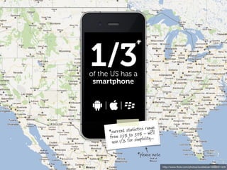
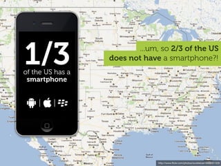
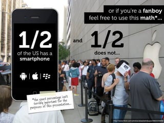
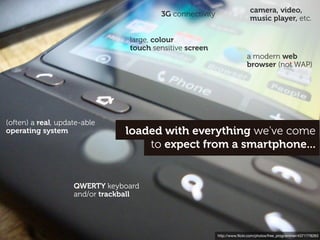
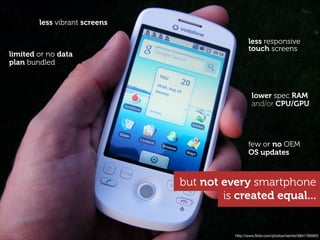
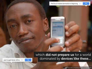
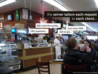
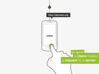
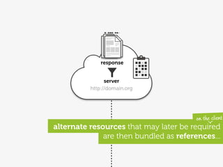
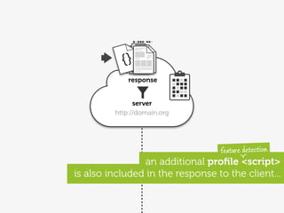
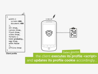
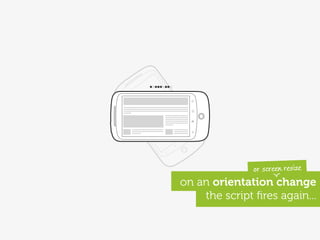
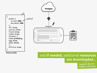
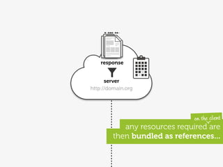
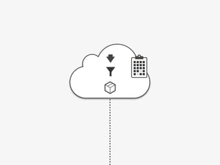
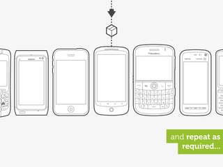
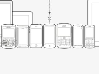
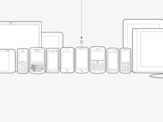
The document discusses how responsive design begins on the server by adapting to different devices. It notes that as more devices have become capable of accessing the web, including lower-cost smartphones and basic phones, the definition of what constitutes a "smartphone" has expanded. It argues that while there is diversity in mobile devices, many lower-end devices still provide web access and basic smartphone functionality at an affordable price for many users.
Presented by Stephanie Rieger at Breaking Development in Dallas, April 11 2011 and Mobilism in Amsterdam, May 12, 2011.
Context is often cited as the single most important factor in design for the mobile medium. Mobile devices are of course 'mobile', but they are also small, always on, always with us, and can instantly connect us to the people we love. Mobile services must therefore be simple, social, and well-focussed--enabling us to quickly get things done on even the smallest screens.
This is all well and good, but mobile devices have changed. They may be mobile, but many have already stopped being 'phones'—nor do they resemble what we traditionally think of as computers. This presentation will explore how our use, and perception of mobile devices is changing, and how these changes may impact how we should design for them going forward.
The time is 2020. The inflection point has long passed. Most web traffic is now coming from some manner of portable device. And if Google Chairman Eric Schmidt (and many others’) predictions have come true, we will have truly reached time where “…[technology] will just be seamless. It will just be there. The web will be everything, and it will be nothing. It will be like electricity.”
This presentation challenges us to think about the role of the web going forward. What steps must we take to build a world where interactions with the web are truly “seamless”? What would a seamless web even look like? How can we ensure the web remains strong amidst all the new technologies that are on the way.
Presented on September 13 in London at Generate.
Midway through a project, a client of ours recently said "One thing I'm learning is that it's ok to give up on the desktop experience once it stops making sense". This wasn't an isolated incident. In fact, i'm beginning to think desktop web sites stopped making sense quite a while ago. We've just had nothing viable to replace them with. Mobile apps have given us a glimpse, but I think they're merely a glimpse into something bigger.
Mobile isn't merely a new stage in the evolution of the web, it's not even merely a new context, it's the very early stages of an entirely new system. A system that has already started to shape our environment, affect the way we live, how we choose to connect with others, and how we're able to spend our time. A system that is also slowly unravelling our assumptions and causing us to question the very reason we build web sites, why people visit them, and where the true value of the web actually lies.
Presented by Stephanie Rieger at Breaking Development in Orlando, Florida on April 17, 2012.
If your job is to make things for the web, and the company you work for doesn’t build fitness trackers, or robots, or smart light bulbs, or a cloud service that aims to connect all these things, you could be forgiven for not caring all that much about today's Internet of Things. My aim with this talk is to shift the conversation away from things and back to people. In doing so, I hope to also arm you with tools to better understand, and find your place, within this complex but fascinating landscape.
First presented at Generate Conference in San Francisco on July 15, 2016.
Some people say the web is dying, but I believe it’s just getting started. And what will kick it into overdrive is the Physical Web: the ability to discover, engage, and interact with smart devices (or that “dumb” tree over there) using nothing more than a browser.
In this presentation, we explore the impact these new capabilities may have on the way we design and think about this (increasingly near) future web.
Why You Should Make Mobile Your Career | Clark CollegeJason Grigsby
A variation of my talk on mobile strategy given to Clark College to encourage students to pursue mobile and to encourage the college to adopt mobile curriculum.
Designing for multiple devices - GA London, 19 Nov 2012Anna Dahlström
Slides from my class on November 19th 2012 at General Assembly in London about designing for multiple devices.
ABSTRACT
The rise in mobiles and tablets have changed the way we consume and interact with content, but also the way we design and what we base our design approach on. This class will teach you about the shift in user expectations, behaviour- and consumption patterns and what that means for designing products that will be used on multiple devices. Coming out of it you'll be equipped with guiding principles and tools to tackle the multiple device jungle.
Understanding UX: Designing for multiple devices - GA London, 18 Jan 2013Anna Dahlström
Slides from my 1 hour class on January 18th at General Assembly in London during the Understanding UX day.
ABSTRACT
The rise in mobiles and tablets have changed the way we consume and interact with content, but also the way we design and what we base our design approach on. This class will teach you about the shift in user expectations, behaviour- and consumption patterns and what that means for designing products that will be used on multiple devices. Coming out of it you'll be equipped with guiding principles and tools to tackle the multiple device jungle.
UCD14 Talk - Anna Dahlstrom - Device Agnostic Design: How to get your content...UCD UK Ltd
Anna Dahlstrom - Device Agnostic Design: How to get your content to go anywhere
There was a time when we did glossy page designs and when those designs were pretty much what we saw in our desktop browsers. With the introduction and rise of smartphones, tablets, phablets there isn't one view of our designs anymore.
Instead, what we create needs to be able to adapt in a way that is suitable for the device as well as where and how it’s being used.
With responsive design we've learnt the basics of how to adapt content, interactions and layouts so that it works across devices. But with further developments in technology and screens, our content is going to go anywhere. As a result we need to move away from designing for specific devices to solutions that are device agnostic. For us as UX designers this means means letting content rather than devices guide layouts, and also increasingly moving away from designing and wireframing pages to focusing on the modules that those views are made up of. But there are other aspects to consider in device agnostic design.
In this talk Anna will walk through why device agnostic design matters, what it means and how we go about it.
Mobile UX 101 - current trends, behaviours, design considerations, common mistakes, platform choices and general advice for anyone entering the mobile design and development industry
Live streaming: Designing For Multiple Devices - GA, New York, 14 March 2013Anna Dahlström
Slides from my 1 hour live streaming class on March 14th at GA in New York
ABSTRACT
The rise in mobiles and tablets have changed the way we consume and interact with content, but also the way we design and what we base our design approach on. This class will teach you about the shift in user expectations, behaviour- and consumption patterns and what that means for designing products that will be used on multiple devices. Coming out of it you'll be equipped with guiding principles and tools to tackle the multiple device jungle.
Best of GA: Designing For Multiple Devices - Google Campus, 26 Feb 2013Anna Dahlström
Slides from my 1 hour class on February 26th at Google Campus in London during the 'Best of GA' event.
ABSTRACT
The rise in mobiles and tablets have changed the way we consume and interact with content, but also the way we design and what we base our design approach on. This class will teach you about the shift in user expectations, behaviour- and consumption patterns and what that means for designing products that will be used on multiple devices. Coming out of it you'll be equipped with guiding principles and tools to tackle the multiple device jungle.
Designing for multiple devices - GA London, 14 Jan 2013Anna Dahlström
Slides from my class on January 14 at General Assembly in London about designing for multiple devices.
ABSTRACT
The rise in mobiles and tablets have changed the way we consume and interact with content, but also the way we design and what we base our design approach on. This class will teach you about the shift in user expectations, behaviour- and consumption patterns and what that means for designing products that will be used on multiple devices. Coming out of it you'll be equipped with guiding principles and tools to tackle the multiple device jungle.
Designing For Multiple Devices - GA New York, 6 March 2013Anna Dahlström
Slides from my class on March 6th at GA in New York.
ABSTRACT
The rise in mobiles and tablets have changed the way we consume and interact with content, but also the way we design and what we base our design approach on. This class will teach you about the shift in user expectations, behaviour- and consumption patterns and what that means for designing products that will be used on multiple devices. Coming out of it you'll be equipped with guiding principles and tools to tackle the multiple device jungle.
GA London - Designing for multiple devices, 28may2012Anna Dahlström
Slides from my class on May 28 2012 at General Assembly London on designing for multiple devices.
ABSTRACT
The rise in mobiles and tablets have changed the way we consume and interact with content, but also the way we design and what we base our design approach on. This class will teach you about the shift in user expectations, behaviour- and consumption patterns and what that means for designing products that will be used on multiple devices. Coming out of it you'll be equipped with guiding principles and tools to tackle the multiple device jungle.
Designing For Multiple Devices - GA London, 04 Mar 2013Anna Dahlström
Slides from my class on the 4th of March at General Assembly in London.
ABSTRACT
The rise in mobiles and tablets have changed the way we consume and interact with content, but also the way we design and what we base our design approach on. This class will teach you about the shift in user expectations, behaviour- and consumption patterns and what that means for designing products that will be used on multiple devices. Coming out of it you'll be equipped with guiding principles and tools to tackle the multiple device jungle.
What will education and teaching look like in the future. Emerging technologies, changing pedagogies, new literacies and digital learners. This presentation is produced for teachers and trainers.
Designing for multiple devices - GA, New York 08 Oct 2012Anna Dahlström
Slides from my class on October 8th 2012 at General Assembly in New York about designing for multiple devices.
ABSTRACT
The rise in mobiles and tablets have changed the way we consume and interact with content, but also the way we design and what we base our design approach on. This class will teach you about the shift in user expectations, behaviour- and consumption patterns and what that means for designing products that will be used on multiple devices. Coming out of it you'll be equipped with guiding principles and tools to tackle the multiple device jungle.
New sensor based Web Standards developments have punched a hole in the web that is letting the real world leak into the browser. The getUserMedia API now lets us access cameras and microphones and JSARToolkit and javascript based Natural Feature Tracking like the examples from ICG Graz University have shown that browsers can now be taught to perceive the world around them. Combine this with the <canvas> and WebGL and you have a real working model for a Web Standards based Augmented Reality.
On top of this we also have OGCs Sensor Web Enablement and new developments like the Sensor API and the rapid spread of networked sensors and wireless Arduino-ised devices. Massively distributed dynamic immersive visualisation is now the new structural form for the modern web.
e is for everywhere - Interactive Mobile Web PresentationRob Manson
This presentation at Web Directions South 2007 captures the screens from an interactive poll held during the presentation. 67 people in the audience joined in and a dynamic profile of their phones, browsers, operating system and network providers is also include. A more involved analysis of the results will be available soon...
Divergence - what happens after ConvergenceRob Manson
Convergence is the verb that everyone is focused upon. Divergence is the noun at the end of that process. This presentation lays out some foundation ideas for mobile strategy development.
Why are mobiles important to your business strategy and how can you use them to drive your business growth? There's one simple idea you need to know...
A brief exploration of proposed Level 4 Media Queries and some thoughts about the future of the web. Presented at Responsive Day Out in Brighton on June 27 2014.
Designing for diversity - how to stop worrying and embrace the Android revol...yiibu
It took 16 years for smartphone penetration to reach 1 billion people. Analysts believe it will take only 3 years to reach the next billion. The devices these consumers buy will be incredibly diverse, yet many will run on Android; a platform that now sees more than 1.5 million activations per day.
In this presentation, we explore the fascinating rise of Android around the globe. From dual SIM phones in Indonesia, to dual screen e-ink devices in Russia and crowd-sourced platform modifications in China, we will discover the role open source has played in Android's popularity and how to design for such a diverse environment.
Today’s 'smart devices' are a product of the technology and mental models of our past. From a connected lightbulb to a robot vacuum, using most of these devices requires a native app. This in turn greatly limits their contexts of use. Can we really expect users to download an app to interact with a random ’thing’ they encounter at the mall, a space they explore for an hour at the museum, or a city they will only visit for a day? What devices could we build, what 'smart' environments could we enable if users could simply discover, “walk up and use”(and then if needed, abandon) these objects and environments as they do a web site?
This workshop will discuss two new technologies--Physical Web and Web Bluetooth--that can enable on-demand interaction with physical things and spaces using no more than a browser.
Websites are all about content. People can access your content many different ways and formats with mobile devices, iPads, phones, etc. The questions are: how can we maintain control over the display of our content and keep our brand consistent? How can we try to provide the best user experience on any platform? Enter Responsive Web Design. Many experts are not leaning on one static design but on structured content that adapts to its given environment. In this talk, we are going to take a look at responsive web design techniques out there including: progressive enhancement, flexible grids, media queries, flexible images & video, & other methods of implementation.
With each passing day, our relationship with computers grows more personal. The touch of a human hand has replaced the mouse, and conversational interfaces now seem set to replace all manner of button or conventional interface. Is this pure hype, or a true step change in the evolution of personal computing?
In this workshop we will look at the current state of conversational interfaces, the challenges and benefits they bring, and where things are heading.
Ohaiyogozaimasu! This presentation was crafted to help those traveling to Japan for the first time, providing priceless tips that will help navigate and experience Japan to the fullest! Enjoy! : )
www.empoweredpresentations.com
@empoweredpres
The web was first conceived 25 years ago, by an Englishman. Fifteen years later, as the first crop of dot.coms were going bust, close to 60% of its users (and all Alexa "top 20" sites) came from developed nations. Fast forward to today, and the picture is strikingly different. Almost half the Alexa "top 20" now comes from emerging economies. Economies where close to 3 billion people have yet to use the web, but thanks to mobile--won't have to wait much longer to discover it. This presentation will introduce you to fascinating and innovative services that are re-shaping the web to serve the consumers of tomorrow. Driven by mobile, the power of personal relationships, and the breakneck pace of globalisation, these services provide a glimpse into the business models, opportunities and challenges we will face, when growing a truly global web.
Beyond The Hamburger Menu - MOBX, 13 Sep 2014Anna Dahlström
Slides from my talk at MOBX in Berlin on 13 Sep 2014 - http://2014.mobxcon.com/
Beyond the hamburger menu - What you need to know about designing for multiple devices.
Abstract: From myths to trends and best practice, actual usage, engagement, design patterns and interactions, we’ll go through the insights behinds the stats and take a look at the reality behind mobile and what really matters when designing for multiple devices.
Adapting to Input — Smashing Conference NYCJason Grigsby
Responsive Web Design has forced us to accept that we don't know the size of our canvas, and we've learned to embrace the squishiness of the web. Input, it turns out, is every bit as challenging as screen size. We have tablets with keyboards, laptops that become tablets, laptops with touch screens, phones with physical keyboards, and even phones that become desktop computers.
In this session, Jason will guide you through the input landscape, showing you new forms of input like sensors and voice control, as well as new lessons about old input standbys. You'll learn the design principles necessary to build web sites that respond and adapt to whatever input people use.
No matter how much we try to put ourselves into a mobile first mentality, it is hard for us to do so fully. Our access to PCs prevents us from experiencing mobile the way many in the world do.
We're currently fighting for parity among experiences. We're arguing that the mobile version shouldn't be a dumbed down version of the desktop site.
But we've set our sights too low. In a true Mobile First world, the mobile version should be the best experience. Mobile shouldn't just match the desktop experience, it should exceed it.
A talk I gave in november 2011 for our internal Web Developer Network at EVRY.
Inspirational slides, tweets and flickr photos are credited with links to the sources. Thanks!
Similar to Adaptation: Why responsive design actually begins on the server (20)
Builder.ai Founder Sachin Dev Duggal's Strategic Approach to Create an Innova...Ramesh Iyer
In today's fast-changing business world, Companies that adapt and embrace new ideas often need help to keep up with the competition. However, fostering a culture of innovation takes much work. It takes vision, leadership and willingness to take risks in the right proportion. Sachin Dev Duggal, co-founder of Builder.ai, has perfected the art of this balance, creating a company culture where creativity and growth are nurtured at each stage.
UiPath Test Automation using UiPath Test Suite series, part 4DianaGray10
Welcome to UiPath Test Automation using UiPath Test Suite series part 4. In this session, we will cover Test Manager overview along with SAP heatmap.
The UiPath Test Manager overview with SAP heatmap webinar offers a concise yet comprehensive exploration of the role of a Test Manager within SAP environments, coupled with the utilization of heatmaps for effective testing strategies.
Participants will gain insights into the responsibilities, challenges, and best practices associated with test management in SAP projects. Additionally, the webinar delves into the significance of heatmaps as a visual aid for identifying testing priorities, areas of risk, and resource allocation within SAP landscapes. Through this session, attendees can expect to enhance their understanding of test management principles while learning practical approaches to optimize testing processes in SAP environments using heatmap visualization techniques
What will you get from this session?
1. Insights into SAP testing best practices
2. Heatmap utilization for testing
3. Optimization of testing processes
4. Demo
Topics covered:
Execution from the test manager
Orchestrator execution result
Defect reporting
SAP heatmap example with demo
Speaker:
Deepak Rai, Automation Practice Lead, Boundaryless Group and UiPath MVP
State of ICS and IoT Cyber Threat Landscape Report 2024 previewPrayukth K V
The IoT and OT threat landscape report has been prepared by the Threat Research Team at Sectrio using data from Sectrio, cyber threat intelligence farming facilities spread across over 85 cities around the world. In addition, Sectrio also runs AI-based advanced threat and payload engagement facilities that serve as sinks to attract and engage sophisticated threat actors, and newer malware including new variants and latent threats that are at an earlier stage of development.
The latest edition of the OT/ICS and IoT security Threat Landscape Report 2024 also covers:
State of global ICS asset and network exposure
Sectoral targets and attacks as well as the cost of ransom
Global APT activity, AI usage, actor and tactic profiles, and implications
Rise in volumes of AI-powered cyberattacks
Major cyber events in 2024
Malware and malicious payload trends
Cyberattack types and targets
Vulnerability exploit attempts on CVEs
Attacks on counties – USA
Expansion of bot farms – how, where, and why
In-depth analysis of the cyber threat landscape across North America, South America, Europe, APAC, and the Middle East
Why are attacks on smart factories rising?
Cyber risk predictions
Axis of attacks – Europe
Systemic attacks in the Middle East
Download the full report from here:
https://sectrio.com/resources/ot-threat-landscape-reports/sectrio-releases-ot-ics-and-iot-security-threat-landscape-report-2024/
Neuro-symbolic is not enough, we need neuro-*semantic*Frank van Harmelen
Neuro-symbolic (NeSy) AI is on the rise. However, simply machine learning on just any symbolic structure is not sufficient to really harvest the gains of NeSy. These will only be gained when the symbolic structures have an actual semantics. I give an operational definition of semantics as “predictable inference”.
All of this illustrated with link prediction over knowledge graphs, but the argument is general.
Securing your Kubernetes cluster_ a step-by-step guide to success !KatiaHIMEUR1
Today, after several years of existence, an extremely active community and an ultra-dynamic ecosystem, Kubernetes has established itself as the de facto standard in container orchestration. Thanks to a wide range of managed services, it has never been so easy to set up a ready-to-use Kubernetes cluster.
However, this ease of use means that the subject of security in Kubernetes is often left for later, or even neglected. This exposes companies to significant risks.
In this talk, I'll show you step-by-step how to secure your Kubernetes cluster for greater peace of mind and reliability.
Elevating Tactical DDD Patterns Through Object CalisthenicsDorra BARTAGUIZ
After immersing yourself in the blue book and its red counterpart, attending DDD-focused conferences, and applying tactical patterns, you're left with a crucial question: How do I ensure my design is effective? Tactical patterns within Domain-Driven Design (DDD) serve as guiding principles for creating clear and manageable domain models. However, achieving success with these patterns requires additional guidance. Interestingly, we've observed that a set of constraints initially designed for training purposes remarkably aligns with effective pattern implementation, offering a more ‘mechanical’ approach. Let's explore together how Object Calisthenics can elevate the design of your tactical DDD patterns, offering concrete help for those venturing into DDD for the first time!
Software Delivery At the Speed of AI: Inflectra Invests In AI-Powered QualityInflectra
In this insightful webinar, Inflectra explores how artificial intelligence (AI) is transforming software development and testing. Discover how AI-powered tools are revolutionizing every stage of the software development lifecycle (SDLC), from design and prototyping to testing, deployment, and monitoring.
Learn about:
• The Future of Testing: How AI is shifting testing towards verification, analysis, and higher-level skills, while reducing repetitive tasks.
• Test Automation: How AI-powered test case generation, optimization, and self-healing tests are making testing more efficient and effective.
• Visual Testing: Explore the emerging capabilities of AI in visual testing and how it's set to revolutionize UI verification.
• Inflectra's AI Solutions: See demonstrations of Inflectra's cutting-edge AI tools like the ChatGPT plugin and Azure Open AI platform, designed to streamline your testing process.
Whether you're a developer, tester, or QA professional, this webinar will give you valuable insights into how AI is shaping the future of software delivery.
Connector Corner: Automate dynamic content and events by pushing a buttonDianaGray10
Here is something new! In our next Connector Corner webinar, we will demonstrate how you can use a single workflow to:
Create a campaign using Mailchimp with merge tags/fields
Send an interactive Slack channel message (using buttons)
Have the message received by managers and peers along with a test email for review
But there’s more:
In a second workflow supporting the same use case, you’ll see:
Your campaign sent to target colleagues for approval
If the “Approve” button is clicked, a Jira/Zendesk ticket is created for the marketing design team
But—if the “Reject” button is pushed, colleagues will be alerted via Slack message
Join us to learn more about this new, human-in-the-loop capability, brought to you by Integration Service connectors.
And...
Speakers:
Akshay Agnihotri, Product Manager
Charlie Greenberg, Host
Smart TV Buyer Insights Survey 2024 by 91mobiles.pdf91mobiles
91mobiles recently conducted a Smart TV Buyer Insights Survey in which we asked over 3,000 respondents about the TV they own, aspects they look at on a new TV, and their TV buying preferences.
UiPath Test Automation using UiPath Test Suite series, part 3DianaGray10
Welcome to UiPath Test Automation using UiPath Test Suite series part 3. In this session, we will cover desktop automation along with UI automation.
Topics covered:
UI automation Introduction,
UI automation Sample
Desktop automation flow
Pradeep Chinnala, Senior Consultant Automation Developer @WonderBotz and UiPath MVP
Deepak Rai, Automation Practice Lead, Boundaryless Group and UiPath MVP
Kubernetes & AI - Beauty and the Beast !?! @KCD Istanbul 2024Tobias Schneck
As AI technology is pushing into IT I was wondering myself, as an “infrastructure container kubernetes guy”, how get this fancy AI technology get managed from an infrastructure operational view? Is it possible to apply our lovely cloud native principals as well? What benefit’s both technologies could bring to each other?
Let me take this questions and provide you a short journey through existing deployment models and use cases for AI software. On practical examples, we discuss what cloud/on-premise strategy we may need for applying it to our own infrastructure to get it to work from an enterprise perspective. I want to give an overview about infrastructure requirements and technologies, what could be beneficial or limiting your AI use cases in an enterprise environment. An interactive Demo will give you some insides, what approaches I got already working for real.
LF Energy Webinar: Electrical Grid Modelling and Simulation Through PowSyBl -...DanBrown980551
Do you want to learn how to model and simulate an electrical network from scratch in under an hour?
Then welcome to this PowSyBl workshop, hosted by Rte, the French Transmission System Operator (TSO)!
During the webinar, you will discover the PowSyBl ecosystem as well as handle and study an electrical network through an interactive Python notebook.
PowSyBl is an open source project hosted by LF Energy, which offers a comprehensive set of features for electrical grid modelling and simulation. Among other advanced features, PowSyBl provides:
- A fully editable and extendable library for grid component modelling;
- Visualization tools to display your network;
- Grid simulation tools, such as power flows, security analyses (with or without remedial actions) and sensitivity analyses;
The framework is mostly written in Java, with a Python binding so that Python developers can access PowSyBl functionalities as well.
What you will learn during the webinar:
- For beginners: discover PowSyBl's functionalities through a quick general presentation and the notebook, without needing any expert coding skills;
- For advanced developers: master the skills to efficiently apply PowSyBl functionalities to your real-world scenarios.
LF Energy Webinar: Electrical Grid Modelling and Simulation Through PowSyBl -...
Adaptation: Why responsive design actually begins on the server
1. Adaptation
why responsive design actually begins on the server...
http://creativecommons.org/licenses/by/2.0 http://www.flickr.com/photos/newsbiepix/4113886275
2. the tech media loves
a good story...
TechCrunch
http://www.flickr.com/photos/scobleizer/4694051328
3. 200 million iOS devices
and life on the
bleeding edge...
http://www.flickr.com/photos/scobleizer/3553486766
4. 1/3
*
of the US has a
smartphone
ge
statistics rane'll
*current –w
fro m 25% to 50%licity...
p
u se 1/3 for sim
*please note
http://www.flickr.com/photos/scobleizer/4694051328
5. 1/3
of the US has a
...um, so 2/3 of the US
does not have a smartphone?!
smartphone
http://www.flickr.com/photos/scobleizer/4694051328
6. or if you're a fanboy
feel free to use this math*...
1/2
of the US has a
and
1/2
does not...
smartphone
n't
t percentage ishe
*the exac rtant for t
terribly impo presentation...
is
purposes of th
http://www.flickr.com/photos/abasketofpups/2662225972
7. will save us all!
http://www.flickr.com/photos/scobleizer/4694051328
8. but it's really only kinda useable
on few high-end devices...
will save us all!
http://www.flickr.com/photos/scobleizer/4694051328
9. the "tech industry"
...and are we making
promises we can't keep?
htc Magic
Android 1.6
must
the " bleeding edge" e of
ha ve Android devic stop...
r
200 9 is now a doo
http://www.flickr.com/photos/whatleydude/3547624583
26. but we still can't see
the forest for the trees...
http://www.flickr.com/photos/clairity/1449248189
27. 2/3
*
of the US does not
have a smartphone...
e
*or 1/2 if you'r
a fanboy...
http://www.flickr.com/photos/centralasian/3239065547
28. last year we
asked a simple question...
http://www.flickr.com/photos/fpat/3692425154
29. welcome to the
mobile web
I asked this a year ago,
i'm not sure anything's
changed!!
if you want to use the web
on a mobile device, is the purchase
of an iPhone the cost of entry?
http://www.flickr.com/photos/sketch22/1127556671
30. to infinity and beyond...
well over
by 2015 50% of web traffic is expected
to come from mobile devices
http://www.netmagazine.com/news/uk-sees-huge-mobile-web-traffic-growth-111340
32. still the only
device where
the Web
actually works
this is rhetorical, and absurd...
in 2015, if you want to use the web
on a mobile device, will the purchase
of an iPhone be mandatory...?
http://www.flickr.com/photos/dantaylor/2161663267
33. gotta get 'em all...
or even want
many of us cannot afford to
purchase every shiny new device released...
http://www.flickr.com/photos/bytemarks/4732726333
34. especially in the light of
recent events...
http://www.flickr.com/photos/wagnertc/3217859975
40. as lots of Android devices are
now available for less than $200*....
or very close to it...
...*free is also becoming a popular option!
http://www.flickr.com/photos/cambodia4kidsorg/5253151186
41. and some feature phones aimed at
the next billion now include WebKit
ooh, touch...
and a touch screen...
ype
Nokia C3 Touch & T
S eries 40 device
http://www.flickr.com/photos/yoggy0/5380738918
42. every phone is now (essentially)
a smartphone*...
or soon will be
ns of
ctual definitioy - but to
*a
ill var
'smartphone' wey are all magic...
normal folks th
http://www.flickr.com/photos/tanj/4432327487
43. camera, video,
3G connectivity
music player, etc.
large, colour
touch sensitive screen
a modern web
browser (not WAP)
(often) a real, update-able
operating system loaded with everything we've come
to expect from a smartphone...
QWERTY keyboard
and/or trackball
http://www.flickr.com/photos/free_programmer/4371778263
44. less vibrant screens
less responsive
touch screens
limited or no data
plan bundled
lower spec RAM
and/or CPU/GPU
few or no OEM
OS updates
but not every smartphone
is created equal...
http://www.flickr.com/photos/nechbi/3841765925
45. UNDESIRABLE
this inequality creates diversity
and (often) "undesirables"...
http://www.flickr.com/photos/handwrite/3460075040
46. "Android WebKit is the closest thing to
being the IE6 of mobile development for me."
- @dalmaer via http://functionsource.com/post/a-day-in-the-life-of-android-webkit-dealings
http://www.flickr.com/photos/blank22763/4089926742
48. an optimal experience for
for a privileged few...
http://www.flickr.com/photos/carbonnyc/5140154965
49. and a missed opportunity
for many more...
linkedin HTML5 webapp disappointment
must
leeding edge" f 2009
the "b o
have A ndroid device r stop...
doo
is once again a
http://www.flickr.com/photos/dumbledad/3400708183
50. 2 year old, state-of-the-art
your smartphone is obsolete,
please upgrade now...
http://www.flickr.com/photos/herval/2050815997
54. where we learn to
adapt as required...
http://www.flickr.com/photos/kalleboo/3536493996
55. craftivism
where simply learning to knit
can change your life...
http://www.flickr.com/photos/bosstweed/152159981
56. from your local library
where borrowing books for free
is beating paying for ebooks...
Times Are Tough, Libraries Are Thriving
http://www.nytimes.com/2009/03/15/nyregion/long-island/15libraryli.html http://www.flickr.com/photos/ccacnorthlib/3553821229/
57. where Hulu, iTunes and sports bars
are replacing cable services...
expensive
http://www.businessinsider.com/2008/3/hulu-household-why-i-got-rid-of-cable
58. and which led @grigs
to pick up those clippers...
http://www.flickr.com/photos/kdnewton/2691125617
63. ...have you actually
offered them anything yet?
re
logs, chances aail...
check your in the long t
you'll find them
http://www.flickr.com/photos/zoetnet/4669800101/
64. small
a few companies
most certainly have...
twitter indonesia
0.facebook
OperaMini
http://www.flickr.com/photos/nseika/5848996146
65. us humans are amazing when it comes
to adapting to new circumstances...
...do we still really
need the dogs?
http://www.flickr.com/photos/thenationalguard/3251277781
66. the web was actually built
on similar principles...
http://www.flickr.com/photos/tanaka/3212373419
67. "The primary design principle underlying the Web's
usefulness and growth is universality.
The Web should be usable by people with disabilities.
It must work with any form of information, be it a
document or a point of data, and information of any
quality–from a silly tweet to a scholarly paper.
And it should be accessible from any kind of hardware
than can connect to the internet: stationary or mobile,
small screen or large."
...
as seen b efore @bdconf
Tim Berners-Lee
Long Live the Web
http://www.scientificamerican.com/article.cfm?id=long-live-the-web
http://www.flickr.com/photos/lonelyfox/2939757714
69. The Era of mobile dominance is beginning
which did not prepare us for a world
paul rouget taiwan africa
dominated by devices like these...
http://www.flickr.com/photos/whiteafrican/2594981758
70. “The best, most solid way out of a crisis
in a changing market is through
experiment and adaptation.”
Richard Branson
Business Stripped Bare – Adventures of a Global Entrepreneur
http://www.flickr.com/photos/jedibfa/5146867827
72. short
a tale of clients
and servers...
http://www.flickr.com/photos/richardberg/2135409739
73. pastrami on rye... a client makes a request
to a server...
http://www.flickr.com/photos/_ppo/2393063853
74. other unique clients make
similar requests...
yet not identical
Rueben...
turkey chilli dog...
grilled cheese brisket...
corned beef...
http://www.flickr.com/photos/_ppo/2393063853
75. Rueben...
chilli dog...
a method to track each client
request is required...
http://www.flickr.com/photos/mrgarin/3476714113
76. as each client request
is received...
tra pickle... no pickle... Rueben...
pastrami on rye... turkey chilli dog...
Rueben... Rueben...
grilled cheese brisket... corned beef...
http://www.flickr.com/photos/_ppo/2393063853
77. the server tailors each request
to each client...
320, hold the pickle...
one more 320...
150, pastrami... 210 to go...
tracking (ticketing, bills, etc)
analytics (what works, what doesn't)
preparation (vs just-in-time)
tacit knowledge
http://www.flickr.com/photos/_ppo/2393063853
78. ensuring they get exactly
what they need...
http://www.flickr.com/photos/the_junes/2134127618
79. rather than everything they
might not want...
http://www.flickr.com/photos/86624586@N00/10176570
87. ...profile please?
server
http://domain.org
server then asks the client
for it's profile cookie...
88. yeah, you're going to need a profile...
server
http://domain.org
if a client doesn't have a profile
cookie the server creates one for it...
89. {
width:{
screen:240,
document:240
}
}
let's start with the 'default' profile...
default profile
*defining a 'default' baseline
profile depends on your
project requirements...
server
http://domain.org
or default*
notice that this makes the
begin with a baseline profile
assumption that basic = default that covers the very basic experience...
(in other words "mobile first")
90. eww....
then...grab the client user agent string
(trust me, it's more useful than you think)
server
http://domain.org
...oh yes, user-agent please?
Mozilla/5.0
(Linux;
U;
Android
2.1-‐update1;
en-‐gb;
Nexus
One
Build/ERE27)
AppleWebKit/530.17
(KHTML,
like
Gecko)
Version/4.0
Mobile
Safari/530.17
91. Mozilla/5.0
(Linux;
U;
Android
2.1-‐update1;
en-‐gb;
Nexus
One
Build/ERE27)
AppleWebKit/530.17
(KHTML,
like
Gecko)
Version/4.0
Mobile
Safari/530.17
hey DeviceAtlas, wanna check this UA for me?
server
http://domain.org
query the user agent string against
a device database such as DeviceAtlas...
...or WURFL
92. Mozilla/5.0
(Linux;
U;
Android
2.1-‐update1;
en-‐gb;
Nexus
One
Build/ERE27)
AppleWebKit/530.17
(KHTML,
like
Gecko)
Version/4.0
Mobile
Safari/530.17
{
width:480, ...found it, here it comes!
height:480,
color-‐depth:8,
touch:true,
cookie:true,
...
}
http://deviceatlas.com
DeviceAtlas profile
93. {
width:{
screen:240,
document:240
}
}
default profile
...hmm, I think I've seen this before?
server
{
width:480, http://domain.org
height:480,
color-‐depth:8,
touch:true,
cookie:true,
...
}
DeviceAtlas profile now query the user agent string against
any tacit knowledge you have collected...
may
95. {
width:{ tacit data
screen:240,
document:240
}
}
default profile
{
width:320,
droid:1, yeah, I've seen this before...
canvas:true,
flash:true,
video:true, server
... http://domain.org
}
Tacit (or known) profile
{
width:480,
height:480, this tacit knowledge is gathered
color-‐depth:8,
touch:true, over time from other device profiles...
cookie:true,
... ...or through knowledge
} gained during testing
DeviceAtlas profile
96. {
width:{
screen:320,
document:320
},
xhr:true,
canvas:true,
flash:false,
video:true,
formats:{ server
h264:probably, http://domain.org
ogg:false,
webm:false
},
offline:true
}
Client profile
merge the baseline data, with the data
returned from queries into the client profile...
97. cookie
{
width:{ document
screen:320,
document:320
},
xhr:true, response
canvas:true,
flash:false,
video:true,
formats:{ server
h264:probably, http://domain.org
ogg:false,
webm:false
},
offline:true
}
Client profile
write the profile cookie to the doc header
which will be returned to the client...
98. {
width:{
screen:320,
document:320
},
xhr:true, response
canvas:true, profile
flash:false,
video:true,
formats:{ server
h264:probably, http://domain.org
ogg:false,
webm:false
},
offline:true
}
for this client
Client profile
server now has a usable profile
and can continue...
99. media queries are not a means using Javascript to modify
of adapting content contained significant portions of the
within the DOM on the client... DOM will impact performance
on mobile devices...
response
filter
server
http://domain.org
and adapt
the server now begins to filter the content
based on the properties in the client profile...
100. Adaptation Rules
ensure all images are
appropriately sized for
client display
replace any images that
contain fine details or text
replace Flash media with
an appropriate alternative response
where not supported
remove unnecessary
markup, scripts, etc. server
http://domain.org
or app
adaptation 'rules' will vary from site to site,
but adapting <img>'s is most common...
101. Adaptation Rules
ensure all images are
appropriately sized for
client display
replace any images that
contain fine details or text
replace Flash media with
an appropriate alternative response
where not supported
remove unnecessary
markup, scripts, etc. server
http://domain.org
adapt large tables as
required, link to data
serve appropriate video
format, codec and size
adapt DOM components
including scripts and styles <video>, <table> and other DOM
structures also require adaptation
may
102. Adaptation Rules Resource Bundles
ensure all images are alternate content
appropriately sized for appropriate for context
client display
alternate DOM templates,
replace any images that components & fragments
contain fine details or text
alternate sized, formatted +
replace Flash media with encoded video as required
an appropriate alternative response
where not supported alternate images for
required breakpoints
remove unnecessary
markup, scripts, etc. server alternate scripts + styles
http://domain.org for required client profiles
adapt large tables as
required, link to data
serve appropriate video
format, codec and size
adapt DOM components
including scripts and styles you will often require
new resources
103. "pinch-‐zoom":{
"0-‐320":"resources/images/meego/pinch-‐zoom@240.png",
"320-‐720":"resources/images/meego/pinch-‐zoom@320.png", Resource Bundles
"720-‐9999":"resources/images/meego/pinch-‐zoom.png"
}, alternate content
"typing":{
"0-‐320":"resources/images/meego/typing@240.png",
appropriate for context
"320-‐720":"resources/images/meego/typing@320.png",
"720-‐9999":"resources/images/meego/typing.png" alternate DOM templates,
}, components & fragments
"stay-‐safe":{
"0-‐320":"resources/images/meego/stay-‐safe@240.png", alternate sized, formatted +
"320-‐720":"resources/images/meego/stay-‐safe@320.png", encoded video as required
"720-‐9999":"resources/images/meego/stay-‐safe.png"
}, alternate images for
"swipe-‐more":{ required breakpoints
"0-‐320":"resources/images/meego/swipe@240.jpg",
"320-‐640":"resources/images/meego/swipe@320.jpg",
"640-‐9999":"resources/images/meego/swipe.jpg" alternate scripts + styles
}, for required client profiles
"pinch-‐zoom-‐more":{
"0-‐320":"resources/images/meego/pinch-‐zoom@240.png",
"320-‐720":"resources/images/meego/pinch-‐zoom@320.png",
"720-‐9999":"resources/images/meego/pinch-‐zoom.png"
},
"typing-‐more":{
"0-‐320":"resources/images/meego/typing@240.png",
"320-‐720":"resources/images/meego/typing@320.png",
"720-‐9999":"resources/images/meego/typing.png" which can be defined in
},
"stay-‐safe-‐more":{ any number of ways...
"0-‐320":"resources/images/meego/stay-‐safe@240.png",
"320-‐720":"resources/images/meego/stay-‐safe@320.png",
"720-‐9999":"resources/images/meego/stay-‐safe.png"
},
"location":{
104. video
data
images
response
server
http://domain.org
these resources can be static, cached
or even dynamically generated...
which would make them
even more responsive
105. response
server
http://domain.org
all content adaptation is
performed on the server...
before the page is
downloaded
106. response
server
http://domain.org
on the client
alternate resources that may later be required
are then bundled as references...
107. {}
response
server
http://domain.org
feature detection
an additional profile <script>
is also included in the response to the client...
129. all in preparation for the coming
zombie apocalypse...
@scottjenson zombie frog
http://www.flickr.com/photos/digitalsextant/3624030270
130. benefits of this
approach...
http://www.flickr.com/photos/sarahreido/3120877348
131. known
focus on the features,
not the device...
OperaMini
ceçi n'est plus un iphone
http://www.flickr.com/photos/jane_garratt/5377694159
132. browser
accepts that features
are rarely binary...
just because it's 'supported', doesn't mean
it works as intended (or works at all)...
http://html5test.com/
133. tweaks for "important" devices
(e.g. client-specific requests,
business goal-specific, partners,
high-traffic edge cases etc.)
tacit data enables you to
create custom properties needed
for your specific project fine tune the profiles...
override false positives
http://www.flickr.com/photos/mujitra/2559447601
134. handling
which makes edge cases
much easier...
http://twitter.com/#!/stephanierieger/status/113604185857069056
135. all heavy lifting occurs
on the server...
http://www.flickr.com/photos/mackarus/4289960218
136. folks and their
supports a broader range of devices
where client-side-only approaches
can be unreliable...
http://www.flickr.com/photos/mackarus/3022623866
137. embrace the future of
"unknown unknowns"...
http://www.flickr.com/photos/jgoforth/87176920
138. a few thoughts
for tomorrow...
http://www.flickr.com/photos/slemmon/3971195778
139. the <img> tag...
was an after thought
http://diveintomark.org/archives/2009/11/02/why-do-we-have-an-img-element
140. ...perhaps it's finally time
to rethink it?
<image
alt="butterfly">
<source
src="butterfly-‐small.png"
width="100"
height="80"
/>
<source
src="butterfly.png"
width="200"
height="160"
/>
<source
src="butterfly-‐large.svg"
width="400"
height="400"
media="min-‐device-‐width:320px"
/>
</image>
this of course does not exist,
and is simply wishful thinking...
141. <html>
...media queries for the DOM?
... ie: conditional content
@media
all
(max-‐device-‐width:320px)
{
<img
src="butterfly-‐small.png"
width="100"
height="80"
/>
}
@media
all
(min-‐device-‐width:320px)
{
<img
src="butterfly.png"
width="200"
height="160"
/>
}
@media
all
(min-‐device-‐width:320px)
and
(svg:true)
{
<img
src="butterfly.svg"
width="400"
height="400"
/>
}
this of course does not exist, and is
... only the simplest form of an idea...
</html>
143. and maybe even go back and
revisit UA strings...
Andrea Trasatti sorting user agent strings out
ee
for so me thoughts...srting
Andrea Trasatti's "So ut"
O
User Agent Strings
http://en.wikipedia.org/wiki/User_agent
144. "The wise adapt themselves to circumstances,
as the water moulds itself to the pitcher."
Chinese Proverb
http://www.flickr.com/photos/theowl84/3045227001
145. @yiibu
please
say
hi hello@yiibu.com
thank you
the font we
use is
Museo
http://www.exljbris.com/museo.html
many thanks to the
amazing photographers
on
http://www.flickr.com/creativecommons/by-2.0
licensed under
http://creativecommons.org/licenses/by/2.0
available on
http://www.slideshare.net/yiibu/adaptation
http://www.flickr.com/photos/kwl/4171367373