The document discusses how the context in which mobile devices are used has become increasingly complex and unpredictable. Guidelines from a few years ago around mobile design being context-driven are now outdated, as mobile and Internet-connected devices have proliferated and their uses have diversified. Over 5 billion people now own mobile devices, which for many are their primary or only means of Internet access. This shift has dramatically changed user behavior and expectations.
Presented by Stephanie Rieger at Breaking Development in Dallas, April 11 2011 and Mobilism in Amsterdam, May 12, 2011.
Context is often cited as the single most important factor in design for the mobile medium. Mobile devices are of course 'mobile', but they are also small, always on, always with us, and can instantly connect us to the people we love. Mobile services must therefore be simple, social, and well-focussed--enabling us to quickly get things done on even the smallest screens.
This is all well and good, but mobile devices have changed. They may be mobile, but many have already stopped being 'phones'—nor do they resemble what we traditionally think of as computers. This presentation will explore how our use, and perception of mobile devices is changing, and how these changes may impact how we should design for them going forward.
The time is 2020. The inflection point has long passed. Most web traffic is now coming from some manner of portable device. And if Google Chairman Eric Schmidt (and many others’) predictions have come true, we will have truly reached time where “…[technology] will just be seamless. It will just be there. The web will be everything, and it will be nothing. It will be like electricity.”
This presentation challenges us to think about the role of the web going forward. What steps must we take to build a world where interactions with the web are truly “seamless”? What would a seamless web even look like? How can we ensure the web remains strong amidst all the new technologies that are on the way.
Presented on September 13 in London at Generate.
Midway through a project, a client of ours recently said "One thing I'm learning is that it's ok to give up on the desktop experience once it stops making sense". This wasn't an isolated incident. In fact, i'm beginning to think desktop web sites stopped making sense quite a while ago. We've just had nothing viable to replace them with. Mobile apps have given us a glimpse, but I think they're merely a glimpse into something bigger.
Mobile isn't merely a new stage in the evolution of the web, it's not even merely a new context, it's the very early stages of an entirely new system. A system that has already started to shape our environment, affect the way we live, how we choose to connect with others, and how we're able to spend our time. A system that is also slowly unravelling our assumptions and causing us to question the very reason we build web sites, why people visit them, and where the true value of the web actually lies.
Presented by Stephanie Rieger at Breaking Development in Orlando, Florida on April 17, 2012.
No matter how much we try to put ourselves into a mobile first mentality, it is hard for us to do so fully. Our access to PCs prevents us from experiencing mobile the way many in the world do.
We're currently fighting for parity among experiences. We're arguing that the mobile version shouldn't be a dumbed down version of the desktop site.
But we've set our sights too low. In a true Mobile First world, the mobile version should be the best experience. Mobile shouldn't just match the desktop experience, it should exceed it.
Some people say the web is dying, but I believe it’s just getting started. And what will kick it into overdrive is the Physical Web: the ability to discover, engage, and interact with smart devices (or that “dumb” tree over there) using nothing more than a browser.
In this presentation, we explore the impact these new capabilities may have on the way we design and think about this (increasingly near) future web.
Why You Should Make Mobile Your Career | Clark CollegeJason Grigsby
A variation of my talk on mobile strategy given to Clark College to encourage students to pursue mobile and to encourage the college to adopt mobile curriculum.
Part 2: Designing For Multiple Devices - GA London, 18 Mar 2013Anna Dahlström
Slides from my part 2 class of Designing for multiple devices run at General Assembly in London on the 18th of March 2013.
ABSTRACT
In Fundamentals for Designing for Multiple Devices, we covered the basics of responsive design and mobile apps (for both Android & iOS). We also looked at how user expectations have shifted behaviour, how consumption patterns have changed and what that has meant for designing products that will be used on multiple devices. This follow-on session will take outset in the guiding principles covered in the previous class and take a closer look at:
- common challenges faced when designing for multiple devices and how to address them
- content strategy and hierarchy across devices
- navigation patterns for responsive design
- app structures and navigation patterns
- how to test both responsive sites and apps
UCD14 Talk - Anna Dahlstrom - Device Agnostic Design: How to get your content...UCD UK Ltd
Anna Dahlstrom - Device Agnostic Design: How to get your content to go anywhere
There was a time when we did glossy page designs and when those designs were pretty much what we saw in our desktop browsers. With the introduction and rise of smartphones, tablets, phablets there isn't one view of our designs anymore.
Instead, what we create needs to be able to adapt in a way that is suitable for the device as well as where and how it’s being used.
With responsive design we've learnt the basics of how to adapt content, interactions and layouts so that it works across devices. But with further developments in technology and screens, our content is going to go anywhere. As a result we need to move away from designing for specific devices to solutions that are device agnostic. For us as UX designers this means means letting content rather than devices guide layouts, and also increasingly moving away from designing and wireframing pages to focusing on the modules that those views are made up of. But there are other aspects to consider in device agnostic design.
In this talk Anna will walk through why device agnostic design matters, what it means and how we go about it.
Live streaming: Designing For Multiple Devices - GA, New York, 14 March 2013Anna Dahlström
Slides from my 1 hour live streaming class on March 14th at GA in New York
ABSTRACT
The rise in mobiles and tablets have changed the way we consume and interact with content, but also the way we design and what we base our design approach on. This class will teach you about the shift in user expectations, behaviour- and consumption patterns and what that means for designing products that will be used on multiple devices. Coming out of it you'll be equipped with guiding principles and tools to tackle the multiple device jungle.
This is the presentation I will use to discuss issues at the NESC 2009 Forum in Canberra. My aim was to use as many images as possible to illustrate ideas. I tried to reduce my use of words and included all the references I drew upon, particularly in regard to Flickr Creative Commons images.
Mobile UX 101 - current trends, behaviours, design considerations, common mistakes, platform choices and general advice for anyone entering the mobile design and development industry
More people are using mobile platforms to access information - can your business afford to be left behind in an age of rapid digital transformation?
When once it was acceptable to be in the late majority when it came to adjusting your business to technological advancements, nowadays you have to lead the pack in order to be a viable business.
It's a strange world after all- Wim JanssensMonkeyshot
Monkeytalk Fall 2014
We leven in een zeer boeiend tijdperk. Zonder dat we het misschien zelf beseffen, zijn we allemaal onderdeel van een enorme verandering in hoe we leven en omgaan met elkaar en onze omgeving. Met enkele handige voorbeelden gaan we eventjes mee in de wereld van Wim die vooral gekenmerkt wordt door het constant in vraag stellen van vanzelfsprekendheden.
GA London - Designing for multiple devices, 28may2012Anna Dahlström
Slides from my class on May 28 2012 at General Assembly London on designing for multiple devices.
ABSTRACT
The rise in mobiles and tablets have changed the way we consume and interact with content, but also the way we design and what we base our design approach on. This class will teach you about the shift in user expectations, behaviour- and consumption patterns and what that means for designing products that will be used on multiple devices. Coming out of it you'll be equipped with guiding principles and tools to tackle the multiple device jungle.
Разработка клиентской части приложения информационной системы торговой органи...Artur Baranok
В рамках учебного курса «Средства визуального программирования приложений» (ИПКиПК) мы познакомились с Qt - кросс-платформенным инструментарием разработки ПО на языке программирования C++. Этап написания курсовой работы состоял из двух частей. В первой части, на занятиях по управлению базами данных мы разработали структуру базы данных MySQL и различные запросы, согласно своему варианту курсовой работы. Во второй части, мы разработали клиентскую часть приложения на Qt с использованием среды разработки Qt Creator и средой разработки графического интерфейса Qt Designer.
http://la.by/blog/razrabotka-klientskoy-chasti-prilozheniya-informacionnoy-sistemy-torgovoy-organizacii-s
We have learned about 'Iron' in detail in the previous presentation: 'Materials Part I'. In part II, we will study about other metals like Copper, Aluminum, their advantages etc. We will also learn about other materials like wood, cement, their advantages, disadvantages and uses etc.
When's The Right Time To Show Your Prototype?GYK Antler
Whether you are a 2-person startup or a big company with lots of customers, pulling customers into your innovation cycle is one of the most important things to do. But when is the right time? Should you show an idea on the back of a cocktail napkin? Or should you wait for something near finished so customers have a close-to-true experience?
This presentation was given by Brian Gladstein from GYK Antler, at an Alpha Loft Lunch & Learn in November 2014. It's purpose is to help you understand when you should be engaging your target customers and showing off that prototype, and how to turn those meetings into valuable sessions that deliver insights and build relationships, without breaking the bank from a development and production perspective.
A short introduction to my research on the characteristics of different team work environments and how these contribute to creative behaviours and employee engagement.
Presentación en Inglés del "dia de la madre" (Mother's Day). Realizada por los alumnos de 6to Semestre grupo "A" de la UPN 151 subsede Tejupilco, para las asignatruas de Inglés y Habilidades Digitales.
Presentation slides from WordCamp Toronto 2014 talk.
This talk is about creating a multilingual WordPress site using WordPress multisite. The talk will cover: the basics of setting up multisite, some plugins to make it easier to create a multilingual site, pros & cons of using multisite for multilingual sites, and some tips and tricks to help with your sites.
Device Agnostic Design - UCD2014, London 25 Oct 2014Anna Dahlström
Slides from my Device Agnostic Design talk at UCD London
http://2014.ucduk.org/session/device-agnostic-design-how-to-get-your-content-to-go-anywhere/
ABSTRACT:
There was a time when we did glossy page designs and when those designs were pretty much what we saw in our desktop browsers. With the introduction and rise of smartphones, tablets, phablets there isn’t one view of our designs anymore.
Instead, what we create needs to be able to adapt in a way that is suitable for the device as well as where and how it’s being used.
With responsive design we’ve learnt the basics of how to adapt content, interactions and layouts so that it works across devices. But with further developments in technology and screens, our content is going to go anywhere. As a result we need to move away from designing for specific devices to solutions that are device agnostic. For us as UX designers this means means letting content rather than devices guide layouts, and also increasingly moving away from designing and wireframing pages to focusing on the modules that those views are made up of. But there are other aspects to consider in device agnostic design.
In this talk I walk through why device agnostic design matters, what it means and how we go about it.
Beyond The Hamburger Menu - MOBX, 13 Sep 2014Anna Dahlström
Slides from my talk at MOBX in Berlin on 13 Sep 2014 - http://2014.mobxcon.com/
Beyond the hamburger menu - What you need to know about designing for multiple devices.
Abstract: From myths to trends and best practice, actual usage, engagement, design patterns and interactions, we’ll go through the insights behinds the stats and take a look at the reality behind mobile and what really matters when designing for multiple devices.
Beyond the hamburger menu - Digital Doughnut, London 25 Nov 2014Anna Dahlström
Slides from my talk at Digital Doughnut on the 25th of November in London where I talked about 10 things you need to know about mobile.
http://events.digitaldoughnut.com/Meetups/1500/161/other/0/false
GraphRAG is All You need? LLM & Knowledge GraphGuy Korland
Guy Korland, CEO and Co-founder of FalkorDB, will review two articles on the integration of language models with knowledge graphs.
1. Unifying Large Language Models and Knowledge Graphs: A Roadmap.
https://arxiv.org/abs/2306.08302
2. Microsoft Research's GraphRAG paper and a review paper on various uses of knowledge graphs:
https://www.microsoft.com/en-us/research/blog/graphrag-unlocking-llm-discovery-on-narrative-private-data/
LF Energy Webinar: Electrical Grid Modelling and Simulation Through PowSyBl -...DanBrown980551
Do you want to learn how to model and simulate an electrical network from scratch in under an hour?
Then welcome to this PowSyBl workshop, hosted by Rte, the French Transmission System Operator (TSO)!
During the webinar, you will discover the PowSyBl ecosystem as well as handle and study an electrical network through an interactive Python notebook.
PowSyBl is an open source project hosted by LF Energy, which offers a comprehensive set of features for electrical grid modelling and simulation. Among other advanced features, PowSyBl provides:
- A fully editable and extendable library for grid component modelling;
- Visualization tools to display your network;
- Grid simulation tools, such as power flows, security analyses (with or without remedial actions) and sensitivity analyses;
The framework is mostly written in Java, with a Python binding so that Python developers can access PowSyBl functionalities as well.
What you will learn during the webinar:
- For beginners: discover PowSyBl's functionalities through a quick general presentation and the notebook, without needing any expert coding skills;
- For advanced developers: master the skills to efficiently apply PowSyBl functionalities to your real-world scenarios.
Software Delivery At the Speed of AI: Inflectra Invests In AI-Powered QualityInflectra
In this insightful webinar, Inflectra explores how artificial intelligence (AI) is transforming software development and testing. Discover how AI-powered tools are revolutionizing every stage of the software development lifecycle (SDLC), from design and prototyping to testing, deployment, and monitoring.
Learn about:
• The Future of Testing: How AI is shifting testing towards verification, analysis, and higher-level skills, while reducing repetitive tasks.
• Test Automation: How AI-powered test case generation, optimization, and self-healing tests are making testing more efficient and effective.
• Visual Testing: Explore the emerging capabilities of AI in visual testing and how it's set to revolutionize UI verification.
• Inflectra's AI Solutions: See demonstrations of Inflectra's cutting-edge AI tools like the ChatGPT plugin and Azure Open AI platform, designed to streamline your testing process.
Whether you're a developer, tester, or QA professional, this webinar will give you valuable insights into how AI is shaping the future of software delivery.
GDG Cloud Southlake #33: Boule & Rebala: Effective AppSec in SDLC using Deplo...James Anderson
Effective Application Security in Software Delivery lifecycle using Deployment Firewall and DBOM
The modern software delivery process (or the CI/CD process) includes many tools, distributed teams, open-source code, and cloud platforms. Constant focus on speed to release software to market, along with the traditional slow and manual security checks has caused gaps in continuous security as an important piece in the software supply chain. Today organizations feel more susceptible to external and internal cyber threats due to the vast attack surface in their applications supply chain and the lack of end-to-end governance and risk management.
The software team must secure its software delivery process to avoid vulnerability and security breaches. This needs to be achieved with existing tool chains and without extensive rework of the delivery processes. This talk will present strategies and techniques for providing visibility into the true risk of the existing vulnerabilities, preventing the introduction of security issues in the software, resolving vulnerabilities in production environments quickly, and capturing the deployment bill of materials (DBOM).
Speakers:
Bob Boule
Robert Boule is a technology enthusiast with PASSION for technology and making things work along with a knack for helping others understand how things work. He comes with around 20 years of solution engineering experience in application security, software continuous delivery, and SaaS platforms. He is known for his dynamic presentations in CI/CD and application security integrated in software delivery lifecycle.
Gopinath Rebala
Gopinath Rebala is the CTO of OpsMx, where he has overall responsibility for the machine learning and data processing architectures for Secure Software Delivery. Gopi also has a strong connection with our customers, leading design and architecture for strategic implementations. Gopi is a frequent speaker and well-known leader in continuous delivery and integrating security into software delivery.
Neuro-symbolic is not enough, we need neuro-*semantic*Frank van Harmelen
Neuro-symbolic (NeSy) AI is on the rise. However, simply machine learning on just any symbolic structure is not sufficient to really harvest the gains of NeSy. These will only be gained when the symbolic structures have an actual semantics. I give an operational definition of semantics as “predictable inference”.
All of this illustrated with link prediction over knowledge graphs, but the argument is general.
Accelerate your Kubernetes clusters with Varnish CachingThijs Feryn
A presentation about the usage and availability of Varnish on Kubernetes. This talk explores the capabilities of Varnish caching and shows how to use the Varnish Helm chart to deploy it to Kubernetes.
This presentation was delivered at K8SUG Singapore. See https://feryn.eu/presentations/accelerate-your-kubernetes-clusters-with-varnish-caching-k8sug-singapore-28-2024 for more details.
Elevating Tactical DDD Patterns Through Object CalisthenicsDorra BARTAGUIZ
After immersing yourself in the blue book and its red counterpart, attending DDD-focused conferences, and applying tactical patterns, you're left with a crucial question: How do I ensure my design is effective? Tactical patterns within Domain-Driven Design (DDD) serve as guiding principles for creating clear and manageable domain models. However, achieving success with these patterns requires additional guidance. Interestingly, we've observed that a set of constraints initially designed for training purposes remarkably aligns with effective pattern implementation, offering a more ‘mechanical’ approach. Let's explore together how Object Calisthenics can elevate the design of your tactical DDD patterns, offering concrete help for those venturing into DDD for the first time!
UiPath Test Automation using UiPath Test Suite series, part 3DianaGray10
Welcome to UiPath Test Automation using UiPath Test Suite series part 3. In this session, we will cover desktop automation along with UI automation.
Topics covered:
UI automation Introduction,
UI automation Sample
Desktop automation flow
Pradeep Chinnala, Senior Consultant Automation Developer @WonderBotz and UiPath MVP
Deepak Rai, Automation Practice Lead, Boundaryless Group and UiPath MVP
Encryption in Microsoft 365 - ExpertsLive Netherlands 2024Albert Hoitingh
In this session I delve into the encryption technology used in Microsoft 365 and Microsoft Purview. Including the concepts of Customer Key and Double Key Encryption.
Slack (or Teams) Automation for Bonterra Impact Management (fka Social Soluti...Jeffrey Haguewood
Sidekick Solutions uses Bonterra Impact Management (fka Social Solutions Apricot) and automation solutions to integrate data for business workflows.
We believe integration and automation are essential to user experience and the promise of efficient work through technology. Automation is the critical ingredient to realizing that full vision. We develop integration products and services for Bonterra Case Management software to support the deployment of automations for a variety of use cases.
This video focuses on the notifications, alerts, and approval requests using Slack for Bonterra Impact Management. The solutions covered in this webinar can also be deployed for Microsoft Teams.
Interested in deploying notification automations for Bonterra Impact Management? Contact us at sales@sidekicksolutionsllc.com to discuss next steps.
Builder.ai Founder Sachin Dev Duggal's Strategic Approach to Create an Innova...Ramesh Iyer
In today's fast-changing business world, Companies that adapt and embrace new ideas often need help to keep up with the competition. However, fostering a culture of innovation takes much work. It takes vision, leadership and willingness to take risks in the right proportion. Sachin Dev Duggal, co-founder of Builder.ai, has perfected the art of this balance, creating a company culture where creativity and growth are nurtured at each stage.
Securing your Kubernetes cluster_ a step-by-step guide to success !KatiaHIMEUR1
Today, after several years of existence, an extremely active community and an ultra-dynamic ecosystem, Kubernetes has established itself as the de facto standard in container orchestration. Thanks to a wide range of managed services, it has never been so easy to set up a ready-to-use Kubernetes cluster.
However, this ease of use means that the subject of security in Kubernetes is often left for later, or even neglected. This exposes companies to significant risks.
In this talk, I'll show you step-by-step how to secure your Kubernetes cluster for greater peace of mind and reliability.
State of ICS and IoT Cyber Threat Landscape Report 2024 previewPrayukth K V
The IoT and OT threat landscape report has been prepared by the Threat Research Team at Sectrio using data from Sectrio, cyber threat intelligence farming facilities spread across over 85 cities around the world. In addition, Sectrio also runs AI-based advanced threat and payload engagement facilities that serve as sinks to attract and engage sophisticated threat actors, and newer malware including new variants and latent threats that are at an earlier stage of development.
The latest edition of the OT/ICS and IoT security Threat Landscape Report 2024 also covers:
State of global ICS asset and network exposure
Sectoral targets and attacks as well as the cost of ransom
Global APT activity, AI usage, actor and tactic profiles, and implications
Rise in volumes of AI-powered cyberattacks
Major cyber events in 2024
Malware and malicious payload trends
Cyberattack types and targets
Vulnerability exploit attempts on CVEs
Attacks on counties – USA
Expansion of bot farms – how, where, and why
In-depth analysis of the cyber threat landscape across North America, South America, Europe, APAC, and the Middle East
Why are attacks on smart factories rising?
Cyber risk predictions
Axis of attacks – Europe
Systemic attacks in the Middle East
Download the full report from here:
https://sectrio.com/resources/ot-threat-landscape-reports/sectrio-releases-ot-ics-and-iot-security-threat-landscape-report-2024/
State of ICS and IoT Cyber Threat Landscape Report 2024 preview
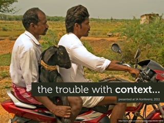
The trouble with context
1. the trouble with context...
presented at IA Konferenz, 2011
http://www.flickr.com/photos/procsilas/2833014872
2. things used to be
remarkably simple...
http://www.flickr.com/photos/lonelyfox/4815935744
3. public space distractions
location?
designing for mobile meant
understanding the ‘mobile context’
limited aention
glanceable?
one hand tiny screen
tedious input
personal
http://www.flickr.com/photos/oimax/3800475934
4. ...long day
only one hour left
oh no...forgot to go to the bank need a quick break
...its impact on
motivation
http://www.flickr.com/photos/7802947@N02/5547816310
5. playing a game
finding a bank nearby sending a text
checking the time of the next bus
...and on
behaviour
http://www.flickr.com/photos/7802947@N02/5547816310
7. “ Context is King: circumstances or conditions that surround
a person, place or thing. Content is of little value if it does
not address the context of where you are.
- Cameron Moll, SXSW, 2007
http://www.flickr.com/photos/webtreatsetc/4860505549/
8. “ Google (2007) breaks down mobile users
into three behaviour groups:
A. "Repetitive now"
B. "Bored now"
C. "Urgent now"
http://www.flickr.com/photos/webtreatsetc/4860505549/
9. “ Mobile user: typically on the go in an unpredictable
environment, interested in quick glanceable
information, focused on discrete individual tasks,
is often distracted.
- Joe Marini @ MIX 2010
http://www.flickr.com/photos/webtreatsetc/4860505549/
13. “ i love it! nice and clean look, easy to navigate
and easy to read. well done! but...can you put a
bit more news on there?
Source: Comments from readers regarding The Guardian’s new mobile web site http://www.flickr.com/photos/webtreatsetc/4860505549/
14. “ There should be a text only version of the
(desktop) site for those of us who don't like the
business of the main site.
Source: User talking about his habit of using the mobile Guardian site on his PC http://www.flickr.com/photos/webtreatsetc/4860505549/
15. “ ...mobile users want to see our menu, hours,
and delivery number...(but)...desktop users
definitely want to see this one megabyte PNG
of somebody smiling at a salad.
...for fun, Google
“Women Laughing
Alone With Salad”
Source: SitePoint Podcast: Responsive web design with Jeremy Keith http://www.flickr.com/photos/webtreatsetc/4860505549/
16. “ I’m definitely moving, I’m in a car. I’m going to look at your website.
This doesn’t mean my intent is to find an address, or quickly use
a news site...
Context can’t predict the way a user is going to use the site.
Mind reading is no way to base fundamental content decisions.
Source: Mark Kirby, The mobile context http://www.flickr.com/photos/webtreatsetc/4860505549/
17. so why this change?
and what does it all mean?
http://www.flickr.com/photos/marcoarment/2035853550
20. a free operating system (Android)
dual core ARM 9 @ 416MHz2G GSM/EDGE
2.8” QVGA resistive touch screen
2MP camera
GPS
WIFI and BlueTooth silicon
+ web browser
= <$90 components + plastic case Actions-Semi, MTK, TongXinDa , Rockchip...
~4 weeks to market!
http://casium.fr/component/kashyap/bc_detail/109
http://www.visionmobile.com/blog/2010/09/waking-the-dragon-the-rise-of-android-in-china-2/
http://www.flickr.com/photos/oskay/3300199882
21. despite this growth
smartphones are not yet
the majority
23%
Global smartphone penetration is only 23%...
http://www.visionmobile.com/blog/2011/04/100-million-club-2h10/
22. but the featurephone of today is
the smartphone of two years ago...
http://www.flickr.com/photos/tanj/4432327487
23. and (most of) the rest
can easily install one
85% of new handsets now include
a web browser
Source: Tomi Ahonen Consulting http://www.flickr.com/photos/johanl/4424185115
24. but connected devices
aren’t just small
http://www.flickr.com/photos/hendry/5491251497/
25. they’re whatever shape
we need them to be
http://www.flickr.com/photos/mackarus/4289960218
26. “
One of the interesting estimates is that there are
about 35 billion devices connected to the Internet.
Soon, there will be so many that we’ll stop
counting.
- Eric Schmidt, Google
http://www.flickr.com/photos/chelsea_nj/4223680604
27. ...which brings us to the present
</historical interlude>
even beer
than cake...
they spent about
an hour staring
like this...
28. “
The most profound technologies are those
that disappear. They weave themselves into
the fabric of everyday life until they are
indistinguishable from it.
- Mark Weiser (1991)
http://www.flickr.com/photos/armaggeusa/3176297283
29. 77%
of the planet
owns a mobile devices
or 5.3 billion at the end of 2010 – U.N. Telecommunications Agency, http://www.itu.int
30. 1.3 billion
already use the ‘mobile internet’
...includes WAP and ‘real web’ via Tomi Ahonen Consulting
31. ...and for 1/3 of us, a mobile device
is the only access point
Russia 19%
UK 22%
China 22%
USA 25%
India 59%
25% of Egypt 70%
American’s
don’t use the 2-3GB home ADSL
Internet at all data ~$100/mth,
~$2/mth PAYG unlimited
mobile data
~$17/mth
Indonesia 44%
S. Africa 57%
Based on “Users who never or infrequently use the desktop web”, Source: On Device Research, Dec 2010
Related: Opera mobile-only study specific to India (May 2011) and NY Times article on lack of Internet access in rural America (Feb 2011)
33. this is having a dramatic impact on
our behaviour and our expectations...
http://www.flickr.com/photos/williambrawley/4522648456
34. using the internet
is no longer “an activity”...
http://www.flickr.com/photos/whatcouldgowrong/5320553588
35. envir
onme
n t focused user
privacy
reliable
network
unlimited
data
with a fairly specific context
comfy chair
full-sized keyboard
work surface
reliable power source
http://www.flickr.com/photos/fuzzcat/22019163
36. ...people reach for the internet using whatever
device makes sense to them at that time
http://www.flickr.com/photos/ghewgill/5046616680
37. “ ...[the Kindle browser] is somewhat slow but
it definitely works, in fact my teen daughter
uses hers constantly...among other things
she uses it to keep in touch with her friends.
People discussing the Kindle browser on a message board
http://www.flickr.com/photos/ghewgill/5046616680
40. 80% use mobile during
miscellaneous downtime...
Source: Compete quarterly smartphone report, Jan 2010 http://www.flickr.com/photos/missmeng/5327470961
41. 80% use mobile while waiting
in line or for an appointment...
Source: Compete quarterly smartphone report, Jan 2010 http://www.flickr.com/photos/wonderdawg777/662293238
42. but the device and the context
no longer go hand-in-hand
43. mobile is increasingly being combined with longer
or completely ‘non-mobile’ activities...
44. 62% use mobile
while watching TV
Source: Compete quarterly smartphone report, Jan 2010 http://www.flickr.com/photos/bcmom/375125992
45. 69% use mobile for
point of sale research
while shopping
Source: Compete quarterly smartphone report, Jan 2010 http://www.flickr.com/photos/lollaping/3327541574
46. and mobile is also used
to time-shift
59% ...and follow up
sometimes on the PC
visit a site
on mobile
Source: Yahoo mobile shopping framework study
47. 34%
visit a site on
and follow-up
on mobile
the PC
Source: Yahoo mobile shopping framework study
48. Research on smartphone,
67% then buy in store.
and so on...
Research on smartphone,
23% then visit store to check
product out, then buy on PC.
Research on smartphone,
16% then visit store to check product
out, then buy on smartphone.
Visit store, then buy
9% on smartphone.
Source: The mobile movement study, Google
49. ...facilitating completion
of larger tasks
“The most expensive item sold via eBay’s
mobile app was a 1985 Piper PA-46-310P
Malibu airplane for $265,000.“ src: Mashable
http://en.wikipedia.org/wiki/Piper_PA-46
50. “The largest purchase on the M&S mobile
web site last Christmas was two sofas
costing over £3000 ($5000)“ src: Marketing Week
and important life decisions...
http://www.flickr.com/photos/plagevinilosyadhesivosdecorativos/5549366513
51. “ With current growth rates, Web access by people
on the move—via laptops and smart mobile devices—
is likely to exceed web access from desktop
computers within the next five years.
...or by 2015 - Source: ITU vis mobiThinking http://www.flickr.com/photos/whiteafrican/2938685296
52. public space
distractions
so while this is (still) ‘mobile’...
limited aention
glanceable?
one hand simple?
tedious input
personal
http://www.flickr.com/photos/oimax/3800475934
53. environment reliable
network
focused user
unlimited data
full-sized
it’s now also this...
keyboard
privacy
comfy work surface
chair
reliable power source
http://www.flickr.com/photos/othree/5224045406
54. focused
user
1hr train ride
privacy
reliable
network? comfy
unlimited wi ? chair
two
hands
reliable power source?
and this...
55. comfy
chair privacy
one hand
reliable power prone to
source interruptions
gravity
and maybe some of this?
http://www.flickr.com/photos/joeshlabotnik/2359224681
56. being mobile
it’s not just about...
your type of device...
your location...
your intent...
how long you’ve be there
your bandwidth...
http://www.flickr.com/photos/mujitra/4571580931
57. features
it’s just one of
the many ingredients
in our new reality...
constraints
mental
expectations
models
magic?
opportunities
familiarity
reach
responsibility
accessibility
http://www.flickr.com/photos/frenkieb/1449664622
58. and hopefully
a new way of thinking
http://www.flickr.com/photos/basheertome/5557362895
59. maybe what has been actual
is actually...not normal
http://www.flickr.com/photos/pagedooley/2121472112
60. ...our mental models
around ‘mobile’
(and the web)
and a great many other things
http://www.flickr.com/photos/amagill/26273015
61. display size/width
are1440 mere
a
historical accident...
1280
1024
512 x 342 1024 x 768
800
640
320 x 480
512 240 x 320
240
1984 1990 1994 1998 2004 2007
62. display size/width
public displays
32
and will continue to shift
????
1920
1024 x 768
1920 x 1080
1440
1280 600 x 1024
1024 768 x 1024 ????
800
640
240
1990 1994 1998 2004 2007 2011 201
63. creating
new cultural norms
“Sir, we’ll be landing soon. Could you please shut off your book?”
- Flight attendant, April 2011
64. until very soon
what was familiar to some...
http://www.flickr.com/photos/ubo_pakes/4472188820
65. pico-projector
will be unrecognisable
to others
http://www.flickr.com/photos/mattedgar/3724116027 http://www.youtube.com/watch?v=E0YVb3x2Amc
66. “For kids like my 13 year-old, the
boundaries between the internet and
life are so porous as to be meaningless.“
Comment on the Guardian web site
http://www.flickr.com/photos/tocaboca/5523598823
67. thank you
hello@yiibu.com
http://www.slideshare.net/yiibu
Part 2 of The trouble with context
can be found in Beyond the mobile web
(starting on slide 62)
http://slidesha.re/dURaVL