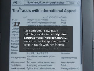
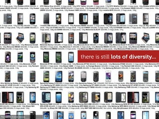
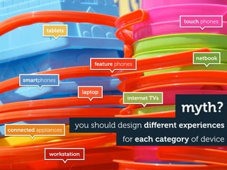
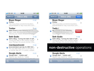
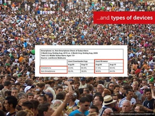
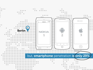
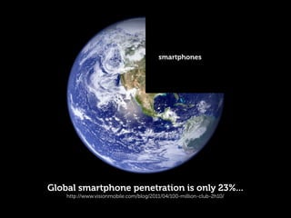
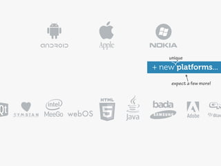
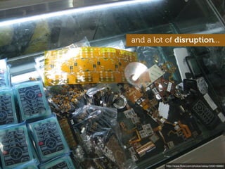
This document discusses the diversity of mobile devices and user experiences globally. It notes that while smartphones have gained popularity in some markets, global smartphone penetration remains only around 23% and the mobile experience varies greatly depending on location, device capabilities, and network infrastructure. This diversity is likely to continue as new platforms and low-cost devices disrupt the market.
Presented by Stephanie Rieger at Breaking Development in Dallas, April 11 2011 and Mobilism in Amsterdam, May 12, 2011.
Context is often cited as the single most important factor in design for the mobile medium. Mobile devices are of course 'mobile', but they are also small, always on, always with us, and can instantly connect us to the people we love. Mobile services must therefore be simple, social, and well-focussed--enabling us to quickly get things done on even the smallest screens.
This is all well and good, but mobile devices have changed. They may be mobile, but many have already stopped being 'phones'—nor do they resemble what we traditionally think of as computers. This presentation will explore how our use, and perception of mobile devices is changing, and how these changes may impact how we should design for them going forward.
The time is 2020. The inflection point has long passed. Most web traffic is now coming from some manner of portable device. And if Google Chairman Eric Schmidt (and many others’) predictions have come true, we will have truly reached time where “…[technology] will just be seamless. It will just be there. The web will be everything, and it will be nothing. It will be like electricity.”
This presentation challenges us to think about the role of the web going forward. What steps must we take to build a world where interactions with the web are truly “seamless”? What would a seamless web even look like? How can we ensure the web remains strong amidst all the new technologies that are on the way.
Presented on September 13 in London at Generate.
Midway through a project, a client of ours recently said "One thing I'm learning is that it's ok to give up on the desktop experience once it stops making sense". This wasn't an isolated incident. In fact, i'm beginning to think desktop web sites stopped making sense quite a while ago. We've just had nothing viable to replace them with. Mobile apps have given us a glimpse, but I think they're merely a glimpse into something bigger.
Mobile isn't merely a new stage in the evolution of the web, it's not even merely a new context, it's the very early stages of an entirely new system. A system that has already started to shape our environment, affect the way we live, how we choose to connect with others, and how we're able to spend our time. A system that is also slowly unravelling our assumptions and causing us to question the very reason we build web sites, why people visit them, and where the true value of the web actually lies.
Presented by Stephanie Rieger at Breaking Development in Orlando, Florida on April 17, 2012.
Some people say the web is dying, but I believe it’s just getting started. And what will kick it into overdrive is the Physical Web: the ability to discover, engage, and interact with smart devices (or that “dumb” tree over there) using nothing more than a browser.
In this presentation, we explore the impact these new capabilities may have on the way we design and think about this (increasingly near) future web.
Why You Should Make Mobile Your Career | Clark CollegeJason Grigsby
A variation of my talk on mobile strategy given to Clark College to encourage students to pursue mobile and to encourage the college to adopt mobile curriculum.
Designing for multiple devices - GA London, 19 Nov 2012Anna Dahlström
Slides from my class on November 19th 2012 at General Assembly in London about designing for multiple devices.
ABSTRACT
The rise in mobiles and tablets have changed the way we consume and interact with content, but also the way we design and what we base our design approach on. This class will teach you about the shift in user expectations, behaviour- and consumption patterns and what that means for designing products that will be used on multiple devices. Coming out of it you'll be equipped with guiding principles and tools to tackle the multiple device jungle.
Live streaming: Designing For Multiple Devices - GA, New York, 14 March 2013Anna Dahlström
Slides from my 1 hour live streaming class on March 14th at GA in New York
ABSTRACT
The rise in mobiles and tablets have changed the way we consume and interact with content, but also the way we design and what we base our design approach on. This class will teach you about the shift in user expectations, behaviour- and consumption patterns and what that means for designing products that will be used on multiple devices. Coming out of it you'll be equipped with guiding principles and tools to tackle the multiple device jungle.
Mobile UX 101 - current trends, behaviours, design considerations, common mistakes, platform choices and general advice for anyone entering the mobile design and development industry
Understanding UX: Designing for multiple devices - GA London, 18 Jan 2013Anna Dahlström
Slides from my 1 hour class on January 18th at General Assembly in London during the Understanding UX day.
ABSTRACT
The rise in mobiles and tablets have changed the way we consume and interact with content, but also the way we design and what we base our design approach on. This class will teach you about the shift in user expectations, behaviour- and consumption patterns and what that means for designing products that will be used on multiple devices. Coming out of it you'll be equipped with guiding principles and tools to tackle the multiple device jungle.
Best of GA: Designing For Multiple Devices - Google Campus, 26 Feb 2013Anna Dahlström
Slides from my 1 hour class on February 26th at Google Campus in London during the 'Best of GA' event.
ABSTRACT
The rise in mobiles and tablets have changed the way we consume and interact with content, but also the way we design and what we base our design approach on. This class will teach you about the shift in user expectations, behaviour- and consumption patterns and what that means for designing products that will be used on multiple devices. Coming out of it you'll be equipped with guiding principles and tools to tackle the multiple device jungle.
Designing For Multiple Devices - GA New York, 6 March 2013Anna Dahlström
Slides from my class on March 6th at GA in New York.
ABSTRACT
The rise in mobiles and tablets have changed the way we consume and interact with content, but also the way we design and what we base our design approach on. This class will teach you about the shift in user expectations, behaviour- and consumption patterns and what that means for designing products that will be used on multiple devices. Coming out of it you'll be equipped with guiding principles and tools to tackle the multiple device jungle.
Designing for multiple devices - GA London, 14 Jan 2013Anna Dahlström
Slides from my class on January 14 at General Assembly in London about designing for multiple devices.
ABSTRACT
The rise in mobiles and tablets have changed the way we consume and interact with content, but also the way we design and what we base our design approach on. This class will teach you about the shift in user expectations, behaviour- and consumption patterns and what that means for designing products that will be used on multiple devices. Coming out of it you'll be equipped with guiding principles and tools to tackle the multiple device jungle.
UCD14 Talk - Anna Dahlstrom - Device Agnostic Design: How to get your content...UCD UK Ltd
Anna Dahlstrom - Device Agnostic Design: How to get your content to go anywhere
There was a time when we did glossy page designs and when those designs were pretty much what we saw in our desktop browsers. With the introduction and rise of smartphones, tablets, phablets there isn't one view of our designs anymore.
Instead, what we create needs to be able to adapt in a way that is suitable for the device as well as where and how it’s being used.
With responsive design we've learnt the basics of how to adapt content, interactions and layouts so that it works across devices. But with further developments in technology and screens, our content is going to go anywhere. As a result we need to move away from designing for specific devices to solutions that are device agnostic. For us as UX designers this means means letting content rather than devices guide layouts, and also increasingly moving away from designing and wireframing pages to focusing on the modules that those views are made up of. But there are other aspects to consider in device agnostic design.
In this talk Anna will walk through why device agnostic design matters, what it means and how we go about it.
Designing For Multiple Devices - GA London, 04 Mar 2013Anna Dahlström
Slides from my class on the 4th of March at General Assembly in London.
ABSTRACT
The rise in mobiles and tablets have changed the way we consume and interact with content, but also the way we design and what we base our design approach on. This class will teach you about the shift in user expectations, behaviour- and consumption patterns and what that means for designing products that will be used on multiple devices. Coming out of it you'll be equipped with guiding principles and tools to tackle the multiple device jungle.
GA London - Designing for multiple devices, 28may2012Anna Dahlström
Slides from my class on May 28 2012 at General Assembly London on designing for multiple devices.
ABSTRACT
The rise in mobiles and tablets have changed the way we consume and interact with content, but also the way we design and what we base our design approach on. This class will teach you about the shift in user expectations, behaviour- and consumption patterns and what that means for designing products that will be used on multiple devices. Coming out of it you'll be equipped with guiding principles and tools to tackle the multiple device jungle.
Designing for multiple devices - GA, New York 08 Oct 2012Anna Dahlström
Slides from my class on October 8th 2012 at General Assembly in New York about designing for multiple devices.
ABSTRACT
The rise in mobiles and tablets have changed the way we consume and interact with content, but also the way we design and what we base our design approach on. This class will teach you about the shift in user expectations, behaviour- and consumption patterns and what that means for designing products that will be used on multiple devices. Coming out of it you'll be equipped with guiding principles and tools to tackle the multiple device jungle.
Designing for multiple devices, GA London - 01 Oct 2012Anna Dahlström
Slides from my class on October 1st 2012 at General Assembly London about designing for multiple devices.
ABSTRACT
The rise in mobiles and tablets have changed the way we consume and interact with content, but also the way we design and what we base our design approach on. This class will teach you about the shift in user expectations, behaviour- and consumption patterns and what that means for designing products that will be used on multiple devices. Coming out of it you'll be equipped with guiding principles and tools to tackle the multiple device jungle.
Designing for diversity - how to stop worrying and embrace the Android revol...yiibu
It took 16 years for smartphone penetration to reach 1 billion people. Analysts believe it will take only 3 years to reach the next billion. The devices these consumers buy will be incredibly diverse, yet many will run on Android; a platform that now sees more than 1.5 million activations per day.
In this presentation, we explore the fascinating rise of Android around the globe. From dual SIM phones in Indonesia, to dual screen e-ink devices in Russia and crowd-sourced platform modifications in China, we will discover the role open source has played in Android's popularity and how to design for such a diverse environment.
Designing for Windows Phone and other touchscreen devices - A presentation given at the recent BizSpark Camp event at Microsoft HQ in London on design and UX considerations for the upcoming Windows Phone
Mobile UX - the intricacies of designing for mobile devicesAntony Ribot
Covering mobile user experience in general and focusing on the little interface tweaks and interaction design that can make all the difference to a mobile application
With each passing day, our relationship with computers grows more personal. The touch of a human hand has replaced the mouse, and conversational interfaces now seem set to replace all manner of button or conventional interface. Is this pure hype, or a true step change in the evolution of personal computing?
In this workshop we will look at the current state of conversational interfaces, the challenges and benefits they bring, and where things are heading.
If your job is to make things for the web, and the company you work for doesn’t build fitness trackers, or robots, or smart light bulbs, or a cloud service that aims to connect all these things, you could be forgiven for not caring all that much about today's Internet of Things. My aim with this talk is to shift the conversation away from things and back to people. In doing so, I hope to also arm you with tools to better understand, and find your place, within this complex but fascinating landscape.
First presented at Generate Conference in San Francisco on July 15, 2016.
Today’s 'smart devices' are a product of the technology and mental models of our past. From a connected lightbulb to a robot vacuum, using most of these devices requires a native app. This in turn greatly limits their contexts of use. Can we really expect users to download an app to interact with a random ’thing’ they encounter at the mall, a space they explore for an hour at the museum, or a city they will only visit for a day? What devices could we build, what 'smart' environments could we enable if users could simply discover, “walk up and use”(and then if needed, abandon) these objects and environments as they do a web site?
This workshop will discuss two new technologies--Physical Web and Web Bluetooth--that can enable on-demand interaction with physical things and spaces using no more than a browser.
A brief exploration of proposed Level 4 Media Queries and some thoughts about the future of the web. Presented at Responsive Day Out in Brighton on June 27 2014.
The web was first conceived 25 years ago, by an Englishman. Fifteen years later, as the first crop of dot.coms were going bust, close to 60% of its users (and all Alexa "top 20" sites) came from developed nations. Fast forward to today, and the picture is strikingly different. Almost half the Alexa "top 20" now comes from emerging economies. Economies where close to 3 billion people have yet to use the web, but thanks to mobile--won't have to wait much longer to discover it. This presentation will introduce you to fascinating and innovative services that are re-shaping the web to serve the consumers of tomorrow. Driven by mobile, the power of personal relationships, and the breakneck pace of globalisation, these services provide a glimpse into the business models, opportunities and challenges we will face, when growing a truly global web.
Connector Corner: Automate dynamic content and events by pushing a buttonDianaGray10
Here is something new! In our next Connector Corner webinar, we will demonstrate how you can use a single workflow to:
Create a campaign using Mailchimp with merge tags/fields
Send an interactive Slack channel message (using buttons)
Have the message received by managers and peers along with a test email for review
But there’s more:
In a second workflow supporting the same use case, you’ll see:
Your campaign sent to target colleagues for approval
If the “Approve” button is clicked, a Jira/Zendesk ticket is created for the marketing design team
But—if the “Reject” button is pushed, colleagues will be alerted via Slack message
Join us to learn more about this new, human-in-the-loop capability, brought to you by Integration Service connectors.
And...
Speakers:
Akshay Agnihotri, Product Manager
Charlie Greenberg, Host
Builder.ai Founder Sachin Dev Duggal's Strategic Approach to Create an Innova...Ramesh Iyer
In today's fast-changing business world, Companies that adapt and embrace new ideas often need help to keep up with the competition. However, fostering a culture of innovation takes much work. It takes vision, leadership and willingness to take risks in the right proportion. Sachin Dev Duggal, co-founder of Builder.ai, has perfected the art of this balance, creating a company culture where creativity and growth are nurtured at each stage.
State of ICS and IoT Cyber Threat Landscape Report 2024 previewPrayukth K V
The IoT and OT threat landscape report has been prepared by the Threat Research Team at Sectrio using data from Sectrio, cyber threat intelligence farming facilities spread across over 85 cities around the world. In addition, Sectrio also runs AI-based advanced threat and payload engagement facilities that serve as sinks to attract and engage sophisticated threat actors, and newer malware including new variants and latent threats that are at an earlier stage of development.
The latest edition of the OT/ICS and IoT security Threat Landscape Report 2024 also covers:
State of global ICS asset and network exposure
Sectoral targets and attacks as well as the cost of ransom
Global APT activity, AI usage, actor and tactic profiles, and implications
Rise in volumes of AI-powered cyberattacks
Major cyber events in 2024
Malware and malicious payload trends
Cyberattack types and targets
Vulnerability exploit attempts on CVEs
Attacks on counties – USA
Expansion of bot farms – how, where, and why
In-depth analysis of the cyber threat landscape across North America, South America, Europe, APAC, and the Middle East
Why are attacks on smart factories rising?
Cyber risk predictions
Axis of attacks – Europe
Systemic attacks in the Middle East
Download the full report from here:
https://sectrio.com/resources/ot-threat-landscape-reports/sectrio-releases-ot-ics-and-iot-security-threat-landscape-report-2024/
Smart TV Buyer Insights Survey 2024 by 91mobiles.pdf91mobiles
91mobiles recently conducted a Smart TV Buyer Insights Survey in which we asked over 3,000 respondents about the TV they own, aspects they look at on a new TV, and their TV buying preferences.
Encryption in Microsoft 365 - ExpertsLive Netherlands 2024Albert Hoitingh
In this session I delve into the encryption technology used in Microsoft 365 and Microsoft Purview. Including the concepts of Customer Key and Double Key Encryption.
Kubernetes & AI - Beauty and the Beast !?! @KCD Istanbul 2024Tobias Schneck
As AI technology is pushing into IT I was wondering myself, as an “infrastructure container kubernetes guy”, how get this fancy AI technology get managed from an infrastructure operational view? Is it possible to apply our lovely cloud native principals as well? What benefit’s both technologies could bring to each other?
Let me take this questions and provide you a short journey through existing deployment models and use cases for AI software. On practical examples, we discuss what cloud/on-premise strategy we may need for applying it to our own infrastructure to get it to work from an enterprise perspective. I want to give an overview about infrastructure requirements and technologies, what could be beneficial or limiting your AI use cases in an enterprise environment. An interactive Demo will give you some insides, what approaches I got already working for real.
Essentials of Automations: Optimizing FME Workflows with ParametersSafe Software
Are you looking to streamline your workflows and boost your projects’ efficiency? Do you find yourself searching for ways to add flexibility and control over your FME workflows? If so, you’re in the right place.
Join us for an insightful dive into the world of FME parameters, a critical element in optimizing workflow efficiency. This webinar marks the beginning of our three-part “Essentials of Automation” series. This first webinar is designed to equip you with the knowledge and skills to utilize parameters effectively: enhancing the flexibility, maintainability, and user control of your FME projects.
Here’s what you’ll gain:
- Essentials of FME Parameters: Understand the pivotal role of parameters, including Reader/Writer, Transformer, User, and FME Flow categories. Discover how they are the key to unlocking automation and optimization within your workflows.
- Practical Applications in FME Form: Delve into key user parameter types including choice, connections, and file URLs. Allow users to control how a workflow runs, making your workflows more reusable. Learn to import values and deliver the best user experience for your workflows while enhancing accuracy.
- Optimization Strategies in FME Flow: Explore the creation and strategic deployment of parameters in FME Flow, including the use of deployment and geometry parameters, to maximize workflow efficiency.
- Pro Tips for Success: Gain insights on parameterizing connections and leveraging new features like Conditional Visibility for clarity and simplicity.
We’ll wrap up with a glimpse into future webinars, followed by a Q&A session to address your specific questions surrounding this topic.
Don’t miss this opportunity to elevate your FME expertise and drive your projects to new heights of efficiency.
UiPath Test Automation using UiPath Test Suite series, part 3DianaGray10
Welcome to UiPath Test Automation using UiPath Test Suite series part 3. In this session, we will cover desktop automation along with UI automation.
Topics covered:
UI automation Introduction,
UI automation Sample
Desktop automation flow
Pradeep Chinnala, Senior Consultant Automation Developer @WonderBotz and UiPath MVP
Deepak Rai, Automation Practice Lead, Boundaryless Group and UiPath MVP
DevOps and Testing slides at DASA ConnectKari Kakkonen
My and Rik Marselis slides at 30.5.2024 DASA Connect conference. We discuss about what is testing, then what is agile testing and finally what is Testing in DevOps. Finally we had lovely workshop with the participants trying to find out different ways to think about quality and testing in different parts of the DevOps infinity loop.
Key Trends Shaping the Future of Infrastructure.pdfCheryl Hung
Keynote at DIGIT West Expo, Glasgow on 29 May 2024.
Cheryl Hung, ochery.com
Sr Director, Infrastructure Ecosystem, Arm.
The key trends across hardware, cloud and open-source; exploring how these areas are likely to mature and develop over the short and long-term, and then considering how organisations can position themselves to adapt and thrive.
Transcript: Selling digital books in 2024: Insights from industry leaders - T...BookNet Canada
The publishing industry has been selling digital audiobooks and ebooks for over a decade and has found its groove. What’s changed? What has stayed the same? Where do we go from here? Join a group of leading sales peers from across the industry for a conversation about the lessons learned since the popularization of digital books, best practices, digital book supply chain management, and more.
Link to video recording: https://bnctechforum.ca/sessions/selling-digital-books-in-2024-insights-from-industry-leaders/
Presented by BookNet Canada on May 28, 2024, with support from the Department of Canadian Heritage.
JMeter webinar - integration with InfluxDB and GrafanaRTTS
Watch this recorded webinar about real-time monitoring of application performance. See how to integrate Apache JMeter, the open-source leader in performance testing, with InfluxDB, the open-source time-series database, and Grafana, the open-source analytics and visualization application.
In this webinar, we will review the benefits of leveraging InfluxDB and Grafana when executing load tests and demonstrate how these tools are used to visualize performance metrics.
Length: 30 minutes
Session Overview
-------------------------------------------
During this webinar, we will cover the following topics while demonstrating the integrations of JMeter, InfluxDB and Grafana:
- What out-of-the-box solutions are available for real-time monitoring JMeter tests?
- What are the benefits of integrating InfluxDB and Grafana into the load testing stack?
- Which features are provided by Grafana?
- Demonstration of InfluxDB and Grafana using a practice web application
To view the webinar recording, go to:
https://www.rttsweb.com/jmeter-integration-webinar
4. this was ‘portable’...
<10 years...
Released: 1998 Released: 2007
CPU: 233 MHz CPU: 412 MHz
RAM: 32 MB (512 MB max) RAM: 128 MB
Storage: 4 GB (+ optical drive) Storage: 4 GB (8 GB max)
Display: 38.1 cm Millions of colours Display: 8.9 cm Millions of colours
Dimensions: 40.1 x 38.6 x 44.7 cm Dimensions: 11.4 x 6.1 x 1.2 cm
Weight: 17.3 kgs Weight: 135 g
5. Your mobile phone has
more computing power than
all of NASA in 1969.
http://www.flickr.com/photos/43533334@N07/5153726732
6. NASA put a man on the moon.
http://history.nasa.gov/ap11ann/kippsphotos/apollo.html
7. ...We put a bird into pigs.
– @moskovich
http://www.flickr.com/photos/denisdervisevic/4568726847
8. over 100 million
iPhones sold*
hp://en.wikipedia.org/wiki/iPhone
On March 2, 2011, at the iPad 2 event, Apple announced that they have sold 100 million iPhones.
http://www.flickr.com/photos/36340796@N05/4862291108
23. Other
7%
HTC
8%
Nokia
Motorola 34%
4%
Sony Ericsson
3%
RIM
16%
Huawei
1%
Apple
16% Samsung
ZTE
LG 8%
1%
2%
Smartphone market share by handset OEM (2010)
Source: VisionMobile blog, Gartner, vendor releases
27. "The future is already here
– it’s just not evenly distributed."
– William Gibson
majority of people don’t
have ‘smartphones’...
http://www.flickr.com/photos/centralasian/3239065547
28. ...why all this diversity?
(and why it’s likely to stick around)
35. and a lot of disruption...
http://www.flickr.com/photos/oskay/3300199882
36. a free operating system (Android)
dual core ARM 9 @ 416MHz2G GSM/EDGE
2.8” QVGA resistive touch screen
2MP camera
GPS
+ WIFI and BlueTooth silicon
= <$90 components + plastic case Actions-Semi, MTK, TongXinDa , Rockchip...
~4 weeks to market!
http://casium.fr/component/kashyap/bc_detail/109
http://www.visionmobile.com/blog/2010/09/waking-the-dragon-the-rise-of-android-in-china-2/
http://www.flickr.com/photos/oskay/3300199882
37. yet again
however, things may change...
...disruption?
Do Not Anger the Alpha Android
http://www.businessweek.com/magazine/content/11_15/b4223041200216.htm
http://www.flickr.com/photos/aturkus/255736909
38. the feature phone of today is
the smartphone from two years ago...
http://www.flickr.com/photos/tanj/4432327487
39. Diversity is a reality and will likely persist,
causing us to decide which platforms breakout #1
(and consequently users) are “worthy” of
our design time.
We’re already seeing some designers
choose to only design for the newest or
most powerful platforms as these
(apparently) provide the very best
experience (e.g gestures, performance etc).
Do you feel this a realistic approach or
simply a cop out?
How do we reconcile inclusion and
accessibility with the need to provide
a great user experience?
http://www.flickr.com/photos/plings/4727867959
42. public space
distractions
limited aention
mobile used to mean this...
glanceable?
one hand simple?
tedious input
personal
http://www.flickr.com/photos/oimax/3800475934
43. inconsistent limited
networks baery life
limited
display +
memory
limited
CPU
varied manipulation
methods
varied form factors
varied input methods
and this...
http://www.flickr.com/photos/hendry/2996622778
44. envir
onme
n t focused user
privacy
reliable
network
unlimited
data
everything else was ‘not mobile’...
comfy chair
full-sized keyboard
work surface
reliable power source
http://www.flickr.com/photos/fuzzcat/22019163
46. environment
focused user
reliable
network
unlimited
data
mobile is now also this...
privacy
full-sized work surface
keyboard
comfy chair
reliable power source
http://www.flickr.com/photos/othree/5224045406
47. 1hr train ride focused user
privacy
reliable
network? comfy
unlimited wifi? chair
two
hands
reliable power source?
or this...
48. comfy
chair privacy
one hand
reliable power prone to
source interruptions
gravity
...and what do you call this?
http://www.flickr.com/photos/joeshlabotnik/2359224681
50. what was once targeted
to specific activities
business
video
music
something else...?
51. a big screen...
web browser
+
is now a highly customisable
application
layer always on, always connected
+ blank canvas...
APIs
with a buon or two!
52. camera
a big screen...
work communication
play
sharing
web browser
learning
+
enabling users to choose
application
layer music their own experience
+
APIs
escape
chat
navigation
discovery
with a buon or two!
creativity
video
53. so what we call ‘mobile context’
is increasingly hard to pin down
54. placing an inventory order
playing Bejeweled updating Facebook
mobile context
http://www.flickr.com/photos/7802947@N02/5547816310
55. mobile context
booking a last minute trip to New York
$ git clone ...
browsing Flickr
http://www.flickr.com/photos/mujitra/4571580931
56. writing the next chapter in her novel
buying a home...
flirting with her husband
mobile context
http://www.flickr.com/photos/razorshine/4662188057
58. 80% use mobile during
miscellaneous downtime
Source: Compete quarterly smartphone report, Jan 2010 http://www.flickr.com/photos/missmeng/5327470961
59. 76% use mobile while waiting
in queues or for appointments
Source: Compete quarterly smartphone report, Jan 2010 http://www.flickr.com/photos/wonderdawg777/662293238
60. mobile is also increasingly being combined
with other activities
61. 62% use their mobile while
watching television...
Source: Compete quarterly smartphone report, Jan 2010 http://www.flickr.com/photos/bcmom/375125992
62. 69% use mobile for
point of sale research
Source: Compete quarterly smartphone report, Jan 2010 http://www.flickr.com/photos/lollaping/3327541574
63. mobile is also used
to time shift...
59% ...and follow up
sometimes on the PC
visit a site
on mobile
Source: Yahoo
64. 34%
visit a site on
and follow-up
on mobile
the PC
Source: Yahoo
65. ...facilitating completion
of much larger tasks
“The most expensive item sold via eBay’s
mobile app was a 1985 Piper PA-46-310P
Malibu airplane for $265,000. “ src: Mashable
http://en.wikipedia.org/wiki/Piper_PA-46
66. “The largest purchase on the M&S mobile
web site last Christmas was two sofas
costing over £3000 ($5000) “ src: Marketing Week
and larger life decisions...
http://www.flickr.com/photos/plagevinilosyadhesivosdecorativos/5549366513
67. some services are even enabling users
to “blur the boundaries between
the past, present and future”
http://www.flickr.com/photos/chelsea_nj/4223680604
68. “ ...[Flirtomatic is] like time travel flirting...
http://www.flickr.com/photos/rolandslakis/99196316
69. breakout #2
What defines context when designing
for connected devices?
Is it the device itself (e.g. a tablet, a
smartphone, an eReader), or the very
act of being mobile?
Or is it something different altogether?
http://www.flickr.com/photos/plings/4727853585
71. a few mobile myths...
http://www.flickr.com/photos/frenchy/3375938488
72. myth
...most device have touch screens
(or will any day now)
http://www.flickr.com/photos/jcfrog/4692750598
73. there is still lots of diversity...
The first 100 Android devices
74. back key
some element of indirect
manipulation is default on
track ball the majority of Android devices...
+ many BlackBerry and Windows Phones
http://www.flickr.com/photos/johanl/4382372758
75. feature phone diversity
touch
screen
tiny hybrid
screen +
keypad
input large
navipad touch
screen
many of these are now < $50
...are they a smartphone or a featurephone?
yesterday today
76. touch phones
tablets
netbook
feature phones
smartphones
laptop
internet TVs
myth?
you should design different experiences
connected appliances
for each category of device
workstation
77. netbook
laptop tablet
categories are constantly morphing...
*and yes, this is in fact one device...
78. is this the interaction
you planned for?
iPad 2 magnets are apparently
strong enough to ‘natively’ do this! plan (and test) for diversity
in form factor and behaviour...
http://www.flickr.com/photos/mattedgar/3724116027 http://tumblr.topherhulett.com/post/3902283232/i-know-you-were-wondering-yes-the-magnets-in
83. and while some are intuitive...
http://www.flickr.com/photos/williambrawley/4314746893
84. others require
clear cues and practice...
http://lukew.com/touch
85. “
...problem is that gestures are like 21st century
command lines. You need to know them to use them.
– @kateho
http://www.flickr.com/photos/_dchris/4652995362
86. “
...anything you can show and touch
can be a UI...there are no standards
and no expectations.
- Don Norman, Gestural interfaces: A step backwards
http://www.flickr.com/photos/jordanfischer/61429449/
96. hijacking native
browser gestures...
touchStart
touchCancel touchMove
touchEnd
the fewest (programmable) gestures
are found in the browser*...
http://www.flickr.com/photos/fontourist/4559491659
97. breakout #3
How far can we take the natural
interface?
Do we foresee a day where all
interactions will be performed through
touch?
What alternatives should we explore
going forward?
http://www.flickr.com/photos/plings/4728486842
99. ...why even talk about
the mobile web?
http://www.flickr.com/photos/adactio/932798536
100. “
The most profound technologies are those
that disappear. They weave themselves
into the fabric of everyday life until they are
indistinguishable from it…. - Mark Weiser
http://www.flickr.com/photos/armaggeusa/3176297283
101. the web is the common thread
across most devices...
103. 85% of new handsets will include
a web browser by 2011
Source: Tomi Ahonen Consulting
104. so people reach for the web
using whatever device makes sense
to them at that time...
105. “ It is somewhat slow but it
definitely works, in fact my teen
daughter uses hers constantly...
among other things she uses it to
keep in touch with her friends.
People discussing the Kindle browser on a message board
106. but it doesn’t all
just happen here...
http://www.flickr.com/photos/diloz/5023417436
107. people use the mobile web
across all brands...
source comScore MobiLens
http://www.flickr.com/photos/pictfactory/2796367140
108. ...and types of devices
source comScore MobiLens
http://www.flickr.com/photos/pictfactory/2796367140
109. mobile is the only
access point for 1/3
of internet users
Russia 19%
UK 22%
China 22%
USA 25%
India 59%
Egypt 70%
home ADSL
~$100/mth,
PAYG unlimited
S. Africa 57% mobile data
~$17/mth
Indonesia 44%
Users who never or infrequently use the desktop web, Source: On Device Research, Dec 2010
110. “ With current growth rates, Web access by people
on the move — via laptops and smart mobile devices –
is likely to exceed web access from desktop computers
within the next five years.
...or by 2015 - Source: ITU vis mobiThinking http://www.flickr.com/photos/whiteafrican/2938685296
111. proxy
browser there are more than 60
lots of
versions
different types/versions
lots of
versions of mobile browsers...
these are the
most common
SkyFire
small install
base
UC Web Firefox OperaMini
end-of-life
proxy
lots of proxy browser
Windows Mobile browser
versions
end-of-life
new
Obigo end-of-life
Platform browsers Add-on browsers
112. ...a growing number of
them are based on WebKit
most S40 as of v6.0
as of
as of 2006 2009
WebKit
113. but there is still lots
of fragmentation...
http://www.flickr.com/photos/wwworks/2472230611
114. the number of mobile optimised
sites is hard to estimate...
http://www.flickr.com/photos/idletype/430895151
115. often separate mobile
site(s) are created...
http://www.alistapart.com/articles/responsive-web-design
http://m.alistapart.com/articles/responsive-web-design
redirect
to m.* sub-domain...
117. can result in lots of redirects
broken links, and exclusion...
http://www.flickr.com/photos/arhadetruit/4428714535
118. others may opt for a more
responsive design...
http://colly.com
one url for everyone = One Web
119. ...or use web technologies to
mimic native experiences
120. very
on the web people have different expectations...
...app or web site?
http://www.flickr.com/photos/williambrawley/4522648456
121. “If I can’t see your awesome
web site...it’s not really that
awesome is it?”
access has become an
aspect of user experience...
http://www.flickr.com/photos/zoetnet/4669800101/
122. breakout #4
Native apps are (for better or worse)
tied to specific platforms and devices.
Should the web be different?
Does access to content on the internet
amount to a human right? Should access
to content from any device become a
matter of legislation and accessibility?
http://www.flickr.com/photos/plings/4728502636
126. “For kids like my 13 year-old, the
boundaries between the internet
and life are so porous as to be
meaningless. “
Comment on the Guardian web site
most will grow up connected
http://www.flickr.com/photos/tocaboca/5523598823
127. interfaces will be more natural
http://www.flickr.com/photos/carbonnyc/4213684953
128. mental models will change
http://www.flickr.com/photos/marcoarment/2035853550
129. often wonderful
a few mistakes will be made
http://www.flickr.com/photos/hazelwood09/3918982930
130. the world will be faster
http://www.flickr.com/photos/kimtaro/324573453
132. and a little magic
http://www.flickr.com/photos/orinrobertjohn/194302673
133. http://speirs.org/blog/2011/4/1/stop-lying.html
This is the world we are living in and we can either
lie to ourselves about it or we can dive headlong
into the new forms and effects that it produces.
– James Bridle
http://www.flickr.com/photos/tijanav/4885088185
134. ...what don’t we know?
http://www.flickr.com/photos/perfectoinsecto/4871175954
135. ...will it add meaning?
http://www.flickr.com/photos/wonderlane/5333152421
136. ...will it bring us closer together?
http://www.flickr.com/photos/wwworks/3156948184
137. ...will we all participate equally?
http://www.flickr.com/photos/goincase/4647893507
138. ...and how will it make us feel?
http://www.flickr.com/photos/mckeyhan/3356570061
139. breakout #5
Many of us will have an opportunity
to shape the devices, behaviours,
and experiences of tomorrow.
What will we choose to do?
http://www.flickr.com/photos/plings/4727843227