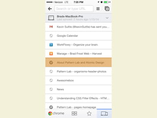
Download to read offline


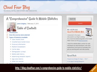


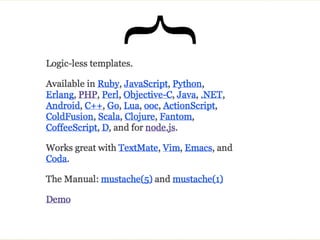


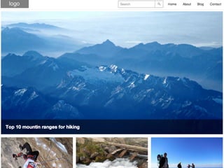

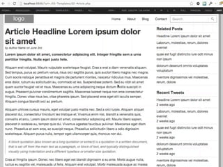
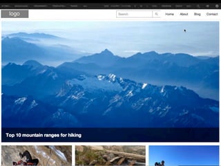
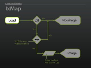
![PIPING IN REAL CONTENT WITH JSON
code block"hero" : [
{
"img": {
"landscape-16x9": {
"src": "images/sample/mountains.jpg",
"alt": "Mountains"
}
},
"headline" : {
"medium" : "Top 10 mountin ranges for hiking"
}
}
],
"touts" : [
{
"img": {
"landscape-4x3": {
"src": "../../images/sample/climber.jpg",
"alt": "Climber"
}
},
"headline" : {](https://image.slidesharecdn.com/codecreativityworkshop1-140506164731-phpapp01/85/Responsive-Design-Beyond-Code-Creativity-Workshop-383-320.jpg)


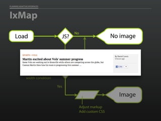


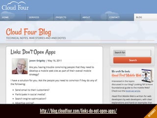
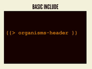
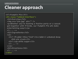
![PLANNING ADAPTIVE INTERFACES
CSS at rest
[data-image-src] {
display: none;
}](https://image.slidesharecdn.com/codecreativityworkshop1-140506164731-phpapp01/85/Responsive-Design-Beyond-Code-Creativity-Workshop-632-320.jpg)
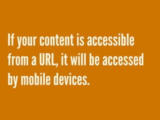
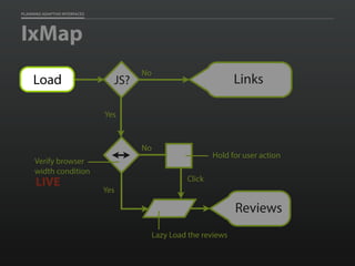
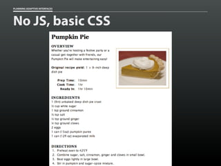
![PLANNING ADAPTIVE INTERFACES
CSS at play
[data-image-src][data-image-loaded] {
display: block;
}](https://image.slidesharecdn.com/codecreativityworkshop1-140506164731-phpapp01/85/Responsive-Design-Beyond-Code-Creativity-Workshop-633-320.jpg)


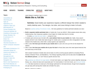
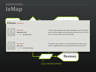
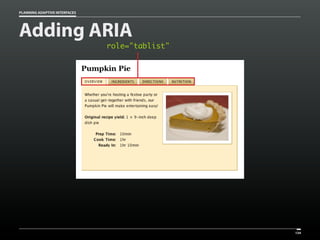
![PLANNING ADAPTIVE INTERFACES
JS Watcher
window.watchResize(function(){
var threshold = 400,
image = document.createElement('img'),
paragraphs = document.getElementsByTagName('p'),
i = paragraphs.length,
p, loaded, src, img;
if ( browser_width >= threshold ) {
image.setAttribute('alt','');
while ( i-- ) {
p = paragraphs[i];
src = p.getAttribute('data-image-src');
loaded = p.getAttribute('data-image-loaded');
if ( src != null && loaded == null ) {
img = image.cloneNode(true);
img.setAttribute('src',src);
p.appendChild( img );
p.setAttribute('data-image-loaded','');
}
}
image = paragraphs = p = img = null;
}
});](https://image.slidesharecdn.com/codecreativityworkshop1-140506164731-phpapp01/85/Responsive-Design-Beyond-Code-Creativity-Workshop-636-320.jpg)

![PLANNING ADAPTIVE INTERFACES
Smart CSS
[data-image-src][data-image-loaded] {
display: block;
}](https://image.slidesharecdn.com/codecreativityworkshop1-140506164731-phpapp01/85/Responsive-Design-Beyond-Code-Creativity-Workshop-638-320.jpg)
![PLANNING ADAPTIVE INTERFACES
Smart CSS
[data-image-src][data-image-loaded] {
display: block;
}
@media only screen and (min-width:400px) {
[data-img-src][data-image-loaded] {
display: block;
}
}](https://image.slidesharecdn.com/codecreativityworkshop1-140506164731-phpapp01/85/Responsive-Design-Beyond-Code-Creativity-Workshop-639-320.jpg)


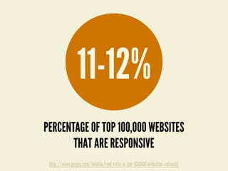
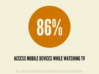
The document discusses the evolving technology landscape, particularly focusing on mobile web strategies and the principles of responsive and adaptive design. It highlights the significant growth in mobile usage and its impact on web development, emphasizing the necessity of making content accessible across various devices. Additionally, it covers best practices for creating user-friendly mobile experiences, including the importance of performance and flexibility in design.


![Delivering Critical Information and Services [JavaScript & Friends 2021]](https://cdn.slidesharecdn.com/ss_thumbnails/deliveringcriticalinformationandservicesjavascriptfriends2021-210513212454-thumbnail.jpg?width=640&height=640&fit=bounds)
![Adapting to Reality [Guest Lecture, March 2021]](https://cdn.slidesharecdn.com/ss_thumbnails/adaptingtorealitybrowsertechnologiesguestlecture-210311215856-thumbnail.jpg?width=640&height=640&fit=bounds)
![Designing the Conversation [Beyond Tellerrand 2019]](https://cdn.slidesharecdn.com/ss_thumbnails/designingtheconversationbeyondtellerrand2019-191115005417-thumbnail.jpg?width=640&height=640&fit=bounds)
![Getting Started with Progressive Web Apps [Beyond Tellerrand 2019]](https://cdn.slidesharecdn.com/ss_thumbnails/gettingstartedwithprogressivewebapps-191113063610-thumbnail.jpg?width=640&height=640&fit=bounds)

![Media in the Age of PWAs [ImageCon 2019]](https://cdn.slidesharecdn.com/ss_thumbnails/mediaintheageofpwasimagecon2019-190502180729-thumbnail.jpg?width=640&height=640&fit=bounds)
![Adapting to Reality [Starbucks Lunch & Learn]](https://cdn.slidesharecdn.com/ss_thumbnails/adaptingtorealitystarbuckslunchlearn-190327234123-thumbnail.jpg?width=640&height=640&fit=bounds)
![Conversational Semantics for the Web [CascadiaJS 2018]](https://cdn.slidesharecdn.com/ss_thumbnails/conversationalsemanticsfortheweb-181116232055-thumbnail.jpg?width=640&height=640&fit=bounds)
![Better Performance === Greater Accessibility [Inclusive Design 24 2018]](https://cdn.slidesharecdn.com/ss_thumbnails/betterperformancegreateraccessibility-181113020711-thumbnail.jpg?width=640&height=640&fit=bounds)
![PWA: Where Do I Begin? [Microsoft Ignite 2018]](https://cdn.slidesharecdn.com/ss_thumbnails/pwa-wheredoibeginmicrosoftignite2018-180928155323-thumbnail.jpg?width=640&height=640&fit=bounds)
![Designing the Conversation [Concatenate 2018]](https://cdn.slidesharecdn.com/ss_thumbnails/designingtheconversationconcatenate2018-180810154426-thumbnail.jpg?width=640&height=640&fit=bounds)
![Designing the Conversation [Accessibility DC 2018]](https://cdn.slidesharecdn.com/ss_thumbnails/designingtheconversationaccessibilitydc2018-180806175332-thumbnail.jpg?width=640&height=640&fit=bounds)
![Performance as User Experience [AEADC 2018]](https://cdn.slidesharecdn.com/ss_thumbnails/performanceasuserexperienceaeadc2018-180806174424-thumbnail.jpg?width=640&height=640&fit=bounds)

![Performance as User Experience [AEA SEA 2018]](https://cdn.slidesharecdn.com/ss_thumbnails/performance-as-user-experience-180409182414-thumbnail.jpg?width=640&height=640&fit=bounds)
![Performance as User Experience [An Event Apart Denver 2017]](https://cdn.slidesharecdn.com/ss_thumbnails/performanceasuserexperienceaeaden2017-171212234737-thumbnail.jpg?width=640&height=640&fit=bounds)


![Designing the Conversation [Paris Web 2017]](https://cdn.slidesharecdn.com/ss_thumbnails/designingtheconversationparisweb-171011181500-thumbnail.jpg?width=640&height=640&fit=bounds)
![Exploring Adaptive Interfaces [Generate 2017]](https://cdn.slidesharecdn.com/ss_thumbnails/exploringadaptiveinterfacesgenerate2017-170922213042-thumbnail.jpg?width=640&height=640&fit=bounds)


