A Future Friendly Web
•
3 likes•1,371 views

A presentation I held at "Betabeers Valencia" on 25th April 2013 at Workether. (http://betabeers.com/event/betabeers-valencia-840/) It's about the changing technology landscape and covers paradigms how we can better prepare our websites for the future. I included much of the material that is listed on the website of the Future Friendly initiative: http://futurefriend.ly

Recommended
More Related Content
What's hot
What's hot (14)
Similar to A Future Friendly Web
Similar to A Future Friendly Web (20)
Recently uploaded
Recently uploaded (20)
A Future Friendly Web
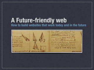
- 1. A Future-friendly web How to build websites that work today and in the future
- 2. MARCEL
- 3. KALVERAM Web
- 4. developer
- 5. from
- 7. MARCEL
- 8. KALVERAM Web
- 9. developer
- 10. from
- 12. MARCEL
- 13. KALVERAM Web
- 14. developer
- 15. from
- 17. MARCEL
- 18. KALVERAM Web
- 19. developer
- 20. from
- 22. A Future-friendly web How to build websites that work today and in the future
- 24. The web‘s major strength is its ubiquity!
- 26. But does the everywhere web work on every device?
- 27. In 2012, less than 10% of the web was Mobile Ready90% 10% Mongoose Metrics Data Series 2012 - Mobile Readyness Study (http://www.mongoosemetrics.com/research)
- 28. Habemus problema Mobile confronts us with a lot of new challenges
- 29. The increasing diversity of devices reveals how unflexible our traditional fixed-width, desktop-centric approach has been. PROBLEM 1
- 30. The increasing diversity of devices reveals how unflexible our traditional fixed-width, desktop-centric approach has been. PROBLEM 1 10% 90%
- 31. The increasing diversity of devices reveals how unflexible our traditional fixed-width, desktop-centric approach has been. PROBLEM 1 10% 90%
- 32. Lack of time Bad connectivity Lack of interest Insufficient memory Distractions / interruptions Low battery PROBLEM 2
- 33. By relying on and optimizing for proprietary solutions or specific technologies, we lock out millions of users. PROBLEM 3
- 34. By relying on and optimizing for proprietary solutions or specific technologies, we lock out millions of users. PROBLEM 3
- 35. 28% 33% 27% 82% 55% 45% Mobile Broadband Subscriptions - Penetration ICT Facts and Figures 2013 (UN agency for information and communication technologies) Global mobile growth rates - CAGR (2010 - 2013) 39%
- 36. Part
- 37. of
- 38. the
- 39. problem
- 40. is
- 41. the
- 42. closed
- 43. development
- 44. ecosystems of
- 45. iOS
- 46. and
- 47. Android; Gary Kovacs, CEO of Mozilla With
- 48. Web-based
- 49. Firefox
- 50. mobile
- 51. OS, Mozilla
- 52. hopes
- 53. to
- 54. open
- 55. the
- 56. ecosystem and
- 57. spark
- 58. innovation „ “
- 59. 0 17,5 35 52,5 70 2009 2010 2011 2012 2013 Android iOS Others Global Statscounter (Top 9 mobile browsers from 2009 to 2013) Mobile platforms - Evolution of market share (in percent)
- 60. 2014 2015 2016 2017 Android iOS Others Web Based Mobile platforms - Evolution of market share (in percent) - The Future? 2013
- 61. Embracing the unpredictable A short journey through today‘s device landscape
- 63. OLD REUSED DEVICES
- 68. OPEN
- 69. DEVICE
- 70. LABS Access
- 71. a
- 72. variety
- 73. of
- 74. devices.
- 75. worldwide.
- 76. for
- 77. free.
- 78. Existing paradigms that solve today‘s problems
- 85. DESIGN UI
- 87. INTERACTIVITY
- 92. DESIGN UI
- 94. INTERACTIVITY
- 99. DESIGN UI
- 101. INTERACTIVITY
- 102. HTML CSS JS CONTENT
- 104. STRUCTURE FORMATTING
- 106. DESIGN UI
- 108. INTERACTIVITY
- 110. FLUID LAYOUTS FLEXIBLE IMAGES MEDIA QUERIES
- 112. min-width: 20em
- 115. Robust, backwards-compatible websites Experiences that won‘t break Support future standards
- 116. Are today‘s websites going to work on tomorrow‘s devices ?
- 117. 3D INTERFACES GESTURES AUGMENTED REALITY EYE-TRACKING TECHNOLOGY BRAIN-TRACKING TECHNOLOGY
- 118. Evolving paradigms that might solve tomorrow‘s problems
- 121. Get
- 122. your
- 123. content
- 124. ready
- 125. to
- 126. go
- 127. anywhere
- 128. because
- 129. it’s
- 130. going
- 131. to
- 132. go
- 134. COPE CMS API LAYER Separate content from display Make Content portable No Markup No Formatting Create Once Publish Everywhere Access content everywhere
- 135. Are the CMSs you have worked with ready for this evolution?
- 136. client
- 137. will
- 138. find
- 139. a
- 140. way
- 141. to
- 142. screw
- 143. it
- 144. up Try to get past WYSIWYG editors
- 145. THE
- 146. EXAMPLARY
- 147. CASE
- 148. OF THE
- 149. NPR
- 150. API
- 151. PROVIDES
- 152. AN
- 153. OPEN
- 154. AND
- 155. EXTENSIVE
- 156. WAY
- 157. FOR
- 158. USERS
- 159. TO
- 160. SHARE
- 161. AND
- 162. MASH-UP
- 163. THE
- 164. RADIO
- 165. STATION'S
- 166. CONTENT.
- 170. its
- 171. launch,
- 172. the
- 173. API
- 174. has
- 175. contributed
- 176. to
- 177. an
- 178. 80
- 179. percent
- 180. increase
- 181. in
- 182. NPR.org’s
- 183. total
- 184. page
- 185. views.
- 187. What
- 188. is
- 189. your
- 190. content
- 191. made
- 192. from,
- 193. not
- 194. what
- 195. your
- 196. content
- 197. is.
- 198. An
- 199. important
- 202. APPS
- 203. ARE
- 204. POINTING
- 205. US
- 206. TOWARD
- 207. A
- 208. FUTURE
- 209. IN
- 210. WHICH
- 211. CONTENT
- 212. IS
- 213. NO
- 214. LONGER
- 215. ENTRENCHED
- 216. IN
- 217. WEBSITES THIS
- 218. TRANSFORMATION
- 219. WILL
- 220. FORCE
- 221. US
- 222. TO
- 223. RETHINK
- 224. EXISTING
- 225. REPUTATION,
- 226. DISTRIBUTION,
- 227. AND
- 228. MONETIZATION
- 229. MODELS
- 231. The more structure you put into your content, Website Mobile Web Mobile Apps Tablet Apps Print E-Mail Intranet Blogs Microsites Social Media Content the freer it becomes in each context.
- 232. HTML5 Semantics A W3C recommendation for semantic markup article ...An Article... /article RDFa schema.org, Facebook Open Graph, Twitter Cards span property=title Beautiful Sunset /span Microformats An approach to publish structured data in HTML div class=locality Valencia, 46021 /div
- 233. span property=food Pink Cupcake /span span property=ingredients Flour, Sugar, ... /span span property=location Pink Cupcake /span
- 234. span property=food Pink Cupcake /span span property=ingredients Flour, Sugar, ... /span span property=location Pink Cupcake /span
- 235. span property=food Pink Cupcake /span span property=ingredients Flour, Sugar, ... /span span property=location Pink Cupcake /span
- 237. Control
- 238. is
- 239. an
- 240. illusion,
- 241. because
- 242. there
- 243. is
- 244. too
- 245. much
- 247. Start tweaking testing Constantly check your product against new technologies Set a user experience base line Start developing your product on the command line Choose most important enhancements Concentrate on those features that are a real benefit for the user
- 248. Responsive Web Design on the server Hi server, here‘s my user agent string: Mozilla/5.0 (iPhone; CPU iPhone OS 6_0 like Mac OS X) AppleWebKit/536.26 (KHTML, like Gecko) Version/6.0 Mobile/10A5376e Safari/8536.25 A random mobile device
- 249. Thanks, let me see what you‘re capable of Responsive Web Design on the server Hi server, here‘s my user agent string: Mozilla/5.0 (iPhone; CPU iPhone OS 6_0 like Mac OS X) AppleWebKit/536.26 (KHTML, like Gecko) Version/6.0 Mobile/10A5376e Safari/8536.25 A random mobile device
- 250. Thanks, let me see what you‘re capable of Responsive Web Design on the server Hi server, here‘s my user agent string: Mozilla/5.0 (iPhone; CPU iPhone OS 6_0 like Mac OS X) AppleWebKit/536.26 (KHTML, like Gecko) Version/6.0 Mobile/10A5376e Safari/8536.25 Found, Here‘s what the device is (not) capable of: touch, geolocation, CSS animations flash, umts A random mobile device
- 251. Responsive Web Design on the server Found, Here‘s what the device is (not) capable of: touch, geolocation, CSS animations flash, umts Here‘s what you asked for - Thanks, let me compose something appropriate for the user... A random mobile device
- 252. Responsive Web Design on the server Found, Here‘s what the device is (not) capable of: touch, geolocation, CSS animations flash, umts Here‘s what you asked for - Thanks, let me compose something appropriate for the user... A random mobile device Here‘s your code. I‘ve only included functionality that you support.
- 253. Responsive Web Design on the server Found, Here‘s what the device is (not) capable of: touch, geolocation, CSS animations flash, umts Here‘s what you asked for - Thanks, let me compose something appropriate for the user... A random mobile device Here‘s your code. I‘ve only included functionality that you support. AWESOME! THAT‘S
- 254. HOW
- 255. I
- 256. EXPECT TO
- 257. BE
- 258. TREATED
- 259. Future ready content Device Independence Golden User Experiences
- 260. This
- 261. job
- 262. takes
- 263. editorial,
- 264. architectural,
- 265. and
- 266. technical
- 267. knowledge.
- 268. It
- 269. is
- 270. a
- 271. project
- 272. for
- 273. all
- 274. of
- 276. Thank you! Now it‘s time for some questions...
- 277. MARCEL
- 278. KALVERAM Web
- 279. Developer
- 280. from
- 282. FUTURE
- 283. FRIENDLY
- 284. WEB Help
- 285. others
- 286. to
- 287. do
- 288. the
- 289. same