


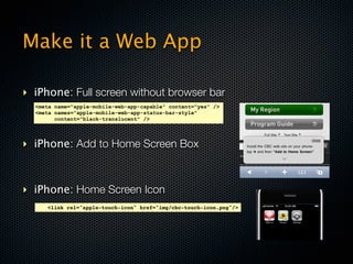
$ http://www.cbc.ca/m/touch
‣ SSI
<!--#if expr="$HTTP_USER_AGENT = /BlackBerry/" -->
<meta http-equiv="refresh" content="0; url=www.cbc.ca/m/rich">
<!--#endif -->](https://image.slidesharecdn.com/cbcmobilewebslideshare-120216194938-phpapp02/85/Developing-for-Mobile-Web-33-320.jpg)


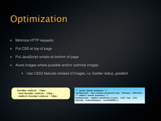
![Customizing for Devices/OS
‣ Fallbacks
‣ CSS
<!--#if expr="$HTTP_USER_AGENT = /BlackBerry/" -->
<!--#if expr="$osversion != /4.2([^&]*)/" -->
<div class="nocss">You don't have CSS enabled. To have a better experience,
please turn on background images and CSS on your device.</div>
<!--#endif -->
<!--#endif -->
‣ JavaScript
<noscript>To access the site with all its functionality, please enable JavaScript.</noscript>](https://image.slidesharecdn.com/cbcmobilewebslideshare-120216194938-phpapp02/85/Developing-for-Mobile-Web-39-320.jpg)


Mobile web development is important because over 6.8 billion people in the world use mobile devices. There are currently over 3.4 billion people with mobile phones, making mobile the 7th mass media. When developing for mobile, it is best to target WebKit-based browsers like those used on Android and iOS devices to ensure compatibility with newer HTML5 features. Websites should be optimized for mobile with a responsive design or separate mobile sites at m.domain.com to provide the best experience for touchscreen smartphones and limited feature phones.