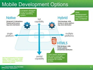
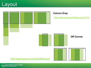
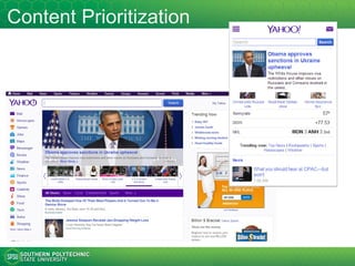
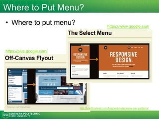
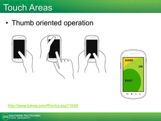
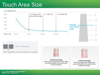
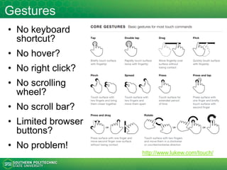
This document provides an overview of mobile web development. It discusses trends in mobile usage, definitions of mobile web and applications, options for developing mobile content like native, web and hybrid apps. It also covers strategies for mobile websites like responsive design and considerations for mobile design like touch interfaces. Development tools, frameworks and best practices for mobile web are also mentioned.
Web navigation systems for information seeking (updated in Feb 2015)Jack Zheng
- User experience, information architecture, and web navigation
- An evaluation framework to examine major web navigation systems from a human information behavior and user interface perspective.
- Advantages and weaknesses of major types of web navigation system.
This is the story of how a small college with a department of 4 and a zero-based budget, developed a mobile solution that is affordable and provides vital information to future and current students, faculty, and staff.
What is Web Portal?
A Web Portal is a specially designed website which brings information together from various sources in a uniform way.
They can be accessed from multiple platforms like personal computers, smartphones, and other electronic devices.
Why are Portals important?
• Efficiently deliver information to the audience.
• Provides customizable features and development tools.
• Increase interaction between customers and employees.
• Eliminating the need for multiple logins.
Types Of Web Portals
• Vertical Portals- These portals covers a particular market (one definite industry or domain).
• Horizontal Portals- These portals focus on a wide array of interests and topics, often referred as “mega portals”.
• Enterprise Portals- Developed and maintained for use by the members of intranet or enterprise network.
• Knowledge Portals- Increase the effectiveness of knowledge by providing easy access to information that is helpful to them in one or more specific roles.
• Market Space Portals- These portals exist to support the business to business, and business to customer e-commerce etc to find and access rich information about the products.
and much more…
Advantages of Web Portals
Easy for users to customize personal places.
Supports users in multiple tasks.
Easy to use design interface.
Help to connect the community.
The powerful back end.
Flexible content and layout.
Disadvantages of Web Portals
High complexity and additional testing efforts.
Somewhere complex to setup.
Re-authentication when using multiple systems.
Customizing portals and integrating applications.
Developers need additional skills besides using a web framework.
Additional costs.
How is Web Portal different from Website?
Personal Login is required in Web Portal, while not on a website.
Dynamic Content changes more frequently than proper websites.
Website is a public interface while Web Portal is public, private(intranet etc…)
Content is generally focused on websites while Web Portal offers content from diverse sources.
Web Portal supports the user in multiple tasks while website supports the user in the specific task.
Future of Web Portal
As the use of electronic devices is increasing, people are moving digital. Traffic on the web is increasing day by day.
Flexible content and layout along with supporting users in multiple tasks and for much more, Web Portal is proved to be an essential tool for the digitalization of a community, business or an organization.
Mobuz Solutions provide the guidelines like things to remember when designing your website. These creative information helps you to design your website easily.
(Healthcare) make your business mobile with responsive web designLeisl Schrader
As the new gold standard for the mobile web, Responsive Web Design has paved the way for businesses of all types to reach customers on the go, by catering to virtually any mobile device. There are specific challenges faced by healthcare organizations in making the transition, but also unique opportunities and benefits.
According to the International Telecommunication Union, at the end of 2011 there were more than 1 billion mobile‐broadband subscriptions worldwide! With more of your library users using mobile devices to access information they will assume that your library can be available from anywhere, at any time, and on most any device. Now is the time to be ready for this demand.
In this webinar:
- Explore some innovative library mobile website designs and see how they were built.
- Understand how HTML, CSS, and JavaScript work together to build mobile websites.
- Learn what a mobile framework is and why they are used.
- Provide some existing mobile services/apps that can be included in library-created mobile websites.
- Acquire best practices in mobile Web development from start to finish.
Mobile tools and services continue to be a dominant force that is changing the way libraries and their users access and use information. Learn ways that libraries can improve their mobile connection with their users, from creating accessible information to loaning hotspots and more. Don’t disappoint your mobile users! Join Chad as he highlights at least 5 ways to provide stellar mobile library services today.
Multidimensional Perceptual Map for Project Prioritization and Selection - 20...Jack Zheng
Traditional perceptual maps are created using scatter charts or quadrant diagrams, which are based on two dimensions (X and Y axes). Then data items are plotted on the plane based on their values for the two attributes.
The multidimensional perceptual map does not rely on the definition of any fixed axes. The map is composed of smaller areas (cells), which are characterized by a vector of values that represent multiple attributes (dimensions). The positioning of data items in the map is determined by its calculated measure (usually Euclidean distance) again each cell. An unsupervised clustering technique called Self-Organizing Map (SOM) is used to generate such maps.
The multidimensional perceptual map ca be used in many areas including project portfolio management, project prioritization, marketing research, product evaluation, performance management, portfolio management, etc.
DevOps and Testing slides at DASA ConnectKari Kakkonen
My and Rik Marselis slides at 30.5.2024 DASA Connect conference. We discuss about what is testing, then what is agile testing and finally what is Testing in DevOps. Finally we had lovely workshop with the participants trying to find out different ways to think about quality and testing in different parts of the DevOps infinity loop.
Transcript: Selling digital books in 2024: Insights from industry leaders - T...BookNet Canada
The publishing industry has been selling digital audiobooks and ebooks for over a decade and has found its groove. What’s changed? What has stayed the same? Where do we go from here? Join a group of leading sales peers from across the industry for a conversation about the lessons learned since the popularization of digital books, best practices, digital book supply chain management, and more.
Link to video recording: https://bnctechforum.ca/sessions/selling-digital-books-in-2024-insights-from-industry-leaders/
Presented by BookNet Canada on May 28, 2024, with support from the Department of Canadian Heritage.
Neuro-symbolic is not enough, we need neuro-*semantic*Frank van Harmelen
Neuro-symbolic (NeSy) AI is on the rise. However, simply machine learning on just any symbolic structure is not sufficient to really harvest the gains of NeSy. These will only be gained when the symbolic structures have an actual semantics. I give an operational definition of semantics as “predictable inference”.
All of this illustrated with link prediction over knowledge graphs, but the argument is general.
Dev Dives: Train smarter, not harder – active learning and UiPath LLMs for do...UiPathCommunity
💥 Speed, accuracy, and scaling – discover the superpowers of GenAI in action with UiPath Document Understanding and Communications Mining™:
See how to accelerate model training and optimize model performance with active learning
Learn about the latest enhancements to out-of-the-box document processing – with little to no training required
Get an exclusive demo of the new family of UiPath LLMs – GenAI models specialized for processing different types of documents and messages
This is a hands-on session specifically designed for automation developers and AI enthusiasts seeking to enhance their knowledge in leveraging the latest intelligent document processing capabilities offered by UiPath.
Speakers:
👨🏫 Andras Palfi, Senior Product Manager, UiPath
👩🏫 Lenka Dulovicova, Product Program Manager, UiPath
GraphRAG is All You need? LLM & Knowledge GraphGuy Korland
Guy Korland, CEO and Co-founder of FalkorDB, will review two articles on the integration of language models with knowledge graphs.
1. Unifying Large Language Models and Knowledge Graphs: A Roadmap.
https://arxiv.org/abs/2306.08302
2. Microsoft Research's GraphRAG paper and a review paper on various uses of knowledge graphs:
https://www.microsoft.com/en-us/research/blog/graphrag-unlocking-llm-discovery-on-narrative-private-data/
Let's dive deeper into the world of ODC! Ricardo Alves (OutSystems) will join us to tell all about the new Data Fabric. After that, Sezen de Bruijn (OutSystems) will get into the details on how to best design a sturdy architecture within ODC.
UiPath Test Automation using UiPath Test Suite series, part 4DianaGray10
Welcome to UiPath Test Automation using UiPath Test Suite series part 4. In this session, we will cover Test Manager overview along with SAP heatmap.
The UiPath Test Manager overview with SAP heatmap webinar offers a concise yet comprehensive exploration of the role of a Test Manager within SAP environments, coupled with the utilization of heatmaps for effective testing strategies.
Participants will gain insights into the responsibilities, challenges, and best practices associated with test management in SAP projects. Additionally, the webinar delves into the significance of heatmaps as a visual aid for identifying testing priorities, areas of risk, and resource allocation within SAP landscapes. Through this session, attendees can expect to enhance their understanding of test management principles while learning practical approaches to optimize testing processes in SAP environments using heatmap visualization techniques
What will you get from this session?
1. Insights into SAP testing best practices
2. Heatmap utilization for testing
3. Optimization of testing processes
4. Demo
Topics covered:
Execution from the test manager
Orchestrator execution result
Defect reporting
SAP heatmap example with demo
Speaker:
Deepak Rai, Automation Practice Lead, Boundaryless Group and UiPath MVP
Smart TV Buyer Insights Survey 2024 by 91mobiles.pdf91mobiles
91mobiles recently conducted a Smart TV Buyer Insights Survey in which we asked over 3,000 respondents about the TV they own, aspects they look at on a new TV, and their TV buying preferences.
"Impact of front-end architecture on development cost", Viktor TurskyiFwdays
I have heard many times that architecture is not important for the front-end. Also, many times I have seen how developers implement features on the front-end just following the standard rules for a framework and think that this is enough to successfully launch the project, and then the project fails. How to prevent this and what approach to choose? I have launched dozens of complex projects and during the talk we will analyze which approaches have worked for me and which have not.
State of ICS and IoT Cyber Threat Landscape Report 2024 previewPrayukth K V
The IoT and OT threat landscape report has been prepared by the Threat Research Team at Sectrio using data from Sectrio, cyber threat intelligence farming facilities spread across over 85 cities around the world. In addition, Sectrio also runs AI-based advanced threat and payload engagement facilities that serve as sinks to attract and engage sophisticated threat actors, and newer malware including new variants and latent threats that are at an earlier stage of development.
The latest edition of the OT/ICS and IoT security Threat Landscape Report 2024 also covers:
State of global ICS asset and network exposure
Sectoral targets and attacks as well as the cost of ransom
Global APT activity, AI usage, actor and tactic profiles, and implications
Rise in volumes of AI-powered cyberattacks
Major cyber events in 2024
Malware and malicious payload trends
Cyberattack types and targets
Vulnerability exploit attempts on CVEs
Attacks on counties – USA
Expansion of bot farms – how, where, and why
In-depth analysis of the cyber threat landscape across North America, South America, Europe, APAC, and the Middle East
Why are attacks on smart factories rising?
Cyber risk predictions
Axis of attacks – Europe
Systemic attacks in the Middle East
Download the full report from here:
https://sectrio.com/resources/ot-threat-landscape-reports/sectrio-releases-ot-ics-and-iot-security-threat-landscape-report-2024/
Mobile Web Overview https://www.edocr.com/v/k52p5vj4/
1. Mobile Web Overview
IT 4213 Mobile Web Development
IT 6753 Advanced Web
Jack G. Zheng
Spring 2016
2. Questions
What is mobile web and
why do we care about it?
What are the basic choices to
develop and deliver contents
and services to mobile devices?
What are the major design
considerations and principles?
What are the popular development
tools, frameworks, and services?
Where can you learn more
about mobile web?
How can web technologies be
used to create mobile apps?
3. Overview
• Mobile trends and stats
• Mobile web definition and scope
• Mobile application types: native, web, hybrid
• Mobile website strategies: one web,
adaptive, mobile version
• High level design considerations and
principles
• Development tools
3
4. St. Peter's
Basilica at
the Vatican
http://photoblog.nbc
news.com/_news/2
013/03/14/1731231
6-witnessing-papal-
history-changes-
with-digital-age
4
5. Cisco Visual Networking Index
Global Mobile Data Traffic Forecast, 2015–2020
http://www.cisco.com/c/en/us/solutions/service-provider/visual-networking-index-vni/index.html
Global North America
The percentage of mobile data traffic will account
for out of all fixed and mobile data traffic by 2020
15% 6%
The percentage of mobile connections will be
'smart' connections by 2020
72% 95%
Mobile traffic per mobile-connected end-user device
per month by 2020
3.3GB 6GB
Average mobile
connection speed
8. What is Mobile Web?
Mobile web refers to the access and use of web
sites and web applications using smart mobile
devices (and optimized for these devices) through
computer networks.
• It's mainly about user experience, particularly with a
focus on user interfaces and interactions.
– Web sites: focus on the optimization of web sites to be used
on mobile devices.
– Web applications: focus on functional features, with UI
specifically designed for mobile devices. Web applications
can be delivered through web sites or other types of apps
(mobile app, hybrid app, browser app, etc.).
• Recently it has begun to impact
the application level architecture.
9. Why? Differences?
• Why to make website mobile friendly?
– Non-mobile-friendly sites create user experience and functional problems
– Search engines also include mobile friendliness as in ranking - https://support.google.com/adsense/answer/6196932
• Screen
– Screen size is generally smaller http://www.statista.com/chart/2269/smartphone-shipments-by-screen-size/
– Screen resolution is lower and density is higher http://developer.android.com/about/dashboards/index.html
– Fragmented market: properties vary a lot among devices
– Orientation: vertical screens accounts for 29% of usage
• Interaction method: touch is different form pointing device
– https://www.nngroup.com/articles/mouse-vs-fingers-input-device/
• Connection and speed
– Mobile device connection is less stable, inconsistent, and slower
• Device capability
– Mobile devices have much more functionality integrated: cam, mic, sensors, GPS, etc.
• Browser capability
– Compatibility: browser behaviors are different
– Fixed browser size (on the same device)
– Viewport, automatic zooming
– Delay: have a more noticeable delay as the application resides on the web versus directly on the native platform
– Weaker plug-in support
9
10. The Problems
• Performance problems
– Mobile device connection is less stable, inconsistent, and slower
– The device is less responsive
• Browser support and compatibility problems
– Fragmented Mobile Browser Market http://marketshare.hitslink.com/browser-market-
share.aspx?qprid=0&qpcustomd=1&qptimeframe=Y
– Functionality limitation: PDF, flash, etc.
• Design/content problem – not optimized for mobile devices
– Content too small and difficult to view
– Content hidden
• Interaction problems
– Links are crowded and difficulty/inaccurate to tap
– Mouse hovering is totally missing
– Slow and error-prone typing
• Not so mobile friendly
– https://kennesaw.curriculog.com/
– https://owlexpress.kennesaw.edu/prodban/bwckschd.p_disp_dyn_sched
– https://www.google.com/finance
• Some interesting problems documented
– http://bradfrost.com/blog/post/mobile-web-problems/
– http://wtfmobileweb.com/
10
Use a tool to report the problems!
https://www.google.com/webmasters
/tools/mobile-friendly/
11. Mobile App Development Options
11
https://developer.salesforce.com/page/Native,_HTML5,_or_Hybrid:
_Understanding_Your_Mobile_Application_Development_Options
A program designed to
run directly on a specific
mobile operating system.
A web based application that
runs in any web browser
especially that designed for
mobile devices.
Applications
developed using
Web development
technologies and
wrapped in a mobile
app container
* New to the
diagram: cross-
platform native
app (Xamarin)
* New to the
diagram: app
like web site
13. https://developer.salesforce.com/page/Native,_HTML5,_or_Hybrid:_Understanding_Your_Mobile_Application_Development_Options
http://www.telerik.com/blogs/everything-you-wanted-to-know-about-native-hybrid-and-web-apps-but-were-afraid-to-ask
http://www.sitepoint.com/native-hybrid-or-web-apps/
http://www.ymedialabs.com/hybrid-vs-native-mobile-apps-the-answer-is-clear/
Comparison of the Three Development Options
Native Apps Mobile Web Hybrid
Device
features
Can fully utilize platform/OS
features if allowed, such as
camera, location, sensors,
and interactions with file
systems and other apps.
Access to devices features
are limited to the browser
environment.
Can utilize platform/OS
features if provided by the
SDK, which are usually
provided as JavaScript
APIs.
UX/UI Best; smooth interaction as
UI is very responsive.
Not as good as native app;
may have delays.
Looks like an app, but may
have performance issues.
Development
Platform
Applications are platform
dependent. They have to be
written and/or compiled to a
specific OS*. Example:
- Andriod (Java) ( Android )
- iOS (Objective C)
- Windows (.Net, C#)
- * Xamarin (all)
Web applications are cross
platform and can use standard
languages such as
HTML/CSS/JavaScript.
Programs runs in browsers,
although they may have
slightly differences in different
browsers.
Hybrid applications are
developed using standard
web technologies, but
complied to each specific
platform.
Distribution /
Installation
App Store, or direct
downloaded; need
installation
Web; no installation App Store, or direct
downloaded; need
installation
14. Trending for Mobile Web
http://www.telerik.com/blogs/everything-you-wanted-to-know-
about-native-hybrid-and-web-apps-but-were-afraid-to-ask
http://www.mediapost.com/publications/article/265873/cons
umers-may-prefer-mobile-web-to-apps.html
A recent survey of U.S. consumers by
Quixey (in 2015) found that 66% of
respondents said they prefer the mobile
Web to apps.
http://www.appcelerator.com/resource-
center/research/2015-mobile-trends-report/
50% use on a
daily basis among
adoption leaders.
15. HTML 5 and Mobile Web
• How does HTML 5 play a role in facilitating mobile computing?
• Standardize mobile web development
– Eliminates the need to create, maintain, and support apps for
different mobile platforms (native platforms)
• HTML 5 has provided a set of features and tools for building
mobile apps
– Mobile friendly tags – activate relevant phone features
– JavaScript APIs to devices features
• Geolocation
• Offline
• Web storage
• Touch events
• Drawing
15
<a href="tel:+14155557777">Order Pizza Now!</a>
<a href="sms:+14155558888?body=Hello">Text me!</a>
16. Mobile Website Delivery Strategy
• Separate mobile version site
– Walmart: http://mobile.walmart.com/
– Ikea: http://m.ikea.com/us (jQuery
Mobile)
– Costco: http://m.costco.com/
• One Web
– One Web means making, as far as
is reasonable, the same information
and services available to users
irrespective of the device they are
using.
– http://www.w3.org/TR/mobile-
bp/#OneWeb
Why Separate Mobile & Desktop Web Pages?
http://www.lukew.com/ff/entry.asp?1390
17. One Web
• One Web
– Does not mean that the content is available in exactly the
same representation across all devices.
– The context of mobile use, device capability variations, bandwidth
issues and mobile network capabilities all affect the representation.
• Approaches
– Responsive design
– Adaptive: device detection and adaptation
• Or dynamic serving as in
http://www.google.com/think/multiscreen/whitepaper-
multiscreenconsumer.html
– Hybrid: RESS (Responsive + Server Serving)
• Examples
– http://mashable.com (responsive)
– http://google.com or Wikipdia.org (adaptive)
18. Responsive Web Design
Responsive Web Design (RWD) is a Web design approach
aimed at crafting sites to provide an optimal viewing
experience, easy reading and navigation with a minimum of
resizing, panning, and scrolling, across a wide range of
screen sizes and devices.
• Ethan Marcotte coined the term responsive web design
and defined it to mean fluid grid/ flexible images/ media
queries in a May 2010 article in A List Apart
– http://alistapart.com/article/responsive-web-design
• Basic principles and practices
– Fluid grid - no horizontal scrolling
– Adaptive/flexible image
– Media query
19. Examples
• Responsive examples
– http://kennesaw.edu
– http://mashable.com
– http://mediaqueri.es (more examples here)
• Non-responsive example
– http://www.mariettaga.gov
– http://www.starsandstrikes.com
Adjust the browser width
and see the changes or
use responsinator.com)
20. Adaptive – Dynamic Serving
• Adaptive design is about serving pages based on device
feature detection
– Also called dynamic serving as in
http://www.google.com/think/multiscreen/whitepaper-
multiscreenconsumer.html
• Adaptive design has different perspectives
– http://bradfrost.com/blog/post/the-many-faces-of-adaptive-
design/
– https://css-tricks.com/the-difference-between-responsive-and-
adaptive-design/ - this one drives a lot of discussions – I also
agree with most comments but not the article itself
• RESS: Responsive Design + Server Side Components
– http://www.lukew.com/ff/entry.asp?1392
• Comparison: http://www.lukew.com/ff/entry.asp?1509
20
21. Hybrid Web Apps
• Hybrid apps are apps developed based on the web technologies
(HTML, CSS, JavaScript) and wrapped in a platform specific
native container
– Similar to Java and .Net’s vision of Write-Once-Run-Anywhere
– Device features are exposed through JavaScript API
– The execution of the app relies on the browser engine of the OS it is
installed in
• Gartner Says by 2016, More Than 50 Percent of Mobile Apps
Deployed Will be Hybrid
– http://www.gartner.com/newsroom/id/2324917
• Major framework:
– Apache Cordova
– PhoneGap
– Appcelerator Titanium
– IBM MobileFirst
21
22. App Like Web Site
• App-like web site looks and acts like an app (browser hidden,
etc.) but is actually a web site
– This will give the website an “app” look and feel without installing
anything at first
– But they are still dependent on the browser to drive them
• Primitive solution: pin it to your home screen
– http://www.howtogeek.com/196087/how-to-add-websites-to-the-
home-screen-on-any-smartphone-or-tablet/
• Take it to another level: progressive web app (optimized app like
web site)
– https://developers.google.com/web/progressive-web-apps
– http://arc.applause.com/2015/11/30/application-shell-architecture/
– http://developer.telerik.com/featured/what-progressive-web-apps-
mean-for-the-web/
– http://gonehybrid.com/are-progressive-web-apps-the-future-of-
mobile-apps/
22
23. Cross-Platform Native App
• This solution uses a common development
environment for all platforms, but wraps (compiles)
them to a target platform.
– Similar to hybrid, but the apps are native apps, not
relying on browser engines.
• Example development framework: Xamarin
– Using C# and .Net for development
– Wrapping all native OS libraries
• Is Xamarin hybrid?
– The short answer is no.
– https://www.quora.com/Is-Xamarin-hybrid-development
– http://www.cygnet-infotech.com/blog/phonegap-or-
titanium-or-xamarin-which-cross-platform-should-you-
choose
23
24. Considerations and Practices
• Follow the general conventions and design principles
• Site or app? Consider their pros and cons and select the most
appropriate one
• Consider the difference of user experience on mobile vs desktop
• Adapt to screen size and density
• Touch friendly UI: touch area, touch target size, gestures
• Others
– Handle browser compatibility and feature detection
– Design for performance
• Strategy: mobile first??
• Details will be covered in other lectures
25. Adapt to Screen Sizes and Density
• Set up the correct viewport
– https://developers.google.com/web/fundamentals/design-and-
ui/responsive/fundamentals/set-the-viewport
• Layout: single column design works best
– Luke Wroblewski has summarized some common layout patterns in
two articles
• “Multi-Device Layout Patterns” http://www.lukew.com/ff/entry.asp?1514
• “Off Canvas Multi-Device Layouts” http://www.lukew.com/ff/entry.asp?1569
• Content prioritization: Non-major content needs to be off screen
– For example, menus are considered as non-major content
• Navigation (menu placement)
– http://bradfrostweb.com/blog/web/responsive-nav-patterns/
– http://bradfrost.com/blog/web/complex-navigation-patterns-for-
responsive-design/
25
26. Touch Friendly UI
• Rule of the thumb: thumb (one or two) oriented
operation is common
– http://www.uxmatters.com/mt/archives/2013/02/how-
do-users-really-hold-mobile-devices.php
– Aware of hot areas -
http://www.lukew.com/ff/entry.asp?1649
• Touch targets
– Touchable areas instead of links
– Size of touch targets:
http://www.smashingmagazine.com/2012/02/21/finger
-friendly-design-ideal-mobile-touchscreen-target-
sizes/
• Gestures
– Gestures represent the future UI opportunities -
http://www.lukew.com/touch/
• Provide interaction feedback
• Activate the most appropriate pseudo keyboard
27. Mobile First
• Mobile First is a philosophy created by Luke
Wroblewski that highlights the need to prioritize the
mobile context when creating user experiences.
– Allows websites to reach more people
– Forces designers to focus on core content and
functionality (What do you do when you lose 80% of your
screen real estate?)
– Let designers innovate and take advantage of new
technologies (geolocation, touch events and more)
• Reference
– http://bradfrostweb.com/blog/web/mobile-first-
responsive-web-design/
– http://www.lukew.com/presos/preso.asp?26
– https://blog.intercom.io/why-mobile-first-may-already-be-
outdated/
27