Download as PDF, PPTX


![“Services aren’t made on an assembly line…
you can’t predict precisely which
[touchpoint] each user will need… The
service is experienced differently by every
person, because every person is different”
ANDY POLAINE
http://www.projectara.com/](https://image.slidesharecdn.com/optimising-mobile-20140326-140326200601-phpapp02/85/Mobilising-Digital-Sydney-26-03-14-77-320.jpg)


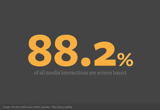
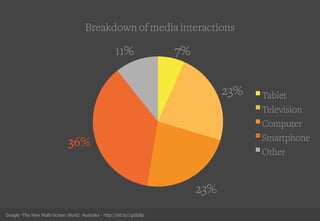
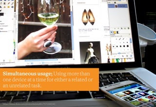
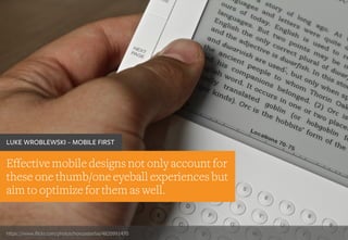
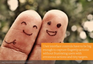
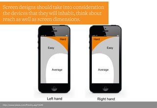
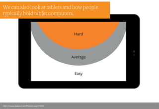
1. Mobile devices have become the primary way people access media through smartphones, tablets, and other screens. Most media interactions are with mobile screens and smartphone ownership continues to rise rapidly. 2. Opportunities on mobile go beyond apps to considering how mobile usage has changed user behavior and discovering the paths users take to content across multiple devices. User research is key to understanding this. 3. Design for mobile must optimize for thumb and eyeball-only interactions, use touch targets large enough for fingers, and consider network limitations. Images should be optimized for recognition or description.


