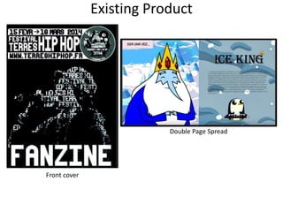
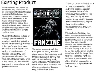
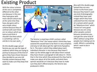
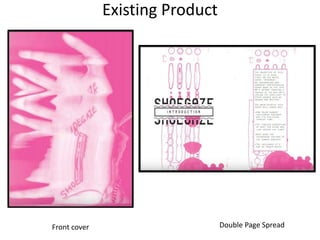
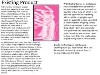
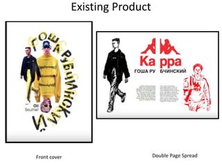
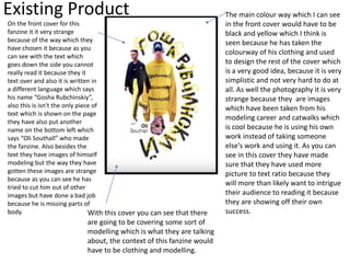
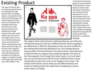
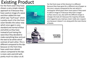
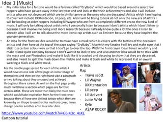
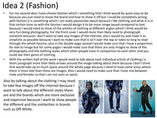
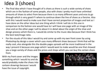
SlideShare a Scribd company logo
1 of 18
Fanzine Research
Fin Sedgwick
Existing Product
Front cover
Double Page Spread
Existing Product
In this front cover for a fanzine you
can see that they have decided put
the information at the top of the page
in a strange fashion because they
have decided to make it look like a
festival which is the theme of the
fanzine which is very clever and
abstract. With them making it look
like a festival ticket it gets straight to
the point because you should know
what the entire fanzine is going to
revolve around.
Also with this fanzine instead of
having a specific name for it
they have decided to just call it
fanzine which is strange because
if they don’t have there own
title I think that it would easily
get lost in the thousands of
fanzines because they have
proper names. Also with the
main name they have gone with
a very simple text which is used
to pop out to the audience and
get their attention.
The image which they have used
as their front cover is a black
and white image of a person
who has text inside of him
which says “Festival Terres Hip
Hop”, which in my personal
opinion is very creative because
it shows that are trying to push
there fanzine and the
theme/genre which they have
chosen.
With this fanzine front cover they
haven't decided to use any kind of
photography in their image because I
don’t think they want to know much
instead they want you to be
intrigued, even though they haven't
used photography they have used
their own drawings in the image on
the top right and the person which is
on the front. With the image they
have used in the top right it is
very small so you may not see it
all but it is their because it is a
festival which is a good extra to
the front cover.
The colour scheme which they
have gone for is very dark and
plain because they have only used
three colours which go very well
with each other being black,
white and green. With black and
white they are colours which are
always seen together because
they contrast each other.
Existing Product
With the colour scheme
of this one is completely
different to the other
one because in this one
they have gone with
more vibrant colours but
at the same time they
have also gone with a
very simple colour
scheme because they all
contrast with each there
are no colours which you
look at and think it
shouldn't be there which
is something I will try
and do in my own work.
On this double page spread
fanzine you can see the type of
audience which they are trying to
portray to because of the kind of
genre they have chosen because
they decided to use very kid
friendly content because they
want to make sure they keep that
audience.
Also with this double page
spread they are very
similar to the front cover
because they haven't used
any kind of photography
instead they have used
images which they have
collected from the internet
of a cartoon which would
be “Adventure time” which
I know isn't very good
because you are using
other peoples content
because sometimes you
cant get the same kind of
effect without using other
peoples but making sure to
credit. Which is something
which I want to do in
limitation.
The fanzine is covering a child's cartoon called
“Adventure Time” the reason which I think they have
covered this would have to be that it is very simplistic
and easy to talk about get the right kind of graphics
for it. The style in which they talked about each
individual character is nice because they haven't
taken up the whole page to talk about them instead
they have chosen a paragraph to talk about it. I think
that in the time which they produced this they had to
make sure about all of the public and what there
opinion would be on It because they have to make
sure they don’t offend anyone, this fanzine was
produced in 2015.
Existing Product
Front cover Double Page Spread
Existing Product
In this fanzine front cover you can
see straight away the strange image
which is think they used to entice
their audience because if they don’t
know what it is about they are more
inclined to have a look what is is
about because they haven't given
anything away on the front cover
besides the name which is
“SHOEGAZE” with this being the only
information which you are shown it
helps the producers because they
have confused a lot of people they
can take a guess on what they think
it could in tale.
As well with this front cover they have chosen to
use an effect compared to last one which changes
the whole face on the front cover because it shows
know what you are doing if you can make effects,
also alongside the effect they have gone with a
single colour way being pink which is different
because you would expect to have more because
without another colour it would be hard to see the
title of the fanzine. With only having a single colour
you can tell that they more than likely go with that
colour throughout the entire thing which is good
because they can all link together and there will be
nothing which looks out of place looking at the
colours.
With this front cover for the fanzine
you cannot take much away from it
because it doesn't give you much to
base the entire thing off which in my
personal opinion isn't something
which I will be copying because I
want my audience to have some kind
of idea what they are going to read
before they have red it. Also another
thing which I don’t think I want to
take away from this cover would have
to be the colour way because I want
to have more than one single colour
to portray my work to my audience.
Due to the front cover not showing
anything really you have no idea what the
fanzine will be covering because there is
no information on the front.
Existing Product
The type of content which
they are showing of in their
first double page spread
would have to be that they
are introducing you to what
the whole fanzine will be
based around, in this page
you can see they have only
include a small amount of
content for their audience
which would be an article of
what they are going to be
covering, and also they
have including some
drawings which you be the
design around the page
being the pink images and
the splats. I think they have
included as little as possible
because they want their
audience to keep reading to
get all of the information
they need. Also with this
dps they have told you the
key information which you
need because it tells you
the different things which
they are going to talk about
throughout this fanzine.
The colour scheme which they have decided to go with
is a very simplistic scheme because they have used pink,
white and black which are colours that all work well
with each other. They have continued the this theme
throughout the whole fanzine because they want
everything to work well together without anything
looking out of place, also with this first page they have
more text to picture ratio which I think they have done
on purpose because it is the opening page to the
fanzine to introduce the audience to what is in it. Also
the font choice with they have decided to use is very
bold but at the same time plan because it is just
standard besides the fact they have chosen to use all
caps in their work which you don’t see very often in
magazines and books.
Also something else which
I have realized with this
fanzine would have to be
that they have almost gone
for a postcard look to it
because as you can see in
this image there is a
custom image which looks
like a stamp and also the
font goes along with the
card theme, as well
underneath the text there
are wavy lines to block
each part of the text from
each other because they
tell you different things
about the fanzine. As well
something else which gives
the hint of a post card
would have to be the
simplicity of the designs
which they have made
because they have made
sure not to include to
much which would
overcrowd their work.
Existing Product
Front cover Double Page Spread
Existing Product
On the front cover for this
fanzine it it very strange
because of the way which they
have chosen it because as you
can see with the text which
goes down the side you cannot
really read it because they it
text over and also it is written in
a different language which says
his name “Gosha Rubchinskiy”,
also this is isn't the only piece of
text which is shown on the page
they have also put another
name on the bottom left which
says “Oli Southall” who made
the fanzine. Also besides the
text they have images of himself
modeling but the way they have
gotten these images are strange
because as you can see he has
tried to cut him out of other
images but have done a bad job
because he is missing parts of
body.
The main colour way which I can see
in the front cover would have to be
black and yellow which I think is
seen because he has taken the
colourway of his clothing and used
to design the rest of the cover which
is a very good idea, because it is very
simplistic and not very hard to do at
all. As well the photography it is very
strange because they are images
which have been taken from his
modeling career and catwalks which
is cool because he is using his own
work instead of taking someone
else's work and using it. As you can
see in this cover they have made
sure that they have used more
picture to text ratio because they
will more than likely want to intrigue
their audience to reading it because
they are showing off their own
success.With this cover you can see that there
are going to be covering some sort of
modelling which is what they are talking
about, the context of this fanzine would
have to be clothing and modelling.
Existing Product
The type of content they
are showing would have to
be clothing in this dps
because they are talking
about a very specific brand
which would be Kappa, also
with the page they have
tried to turn photos into
drawings which have
turned out very well
because they are very
detailed and simple
because they have used a
single colour for each of
the images which is very
nice and abstract because
as you can see with the
colour way they have been
based around the logo and
the text colour because
each side has a different
coloured drawing so for
example on the right the
image is red which is based
of the logo which they have
put in the middle in red.
The subject of this entire fanzine is clothing which you can tell by the
introduction because it tells you 4 different brands which are going to
be talked about in different ways because they are each so different,
the writing which they have decided to use I very strange because
they put both of the text directly in the centre which is weird because
it looks like they are suppose to be conjoined together but when in
fact they separate. Even though they haven't gone it to much detail
you can see that they went with the more simplistic theme as they
would prefer to take more time on the images on the screen. The
context of the fanzine was to show you the different brands and
articles of clothing which this model did his modelling for and his
entire career as a model.
In this fanzine they have
gone for a very simplistic
in the fact that it is very
blocky in the fact that
they haven't decided to
use any fancy kind of
fancy which is a nice
touch because you can
see that they don’t want
to go over the top they
would prefer to keep
everything simple and
bold. And also they have
used a different language
beneath the kappa brand
which could be the
definition in a different
language
Existing Product For the front cover of this fanzine it is different
because they have gone for a different size of paper as
this one is square compared to the rest which is
rectangular which gives them more space if they want
to add an image to it because they have a larger
surface area to use, also with the different shape in
changes the look of it because the majority of books
and magazines you read you never really see a square
one because it doesn't run along with the main theme
of books.
For the front cover they have
chosen a very simple relaxed
approach to it because they
have used an image of a wave
and then added the text
which says “Surf Issue” which
is pretty much it for the front
cover besides the colour way
which once again is very
standard and normal of blue
and white as they have
instead of just having the
wave blue they decided to
make everything blue and just
the text to be white which
contrast of each other. This is
different compared to the dps
because on the front they
have used more vibrant
colours compared to the dps
is more calm and chill with
pretty much no colour at all.
Research summary
• Something which I have learnt from fanzines would have to be
that there are completely different from a normal magazine
because they are more simple and plain in comparison
because with a magazine they go into a large amount of detail
where as with a fanzine they prefer to be more minimalist
with the amount of text which they have included and also
they use more images than text where as magazines usually
decided to use more text because they want to have more
detail.
• Another different which I can see in a fanzine would be that
they are not as formal because they are fan made and don’t
have as much time put into them because it is a side job kind
of.
Initial Ideas
PICKED IDEA 1
Idea 1 (Music)
• My initial idea for a fanzine would be a fanzine called ”CryBaby” which would be based around a select few
rappers who have passed away in the last year and and look at the their achievements and also I will include
artists who are not deceased which are in similar genre as the ones who are deceased, Artists which I am hoping
to cover will include XXXtentacion, Lil peep, etc. Also I will be trying to look at not only the new era of artists I
will be looking at older rappers including lil Wayne who are from a completely different era to the new kind of
music. I will only be talking about artists who I personally listen to because I don’t artists which I don’t listen to
because it will involve me doing a lot more research because I already know quite a lot the ones I listen to
already. Also I will am to talk about the more iconic rap artists such as Eminem because they have inspired the
younger generation.
• An idea for the front an idea would be to make have a mask which Is covers with the tattoos of the deceased
artists and then have at the top of the page saying “CryBaby”. Also with my fanzine I will try and make sure that I
stick to a certain colour way so that I don’t go to over the top. With the front cover Idea I have I would try and
make it look quite cartoony because I don’t want it to look to real and also another idea would be to stick with
the mask and use Photoshop and make it look like it is cracked and decaying to show that they are deceased,
and also I want to split the mask down the middle and make it black and white to represent X at an award
wearing a black and white mask.
For the double page spread for each of the artists I
would have on one side of the page an iconic image of
themselves and then on the right hand side a paragraph
or two talking about they amassed and achieved
throughout there career. As well on the first page pretty
much I will have a section which pages are for that
certain artist. These are more than likely the main ones
which I would take inspiration from for the front cover
because they all have one distinct tattoo which they are
known by an I hope to use that for my front cover, I may
change one for another artist in a later date.
Artists
Rap
- Travis scott
- Lil Wayne
- XXXtentacion
- Lil peep
- Lil Uzi vert
- Juice Wrld
- Kyle
- A$AP ROCKY
https://www.youtube.com/watch?v=G6IKOc_4sXE
Cartoon tutorial
Idea 2 (Fashion)
• For my second idea I have chosen fashion which I something that I think would be quite easy to do
because you just need to know the brand and how to show it off but I could be completely wrong,
with fashion it is something which I am really passionate about because I like clothing and what is is in
that certain time so with the fanzine I would design it to be more image based compared to text
because I would need to show of the articles of clothing at different angles which I think would be
very fun doing photography. For the front cover I would more than likely need to photograph
someone because I don’t want to take any images of the internet, also I would try and make it as
simplistic as possible because I want to make sure that it isn't over the top or takes to long to read
through the whole fanzine, also in the double page spread I would make sure that I have a proportion
for text to image but for some pages I would make sure that there are only images to show of the
photography and the clothing styles which other people have in comparison to each other and you
could see their genre of clothing.
• With the written half of the work I would need to talk about each individual article of clothing I a
short paragraph more than likely arrows around the image talking about them because I don’t think
that would take up to much space around the whole page because I need to have some areas where
there is more text than there are images, Also I would need to make sure that I have mix between
male and females so that I am not seen as sexist.
Also by talking about the clothing I may need
to take few images off the internet because I
want to talk about the different styles there
are and the brands which are more exclusive
and expensive because I want to show people
the different and the similarities in brands
such as Off-White.
Idea 3 (shoes)
• The final idea which I have thought of is shoes as there is such a wide variety of shoes
which are in the fashion of some people, also with shoes I pretty much have unlimited
amounts of shoes to select from because there is so many different years and eras to go
through which is very good if I where to continue down the line of shoes as a fanzine. Also
with this I would need to make sure that I have correct proportion of images and text as I
have done on the other ideas but one thing which I think I will do in this one in
comparison to the fashion one would have to I will have one page with an image of the
shoe and on the other page I will to about it in detail about the origin of the shoe and
design process which there is, I would do similar to the music idea because that I think has
the best text/image ratio.
• For the visuals of this Idea I would try and come up with my own front cover by using
Photoshop by design a cover which uses many different shoes because I think that will be
really cool, also alongside this the double pages spreads will be more traditional in the
way I present it because one page which I would want to make would be one that showed
you a large variety of shoes and the prices and shops which you can buy the certain shoes
from.
With my front cover and the images
something which I would try and do
would probably make the shoes into
cartoon drawings because I would
have the issue of copyright.
Bibliography
Bibliography
1. Interviewees, Name. (2018) Target Audience Interviews (conducted on DATE)
2. Interviewees, Name. (2018) Target Audience Interviews (conducted on DATE)
3. Publisher. (Year of Release) Magazine Name
4. anon. (2014). Le Fanzine Terre(s) Hip Hop 2014 [Mag]. Available:
http://www.hiphop4ever.fr/thh14-mag/. Last accessed 10th september
2018.
5. talita correia. (2015). fanzine adventure time talita correira. Available:
https://issuu.com/talitacorreia/docs/fanzine_adventuretime_talita_correi.
Last accessed 10th sept 2018.
6. lilly marfy. (2014). distortion reverb and delay shoe gaze fanzine. Available:
https://issuu.com/lillymarfy/docs/final_pages. Last accessed 10th sept 2018.
• Oli Southall. (2017). Gosha Rubchinskiy Fanzine. Available:
https://issuu.com/olisouthall/docs/final_fanzine. Last accessed 12th sept
2018.
• fro studio. (2016). 02 surf. Available:
https://issuu.com/fro.studio/docs/surf_last_5. Last accessed 12th sept 2018.

More Related Content

What's hot

Primary and secondary
Primary and secondaryPrimary and secondary
Primary and secondaryfintansedgwick
 
Digital graphics evaluation pro forma
Digital graphics evaluation pro formaDigital graphics evaluation pro forma
Digital graphics evaluation pro formaEmma Wells
 
6. FMP ProductionReflection
6. FMP ProductionReflection6. FMP ProductionReflection
6. FMP ProductionReflectionImogen Minto
 
4. pre production(1)
4. pre production(1)4. pre production(1)
4. pre production(1)AlicjaMorawska
 
Cover progression
Cover progressionCover progression
Cover progressionryanrococo
 
Digital graphics evaluation pro forma (1)
Digital graphics evaluation pro forma (1)Digital graphics evaluation pro forma (1)
Digital graphics evaluation pro forma (1)Harrison Cox
 
Evaluation
EvaluationEvaluation
EvaluationLeah Ellis
 
Evaluation
EvaluationEvaluation
Evaluationemilyap1
 
Evaluation
EvaluationEvaluation
Evaluationgbrownchs
 
Construction Process
Construction ProcessConstruction Process
Construction ProcessNatalie
 
Question 5 finaaaaaaaaaal
Question 5 finaaaaaaaaaalQuestion 5 finaaaaaaaaaal
Question 5 finaaaaaaaaaalJesszc
 

What's hot (18)

Research
ResearchResearch
Research
 
Primary and secondary
Primary and secondaryPrimary and secondary
Primary and secondary
 
Digital graphics evaluation pro forma
Digital graphics evaluation pro formaDigital graphics evaluation pro forma
Digital graphics evaluation pro forma
 
6. FMP ProductionReflection
6. FMP ProductionReflection6. FMP ProductionReflection
6. FMP ProductionReflection
 
4. pre production(1)
4. pre production(1)4. pre production(1)
4. pre production(1)
 
Cover progression
Cover progressionCover progression
Cover progression
 
Research
Research Research
Research
 
Planning
PlanningPlanning
Planning
 
Digital graphics evaluation pro forma (1)
Digital graphics evaluation pro forma (1)Digital graphics evaluation pro forma (1)
Digital graphics evaluation pro forma (1)
 
Evaluation
EvaluationEvaluation
Evaluation
 
Planning
PlanningPlanning
Planning
 
Planning2
Planning2Planning2
Planning2
 
LO3
LO3 LO3
LO3
 
Evaluation
EvaluationEvaluation
Evaluation
 
Evaluation
EvaluationEvaluation
Evaluation
 
Question 1
Question 1Question 1
Question 1
 
Construction Process
Construction ProcessConstruction Process
Construction Process
 
Question 5 finaaaaaaaaaal
Question 5 finaaaaaaaaaalQuestion 5 finaaaaaaaaaal
Question 5 finaaaaaaaaaal
 

Similar to 1. research

1. research yr 2
1. research yr 21. research yr 2
1. research yr 2joe manship
 
Researchfmpcopy 190611085118
Researchfmpcopy 190611085118Researchfmpcopy 190611085118
Researchfmpcopy 190611085118amy foster
 
Researchfmpcopy 190611085118
Researchfmpcopy 190611085118Researchfmpcopy 190611085118
Researchfmpcopy 190611085118amy foster
 
Research fmp copy
Research fmp copyResearch fmp copy
Research fmp copyamy foster
 
Sam Nixon York college Fanzine Research, planning and pre-production
Sam Nixon York college Fanzine Research, planning and pre-productionSam Nixon York college Fanzine Research, planning and pre-production
Sam Nixon York college Fanzine Research, planning and pre-productionsamuel nixon
 
Research (3.2)
Research (3.2)Research (3.2)
Research (3.2)Leticia Pozze
 
Deconstructions of poster
Deconstructions of posterDeconstructions of poster
Deconstructions of posterRebecca Black
 
Contents page powerpoint1
Contents page powerpoint1Contents page powerpoint1
Contents page powerpoint1Daniela Aboltina
 
Digital graphics evaluation pro forma (not done)
Digital graphics evaluation pro forma (not done)Digital graphics evaluation pro forma (not done)
Digital graphics evaluation pro forma (not done)toby96
 
Print pro forma
Print pro formaPrint pro forma
Print pro formaAndrew Downes
 
Contents page powerpoint1
Contents page powerpoint1Contents page powerpoint1
Contents page powerpoint1Daniela Aboltina
 

Similar to 1. research (20)

1. research yr 2
1. research yr 21. research yr 2
1. research yr 2
 
Researchfmpcopy 190611085118
Researchfmpcopy 190611085118Researchfmpcopy 190611085118
Researchfmpcopy 190611085118
 
Researchfmpcopy 190611085118
Researchfmpcopy 190611085118Researchfmpcopy 190611085118
Researchfmpcopy 190611085118
 
Research fmp copy
Research fmp copyResearch fmp copy
Research fmp copy
 
Research
Research Research
Research
 
Research
Research Research
Research
 
Research
Research Research
Research
 
Fanzine research
Fanzine researchFanzine research
Fanzine research
 
Task 6
Task 6Task 6
Task 6
 
Magzines
MagzinesMagzines
Magzines
 
Evaluation
EvaluationEvaluation
Evaluation
 
Portfolio
PortfolioPortfolio
Portfolio
 
Sam Nixon York college Fanzine Research, planning and pre-production
Sam Nixon York college Fanzine Research, planning and pre-productionSam Nixon York college Fanzine Research, planning and pre-production
Sam Nixon York college Fanzine Research, planning and pre-production
 
Research (3.2)
Research (3.2)Research (3.2)
Research (3.2)
 
Deconstructions of poster
Deconstructions of posterDeconstructions of poster
Deconstructions of poster
 
Contents page powerpoint1
Contents page powerpoint1Contents page powerpoint1
Contents page powerpoint1
 
Digital graphics evaluation pro forma (not done)
Digital graphics evaluation pro forma (not done)Digital graphics evaluation pro forma (not done)
Digital graphics evaluation pro forma (not done)
 
Task 10
Task 10Task 10
Task 10
 
Print pro forma
Print pro formaPrint pro forma
Print pro forma
 
Contents page powerpoint1
Contents page powerpoint1Contents page powerpoint1
Contents page powerpoint1
 

More from fintansedgwick

Planning and production
Planning and productionPlanning and production
Planning and productionfintansedgwick
 
Presentation power point
Presentation power pointPresentation power point
Presentation power pointfintansedgwick
 
Ual ucas pro forma(1)43565nearly complete
Ual ucas pro forma(1)43565nearly completeUal ucas pro forma(1)43565nearly complete
Ual ucas pro forma(1)43565nearly completefintansedgwick
 
Final piece of indesign v2
Final piece of indesign v2Final piece of indesign v2
Final piece of indesign v2fintansedgwick
 
Final piece of indesign v1
Final piece of indesign v1Final piece of indesign v1
Final piece of indesign v1fintansedgwick
 
Problem solving bakup
Problem solving bakup Problem solving bakup
Problem solving bakup fintansedgwick
 
Research and planning fmp redone
Research and planning fmp redoneResearch and planning fmp redone
Research and planning fmp redonefintansedgwick
 
Fmp proposal redone
Fmp proposal redoneFmp proposal redone
Fmp proposal redonefintansedgwick
 
Planning and production copy
Planning and production copyPlanning and production copy
Planning and production copyfintansedgwick
 
Production diary 2019 fmp 2
Production diary 2019 fmp 2Production diary 2019 fmp 2
Production diary 2019 fmp 2fintansedgwick
 
Final piece of indesign
Final piece of indesignFinal piece of indesign
Final piece of indesignfintansedgwick
 
Fintan updated personal statement
Fintan updated personal statementFintan updated personal statement
Fintan updated personal statementfintansedgwick
 

More from fintansedgwick (20)

Planning and production
Planning and productionPlanning and production
Planning and production
 
Presentation power point
Presentation power pointPresentation power point
Presentation power point
 
Presentation
PresentationPresentation
Presentation
 
Progression
ProgressionProgression
Progression
 
Peer feedback
Peer feedbackPeer feedback
Peer feedback
 
Evaluation
EvaluationEvaluation
Evaluation
 
Xxl magazine
Xxl magazine Xxl magazine
Xxl magazine
 
Ual ucas pro forma(1)43565nearly complete
Ual ucas pro forma(1)43565nearly completeUal ucas pro forma(1)43565nearly complete
Ual ucas pro forma(1)43565nearly complete
 
Final piece of indesign v2
Final piece of indesign v2Final piece of indesign v2
Final piece of indesign v2
 
Final piece of indesign v1
Final piece of indesign v1Final piece of indesign v1
Final piece of indesign v1
 
Problem solving bakup
Problem solving bakup Problem solving bakup
Problem solving bakup
 
Research and planning fmp redone
Research and planning fmp redoneResearch and planning fmp redone
Research and planning fmp redone
 
Fmp proposal redone
Fmp proposal redoneFmp proposal redone
Fmp proposal redone
 
Planning and production copy
Planning and production copyPlanning and production copy
Planning and production copy
 
Production diary 2019 fmp 2
Production diary 2019 fmp 2Production diary 2019 fmp 2
Production diary 2019 fmp 2
 
Final piece of indesign
Final piece of indesignFinal piece of indesign
Final piece of indesign
 
Ucas powerpoint
Ucas powerpointUcas powerpoint
Ucas powerpoint
 
Pro portal
Pro portal Pro portal
Pro portal
 
Fintan updated personal statement
Fintan updated personal statementFintan updated personal statement
Fintan updated personal statement
 
Fmp proposal
Fmp proposalFmp proposal
Fmp proposal
 

Recently uploaded

Employee wellbeing at the workplace.pptx
Employee wellbeing at the workplace.pptxEmployee wellbeing at the workplace.pptx
Employee wellbeing at the workplace.pptxNirmalaLoungPoorunde1
 
EPANDING THE CONTENT OF AN OUTLINE using notes.pptx
EPANDING THE CONTENT OF AN OUTLINE using notes.pptxEPANDING THE CONTENT OF AN OUTLINE using notes.pptx
EPANDING THE CONTENT OF AN OUTLINE using notes.pptxRaymartEstabillo3
 
Incoming and Outgoing Shipments in 1 STEP Using Odoo 17
Incoming and Outgoing Shipments in 1 STEP Using Odoo 17Incoming and Outgoing Shipments in 1 STEP Using Odoo 17
Incoming and Outgoing Shipments in 1 STEP Using Odoo 17Celine George
 
“Oh GOSH! Reflecting on Hackteria's Collaborative Practices in a Global Do-It...
“Oh GOSH! Reflecting on Hackteria's Collaborative Practices in a Global Do-It...“Oh GOSH! Reflecting on Hackteria's Collaborative Practices in a Global Do-It...
“Oh GOSH! Reflecting on Hackteria's Collaborative Practices in a Global Do-It...Marc Dusseiller Dusjagr
 
BASLIQ CURRENT LOOKBOOK LOOKBOOK(1) (1).pdf
BASLIQ CURRENT LOOKBOOK  LOOKBOOK(1) (1).pdfBASLIQ CURRENT LOOKBOOK  LOOKBOOK(1) (1).pdf
BASLIQ CURRENT LOOKBOOK LOOKBOOK(1) (1).pdfSoniaTolstoy
 
Solving Puzzles Benefits Everyone (English).pptx
Solving Puzzles Benefits Everyone (English).pptxSolving Puzzles Benefits Everyone (English).pptx
Solving Puzzles Benefits Everyone (English).pptxOH TEIK BIN
 
Science 7 - LAND and SEA BREEZE and its Characteristics
Science 7 - LAND and SEA BREEZE and its CharacteristicsScience 7 - LAND and SEA BREEZE and its Characteristics
Science 7 - LAND and SEA BREEZE and its CharacteristicsKarinaGenton
 
call girls in Kamla Market (DELHI) 🔝 >༒9953330565🔝 genuine Escort Service 🔝✔️✔️
call girls in Kamla Market (DELHI) 🔝 >༒9953330565🔝 genuine Escort Service 🔝✔️✔️call girls in Kamla Market (DELHI) 🔝 >༒9953330565🔝 genuine Escort Service 🔝✔️✔️
call girls in Kamla Market (DELHI) 🔝 >༒9953330565🔝 genuine Escort Service 🔝✔️✔️9953056974 Low Rate Call Girls In Saket, Delhi NCR
 
Biting mechanism of poisonous snakes.pdf
Biting mechanism of poisonous snakes.pdfBiting mechanism of poisonous snakes.pdf
Biting mechanism of poisonous snakes.pdfadityarao40181
 
ENGLISH5 QUARTER4 MODULE1 WEEK1-3 How Visual and Multimedia Elements.pptx
ENGLISH5 QUARTER4 MODULE1 WEEK1-3 How Visual and Multimedia Elements.pptxENGLISH5 QUARTER4 MODULE1 WEEK1-3 How Visual and Multimedia Elements.pptx
ENGLISH5 QUARTER4 MODULE1 WEEK1-3 How Visual and Multimedia Elements.pptxAnaBeatriceAblay2
 
Science lesson Moon for 4th quarter lesson
Science lesson Moon for 4th quarter lessonScience lesson Moon for 4th quarter lesson
Science lesson Moon for 4th quarter lessonJericReyAuditor
 
A Critique of the Proposed National Education Policy Reform
A Critique of the Proposed National Education Policy ReformA Critique of the Proposed National Education Policy Reform
A Critique of the Proposed National Education Policy ReformChameera Dedduwage
 
Sanyam Choudhary Chemistry practical.pdf
Sanyam Choudhary Chemistry practical.pdfSanyam Choudhary Chemistry practical.pdf
Sanyam Choudhary Chemistry practical.pdfsanyamsingh5019
 
Proudly South Africa powerpoint Thorisha.pptx
Proudly South Africa powerpoint Thorisha.pptxProudly South Africa powerpoint Thorisha.pptx
Proudly South Africa powerpoint Thorisha.pptxthorishapillay1
 
Hybridoma Technology ( Production , Purification , and Application )
Hybridoma Technology  ( Production , Purification , and Application  ) Hybridoma Technology  ( Production , Purification , and Application  )
Hybridoma Technology ( Production , Purification , and Application ) Sakshi Ghasle
 
Kisan Call Centre - To harness potential of ICT in Agriculture by answer farm...
Kisan Call Centre - To harness potential of ICT in Agriculture by answer farm...Kisan Call Centre - To harness potential of ICT in Agriculture by answer farm...
Kisan Call Centre - To harness potential of ICT in Agriculture by answer farm...Krashi Coaching
 
The Most Excellent Way | 1 Corinthians 13
The Most Excellent Way | 1 Corinthians 13The Most Excellent Way | 1 Corinthians 13
The Most Excellent Way | 1 Corinthians 13Steve Thomason
 
Software Engineering Methodologies (overview)
Software Engineering Methodologies (overview)Software Engineering Methodologies (overview)
Software Engineering Methodologies (overview)eniolaolutunde
 

Recently uploaded (20)

Employee wellbeing at the workplace.pptx
Employee wellbeing at the workplace.pptxEmployee wellbeing at the workplace.pptx
Employee wellbeing at the workplace.pptx
 
EPANDING THE CONTENT OF AN OUTLINE using notes.pptx
EPANDING THE CONTENT OF AN OUTLINE using notes.pptxEPANDING THE CONTENT OF AN OUTLINE using notes.pptx
EPANDING THE CONTENT OF AN OUTLINE using notes.pptx
 
Incoming and Outgoing Shipments in 1 STEP Using Odoo 17
Incoming and Outgoing Shipments in 1 STEP Using Odoo 17Incoming and Outgoing Shipments in 1 STEP Using Odoo 17
Incoming and Outgoing Shipments in 1 STEP Using Odoo 17
 
Model Call Girl in Bikash Puri Delhi reach out to us at 🔝9953056974🔝
Model Call Girl in Bikash Puri  Delhi reach out to us at 🔝9953056974🔝Model Call Girl in Bikash Puri  Delhi reach out to us at 🔝9953056974🔝
Model Call Girl in Bikash Puri Delhi reach out to us at 🔝9953056974🔝
 
“Oh GOSH! Reflecting on Hackteria's Collaborative Practices in a Global Do-It...
“Oh GOSH! Reflecting on Hackteria's Collaborative Practices in a Global Do-It...“Oh GOSH! Reflecting on Hackteria's Collaborative Practices in a Global Do-It...
“Oh GOSH! Reflecting on Hackteria's Collaborative Practices in a Global Do-It...
 
BASLIQ CURRENT LOOKBOOK LOOKBOOK(1) (1).pdf
BASLIQ CURRENT LOOKBOOK  LOOKBOOK(1) (1).pdfBASLIQ CURRENT LOOKBOOK  LOOKBOOK(1) (1).pdf
BASLIQ CURRENT LOOKBOOK LOOKBOOK(1) (1).pdf
 
Solving Puzzles Benefits Everyone (English).pptx
Solving Puzzles Benefits Everyone (English).pptxSolving Puzzles Benefits Everyone (English).pptx
Solving Puzzles Benefits Everyone (English).pptx
 
Science 7 - LAND and SEA BREEZE and its Characteristics
Science 7 - LAND and SEA BREEZE and its CharacteristicsScience 7 - LAND and SEA BREEZE and its Characteristics
Science 7 - LAND and SEA BREEZE and its Characteristics
 
call girls in Kamla Market (DELHI) 🔝 >༒9953330565🔝 genuine Escort Service 🔝✔️✔️
call girls in Kamla Market (DELHI) 🔝 >༒9953330565🔝 genuine Escort Service 🔝✔️✔️call girls in Kamla Market (DELHI) 🔝 >༒9953330565🔝 genuine Escort Service 🔝✔️✔️
call girls in Kamla Market (DELHI) 🔝 >༒9953330565🔝 genuine Escort Service 🔝✔️✔️
 
Biting mechanism of poisonous snakes.pdf
Biting mechanism of poisonous snakes.pdfBiting mechanism of poisonous snakes.pdf
Biting mechanism of poisonous snakes.pdf
 
ENGLISH5 QUARTER4 MODULE1 WEEK1-3 How Visual and Multimedia Elements.pptx
ENGLISH5 QUARTER4 MODULE1 WEEK1-3 How Visual and Multimedia Elements.pptxENGLISH5 QUARTER4 MODULE1 WEEK1-3 How Visual and Multimedia Elements.pptx
ENGLISH5 QUARTER4 MODULE1 WEEK1-3 How Visual and Multimedia Elements.pptx
 
Science lesson Moon for 4th quarter lesson
Science lesson Moon for 4th quarter lessonScience lesson Moon for 4th quarter lesson
Science lesson Moon for 4th quarter lesson
 
A Critique of the Proposed National Education Policy Reform
A Critique of the Proposed National Education Policy ReformA Critique of the Proposed National Education Policy Reform
A Critique of the Proposed National Education Policy Reform
 
Sanyam Choudhary Chemistry practical.pdf
Sanyam Choudhary Chemistry practical.pdfSanyam Choudhary Chemistry practical.pdf
Sanyam Choudhary Chemistry practical.pdf
 
TataKelola dan KamSiber Kecerdasan Buatan v022.pdf
TataKelola dan KamSiber Kecerdasan Buatan v022.pdfTataKelola dan KamSiber Kecerdasan Buatan v022.pdf
TataKelola dan KamSiber Kecerdasan Buatan v022.pdf
 
Proudly South Africa powerpoint Thorisha.pptx
Proudly South Africa powerpoint Thorisha.pptxProudly South Africa powerpoint Thorisha.pptx
Proudly South Africa powerpoint Thorisha.pptx
 
Hybridoma Technology ( Production , Purification , and Application )
Hybridoma Technology  ( Production , Purification , and Application  ) Hybridoma Technology  ( Production , Purification , and Application  )
Hybridoma Technology ( Production , Purification , and Application )
 
Kisan Call Centre - To harness potential of ICT in Agriculture by answer farm...
Kisan Call Centre - To harness potential of ICT in Agriculture by answer farm...Kisan Call Centre - To harness potential of ICT in Agriculture by answer farm...
Kisan Call Centre - To harness potential of ICT in Agriculture by answer farm...
 
The Most Excellent Way | 1 Corinthians 13
The Most Excellent Way | 1 Corinthians 13The Most Excellent Way | 1 Corinthians 13
The Most Excellent Way | 1 Corinthians 13
 
Software Engineering Methodologies (overview)
Software Engineering Methodologies (overview)Software Engineering Methodologies (overview)
Software Engineering Methodologies (overview)
 

1. research

  • 3. Existing Product In this front cover for a fanzine you can see that they have decided put the information at the top of the page in a strange fashion because they have decided to make it look like a festival which is the theme of the fanzine which is very clever and abstract. With them making it look like a festival ticket it gets straight to the point because you should know what the entire fanzine is going to revolve around. Also with this fanzine instead of having a specific name for it they have decided to just call it fanzine which is strange because if they don’t have there own title I think that it would easily get lost in the thousands of fanzines because they have proper names. Also with the main name they have gone with a very simple text which is used to pop out to the audience and get their attention. The image which they have used as their front cover is a black and white image of a person who has text inside of him which says “Festival Terres Hip Hop”, which in my personal opinion is very creative because it shows that are trying to push there fanzine and the theme/genre which they have chosen. With this fanzine front cover they haven't decided to use any kind of photography in their image because I don’t think they want to know much instead they want you to be intrigued, even though they haven't used photography they have used their own drawings in the image on the top right and the person which is on the front. With the image they have used in the top right it is very small so you may not see it all but it is their because it is a festival which is a good extra to the front cover. The colour scheme which they have gone for is very dark and plain because they have only used three colours which go very well with each other being black, white and green. With black and white they are colours which are always seen together because they contrast each other.
  • 4. Existing Product With the colour scheme of this one is completely different to the other one because in this one they have gone with more vibrant colours but at the same time they have also gone with a very simple colour scheme because they all contrast with each there are no colours which you look at and think it shouldn't be there which is something I will try and do in my own work. On this double page spread fanzine you can see the type of audience which they are trying to portray to because of the kind of genre they have chosen because they decided to use very kid friendly content because they want to make sure they keep that audience. Also with this double page spread they are very similar to the front cover because they haven't used any kind of photography instead they have used images which they have collected from the internet of a cartoon which would be “Adventure time” which I know isn't very good because you are using other peoples content because sometimes you cant get the same kind of effect without using other peoples but making sure to credit. Which is something which I want to do in limitation. The fanzine is covering a child's cartoon called “Adventure Time” the reason which I think they have covered this would have to be that it is very simplistic and easy to talk about get the right kind of graphics for it. The style in which they talked about each individual character is nice because they haven't taken up the whole page to talk about them instead they have chosen a paragraph to talk about it. I think that in the time which they produced this they had to make sure about all of the public and what there opinion would be on It because they have to make sure they don’t offend anyone, this fanzine was produced in 2015.
  • 5. Existing Product Front cover Double Page Spread
  • 6. Existing Product In this fanzine front cover you can see straight away the strange image which is think they used to entice their audience because if they don’t know what it is about they are more inclined to have a look what is is about because they haven't given anything away on the front cover besides the name which is “SHOEGAZE” with this being the only information which you are shown it helps the producers because they have confused a lot of people they can take a guess on what they think it could in tale. As well with this front cover they have chosen to use an effect compared to last one which changes the whole face on the front cover because it shows know what you are doing if you can make effects, also alongside the effect they have gone with a single colour way being pink which is different because you would expect to have more because without another colour it would be hard to see the title of the fanzine. With only having a single colour you can tell that they more than likely go with that colour throughout the entire thing which is good because they can all link together and there will be nothing which looks out of place looking at the colours. With this front cover for the fanzine you cannot take much away from it because it doesn't give you much to base the entire thing off which in my personal opinion isn't something which I will be copying because I want my audience to have some kind of idea what they are going to read before they have red it. Also another thing which I don’t think I want to take away from this cover would have to be the colour way because I want to have more than one single colour to portray my work to my audience. Due to the front cover not showing anything really you have no idea what the fanzine will be covering because there is no information on the front.
  • 7. Existing Product The type of content which they are showing of in their first double page spread would have to be that they are introducing you to what the whole fanzine will be based around, in this page you can see they have only include a small amount of content for their audience which would be an article of what they are going to be covering, and also they have including some drawings which you be the design around the page being the pink images and the splats. I think they have included as little as possible because they want their audience to keep reading to get all of the information they need. Also with this dps they have told you the key information which you need because it tells you the different things which they are going to talk about throughout this fanzine. The colour scheme which they have decided to go with is a very simplistic scheme because they have used pink, white and black which are colours that all work well with each other. They have continued the this theme throughout the whole fanzine because they want everything to work well together without anything looking out of place, also with this first page they have more text to picture ratio which I think they have done on purpose because it is the opening page to the fanzine to introduce the audience to what is in it. Also the font choice with they have decided to use is very bold but at the same time plan because it is just standard besides the fact they have chosen to use all caps in their work which you don’t see very often in magazines and books. Also something else which I have realized with this fanzine would have to be that they have almost gone for a postcard look to it because as you can see in this image there is a custom image which looks like a stamp and also the font goes along with the card theme, as well underneath the text there are wavy lines to block each part of the text from each other because they tell you different things about the fanzine. As well something else which gives the hint of a post card would have to be the simplicity of the designs which they have made because they have made sure not to include to much which would overcrowd their work.
  • 8. Existing Product Front cover Double Page Spread
  • 9. Existing Product On the front cover for this fanzine it it very strange because of the way which they have chosen it because as you can see with the text which goes down the side you cannot really read it because they it text over and also it is written in a different language which says his name “Gosha Rubchinskiy”, also this is isn't the only piece of text which is shown on the page they have also put another name on the bottom left which says “Oli Southall” who made the fanzine. Also besides the text they have images of himself modeling but the way they have gotten these images are strange because as you can see he has tried to cut him out of other images but have done a bad job because he is missing parts of body. The main colour way which I can see in the front cover would have to be black and yellow which I think is seen because he has taken the colourway of his clothing and used to design the rest of the cover which is a very good idea, because it is very simplistic and not very hard to do at all. As well the photography it is very strange because they are images which have been taken from his modeling career and catwalks which is cool because he is using his own work instead of taking someone else's work and using it. As you can see in this cover they have made sure that they have used more picture to text ratio because they will more than likely want to intrigue their audience to reading it because they are showing off their own success.With this cover you can see that there are going to be covering some sort of modelling which is what they are talking about, the context of this fanzine would have to be clothing and modelling.
  • 10. Existing Product The type of content they are showing would have to be clothing in this dps because they are talking about a very specific brand which would be Kappa, also with the page they have tried to turn photos into drawings which have turned out very well because they are very detailed and simple because they have used a single colour for each of the images which is very nice and abstract because as you can see with the colour way they have been based around the logo and the text colour because each side has a different coloured drawing so for example on the right the image is red which is based of the logo which they have put in the middle in red. The subject of this entire fanzine is clothing which you can tell by the introduction because it tells you 4 different brands which are going to be talked about in different ways because they are each so different, the writing which they have decided to use I very strange because they put both of the text directly in the centre which is weird because it looks like they are suppose to be conjoined together but when in fact they separate. Even though they haven't gone it to much detail you can see that they went with the more simplistic theme as they would prefer to take more time on the images on the screen. The context of the fanzine was to show you the different brands and articles of clothing which this model did his modelling for and his entire career as a model. In this fanzine they have gone for a very simplistic in the fact that it is very blocky in the fact that they haven't decided to use any fancy kind of fancy which is a nice touch because you can see that they don’t want to go over the top they would prefer to keep everything simple and bold. And also they have used a different language beneath the kappa brand which could be the definition in a different language
  • 11. Existing Product For the front cover of this fanzine it is different because they have gone for a different size of paper as this one is square compared to the rest which is rectangular which gives them more space if they want to add an image to it because they have a larger surface area to use, also with the different shape in changes the look of it because the majority of books and magazines you read you never really see a square one because it doesn't run along with the main theme of books. For the front cover they have chosen a very simple relaxed approach to it because they have used an image of a wave and then added the text which says “Surf Issue” which is pretty much it for the front cover besides the colour way which once again is very standard and normal of blue and white as they have instead of just having the wave blue they decided to make everything blue and just the text to be white which contrast of each other. This is different compared to the dps because on the front they have used more vibrant colours compared to the dps is more calm and chill with pretty much no colour at all.
  • 12. Research summary • Something which I have learnt from fanzines would have to be that there are completely different from a normal magazine because they are more simple and plain in comparison because with a magazine they go into a large amount of detail where as with a fanzine they prefer to be more minimalist with the amount of text which they have included and also they use more images than text where as magazines usually decided to use more text because they want to have more detail. • Another different which I can see in a fanzine would be that they are not as formal because they are fan made and don’t have as much time put into them because it is a side job kind of.
  • 14. Idea 1 (Music) • My initial idea for a fanzine would be a fanzine called ”CryBaby” which would be based around a select few rappers who have passed away in the last year and and look at the their achievements and also I will include artists who are not deceased which are in similar genre as the ones who are deceased, Artists which I am hoping to cover will include XXXtentacion, Lil peep, etc. Also I will be trying to look at not only the new era of artists I will be looking at older rappers including lil Wayne who are from a completely different era to the new kind of music. I will only be talking about artists who I personally listen to because I don’t artists which I don’t listen to because it will involve me doing a lot more research because I already know quite a lot the ones I listen to already. Also I will am to talk about the more iconic rap artists such as Eminem because they have inspired the younger generation. • An idea for the front an idea would be to make have a mask which Is covers with the tattoos of the deceased artists and then have at the top of the page saying “CryBaby”. Also with my fanzine I will try and make sure that I stick to a certain colour way so that I don’t go to over the top. With the front cover Idea I have I would try and make it look quite cartoony because I don’t want it to look to real and also another idea would be to stick with the mask and use Photoshop and make it look like it is cracked and decaying to show that they are deceased, and also I want to split the mask down the middle and make it black and white to represent X at an award wearing a black and white mask. For the double page spread for each of the artists I would have on one side of the page an iconic image of themselves and then on the right hand side a paragraph or two talking about they amassed and achieved throughout there career. As well on the first page pretty much I will have a section which pages are for that certain artist. These are more than likely the main ones which I would take inspiration from for the front cover because they all have one distinct tattoo which they are known by an I hope to use that for my front cover, I may change one for another artist in a later date. Artists Rap - Travis scott - Lil Wayne - XXXtentacion - Lil peep - Lil Uzi vert - Juice Wrld - Kyle - A$AP ROCKY https://www.youtube.com/watch?v=G6IKOc_4sXE Cartoon tutorial
  • 15. Idea 2 (Fashion) • For my second idea I have chosen fashion which I something that I think would be quite easy to do because you just need to know the brand and how to show it off but I could be completely wrong, with fashion it is something which I am really passionate about because I like clothing and what is is in that certain time so with the fanzine I would design it to be more image based compared to text because I would need to show of the articles of clothing at different angles which I think would be very fun doing photography. For the front cover I would more than likely need to photograph someone because I don’t want to take any images of the internet, also I would try and make it as simplistic as possible because I want to make sure that it isn't over the top or takes to long to read through the whole fanzine, also in the double page spread I would make sure that I have a proportion for text to image but for some pages I would make sure that there are only images to show of the photography and the clothing styles which other people have in comparison to each other and you could see their genre of clothing. • With the written half of the work I would need to talk about each individual article of clothing I a short paragraph more than likely arrows around the image talking about them because I don’t think that would take up to much space around the whole page because I need to have some areas where there is more text than there are images, Also I would need to make sure that I have mix between male and females so that I am not seen as sexist. Also by talking about the clothing I may need to take few images off the internet because I want to talk about the different styles there are and the brands which are more exclusive and expensive because I want to show people the different and the similarities in brands such as Off-White.
  • 16. Idea 3 (shoes) • The final idea which I have thought of is shoes as there is such a wide variety of shoes which are in the fashion of some people, also with shoes I pretty much have unlimited amounts of shoes to select from because there is so many different years and eras to go through which is very good if I where to continue down the line of shoes as a fanzine. Also with this I would need to make sure that I have correct proportion of images and text as I have done on the other ideas but one thing which I think I will do in this one in comparison to the fashion one would have to I will have one page with an image of the shoe and on the other page I will to about it in detail about the origin of the shoe and design process which there is, I would do similar to the music idea because that I think has the best text/image ratio. • For the visuals of this Idea I would try and come up with my own front cover by using Photoshop by design a cover which uses many different shoes because I think that will be really cool, also alongside this the double pages spreads will be more traditional in the way I present it because one page which I would want to make would be one that showed you a large variety of shoes and the prices and shops which you can buy the certain shoes from. With my front cover and the images something which I would try and do would probably make the shoes into cartoon drawings because I would have the issue of copyright.
  • 18. Bibliography 1. Interviewees, Name. (2018) Target Audience Interviews (conducted on DATE) 2. Interviewees, Name. (2018) Target Audience Interviews (conducted on DATE) 3. Publisher. (Year of Release) Magazine Name 4. anon. (2014). Le Fanzine Terre(s) Hip Hop 2014 [Mag]. Available: http://www.hiphop4ever.fr/thh14-mag/. Last accessed 10th september 2018. 5. talita correia. (2015). fanzine adventure time talita correira. Available: https://issuu.com/talitacorreia/docs/fanzine_adventuretime_talita_correi. Last accessed 10th sept 2018. 6. lilly marfy. (2014). distortion reverb and delay shoe gaze fanzine. Available: https://issuu.com/lillymarfy/docs/final_pages. Last accessed 10th sept 2018. • Oli Southall. (2017). Gosha Rubchinskiy Fanzine. Available: https://issuu.com/olisouthall/docs/final_fanzine. Last accessed 12th sept 2018. • fro studio. (2016). 02 surf. Available: https://issuu.com/fro.studio/docs/surf_last_5. Last accessed 12th sept 2018.

Editor's Notes

  1. Look at different types of content, design elements, the subject and context. Type of content- studio/location photography, articles, reviews, adverts, sketches, drawings and other artwork Design – colour schemes, photography and images, text/picture ratio, font choices Subject and context – What subject(s) is the fanzine covering? What is the writing style? What is the mode of address? In what context was the fanzine produced? Context is the environment in which something was produced. Think about the time this was made.
  2. Look at different types of content, design elements, the subject and context. Type of content- studio/location photography, articles, reviews, adverts, sketches, drawings and other artwork Design – colour schemes, photography and images, text/picture ratio, font choices Subject and context – What subject(s) is the fanzine covering? What is the writing style? What is the mode of address? In what context was the fanzine produced? Context is the environment in which something was produced. Think about the time this was made.
  3. Look at different types of content, design elements, the subject and context. Type of content- studio/location photography, articles, reviews, adverts, sketches, drawings and other artwork Design – colour schemes, photography and images, text/picture ratio, font choices Subject and context – What subject(s) is the fanzine covering? What is the writing style? What is the mode of address? In what context was the fanzine produced? Context is the environment in which something was produced. Think about the time this was made.
  4. Look at different types of content, design elements, the subject and context. Type of content- studio/location photography, articles, reviews, adverts, sketches, drawings and other artwork Design – colour schemes, photography and images, text/picture ratio, font choices Subject and context – What subject(s) is the fanzine covering? What is the writing style? What is the mode of address? In what context was the fanzine produced? Context is the environment in which something was produced. Think about the time this was made.
  5. Look at different types of content, design elements, the subject and context. Type of content- studio/location photography, articles, reviews, adverts, sketches, drawings and other artwork Design – colour schemes, photography and images, text/picture ratio, font choices Subject and context – What subject(s) is the fanzine covering? What is the writing style? What is the mode of address? In what context was the fanzine produced? Context is the environment in which something was produced. Think about the time this was made.
  6. Look at different types of content, design elements, the subject and context. Type of content- studio/location photography, articles, reviews, adverts, sketches, drawings and other artwork Design – colour schemes, photography and images, text/picture ratio, font choices Subject and context – What subject(s) is the fanzine covering? What is the writing style? What is the mode of address? In what context was the fanzine produced? Context is the environment in which something was produced. Think about the time this was made.
  7. Look at different types of content, design elements, the subject and context. Type of content- studio/location photography, articles, reviews, adverts, sketches, drawings and other artwork Design – colour schemes, photography and images, text/picture ratio, font choices Subject and context – What subject(s) is the fanzine covering? What is the writing style? What is the mode of address? In what context was the fanzine produced? Context is the environment in which something was produced. Think about the time this was made.
  8. You don’t need to find links between different fanzines because, often there are not any.
  9. Think about a subject you could write about, a design style could work in and why you would want to do it. Think about content. What different visual and written elements would you include? Initial ideas can be documented in any way that you would like. Mind maps are ok, but they don’t work for everyone. If you prefer to simply write your idea, do that. If you want to combine text and images, do that. As long as you communicate a potential idea, the method is up to you. Present you idea and also some justification for your choices. You can link this back to your research.
  10. Think about a subject you could write about, a design style could work in and why you would want to do it. Think about content. What different visual and written elements would you include? Initial ideas can be documented in any way that you would like. Mind maps are ok, but they don’t work for everyone. If you prefer to simply write your idea, do that. If you want to combine text and images, do that. As long as you communicate a potential idea, the method is up to you. Present you idea and also some justification for your choices. You can link this back to your research.
  11. Think about a subject you could write about, a design style could work in and why you would want to do it. Think about content. What different visual and written elements would you include? Initial ideas can be documented in any way that you would like. Mind maps are ok, but they don’t work for everyone. If you prefer to simply write your idea, do that. If you want to combine text and images, do that. As long as you communicate a potential idea, the method is up to you. Present you idea and also some justification for your choices. You can link this back to your research.
  12. List all products researched in previous sections. Include anything additional you have watched/read in preparation for production. Alphabetise your list.