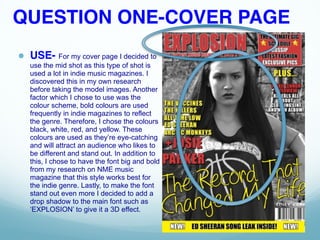
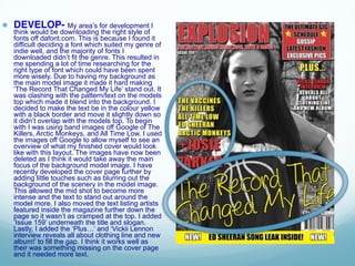
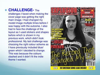
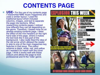
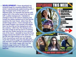
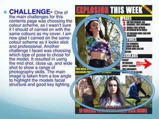
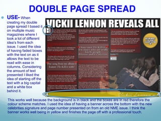
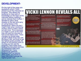
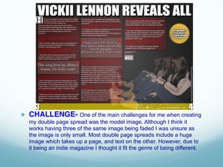
EVALUATION
BY VICKII LENNON
QUESTION ONE-COVER PAGE
● USE- For my cover page I decided to
use the mid shot as this type of shot is
used a lot in indie music magazines. I
discovered this in my own research
before taking the model images. Another
factor which I chose to use was the
colour scheme, bold colours are used
frequently in indie magazines to reflect
the genre. Therefore, I chose the colours
black, white, red, and yellow. These
colours are used as they’re eye-catching
and will attract an audience who likes to
be different and stand out. In addition to
this, I chose to have the font big and bold
from my research on NME music
magazine that this style works best for
the indie genre. Lastly, to make the font
stand out even more I decided to add a
drop shadow to the main font such as
‘EXPLOSION’ to give it a 3D effect.
● DEVELOP- My area’s for development I
think would be downloading the right style of
fonts off dafont.com. This is because I found it
difficult deciding a font which suited my genre of
indie well, and the majority of fonts I
downloaded didn’t fit the genre. This resulted in
me spending a lot of time researching for the
right type of font which could have been spent
more wisely. Due to having my background as
the main model image it made it hard making
‘The Record That Changed My Life’ stand out. It
was clashing with the pattern/text on the models
top which made it blend into the background. I
decided to make the text be in the colour yellow
with a black border and move it slightly down so
it didn’t overlap with the models top. To begin
with I was using band images off Google of The
Killers, Arctic Monkeys, and All Time Low. I used
the images off Google to allow myself to see an
overview of what my finished cover would look
like with this layout. The images have now been
deleted as I think it would take away the main
focus of the background model image. I have
recently developed the cover page further by
adding little touches such as blurring out the
background of the scenery in the model image.
This allowed the mid shot to become more
intense and the text to stand out around the
model more. I also moved the text listing artists
featured inside the magazine further down the
page so it wasn’t as cramped at the top. I added
‘Issue 159’ underneath the title and slogan.
Lastly, I added the ‘Plus…’ and ‘Vickii Lennon
interview reveals all about clothing line and new
album!’ to fill the gap. I think it works well as
their was something missing on the cover page
and it needed more text.
● CHALLENGE- The
challenges I faced when making the
cover page was getting the right
main image. I had changed my
model image multiple times before I
was happy with the outcome. I also
had to face the challenge of the
layout as I used stickers and shapes
before which is shown in my
previous work, which didn’t look
professional. My last challenge was
choosing the right colour scheme as
I have previously included blue/
green which I decided to change.
This was because the colours
clashed and it didn’t fit the indie
theme I wanted.
CONTENTS PAGE
● USE- For the use of my contents page
I researched NME music magazines and
used a similar layout. I used the
traditional layout which included
columns, images, and text to separate
the page into sections. When
researching contents pages I noticed
how different they can be depending on
the genre. Therefore, I based mine on an
already existing contents page. I liked
the effect of the mini headers on the right
hand side of the page, where it makes
the text look like it was part of the
background. I also really liked the idea of
the red arrow which allowed the reader
to skip to one of the main magazines key
features in that issue. The colour
scheme is black, white, red, and yellow
as I wanted it to match with the cover
page. I think it works well with these
colours and allows the page to look
professional and fit the ‘indie’ genre.
● DEVELOPMENT- I have developed my
contents page by choosing different fonts
which I was previously experimenting with. I
also changed some of the colours on
different parts, for example the banner with
yellow font in the centre used to be red font
with a yellow background. I decided to
change it due to the colours clashing and
incase the yellow background of the banner
would be the main focus, rather than the
model image above. I have changed all of
the model images a lot recently and edited
them by blurring out the background with
the scenery. I didn’t blur the background in
the main image at the top due to it working
well and the model having her arm around
one of the tree’s. I decided to have the three
images across the bottom with each one on
the left and right looking out on purpose.
From my previous work you can see how
much the contents page has developed as I
was worried it wouldn't look professional or
finished. I am finally happy with how the
contents page looks as it’s filled with
images and texts with lots of eye catching
features.
● CHALLENGE- One of
the main challenges for this
contents page was choosing the
colour scheme, as I wasn’t sure
if I should of carried on with the
same colours as my cover. I am
now glad I carried on the same
colour scheme as it looks slick
and professional. Another
challenge I faced was choosing
which type of pose to chose for
the model. It resulted in using
the mid shot, close up, and wide
shot to show a range of
photography skills. The main
image is taken from a low angle
to highlight the models facial
structure and good key lighting.
DOUBLE PAGE SPREAD
● USE- When
creating my double
page spread I based it
on multiple music
magazines where I
took a lot of different
idea’s from each
issue. I used the idea
of having faded boxes
with the text on as it
allows the text to be
read with ease in
columns. Considering
the amount of text
presented I liked the
idea of starting off the
text with a big capital
and a white box
behind it.
This works well because the background is in black and the boxes are in red therefore the
colour scheme matches. I used the idea of having a banner across the bottom with the new
celebrities signature and page number presented on from an old NME issue. I think the
banner works well being in yellow and finishes the page off with a professional touch.
● DEVELOPMENT-
On the right of the page are
quotations which I have
picked out of the interview on
purpose. This allows the
audience to have abit of
knowledge on the topic of the
interview before reading it
and to interest them further. I
decided to add a drop
shadow to the text and carry
on using boxes in the
background. Within the text I
made it italic when mentioning
another artist to make it stand
out abit more. This is because
if a reader is a fan of the artist
they will read the interview to
find out the latest news. I have
changed my double page
spread multiple times now with
the layout, text, and fonts to get
the highest grade possible. As
shown on my previous work on
my blog you can see the
progress I have made since
starting this document and how
my Photoshop skills have
developed too. I have
continuously gathered
feedback from my teacher,
other pupils, and friends to
keep improving it and get the
highest grade I can.
● CHALLENGE- One of the main challenges for me when creating
my double page spread was the model image. Although I think it
works having three of the same image being faded I was unsure as
the image is only small. Most double page spreads include a huge
image which takes up a page, and text on the other. However, due to
it being an indie magazine I thought it fit the genre of being different.

Evaluation

  • 1.
  • 2.
    QUESTION ONE-COVER PAGE ●USE- For my cover page I decided to use the mid shot as this type of shot is used a lot in indie music magazines. I discovered this in my own research before taking the model images. Another factor which I chose to use was the colour scheme, bold colours are used frequently in indie magazines to reflect the genre. Therefore, I chose the colours black, white, red, and yellow. These colours are used as they’re eye-catching and will attract an audience who likes to be different and stand out. In addition to this, I chose to have the font big and bold from my research on NME music magazine that this style works best for the indie genre. Lastly, to make the font stand out even more I decided to add a drop shadow to the main font such as ‘EXPLOSION’ to give it a 3D effect.
  • 3.
    ● DEVELOP- Myarea’s for development I think would be downloading the right style of fonts off dafont.com. This is because I found it difficult deciding a font which suited my genre of indie well, and the majority of fonts I downloaded didn’t fit the genre. This resulted in me spending a lot of time researching for the right type of font which could have been spent more wisely. Due to having my background as the main model image it made it hard making ‘The Record That Changed My Life’ stand out. It was clashing with the pattern/text on the models top which made it blend into the background. I decided to make the text be in the colour yellow with a black border and move it slightly down so it didn’t overlap with the models top. To begin with I was using band images off Google of The Killers, Arctic Monkeys, and All Time Low. I used the images off Google to allow myself to see an overview of what my finished cover would look like with this layout. The images have now been deleted as I think it would take away the main focus of the background model image. I have recently developed the cover page further by adding little touches such as blurring out the background of the scenery in the model image. This allowed the mid shot to become more intense and the text to stand out around the model more. I also moved the text listing artists featured inside the magazine further down the page so it wasn’t as cramped at the top. I added ‘Issue 159’ underneath the title and slogan. Lastly, I added the ‘Plus…’ and ‘Vickii Lennon interview reveals all about clothing line and new album!’ to fill the gap. I think it works well as their was something missing on the cover page and it needed more text.
  • 4.
    ● CHALLENGE- The challengesI faced when making the cover page was getting the right main image. I had changed my model image multiple times before I was happy with the outcome. I also had to face the challenge of the layout as I used stickers and shapes before which is shown in my previous work, which didn’t look professional. My last challenge was choosing the right colour scheme as I have previously included blue/ green which I decided to change. This was because the colours clashed and it didn’t fit the indie theme I wanted.
  • 5.
    CONTENTS PAGE ● USE-For the use of my contents page I researched NME music magazines and used a similar layout. I used the traditional layout which included columns, images, and text to separate the page into sections. When researching contents pages I noticed how different they can be depending on the genre. Therefore, I based mine on an already existing contents page. I liked the effect of the mini headers on the right hand side of the page, where it makes the text look like it was part of the background. I also really liked the idea of the red arrow which allowed the reader to skip to one of the main magazines key features in that issue. The colour scheme is black, white, red, and yellow as I wanted it to match with the cover page. I think it works well with these colours and allows the page to look professional and fit the ‘indie’ genre.
  • 6.
    ● DEVELOPMENT- Ihave developed my contents page by choosing different fonts which I was previously experimenting with. I also changed some of the colours on different parts, for example the banner with yellow font in the centre used to be red font with a yellow background. I decided to change it due to the colours clashing and incase the yellow background of the banner would be the main focus, rather than the model image above. I have changed all of the model images a lot recently and edited them by blurring out the background with the scenery. I didn’t blur the background in the main image at the top due to it working well and the model having her arm around one of the tree’s. I decided to have the three images across the bottom with each one on the left and right looking out on purpose. From my previous work you can see how much the contents page has developed as I was worried it wouldn't look professional or finished. I am finally happy with how the contents page looks as it’s filled with images and texts with lots of eye catching features.
  • 7.
    ● CHALLENGE- Oneof the main challenges for this contents page was choosing the colour scheme, as I wasn’t sure if I should of carried on with the same colours as my cover. I am now glad I carried on the same colour scheme as it looks slick and professional. Another challenge I faced was choosing which type of pose to chose for the model. It resulted in using the mid shot, close up, and wide shot to show a range of photography skills. The main image is taken from a low angle to highlight the models facial structure and good key lighting.
  • 8.
    DOUBLE PAGE SPREAD ●USE- When creating my double page spread I based it on multiple music magazines where I took a lot of different idea’s from each issue. I used the idea of having faded boxes with the text on as it allows the text to be read with ease in columns. Considering the amount of text presented I liked the idea of starting off the text with a big capital and a white box behind it. This works well because the background is in black and the boxes are in red therefore the colour scheme matches. I used the idea of having a banner across the bottom with the new celebrities signature and page number presented on from an old NME issue. I think the banner works well being in yellow and finishes the page off with a professional touch.
  • 9.
    ● DEVELOPMENT- On theright of the page are quotations which I have picked out of the interview on purpose. This allows the audience to have abit of knowledge on the topic of the interview before reading it and to interest them further. I decided to add a drop shadow to the text and carry on using boxes in the background. Within the text I made it italic when mentioning another artist to make it stand out abit more. This is because if a reader is a fan of the artist they will read the interview to find out the latest news. I have changed my double page spread multiple times now with the layout, text, and fonts to get the highest grade possible. As shown on my previous work on my blog you can see the progress I have made since starting this document and how my Photoshop skills have developed too. I have continuously gathered feedback from my teacher, other pupils, and friends to keep improving it and get the highest grade I can.
  • 10.
    ● CHALLENGE- Oneof the main challenges for me when creating my double page spread was the model image. Although I think it works having three of the same image being faded I was unsure as the image is only small. Most double page spreads include a huge image which takes up a page, and text on the other. However, due to it being an indie magazine I thought it fit the genre of being different.