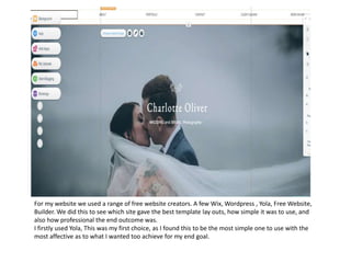
This document discusses layout plans for a fashion magazine focused on makeup and beauty.
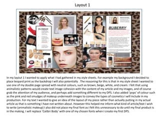
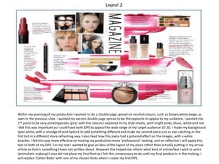
The first layout uses a leopard print background with pink and red smudges to represent makeup products. Neutral colors are used to match an article about "animalistic makeup." Sample text and images are included but no final font is chosen.
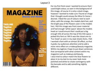
The second layout uses a white background with a pink lipstick smudge. Bright pink, blue, white and red colors match a planned article. Polaroid photo effects and sample text and images are displayed without final font.
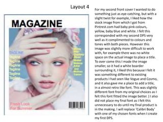
The first cover layout features a stock image of a model with orange hair and blue flowers. Bright colors and white space allow room for a title in a retro-