The document analyzes and compares the contents pages of three alternative music magazines: Kerrang!, Rock Sound, and Big Cheese. It finds that Kerrang! emphasizes a busy layout with tightly packed columns and images to maintain their bold house style, though this could be overwhelming for some readers. Rock Sound takes a simpler approach with fewer details, prioritizing large images and a controversial quote to attract readers. Big Cheese balances organization and vibrancy through divided sections and angled images. While all three represent the alternative music genre, they target different age demographics and have varying approaches to industry focus versus artist representation.
Here I have analysed different Rock related contents pages and double page spread's so I could see how they were structured for the production of my own magazine.
Here I have analysed different Rock related contents pages and double page spread's so I could see how they were structured for the production of my own magazine.
How to Make a Field invisible in Odoo 17Celine George
It is possible to hide or invisible some fields in odoo. Commonly using “invisible” attribute in the field definition to invisible the fields. This slide will show how to make a field invisible in odoo 17.
Instructions for Submissions thorugh G- Classroom.pptxJheel Barad
This presentation provides a briefing on how to upload submissions and documents in Google Classroom. It was prepared as part of an orientation for new Sainik School in-service teacher trainees. As a training officer, my goal is to ensure that you are comfortable and proficient with this essential tool for managing assignments and fostering student engagement.
Welcome to TechSoup New Member Orientation and Q&A (May 2024).pdfTechSoup
In this webinar you will learn how your organization can access TechSoup's wide variety of product discount and donation programs. From hardware to software, we'll give you a tour of the tools available to help your nonprofit with productivity, collaboration, financial management, donor tracking, security, and more.
We all have good and bad thoughts from time to time and situation to situation. We are bombarded daily with spiraling thoughts(both negative and positive) creating all-consuming feel , making us difficult to manage with associated suffering. Good thoughts are like our Mob Signal (Positive thought) amidst noise(negative thought) in the atmosphere. Negative thoughts like noise outweigh positive thoughts. These thoughts often create unwanted confusion, trouble, stress and frustration in our mind as well as chaos in our physical world. Negative thoughts are also known as “distorted thinking”.
The French Revolution, which began in 1789, was a period of radical social and political upheaval in France. It marked the decline of absolute monarchies, the rise of secular and democratic republics, and the eventual rise of Napoleon Bonaparte. This revolutionary period is crucial in understanding the transition from feudalism to modernity in Europe.
For more information, visit-www.vavaclasses.com
Read| The latest issue of The Challenger is here! We are thrilled to announce that our school paper has qualified for the NATIONAL SCHOOLS PRESS CONFERENCE (NSPC) 2024. Thank you for your unwavering support and trust. Dive into the stories that made us stand out!
Ethnobotany and Ethnopharmacology:
Ethnobotany in herbal drug evaluation,
Impact of Ethnobotany in traditional medicine,
New development in herbals,
Bio-prospecting tools for drug discovery,
Role of Ethnopharmacology in drug evaluation,
Reverse Pharmacology.
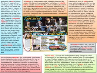
1. Aptly named, the title is Contents.
This allows the reader to know
what they’re reading. Beneath the
title is also the issue number and
cover date. These are important as
it lets fans know whether they have
the most recent issue or not. It
could be said that Kerrang! values
the magazine and it’s profit over
the content as the issue number is
present as well as a subscription
offer. This subscription offer, in the
right third is one of the first things
seen by the reader as they turn the
page. This shows how Kerrang!
places greater emphasis on the
music industry than the artists and
bands they have content on and
how they are only seeking profit
rather than sharing content
appreciated by it’s audience. Unlike
the masthead on the Front Cover,
the title doesn’t run across the
whole of the width. Instead it is
framed in top left hand side.
However, a banner is used to show
the Brand’s identity (the Kerrang!
Name). The use of the words “This
week” lets the reader know that
the content is from that current
week.
Kerrang! includes an editorial in their contents page. This is included
because it allows the reader to relate to the editor as they read her
piece as well as see which content she may like in particular. By
having the editorial, the magazine contradicts this industry over
artist representation as the editorial discusses some content. The
reader will relate to the editorial more as there is also an image of
the editor. Because of the image, the reader will be more inclined to
buy the magazine because they feel like someone similar to them, a
fan of alternative music, has written the magazine.
The layout of the contents page is simple, the page is divided into two
sections. With the main image occupying the first half, and the editorial,
features and other content in the other. Like the Front Cover, the contents
page follows the busy house style, with overlapping images in the first
section and 4 tightly packed columns in the second section (excluding the
editorial). These 4 columns are then divided into 9 subheadings, allowing
the reader to easily navigate through the different content. Unlike the
Front Cover, the contents page is more organised however it still maintains
the busy house style.
The main image, a low angle shot denoting the band sitting, looking at the camera
further cements the idea of artist over industry as the top half of the contents page is
an image of the band Young Guns. This image represents them as down to earth,
regular people as they are not posed extravagantly or in a rebellious way (although this
would connote the chaotic alternative music genre). This allows the reader to relate
and encourages them to read the feature about them. This feature can be found using
the icon by the caption. The fact that the band take up half of the contents page
represents them as important. This important representation can also be conveyed
through the low angle of the shot. This represents the band as more important and
successful than the reader, allowing the reader to idolise them instead.
In addition, the use of the icons forces the
reader to skim through content they normally
wouldn’t read to find the features’ pages. The
black star on a red circle let the reader know
that the content is a feature. These icons are
unevenly spread out, making the reader look
through other content. In addition, although
the organisation can be seen, (through the
separated columns, subheadings and icons),
the contents page maintains the busy and lively
connotations of alternative music. The tightly
packed content, slanted images and vibrant
colour scheme convey to the reader the hectic
lifestyle of an artist in the alternative music
industry. It’s the busy layout that let’s the
reader know that the magazine’s genre is
alternative. The target audience wouldn’t have
any issues navigating through the layout as
they are teenagers/young adults and therefore
are used to layouts like this. Adults who don’t
read these types of magazines would struggle
locating the content they want as they aren’t
used to the busy layout.
The trail article used on Cover is now used
as an image, along with others, to break up
the text, creating the busy house style.
The Target Audience like this as it’s not
lengthily paragraphs.
2. The colour scheme used on the Front Cover is maintained throughout, connoting professionalism. Although red is
not used as extensively, it is still used for the icons and subscription offer. These grab the reader’s attention and
therefore play a crucial part in maintaining the reader’s interest. Yellow and white have been used more for the
contents page. This is to make it follow the bold house style. These colours in particular stand out on the banner and
main image. By using black as a background for text, the contents page is vibrant and connotes the loud alternative
music genre. By following the vibrant and bold house style, Kerrang! is represented as professional as their audience
reads a well produced contents page.
In order to maintain the bold house
style, a sans serif typeface has been
used throughout the contents page.
Although this grabs the reader’s
attention, it could be suggested that the
typeface connotes a lack of
professionalism as a sans serif typeface
is used. Other alternative music
magazines use serif typefaces to convey
how editors have an influence in the
content. Kerrang! only uses sans serif
typefaces. This connotes that it is fans
who write the content for Kerrang!. On
the other hand, this is beneficial for the
Target Audience as they can relate to
the person who wrote the article. Like
the Front Cover, all of the writing is in
capital letters. This represents all the
content as important, not just the
features.
3. Unlike Kerrang!, Rock Sound’s title is the Masthead from the Front Cover. This connotes that they place a greater
emphasis on the magazine and industry over the artists and content. Furthermore, the inclusion of the issue number
below the title reinforces this as it conveys to the reader how it is a collectable and therefore all issues should be
purchased. This shows how Rock Sound are only looking to financially benefit themselves. The fact that the title is in the
largest typeface and in the left third means it is one of the first things seen by the reader. As a result, the reader will see
the title as well as the financial aims connoted.
In order to follow it’s organised house
style, Rock Sound have a simplistic
Contents Page with a lot less vibrancy
and content than Kerrang!’s. This is
because Kerrang! had a messy and bold
house style which therefore included
tightly packed columns, subheadings and
icons. Whereas Rock Sound have opted
for a less busy layout which is more
navigable. The only content that they
mention are the main features in the left
third. Due to it’s positioning, it’s one of
the first things read and would make the
reader want to read the content on
those pages. By only incorporating the
main features, there is less content on
the contents page. This would appeal to
the Target Audience as unlike Kerrang!,
who has an audience which includes
young teenagers, this contents page is
more suited to young adults.
The title is also
the brand’s
identity,
promoting the
magazine to it’s
reader.
There is no need for a contents page to
be extremely messy if it’s targeting a
young adult. Moreover, if the contents
page was messy then it wouldn’t follow
the organised house style and therefore
would represent Rock Sound as
unprofessional. The fact that the house
style is followed connotes that the
editors and contributors have a big input
into the production of this magazine, it’s
not just fans writing the content (like
Kerrang! connotes.)
Furthermore, Rock Sound uses the main image
as a background for the Contents Page. Not
only does this follow the house style, (the main
image on the Cover filled all of it), the image
also connotes the teenage audience that the
magazine attracts. This is because teenagers
prefer large images over lengthily paragraphs.
Overall, the simplistic layout allows the reader to easily navigate through the
features whilst maintaining it’s house style. However, the reader would only
be aware that is an alternative music magazine because of the main image and
it’s connotations. The lack of content, colours, images and messy layout
subvert the expectations of an alternative music magazine. This connotes an
older Target Audience. A teenage fan of Kerrang! would be disappointed with
the layout as it’s not eye catching and with the dark background of the main
image, the magazine appears dull, losing the reader’s interest.
The main image is a medium close up
denoting Jacoby Shaddix staring at the
camera, with a questioning facial expression.
This facial expression is linked with the pull
quote which suggests he likes to listen to
Justin Bieber. As a rock star, fans of the
magazine and Shaddix wouldn’t expect him to
listen to pop music. This pull quote is
controversial as many fans would be angry at
Jacoby for listening to that genre of music.
Rock Sound chose to include the pull quote as
they knew it would be a major talking point
and would be controversial. The decision to
include this connotes the rebellious
alternative music genre. Shaddix’s facial
expression mirrors the reader’s thoughts,
questioning his music taste. This represents
him as unique and weird. The fact that he
knew that the quote would cause an uproar
represents him as a rule breaker and
rebellious as he still chose to say it, regardless
of the reactions of fans. This connotes the
alternative music genre.
4. In addition, it also generates a major
talking point and encourages readers to
turn to the feature. Interestingly, Rock
Sound have chosen to have a
controversial pull quote to attract the
readers instead of a vibrant colour
scheme and busy layout. Furthermore,
the pull quote and main image connote
the alternative music genre whilst
following the house style. This
represents Rock Sound as professional.
Unlike Kerrang!, Rock Sound have
chosen not to advertise their
subscription offers on the contents
page. This conveys to the reader how
they value the bands and content over
financial gain.
Although the lack of vibrancy from the main image may
lead to a dull Contents Page, the reader can clearly see that
it is an alternative music magazine. This is because the
main image includes Shaddix’s tattoos and represents him
as the most important. Alternative music magazines often
represent an artist or band as the most important though
the size of the images. This is to connote their popularity
and status on the scene.
The mode of address, staring at the
camera, encourages the reader to turn
to the feature as they feel Shaddix is
looking at them personally. This makes
the magazine more personal to them
and would make them want to purchase
it.
The colours used for the contents page mirror the ones used for the cover, following the colour scheme and continuing the professional house style. The colour
scheme used connotes a male audience as blue is used extensively. Moreover, the blue t-shirt Shaddix wears matches the blue border of the contents page,
connoting professionalism and a male audience. The colour scheme includes black and white and are used to contrast each other with the aim of having a contents
page that is eye catching. However, due to the lack of colours in the colour scheme and the dark main image, the colour scheme is not successful in grabbing the
reader’s attention. Although the blue and white used for the text standout, the lack of conventions on the contents page lead to the loss of interest of the teenage
audience. However, part of the target audience, the young adults, would realise that the lack of conventions is part of the organised and simplistic house style and
therefore wouldn’t mind the lack of vibrancy. If the colour scheme was more vibrant then I think that all of the target audience wouldn’t be bothered by the
simplistic contents page.
A sans serif typeface is used for all of the
text on the contents page by Rock
Sound. This connotes the teenage target
audience. This is because stereotypically,
a serif typeface appeals to adults. By
using this sans serif typeface, one can
see how all the content is targeted
towards teenagers. Interestingly,
beneath each feature, there is additional
information about the features. This
information is in a smaller sans serif
typeface however it looks similar to a
serif typeface. This would appeal to the
older part of the audience (the young
adults), who would think the typeface
adds a professional edge and makes the
magazine stand out when compared to
other alternative music magazines that
rely on big sans serif typefaces to grab
the reader’s attention. This smaller
typeface connotes professionalism and
suggest that the editors and contributors
have had a large contribution to the
page as they want the page to follow the
house style as much as possible whilst
connoting reputability and
professionalism.
5. Unlike Rock Sound, Big Cheese have also done the same as Kerrang! and have decided to
name the title “contents”. This clearly allows the reader to understand what they’re looking
at. In extension, Big Cheese have chosen not to include the issue number. This conveys to
the reader how they are not focused on financial gain. If the issue number was present the
magazine would be connoted as a collectable and therefore a series of magazines that
should be bought. The fact that it doesn’t shows how the magazine values the content over
profit. “Content” also has the largest typeface, grabbing the reader’s attention and letting
them know what they’re reading.
The Contents page’s layout is very simplistic with the page divided
into two sections. In the left third, the reader can see and navigate
through the articles and features. In addition, Big Cheese have all the
content in one column which is then divided into two under two
subheadings. The reader can see all the articles and “regular”
content in the regular section. Or alternatively, they can see the list
of features under the subheading of Kingsize.
I think that division of content clearly shows how
the magazine’s contents page subverts the busy
house style. The separation of content contradicts
the cover where conventions like posters and
anchorage text were angled, connoting the wild
rock lifestyle. I think that the well organised layout
subverts the messy house style because the target
audience includes some adults. Both teenagers
and adults would find the layout easily navigable.
Adults would prefer this layout over Kerrangs! as
they don’t have to search through other content
to find the one they want. The downside to this
layout is that content is easily ignored as
everything is already sectioned. If the reader
doesn’t look in that section, the content won’t be
read. The benefit of Kerrang!’s layout is that all the
content is integrated together meaning the
features have to be searched for. This means all
the content is read when finding the features. Big
Cheese’s organised layout appeals to the adults of
the audience more than the teenagers who prefer
a busier and more messy layout. The fact that the
text is all in the left third means that it is read first
as it is the first thing seen by the reader.
Furthermore, the images take up two thirds of the
contents page, taking the centre and right third.
This represents them as more important. The
reader will be drawn to the large images as they
occupy most of the space. Each image is aligned
with one another and is slanted. This connotes the
rebellious attitude and the chaotic rock lifestyle in
the alternative music industry. The reader will see
this and know that the magazine is about
alternative music.
Like Rock Sound, Big Cheese do not
have an editorial. This shows how
editors and contributors have a big
influence on the production. In
Kerrang!, an editorial allows the
reader’s to relate to the editor,
connoting how the editor is a fan of
the music. The fact that this contents
page doesn’t, represents the
magazine as more professional. The
organised layout also connotes the
professionalism.
Interestingly, Big Cheese have chosen
to subvert expectations and not have
a main image in the contents page.
This connotes the rebellious life style
in rock music. Instead, they have 3
images which add vibrancy and
maintain the reader’s interest
through the colours. The top image
represents the band “pure love” as
successful and the most important.
This is because they are positioned at
the top of the images. Moreover, the
fact that they are the main image
with Lower than Atlantis represents
them as important. The image of Pure
Love is a two shot denoting them
looking down at the camera,
cementing this idea of power and
fame as the reader would look up and
idolise them.
The white shirt worn by one of the band members also connotes
purity and success. The sunny background is unconventional and
adds vibrancy to the contents page, grabbing the reader’s attention.
The fact that the bad look like they are in an exotic location also
represents them as successful. The location is unusual as usually, the
background of images in an alternative music magazine are dark like
the central image.
6. The central image is of the other band from the Cover- Lower than Atlantis. The image is a wide shot denoting the band staring at the camera. This mode of address
is used in all 3 images and makes the reader feel like the magazine is targeted towards them specifically. This will encourage them to read on and buy the magazine.
The band are represented as serious through their stern facial expressions. This representation is common in alternative music magazines as the rock genre isn’t
usually associated with positivity and happiness. The dark background also connotes the aggressiveness of the subgenres that the magazine covers. The bottom
image is of the famous punk/rock band Green Day. Fans of Green Day would buy the magazine because their favourite band is in the magazine (Richard Dyer’s Star
Theory). The image is a wide shot denoting the trio playing live. This sums up the alternative music genre entirely as the reader can see the band rocking out. The
image represents them as a stereotypical band as many other alternative music magazines incorporate an image like this. It could be suggested that due to Green
Day being only a feature article and Lower than Atlantis and Pure Love being the main image on the cover, the band are positioned at the bottom as the content
about them is less important. On the other hand, the fact that all the images are the same size and shape represents them all as equally important and successful.
This also represents the magazine as organised and well laid out, subverting the busy house style on the cover.
The colour scheme seen on the cover is
used throughout, including on the contents
page. This represents the magazine as
professional, once again showing how the
editors had a big input in the production
process. If a different colour scheme had
been used them the magazine would lose
it’s reputability as the magazine wouldn’t
look as presentable. The use of the colour
red grabs the reader’s attention and stands
out against the white background.
Interestingly, a white background has been
used instead of a black one. Usually it is the
other way around. This represents Big
Cheese as breaking the mould and
conveying to the reader the rock attitude.
Although blue is not used in the contents
page, the reader can still see that the
magazine targets a male audience as red
and black are stereotypically masculine
colours. Additionally, the fact that all the
images are of men connote this male
audience. I think that although the colour
scheme is bold, the images maintain the
reader’s attention. The variety of lighting
and colour make the page stand out, not
the colours of the typeface. Big Cheese
have chosen to subvert the busy house
style to have an organised layout. This is to
clearly convey content which appeal to all
members of the audience.
A bold, sans serif typeface has been used
for the contents. This has been used as not
only does it stand out, it appeals to the
teenagers of the audience. Like Rock Sound
and Kerrang!, Big Cheese uses a sans serif
typeface throughout. This is because a serif
font wouldn’t connote the rock genre
correctly. However, like Rock Sound, Big
Cheese also have additional information
underneath the contents. This sans serif
typeface is smaller and looks similar to a
serif font. This connotes professionalism
and shows how they are trying to appeal to
the adults in the audience as well as
teenagers.
7. XXL have used the title “the A-side” for this contents page. This is to convey to the reader that the content
relating to the well known celebrities in the rap industry will be in this section. The main image of Soulja Boy
and 50 cent reinforces this as they are two very well known artists in the music industry in general. All of the
title is in lower-case apart from the “A”. This places emphasis on it and connotes this contents page as having
the best rappers. Usually, the title would be all in capitals however this title is the opposite. By subverting this
convention, the title connotes the rebellious attitude of rappers. This helps the reader understand the genre
and also emphasises the brand’s identity.
A banner has been used to alert the reader to the
fact that the content below are only features.
Additionally, the banner also includes the date
and masthead from the cover. By including the
masthead from the cover, XXL is represented as
placing financial gain over content. This is because
they place great emphasis on promoting their
brand identity, this can also be seen in the
bottom left corner with the magazine’s website
being advertised. With self promotion, the
magazine is going to make more profit meanwhile
they only include the features, not all the content.
They have chosen to do this as they value the
features as the most important. This is because
the features are about the well known artists and
not unknown newcomers. The target audience
would prefer to read about a star rather than
someone with little credibility. The fact that 50
cent’s hat extends into the banner represents him
as important as it is the only thing that overlaps in
the well organised layout.
The layout follows the neat and organised house
style. As seen on the Front Cover, the text flows
around the left hand side of 50 Cent, in the left
third. Although the text is in the left third and
would be one of the first things read, the
attention is once again on the main image. This
is due to the size and position. Extending slightly
into the left third and covering the rest of the
width, the main image is the convention that
grabs the reader’s attention. Like the Front
Cover, the text is less important as there is a
greater emphasis on the image. This represents
the artists as the most important. The neat
house style can be seen in the layout as the text
is all in one column and goes down the page,
divided by 7 subheadings (the feature names).
This represents the magazine as professional as
the layout is not messy and does not contradict
the house style which is seen on the Front Cover.
By maintaining this house style, the magazine
has a professional and reputable feel. This layout
would appeal to the target audience as the main
age bracket is 16-22. The audience would want
to be able to easily navigate through the content
whilst seeing their favourite artists.
The main image covers the majority of the contents page (the middle and right third). This mirrors the Front
Cover creating a well laid out Contents page, following the organised house style. In addition, the contents
page cements 50 Cent’s representation as guardian to Soulja Boy as once again, he is behind him. This
representation embodies the phrase “got your back” as the reader sees a close friendship. This shows how the
rap industry creates bonds and unifies people. Additionally, the pull quote represents Soulja Boy as honest as
he makes a truthful and bold statement. This honest and heartfelt statement is not usually seen in rap
magazines as the rappers are trying to be represented as intimidating and successful.
Like the Front Cover, the contents page uses a
large main image to grab the reader’s attention
and to offer an insight into the rappers’ lifestyle
and habits. The main image is a two shot,
denoting Soulja Boy and 50 Cent standing back to
back. Accompanied with the pull quote, one can
see how the image represents them as loyal
friends and guardians, looking out for one
another. The fact that this is the main image
shows how a rapper’s extravagant lifestyle leads
to allies. The mise-en-scene also connotes their
wealth as the reader can see lots of gold
accessories. This represents them as successful as
they can afford these expensive items. The mode
of address, staring at the camera, not only makes
the reader feel like the magazine is personal to
them but also represents the rappers as
intimidating. This cements their powerful and
dangerous representation.
8. For the title , a bold sans serif typeface is used. This has been used to grab the reader’s attention and to create an
eye catching cover. Accompanied with the image, I think that the magazine is successful in drawing the reader in.
Furthermore, another sans serif typeface has been used for the subheadings. This stands out in comparison to the
text underneath. This text is also a sans serif typeface but looks similar to a serif font. This is to represent the
magazine as professional and to appeal to the main age bracket of the target audience. 16-22 year olds won’t be
attracted to the magazine if it has a sans serif bubble writing typeface. By having a professional looking typeface, the
reader would be more interested in the magazine as it connotes that there are serious topics in the magazine.
The colour scheme is continued from the Cover
and maintained throughout the magazine. This
represents XXL as reputable and professional as
the magazine appeals to it’s audience and
therefore generates a large circulation. The dark
masculine colours connote a male dominated
audience. Although the magazine doesn’t need
to be vibrant to stand out, because the main
focus is on the image, the use of the colour red
adds vibrancy to the page. The colour red also
connotes the gangster lifestyle of these rappers.
By using the colour white, the main image and
black text look prominent on the page, drawing
the reader’s attention to them.