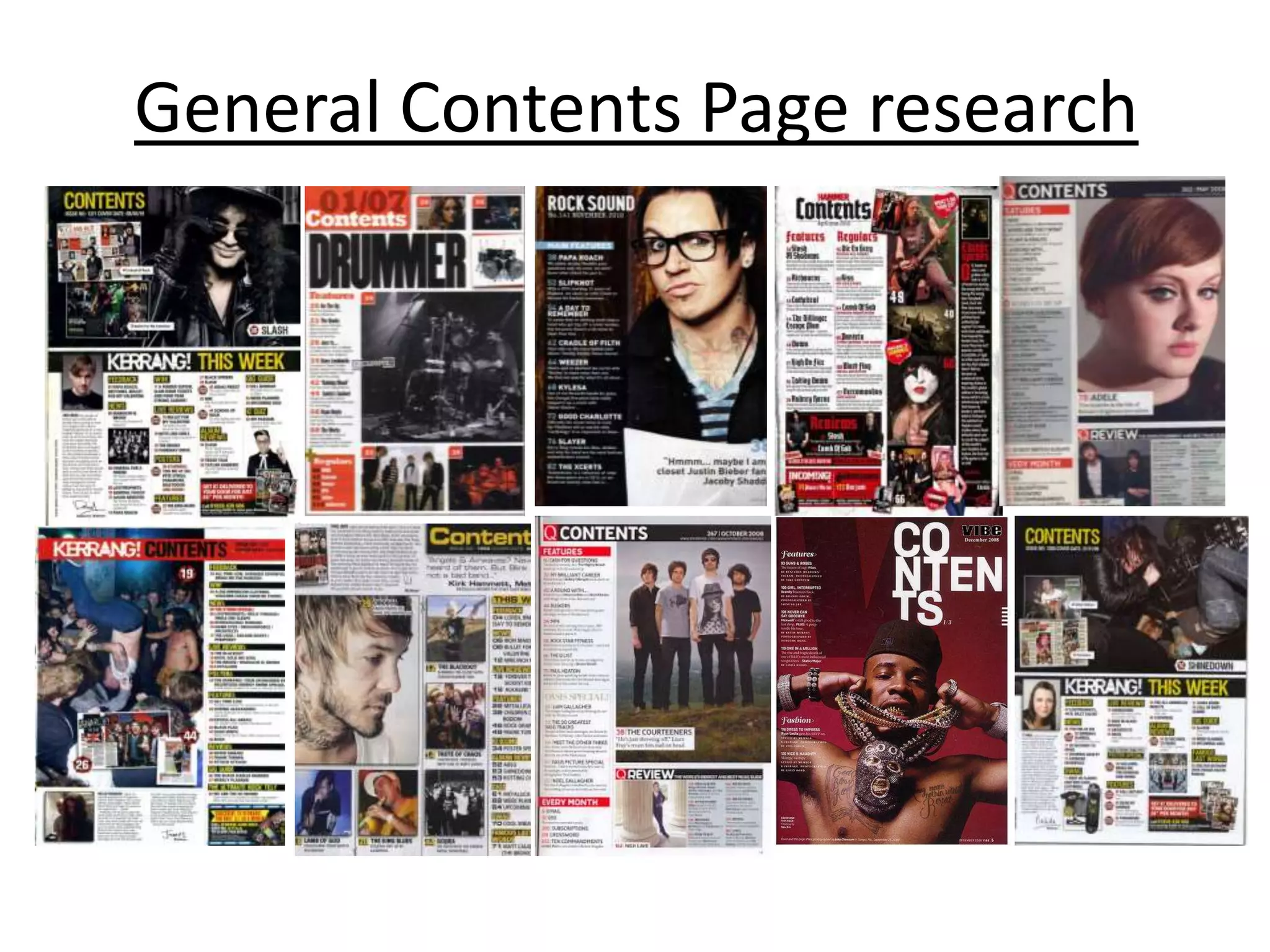
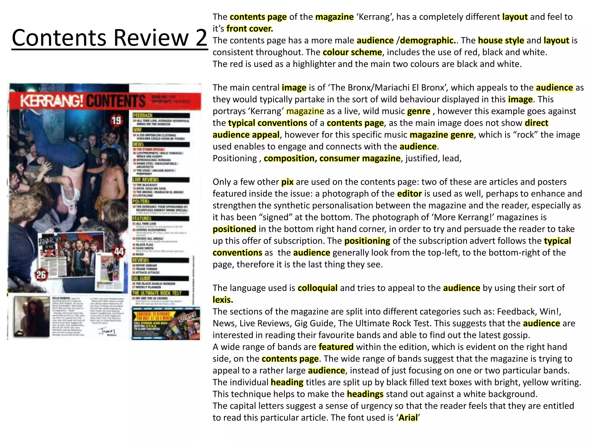
Research-Music Magazine
Spin, Q, kerrang, Vibe, xxl ,the source
Research- Magazine Front Cover
http://prezi.com/b_d9qfmu0lqp/front-page-conventions/
General Music Magazine Research
Cover Review 1
This is the number one, ‘hip hop’ selling magazine in the world.
Unlike “The Source”, ‘XXL’ concentrates strictly on music, the
consumers buy the magazine for its information on artists, album
releases, top 20 in the charts, interviews with the artist.
In this edition, the main image is of the famous rapper Eminem,
who is statistically in the top 5 most successful and popular rappers
of all time.
This is an example of one of the codes and conventions.. XXL use
notorious artists, such as Eminem to reel in their consumers and by
using a dominant character in the ‘hip hop’ culture, who has
influenced many, thus it will help their marketing..
The main image has been ... Through the use of mise-en-scene, the
audience can recognise the genre of music. Eminem’s facial
expression and position supports this view. The artists facial
expression is very blunt and direct. His right hand reaching for a
gun. Through this, the implication of ‘violence’ and .. Is portrayed.
Although his gun is not fully portrayed, it could be argued that it is
part of his outfit.. Image..
The artist also has a black ‘punisher’ tattoo on his chest, which is
the first thing the audience sees, it mirrors his image and
expression of anger and evil.
The lettering used is white and red. This is a typical convention of
opposing colours, as the red’s boldness stands out and catches the
viewers eye. The white font is clearly visible on both the red and the
black background. The font used for “Eminem” is hollow,
transparent font..Which is not a typical convention of magazine
products, thus catching eye.
Cover Review 2
“The Source” which is statistically the second most sold hip hop
magazine in the world, is widely credited for its insight into hip
hop’s music genre, politics and culture.
I decided to analyse this music magazine product because of its
popularity and also because of the theme of politics is rather rare to
have within a music magazine, therefore highlighting its
uniqueness.
The main image features the rapper “Game”. He has been
composed with his eyes closed and holding a gun under his chin,
projecting the idea of suicide and violence, however the strapline
states “Suicide Is Not An Option”, suggesting its advertising the
danger and stupidity. This is an example of controversy and
juxtaposition.
The specific choice of colours used for the text denotes the theme
of anger.. The use of the strong, vibrant red connotes anger, which
mirrors the reaction on the artists face. The purity of the white,
connotes ‘hope’, mirroring the message being illustrated...
The composition of the main image is positioned infront of the
masthead, which suggests the confidence and popularity of the
magazine, because they are able to block part of the lettering and
consumers would know which magazine it is.
The target audience for this magazine is most likely to be males
ages 18+ due to its profound moral messages and young peoples
lack of interest in politics. The cultural would be ‘gangster’
KERRANG Music Magazine Research
Research- Contents Page
bauer distribution
-think about for evaluation
http://prezi.com/iememenln6rq/contents-page-conventions/
General Contents Page research
Review 1
This is a contents page from ‘Vibe’ magazine. The magazine consists of the latest music, music
reviews, interviews and fashion.
The key/main image used is featuring the famous singer..”..”, who portrays a very sexual.. Nature.
His showing his bare chest which is a typical convention as it entices and captures female
attention to the magazine.
The artist in the key image has been portrayed as a very stereotypical Hip-Hop artist, which is
evident through the use of positioning and costume. In the main image, he has a vast amount of
jewellery on, around his neck and gold teeth, this connotes the idea that the artist is very
successful therefore very wealthy. The tattoos on his body, and his fit, muscular physique gives
the audience the impression that he is very strong and intimidating, almost invisible.
Although the Vibe magazine is a music magazine, it is clear on the contents page that the
magazine also provides /features articles on ‘fashion’ therefore it also provides a source of
entertainment and lifestyle, which is an example of a consumer magazine.
This contents page only features one image, which is deliberately placed in the centre to not only fill the spare spaces, but puts the
readers focus on the image as centre of attention.
The type of camera shot used is a medium/close up, therefore the audience can only view the chest and above. ...
The artists is showing direct audience appeal which is a typical convention used on all main covers, contents pages and double page
spreads, to engage and connect with the audience.
The layout of this contents page is very simple.
The main subhead on this page is 'Contents’ is an example of a ‘deck’, as the word is made up with several lines. This is due to the title
being deliberately made big and in capital letters therefore creating an effective and eye catching title. This convention has become a motif
to this specific magazine, as the typography is the same throughout every article.
The colour scheme seems to be white with a deep dark red/burgandy background. This source of colour connotes the story of the article,
it is likely to feature something about either passion, anger or violence.
The white font in contrast to the red background is very effective and works to help make the text stand out to the audience, which it
certainly does.
The typography of this contents magazine ..
Although the example above is a magazine ‘contents page’ there are particular features that go against the typical conventions of a
contents page. For example, there are no direct page numbers..
There is also no ‘wrap’ structure to the text/font, it all appears to just lay over the key image.
Contents Review 2
The contents page of the magazine ‘Kerrang’, has a completely different layout and feel to
it’s front cover.
The contents page has a more male audience /demographic.. The house style and layout is
consistent throughout. The colour scheme, includes the use of red, black and white.
The red is used as a highlighter and the main two colours are black and white.
The main central image is of ‘The Bronx/Mariachi El Bronx’, which appeals to the audience as
they would typically partake in the sort of wild behaviour displayed in this image. This
portrays ‘Kerrang’ magazine as a live, wild music genre , however this example goes against
the typical conventions of a contents page, as the main image does not show direct
audience appeal, however for this specific music magazine genre, which is “rock” the image
used enables to engage and connects with the audience.
Positioning , composition, consumer magazine, justified, lead,
Only a few other pix are used on the contents page: two of these are articles and posters
featured inside the issue: a photograph of the editor is used as well, perhaps to enhance and
strengthen the synthetic personalisation between the magazine and the reader, especially as
it has been “signed” at the bottom. The photograph of ‘More Kerrang!’ magazines is
positioned in the bottom right hand corner, in order to try and persuade the reader to take
up this offer of subscription. The positioning of the subscription advert follows the typical
conventions as the audience generally look from the top-left, to the bottom-right of the
page, therefore it is the last thing they see.
The language used is colloquial and tries to appeal to the audience by using their sort of
lexis.
The sections of the magazine are split into different categories such as: Feedback, Win!,
News, Live Reviews, Gig Guide, The Ultimate Rock Test. This suggests that the audience are
interested in reading their favourite bands and able to find out the latest gossip.
A wide range of bands are featured within the edition, which is evident on the right hand
side, on the contents page. The wide range of bands suggest that the magazine is trying to
appeal to a rather large audience, instead of just focusing on one or two particular bands.
The individual heading titles are split up by black filled text boxes with bright, yellow writing.
This technique helps to make the headings stand out against a white background.
The capital letters suggest a sense of urgency so that the reader feels that they are entitled
to read this particular article. The font used is ‘Arial’
Review 3
The colour scheme and font style used
on the contents page differs from the
one which was used on the cover page.
The monochromic colours highlight and
separate: the headlines, page numbers
and the brief explanations that come
with this. This helps make the
headlines stand out.
The font used is more formal than the bold
thick font that is used on the cover. This
signifies this lexis is more informative. This will
gratify the consumers needs of information and
entertainment. All font is clear too read which
will appeal to the reader as it will be easy to
read. By having the headlines and description of
the articles different colours it will draw
attention to each article and encourage the
audience too the read on. The lexis used as in
description is done deliberately to give the
reader enough information to intrigue them too
read on.
The stern facial expression used is to reinforce
the emotion of intimidation that magazine would
like the audience too feel. This could be used so
that when the reader reads the article based on
Eminem they feel endear to him after he has
shared his stories with them. This will satisfy the
reader needs of entertainment, information,
personal, identity, integration and social
interaction.
The white space is filled with the dominating
image of the main artist, Eminem and the stage
curtain’s. This reinforces the sense of significance
and popularity that was created and portrayed to
the audience within the cover of the magazine.
The advertisement used on the contents cover is a link to
the ‘Vibe’ website hidden with a barcode. This will
attract the attention of the audience as this convention is
used on the cover normally not within the magazine
which will cause them too concentrate and realise it is a
means of advertisement. By this time the image would
have caused their attention so the majority of the
audience will check out the website.
The introduction gives the reader a
deeper insight to the magazine which
creates a sense of loyalty and
importance for the reader and
encourages them to buy the magazine
through deeper knowledge.
This contents page includes an artist
index to inform and navigate the
audience to the specific artist they
may prefer to read about through
admiration. This will appeal to the
reader because it makes finding the
information they want easier
The mise-en-scene used on the contents
page signifies and represents the artists
magazine in a certain way. For example,
the costume chose for Eminem signifies
his wealth, importance and high statue.
Which also suggests the credibility of the
magazine due to the fact they can feature
a well known star. (star marketing).
The low key lighting used which creates a
shadow across the face of Eminem gives
the image a feeling of mystery and danger.
It could also signify the dark secrets the
artists is going to tell within the article.
This will gratify the audience’s needs of
information and entertainment.
This is a very un-conventional contents page
due to the lack of pictures and also for the
fact it doesn't feature any page numbers.
This differs the contents page from the
typical print-based media products so that
the audience will find it easier to recognise
and remember. It also connotes that the
magazine would like to appear rebellious and
independent.
The body language used on the .. Contents page by Eminem, connotes that the magazine would like him to be
represented negatively. By having his fingers intertwined with another this suggests intimidation. This along with the
headline used on the cover will intrigue the reader through feelings of curiosity and interest.
Research- Double Page Spread
General Double Page Spread
Double page spread review 1
The main image of Jay-z takes up one page of the double page spread and thus
enforces his presence on the article. The main image has been composed so
that the audience can see Jay-z’s face and shoulders, however most of his
shoulders/lower frame has been cut out of the page, possible due to his broad
shoulders, as well as demonstrative of the struggle in his life and the power that
he now holds.
The sunglasses completely conceal the identity behind his eyes, therefore portrays a feeling that there are many things that
remain hidden and that are possibly revealed in this article, therefore it is an engaging convention.
The sunglasses add emphasis to his trademark mouth and lips what has helped his career and fortune.
The necklace around his neck is a symbol of wealth and class. This style of costume and image supports the stereotypical
portrayal of an ‘Hip Hop’ artist.. “gangster”
The image is cast with a red-washed liked effect on one side. The red conotes the theme colour of the Q magazine, as well as
symbolising the colour of passion, love and blood. The other side is green/white, a colour of purity and cleanliness, perhaps
suggesting Jay-z is now tainted and his purity is disappearing, he is now soiled.
This image is almost in the ‘Sheppard Fairey style’, made so famous by Barak Obama’s successful election campaign of 2007.
Therefore, this could relate to Jay-z trying to achieve this equality, power and wealth as a black American Rapper...
Red is used again as a quote from the interview placed on Jay-Z’s left shoulder. He is talking about the adversity he met from
Noel Gallagher when he headlined at Glastonbury and the colour red demonstrates the power he showed to overcome it. The
quote also relates to him breaking down cultural and social stereotypes, which supports the suggesting of the Sheppard Fairey
style.
The large red J behind the text in a serif font is a mirror image of the Q magazine logo, yet the J is representing the ‘J’ in ‘Jay-Z.
The whole text is in a sans serif font which holds with the classy, upper end look of the Q magazine. All over the double page
spread, Jay-Z and other key words are highlighted in red, the colour of power, passion and Q magazine.
Double Page Review 3
The main image is
featuring Lady Gaga.
This image portays a
sexual behaviour as
appears to be naked
her facial expression
draws the audience
to.. In addition to thi
the image has darke
areas for effect so th
we look at her eyes a
the jewlery..
Jewlerry only roun
neck, infers that sh
quite like a male..
Stereotype male R
stars to wear gold
and jewlerry aroun
their neck.
The main image of Lady Gaga takes up
one page of the double page spread and
thus enforces her presence on the
article.
In the image, we see Lady Gaga’s face
and shoulders, yet her left shoulder/arm
is slightly cut off,..

Research Existing Magazines

  • 1.
    Research-Music Magazine Spin, Q,kerrang, Vibe, xxl ,the source
  • 2.
  • 3.
  • 4.
  • 5.
    Cover Review 1 Thisis the number one, ‘hip hop’ selling magazine in the world. Unlike “The Source”, ‘XXL’ concentrates strictly on music, the consumers buy the magazine for its information on artists, album releases, top 20 in the charts, interviews with the artist. In this edition, the main image is of the famous rapper Eminem, who is statistically in the top 5 most successful and popular rappers of all time. This is an example of one of the codes and conventions.. XXL use notorious artists, such as Eminem to reel in their consumers and by using a dominant character in the ‘hip hop’ culture, who has influenced many, thus it will help their marketing.. The main image has been ... Through the use of mise-en-scene, the audience can recognise the genre of music. Eminem’s facial expression and position supports this view. The artists facial expression is very blunt and direct. His right hand reaching for a gun. Through this, the implication of ‘violence’ and .. Is portrayed. Although his gun is not fully portrayed, it could be argued that it is part of his outfit.. Image.. The artist also has a black ‘punisher’ tattoo on his chest, which is the first thing the audience sees, it mirrors his image and expression of anger and evil. The lettering used is white and red. This is a typical convention of opposing colours, as the red’s boldness stands out and catches the viewers eye. The white font is clearly visible on both the red and the black background. The font used for “Eminem” is hollow, transparent font..Which is not a typical convention of magazine products, thus catching eye.
  • 6.
    Cover Review 2 “TheSource” which is statistically the second most sold hip hop magazine in the world, is widely credited for its insight into hip hop’s music genre, politics and culture. I decided to analyse this music magazine product because of its popularity and also because of the theme of politics is rather rare to have within a music magazine, therefore highlighting its uniqueness. The main image features the rapper “Game”. He has been composed with his eyes closed and holding a gun under his chin, projecting the idea of suicide and violence, however the strapline states “Suicide Is Not An Option”, suggesting its advertising the danger and stupidity. This is an example of controversy and juxtaposition. The specific choice of colours used for the text denotes the theme of anger.. The use of the strong, vibrant red connotes anger, which mirrors the reaction on the artists face. The purity of the white, connotes ‘hope’, mirroring the message being illustrated... The composition of the main image is positioned infront of the masthead, which suggests the confidence and popularity of the magazine, because they are able to block part of the lettering and consumers would know which magazine it is. The target audience for this magazine is most likely to be males ages 18+ due to its profound moral messages and young peoples lack of interest in politics. The cultural would be ‘gangster’
  • 7.
  • 8.
    Research- Contents Page bauerdistribution -think about for evaluation
  • 9.
  • 10.
  • 11.
    Review 1 This isa contents page from ‘Vibe’ magazine. The magazine consists of the latest music, music reviews, interviews and fashion. The key/main image used is featuring the famous singer..”..”, who portrays a very sexual.. Nature. His showing his bare chest which is a typical convention as it entices and captures female attention to the magazine. The artist in the key image has been portrayed as a very stereotypical Hip-Hop artist, which is evident through the use of positioning and costume. In the main image, he has a vast amount of jewellery on, around his neck and gold teeth, this connotes the idea that the artist is very successful therefore very wealthy. The tattoos on his body, and his fit, muscular physique gives the audience the impression that he is very strong and intimidating, almost invisible. Although the Vibe magazine is a music magazine, it is clear on the contents page that the magazine also provides /features articles on ‘fashion’ therefore it also provides a source of entertainment and lifestyle, which is an example of a consumer magazine. This contents page only features one image, which is deliberately placed in the centre to not only fill the spare spaces, but puts the readers focus on the image as centre of attention. The type of camera shot used is a medium/close up, therefore the audience can only view the chest and above. ... The artists is showing direct audience appeal which is a typical convention used on all main covers, contents pages and double page spreads, to engage and connect with the audience. The layout of this contents page is very simple. The main subhead on this page is 'Contents’ is an example of a ‘deck’, as the word is made up with several lines. This is due to the title being deliberately made big and in capital letters therefore creating an effective and eye catching title. This convention has become a motif to this specific magazine, as the typography is the same throughout every article. The colour scheme seems to be white with a deep dark red/burgandy background. This source of colour connotes the story of the article, it is likely to feature something about either passion, anger or violence. The white font in contrast to the red background is very effective and works to help make the text stand out to the audience, which it certainly does. The typography of this contents magazine .. Although the example above is a magazine ‘contents page’ there are particular features that go against the typical conventions of a contents page. For example, there are no direct page numbers.. There is also no ‘wrap’ structure to the text/font, it all appears to just lay over the key image.
  • 12.
    Contents Review 2 Thecontents page of the magazine ‘Kerrang’, has a completely different layout and feel to it’s front cover. The contents page has a more male audience /demographic.. The house style and layout is consistent throughout. The colour scheme, includes the use of red, black and white. The red is used as a highlighter and the main two colours are black and white. The main central image is of ‘The Bronx/Mariachi El Bronx’, which appeals to the audience as they would typically partake in the sort of wild behaviour displayed in this image. This portrays ‘Kerrang’ magazine as a live, wild music genre , however this example goes against the typical conventions of a contents page, as the main image does not show direct audience appeal, however for this specific music magazine genre, which is “rock” the image used enables to engage and connects with the audience. Positioning , composition, consumer magazine, justified, lead, Only a few other pix are used on the contents page: two of these are articles and posters featured inside the issue: a photograph of the editor is used as well, perhaps to enhance and strengthen the synthetic personalisation between the magazine and the reader, especially as it has been “signed” at the bottom. The photograph of ‘More Kerrang!’ magazines is positioned in the bottom right hand corner, in order to try and persuade the reader to take up this offer of subscription. The positioning of the subscription advert follows the typical conventions as the audience generally look from the top-left, to the bottom-right of the page, therefore it is the last thing they see. The language used is colloquial and tries to appeal to the audience by using their sort of lexis. The sections of the magazine are split into different categories such as: Feedback, Win!, News, Live Reviews, Gig Guide, The Ultimate Rock Test. This suggests that the audience are interested in reading their favourite bands and able to find out the latest gossip. A wide range of bands are featured within the edition, which is evident on the right hand side, on the contents page. The wide range of bands suggest that the magazine is trying to appeal to a rather large audience, instead of just focusing on one or two particular bands. The individual heading titles are split up by black filled text boxes with bright, yellow writing. This technique helps to make the headings stand out against a white background. The capital letters suggest a sense of urgency so that the reader feels that they are entitled to read this particular article. The font used is ‘Arial’
  • 13.
    Review 3 The colourscheme and font style used on the contents page differs from the one which was used on the cover page. The monochromic colours highlight and separate: the headlines, page numbers and the brief explanations that come with this. This helps make the headlines stand out. The font used is more formal than the bold thick font that is used on the cover. This signifies this lexis is more informative. This will gratify the consumers needs of information and entertainment. All font is clear too read which will appeal to the reader as it will be easy to read. By having the headlines and description of the articles different colours it will draw attention to each article and encourage the audience too the read on. The lexis used as in description is done deliberately to give the reader enough information to intrigue them too read on. The stern facial expression used is to reinforce the emotion of intimidation that magazine would like the audience too feel. This could be used so that when the reader reads the article based on Eminem they feel endear to him after he has shared his stories with them. This will satisfy the reader needs of entertainment, information, personal, identity, integration and social interaction. The white space is filled with the dominating image of the main artist, Eminem and the stage curtain’s. This reinforces the sense of significance and popularity that was created and portrayed to the audience within the cover of the magazine. The advertisement used on the contents cover is a link to the ‘Vibe’ website hidden with a barcode. This will attract the attention of the audience as this convention is used on the cover normally not within the magazine which will cause them too concentrate and realise it is a means of advertisement. By this time the image would have caused their attention so the majority of the audience will check out the website. The introduction gives the reader a deeper insight to the magazine which creates a sense of loyalty and importance for the reader and encourages them to buy the magazine through deeper knowledge. This contents page includes an artist index to inform and navigate the audience to the specific artist they may prefer to read about through admiration. This will appeal to the reader because it makes finding the information they want easier The mise-en-scene used on the contents page signifies and represents the artists magazine in a certain way. For example, the costume chose for Eminem signifies his wealth, importance and high statue. Which also suggests the credibility of the magazine due to the fact they can feature a well known star. (star marketing). The low key lighting used which creates a shadow across the face of Eminem gives the image a feeling of mystery and danger. It could also signify the dark secrets the artists is going to tell within the article. This will gratify the audience’s needs of information and entertainment. This is a very un-conventional contents page due to the lack of pictures and also for the fact it doesn't feature any page numbers. This differs the contents page from the typical print-based media products so that the audience will find it easier to recognise and remember. It also connotes that the magazine would like to appear rebellious and independent. The body language used on the .. Contents page by Eminem, connotes that the magazine would like him to be represented negatively. By having his fingers intertwined with another this suggests intimidation. This along with the headline used on the cover will intrigue the reader through feelings of curiosity and interest.
  • 14.
  • 15.
  • 16.
    Double page spreadreview 1 The main image of Jay-z takes up one page of the double page spread and thus enforces his presence on the article. The main image has been composed so that the audience can see Jay-z’s face and shoulders, however most of his shoulders/lower frame has been cut out of the page, possible due to his broad shoulders, as well as demonstrative of the struggle in his life and the power that he now holds. The sunglasses completely conceal the identity behind his eyes, therefore portrays a feeling that there are many things that remain hidden and that are possibly revealed in this article, therefore it is an engaging convention. The sunglasses add emphasis to his trademark mouth and lips what has helped his career and fortune. The necklace around his neck is a symbol of wealth and class. This style of costume and image supports the stereotypical portrayal of an ‘Hip Hop’ artist.. “gangster” The image is cast with a red-washed liked effect on one side. The red conotes the theme colour of the Q magazine, as well as symbolising the colour of passion, love and blood. The other side is green/white, a colour of purity and cleanliness, perhaps suggesting Jay-z is now tainted and his purity is disappearing, he is now soiled. This image is almost in the ‘Sheppard Fairey style’, made so famous by Barak Obama’s successful election campaign of 2007. Therefore, this could relate to Jay-z trying to achieve this equality, power and wealth as a black American Rapper... Red is used again as a quote from the interview placed on Jay-Z’s left shoulder. He is talking about the adversity he met from Noel Gallagher when he headlined at Glastonbury and the colour red demonstrates the power he showed to overcome it. The quote also relates to him breaking down cultural and social stereotypes, which supports the suggesting of the Sheppard Fairey style. The large red J behind the text in a serif font is a mirror image of the Q magazine logo, yet the J is representing the ‘J’ in ‘Jay-Z. The whole text is in a sans serif font which holds with the classy, upper end look of the Q magazine. All over the double page spread, Jay-Z and other key words are highlighted in red, the colour of power, passion and Q magazine.
  • 17.
    Double Page Review3 The main image is featuring Lady Gaga. This image portays a sexual behaviour as appears to be naked her facial expression draws the audience to.. In addition to thi the image has darke areas for effect so th we look at her eyes a the jewlery.. Jewlerry only roun neck, infers that sh quite like a male.. Stereotype male R stars to wear gold and jewlerry aroun their neck. The main image of Lady Gaga takes up one page of the double page spread and thus enforces her presence on the article. In the image, we see Lady Gaga’s face and shoulders, yet her left shoulder/arm is slightly cut off,..