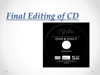
2. In order to make the sure that the CD has that extra
professional look, I decided to add in grid lines to ensure
that the text and logos on the CD cover is as symmetrical
as possible. After doing so I was able to add in copyright in
formation along the bottom with the production company
logos on top of this.
3. In order to stick to the consistency of the fonts chosen I
was able to reuse the font I had chosen for the artist’s
name. Not only does this allow me to show continuity of the
text chosen but to also create the impression for the
audience of the text chosen will act as the artist logo.
4. For the album’s title I wanted to keep it simple and so chose the font
that I had used for the back cover. I thought that overall this will create
a simple but powerful impression on the audience. Keeping the CD
itself simple, I thought that this would create a strong statement, type of
image fort eh audience. It will also allow the audience to connote an
idea of the artist’s personality and what her album is actually about. The
type of artist that doesn’t need to show off too much pictures of herself
on every piece of media product, and have bright colours everywhere.
5. I wanted to represent the arts through the CD as a simple young
girl who’s trying to make her mark in the industry. The CD could
also represent her childhood, as I wanted the artist to seem like
one which had a rough childhood, growing up with little. This
therefore gave me the idea to try and construct the CD using
basically nothing other than what was actually needed: her
name, the album’s title, the release date along with the copyright
information and production company logos.