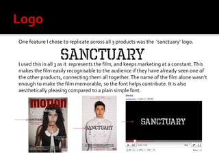
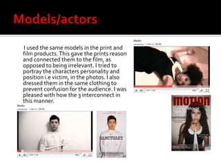
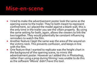
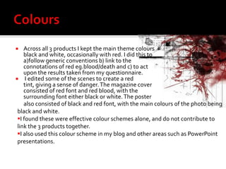
Media Evaluation 2 How effective is the combination of your main product and ancillary texts?
Logo One feature I chose to replicate across all 3 products was the  ‘sanctuary’ logo. I used this in all 3 as it  represents the film, and keeps marketing at a constant. This makes the film easily recognisable to the audience if they have already seen one of the other products, connecting them all together. The name of the film alone wasn’t enough to make the film memorable, so the font helps contribute. It is also aesthetically pleasing compared to a plain simple font.
Models/actors        I used the same models in the print and film products. This gave the prints reason and connected them to the film, as opposed to being irrelevant. I tried to portray the characters personality and position i.e victim, in the photos. I also dressed them in the same clothing to prevent confusion for the audience. I was pleased with how the 3 interconnect in this manner.
Mise-en-sceneI tried to make the advertisement poster look the same as the opening scene to the trailer. They’re both meant to represent confinement, so I placed the model against a blank wall, this is the only time in the trailer you see the villain properly.  By using the same setting for both, again, allows the viewers to link the two together. They would potentially be constant influencing reminders to watch the film. Another feature I kept the same was the area of the wound on the victims neck. This prevents confusion, and keeps in line with the film. One feature that I wanted to replicate was the height chart in the background of the opening scene, to mimic the advertisement poster. However as I added this in Photoshop, rather than using a prop during filming I was unable to do this as the software ‘iMovie’ didn’t have this tool.
Colours Across all 3 products I kept the main theme colours black and white, occasionally with red. I did this to a)follow generic conventions b) link to the connotations of red eg.blood/death and c) to act upon the results taken from my questionnaire. I edited some of the scenes to create a red tint, giving a sense of danger. The magazine cover consisted of red font and red blood, with the surrounding font either black or white. The poster     also consisted of black and red font, with the main colours of the photo being black and white. I found these were effective colour schemes alone, and do not contribute to link the 3 products together.
I also used this colour scheme in my blog and other areas such as PowerPoint presentations. Lighting In some areas I used bright light and others I used dark to create the effect I intended. The prints were produced using bright natural light. This gave the best finish to the photos and meant I could edit them however I wanted. I changed the brightness of the photo used on the magazine cover to create more shadows, this is to represent her death. Several scenes in the trailer were filmed at night, to assist this I used a flash light, or areas that were already lit. This created effective shadows, making an eerie atmosphere. Some of the scenes were intentionally filmed in bright light, and then edited to look lighter and brighter e.g. The opening scene. I did this to give the viewer one clear view of the villain, exposing his  features and highlighting the straight jacket.

Media evaluation 2

  • 1.
    Media Evaluation 2How effective is the combination of your main product and ancillary texts?
  • 2.
    Logo One featureI chose to replicate across all 3 products was the ‘sanctuary’ logo. I used this in all 3 as it represents the film, and keeps marketing at a constant. This makes the film easily recognisable to the audience if they have already seen one of the other products, connecting them all together. The name of the film alone wasn’t enough to make the film memorable, so the font helps contribute. It is also aesthetically pleasing compared to a plain simple font.
  • 3.
    Models/actors I used the same models in the print and film products. This gave the prints reason and connected them to the film, as opposed to being irrelevant. I tried to portray the characters personality and position i.e victim, in the photos. I also dressed them in the same clothing to prevent confusion for the audience. I was pleased with how the 3 interconnect in this manner.
  • 4.
    Mise-en-sceneI tried tomake the advertisement poster look the same as the opening scene to the trailer. They’re both meant to represent confinement, so I placed the model against a blank wall, this is the only time in the trailer you see the villain properly. By using the same setting for both, again, allows the viewers to link the two together. They would potentially be constant influencing reminders to watch the film. Another feature I kept the same was the area of the wound on the victims neck. This prevents confusion, and keeps in line with the film. One feature that I wanted to replicate was the height chart in the background of the opening scene, to mimic the advertisement poster. However as I added this in Photoshop, rather than using a prop during filming I was unable to do this as the software ‘iMovie’ didn’t have this tool.
  • 5.
    Colours Across all3 products I kept the main theme colours black and white, occasionally with red. I did this to a)follow generic conventions b) link to the connotations of red eg.blood/death and c) to act upon the results taken from my questionnaire. I edited some of the scenes to create a red tint, giving a sense of danger. The magazine cover consisted of red font and red blood, with the surrounding font either black or white. The poster also consisted of black and red font, with the main colours of the photo being black and white. I found these were effective colour schemes alone, and do not contribute to link the 3 products together.
  • 6.
    I also usedthis colour scheme in my blog and other areas such as PowerPoint presentations. Lighting In some areas I used bright light and others I used dark to create the effect I intended. The prints were produced using bright natural light. This gave the best finish to the photos and meant I could edit them however I wanted. I changed the brightness of the photo used on the magazine cover to create more shadows, this is to represent her death. Several scenes in the trailer were filmed at night, to assist this I used a flash light, or areas that were already lit. This created effective shadows, making an eerie atmosphere. Some of the scenes were intentionally filmed in bright light, and then edited to look lighter and brighter e.g. The opening scene. I did this to give the viewer one clear view of the villain, exposing his features and highlighting the straight jacket.