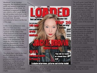
This document discusses improvements made to a student magazine cover and contents page from a preliminary version. For the cover, elements like the masthead, cover lines, photo size, strapline, sub-headline, pull quote, and competition details were enhanced to make the design less empty. For the contents page, changes such as increasing the title size, including a scaled cover image, adding page number details, and a subscription box made the layout feel fuller. Images were also improved across pages for continuity and impact. Overall, the revisions filled out empty space and added more engaging elements to draw in readers.