2. Front cover
In my opinion, I think that there has been major improvements from then to now. The skills that I have learnt and developed for the
front cover is definitely the layout of the front cover, right from the masthead, sell lines, anchorage text and so on. When I had
finished the preliminary task (which was based on a school magazine) I initially thought it was good but when I started to make my
front cover, I started to realize that you can’t do the layout like how I did on my preliminary task because it looks unprofessional.
When I was making the preliminary tasks I was using the software Publisher but when I made my actual magazine I used Photoshop.
I have now realized now, that you’ll never see a red barcode on any magazine ever. Also you’ll never see cover lines using word art
because it looks unprofessional. When I was making my front cover for my preliminary task I didn’t know that a front cover included a
left side third because on my preliminary task I let the sell lines just float on the page which doesn’t look right and personally I
wouldn’t buy a magazine which has sell lines that are floating on the page. When making my preliminary task I did get some things
right, where I placed the masthead on the top left hand side corner and on the preliminary task, and on the actual front cover I wrote
the issue on the left hand side, but the date on the preliminary task is on the right, actual magazines place it on the left. The main
story on my preliminary task is the GCSE results but it doesn’t stand out, it blends in with the other stories. In comparison to the
actual front cover where I have made the main story big, bold and stand out compared to the sell lines. On my preliminary task I have
positioned three logos which are associated with the school under the masthead, I have never seen logos on a music magazine as
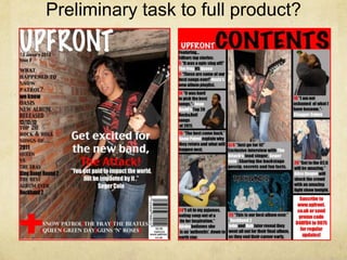
3. Contents page
In my opinion, I think there have been an innumerable amount of changes from the preliminary task’s contents page and the final
contents page. On the preliminary task the ‘contents’ dominates the page compared to ‘contents’ on the final page, where it looks
more modest. The similarities between the two is that on both there’s quite a lot of images used. However on the preliminary task, I
have covered the images with word art which looks very unprofessional and childish as it obscures the images. Another
unprofessional thing for the preliminary task is the green and red boxes, I would never do that on my final contents page as the block
colours are unprofessional and appear too flat. The preliminary task content page numbers look boring and dull, in comparison to the
final contents page where the page numbers have been brought to life though use of colour, and by making them bold. The size of
the text on the preliminary content page is bigger and appears unprofessional compared to the final contents page, where it looks
more efficient, this is because the size implies that it’s merely trying to fill empty space instead of providing actual information. The
preliminary task’s content page layout is not interesting at all compared to the final content page where it looks like a content page in
a music magazine, as it’s filled up, organized and clear.
Throughout the preliminary task I have stuck to the house style (black, green and red) similarly for the final contents page I’ve stuck
to a colour scheme (red, white black and grey) creating a professional, maintained overall look of the magazine. The word ‘contents’
on the preliminary task looks like it is floating, in contrast the word ‘contents’ on the final page has a red banner which make it look
professional and as though it has a set, anchored place to be, adding to the organized feel presented by the magazine. On the
preliminary task’s content page the numbers go from one to thirteen compared to the final one which have a variety of pages (five to
twenty four) which makes the magazine look spread out and doesn't’t give the impression that it cramped or only has a set amount of
pages, so has to talk about only them. By using various unordered page numbers creates the idea that there are interesting articles
all across the magazine. On the preliminary task’s content page the stories from one to four look like that there's too much empty
space, in contrast with the final contents page all the stories have been separated with black columns and fill the page up, so it
doesn’t appear empty and there is a lot of interesting information and articles within the magazine.