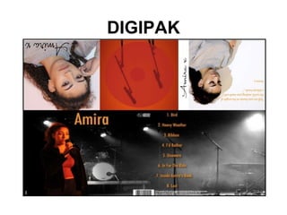
IN WHAT WAYS DOES YOUR
MEDIA PRODUCT USE,
DEVELOP OR CHALLENGE
FROMS AND CONVENTIONS
OF REAL MEDIA PRODUCTS?
DIGIPAK
Before creating our digipak I
researched and analysed some
existing digipak’s by established indie
artists.
I decided to look at the digipaks of
Marina and the diamonds, The 1975
and The XX. These artists are all part
of the indie genre but they are
individual in their own respective ways
DIGIPAK
MARINA AND THE DIAMONDS
THE 1975
THE XX
DESIGN
1/3 featured direct address on the front
cover.
3/3 featured a consistent colour
scheme throughout.
3/3 used the same font design
throughout.
3/3 remained within the theme.
CONTENT
3/3 digipaks included a panel for the CD.
3/3 digipaks included a panel with a list of
songs.
3/3 digipaks included information on
production companies, music producers,
etc.
2/3 digipaks included the album name on
the front cover.
CONTENT
Using Content Conventions In Our Digipak
3/3 digipak’s included
a panel for the CD.
We created a panel that
would be meant for a
CD mainly for practically
for the product. Using
this convention also
made the product seem
more professional and
like a real digipak.
3/3 digipak’s included a panel with a
list of songs.
We created a panel with the list of artist
songs because it made our digipak
seem more like a real media product.
3/3 digipak’s included information on
production companies, music
producers, etc.
We weren’t going to follow this
convention at first, but once we had
created the digipak we found that it
looked like something was missing. We
created this feature so that our digipak
looked like as real as possible.
2/3 digipak’s included the album name.
As our artist Amira is a new artist, it was important
that we put the album name onto the digipak in
order to market her music. Perhaps if Amira was
established within the genre, we would be able to
get away with leaving it out of the product.
DESIGN
Using Design Conventions In Our Digipak
1/3 featured direct address on
the front cover.
Out of the three digipaks that we
looked at, only one of them
included an image of the artist
that used direct address.
However, looking at other
digipaks within the genre, I found
that quite a lot of them did use it.
Not only does direct address
convey emotion as it gives our
artist a more ‘deep’ look, but it
also helped to create more of a
connection with the audience.
3/3 featured a consistent
colour scheme throughout.
We decided that it would be
appropriate to use a consistent
colour scheme throughout the whole
of our digipak. Using darker tones
along with hints of orange helped to
reflect our artists fun yet still
emotional persona. Darker colours
such as black and white are
commonly used in the indie genre
as a whole to convey emotion.
3/3 remained within the
theme.
I would say that the theme we used
was quite serene and composed. Our
digipak used neat and clean images
of the artist. I would say that the
theme we used was quite serene and
composed. Our digipak used neat and
clean images of the artist. We were
able to create a peaceful tone through
the colours that we used. The colours
are subtly hinted in the font and aren’t
so bright and ‘in your face’. The panel
with the song lyrics on them add
calming element. The whole of the
digipak is generally ‘nice’.
DESIGN
Challenging Design Conventions In Our
Digipak
3/3 used the same font design throughout.
All of the indie digipaks that I analysed used the same font
design throughout the whole of the digipak. All of the font on
our digipak is orange and bold. For the album title and song
names, we used a basic and quite common font. The reason
that we did this was so that the album title especially would
stand out and could be clearly read against the dark
background. On the third panel of the digipak, we used an italic
font because we used a quote from our artist’s song lyrics. We
agreed that this would be more suitable for our audience as like
the ‘signature’ logo we used, it makes it more personal and it
presents our artist as connected with her fans.
MARKETING
3/3 digipak’s incorporate the logo somewhere on
the product
Through our early research I found that it was really
important to create a memorable logo so that as soon
as it is seen by the audience, they know that the
product belongs to the particular artist. When it came
to creating our logo, we decided we should create a
‘signature’ belonging to our artist. This would give
everything that we put the logo on, a more personal
vibe.
1/3 digipaks used images of the artist in the product
We decided to follow the conventions of indie digipaks
and we used images of our artist Amira throughout our
product. Because she is a new artist, it was important
for us to use her face so that she is able to gain
recognition from the product. The more her face is seen,
the more she is marketed to the audience.
OVERALL HOW WELL DID THE PRODUCT MARKET THE ARTIST?

EVALUATION Q1 DIGIPAK

  • 1.
    IN WHAT WAYSDOES YOUR MEDIA PRODUCT USE, DEVELOP OR CHALLENGE FROMS AND CONVENTIONS OF REAL MEDIA PRODUCTS?
  • 2.
  • 3.
    Before creating ourdigipak I researched and analysed some existing digipak’s by established indie artists. I decided to look at the digipaks of Marina and the diamonds, The 1975 and The XX. These artists are all part of the indie genre but they are individual in their own respective ways
  • 4.
  • 5.
  • 6.
  • 7.
  • 8.
    DESIGN 1/3 featured directaddress on the front cover. 3/3 featured a consistent colour scheme throughout. 3/3 used the same font design throughout. 3/3 remained within the theme.
  • 9.
    CONTENT 3/3 digipaks includeda panel for the CD. 3/3 digipaks included a panel with a list of songs. 3/3 digipaks included information on production companies, music producers, etc. 2/3 digipaks included the album name on the front cover.
  • 10.
    CONTENT Using Content ConventionsIn Our Digipak 3/3 digipak’s included a panel for the CD. We created a panel that would be meant for a CD mainly for practically for the product. Using this convention also made the product seem more professional and like a real digipak. 3/3 digipak’s included a panel with a list of songs. We created a panel with the list of artist songs because it made our digipak seem more like a real media product. 3/3 digipak’s included information on production companies, music producers, etc. We weren’t going to follow this convention at first, but once we had created the digipak we found that it looked like something was missing. We created this feature so that our digipak looked like as real as possible. 2/3 digipak’s included the album name. As our artist Amira is a new artist, it was important that we put the album name onto the digipak in order to market her music. Perhaps if Amira was established within the genre, we would be able to get away with leaving it out of the product.
  • 11.
    DESIGN Using Design ConventionsIn Our Digipak 1/3 featured direct address on the front cover. Out of the three digipaks that we looked at, only one of them included an image of the artist that used direct address. However, looking at other digipaks within the genre, I found that quite a lot of them did use it. Not only does direct address convey emotion as it gives our artist a more ‘deep’ look, but it also helped to create more of a connection with the audience. 3/3 featured a consistent colour scheme throughout. We decided that it would be appropriate to use a consistent colour scheme throughout the whole of our digipak. Using darker tones along with hints of orange helped to reflect our artists fun yet still emotional persona. Darker colours such as black and white are commonly used in the indie genre as a whole to convey emotion. 3/3 remained within the theme. I would say that the theme we used was quite serene and composed. Our digipak used neat and clean images of the artist. I would say that the theme we used was quite serene and composed. Our digipak used neat and clean images of the artist. We were able to create a peaceful tone through the colours that we used. The colours are subtly hinted in the font and aren’t so bright and ‘in your face’. The panel with the song lyrics on them add calming element. The whole of the digipak is generally ‘nice’.
  • 12.
    DESIGN Challenging Design ConventionsIn Our Digipak 3/3 used the same font design throughout. All of the indie digipaks that I analysed used the same font design throughout the whole of the digipak. All of the font on our digipak is orange and bold. For the album title and song names, we used a basic and quite common font. The reason that we did this was so that the album title especially would stand out and could be clearly read against the dark background. On the third panel of the digipak, we used an italic font because we used a quote from our artist’s song lyrics. We agreed that this would be more suitable for our audience as like the ‘signature’ logo we used, it makes it more personal and it presents our artist as connected with her fans.
  • 13.
    MARKETING 3/3 digipak’s incorporatethe logo somewhere on the product Through our early research I found that it was really important to create a memorable logo so that as soon as it is seen by the audience, they know that the product belongs to the particular artist. When it came to creating our logo, we decided we should create a ‘signature’ belonging to our artist. This would give everything that we put the logo on, a more personal vibe. 1/3 digipaks used images of the artist in the product We decided to follow the conventions of indie digipaks and we used images of our artist Amira throughout our product. Because she is a new artist, it was important for us to use her face so that she is able to gain recognition from the product. The more her face is seen, the more she is marketed to the audience. OVERALL HOW WELL DID THE PRODUCT MARKET THE ARTIST?