
More Related Content
What's hot
What's hot (20)
Viewers also liked
Viewers also liked (17)
Similar to Question 5
Similar to Question 5 (20)
Recently uploaded
Recently uploaded (15)
Question 5
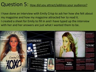
- 1. Question 5: How did you attract/address your audience? I have done an interview with Emily Crisp to ask her how she felt about my magazine and how my magazine attracted her to read it. I created a sheet for Emily to fill in and I have typed up the interview with her and her answers are just what I wanted them to be.
- 2. What Attracts you to this magazine? The colours, the fancy font, the main image – because it has eye contact with you and all of the cover lines and how they are spread out. Do you like the colour scheme of the magazine? Black and white writing is very simple but still looks brilliant on the cover and contents page. On the double page spread I feel that the pink and white writing is excellent because you can tell that this magazine is feminine and will attract the female readers. I think that the black and white colour scheme is strong throughout the whole of the magazine because you have used it throughout all of the magazine and they are both very strong colours to use and you have used them well. Are the font’s attracting you into reading the magazine? Yes I feel that because it’s a fancy font I’m more drawn into reading the magazine because it shows the feminine side of the magazine. Would you by this magazine? I would by the magazine if it was cheaper yes. What do you like about the front cover? I like the bright vibrant colours that you’ve used and that you haven’t over done it with the text as you’ve stayed simple by using the black and white coloured text. What do you like about the contents page? I think you have a really well thought out contents page because the layout is different to most contents pages and I think it’s a nice change. What do you like about the double page spread? I like the fact it looks really feminine by the colour scheme and also I like the fact you have used a black background to make it look like the image is popping out of the page.
- 3. How do you think I could improve it? I think that to improve your magazine you could maybe add more images and colour to the pages, using patterns or something to jazz it up a little. Also think about lowering the price because some-people may be turned away from buying the magazine because of the high price of it. Do you think that my magazine suits the target audience 13-18 Yes I think that you magazine suits the target audience but you could get away with increasing the age to 12-20. Do you think that my magazine suits the genre of music (pop/indie) Yes I think that your music magazine looks like the genre of pop/indie but I think that you could add a few more colours to make it a little bit better. How does my magazine attract the target audience? Front Cover I think that your magazine cover attracts the target audience of 13-18 females by the colours and the fonts and the layout of the front cover, because it’s simple but is still eye catching because of the main image. Contents I think that your contents page attracts the target audience because 13-18 year olds like creativeness and your magazine contents page is so creative because of the layout of it and also the images are good and the writing looks simple but still good, still using the colour scheme of black and white. Double Page spread I think that your double page spread is the best of all because you have added a colour into the colour scheme and it fits in perfectly with the target audience of your choice.
- 4. I feel that I attracted my target audience with the fancy writing on the front cover, because my magazine is targeted at females so I thought instead of using a manly font, or a font that may catch any-one’s eye I would use a fancy feminine one to make sure that they know who my target audience was. as well as the font, I also used a bright image on the front cover of my magazine, as I felt that if I used this bright image it would attract people’s eyes because the colour stands out, I also used this image itself because of the eye contact used in it. I felt that the front cover image had to have eye contact because its more likely to draw people in if the main focus is making eye contact with you. I feel that the cover lines on the front cover are placed in quite good places because they’re not obstructing the model in the image, as they are based around her body outline, and the main cover line is over her chest area which is showing that it’s an important cover line as it’s over the main image.
- 5. I feel that my contents page has attracted my target audience well because I felt that it had to be different to normal contents pages for example, a long list of page numbers with a little bit of explanation next to it, I felt more creative whilst doing this contents page and thought that I would try and jazz it up a bit by putting things at different angles. I feel that my double page spread works well to attract the target audience because of the colour scheme of pink, black and white as it really shows that the magazine is targeted for females and I feel that the picture also shows that the target audience is females because throughout the whole of the magazine it’s about girls and girly interests. I feel that this was a great response to my media magazine because it attracted the sort of person that I wanted it to attract therefore my target audience was a great choice with the age, gender and genre.