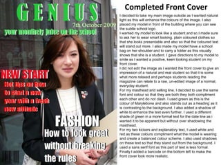
Completed Front Cover I decided to take my main image outside as I wanted natural light as this will enhance the colours of the image. I also placed my model in front of the building where you can see the subtle school logo.  I wanted my model to look like a student and so I made sure to ask her to wear smart looking, plain coloured clothes so that she looks presentable and also so that the coloured text will stand out more. I also made my model have a school bag on her shoulder and to carry a folder as this visually shows that she is a student. I gave directions to my model to smile as I wanted a positive, keen looking student on my front cover. I did not edit the image as I wanted the front cover to give an impression of a natural and real student so that it is some what more relaxed and perhaps students reading the magazine can relate to a raw, un-edited image of a normal, everyday student. For my masthead and selling line, I decided to use the same font and colour so that they are both they both compliment each other and do not clash. I used green as this is the colour of Marylebone and also stands out as a heading as it is contrasting to the background. I also added a shadow of white to enhance the text even further. I used a different shade of green in a more formal text for the date line as i wanted it to be apparent but without over shadowing the masthead. For my two kickers and explanatory text, I used white and red as these colours compliment what the model is wearing and create a balanced colour scheme. I also used shadows on these text so that they stand out from the background. I used a sans serif font as this part of text is less formal. Finally I added a barcode on the bottom left to make the front cover look more realistic.
Feedback from viewers of front cover I received feedback from three people commenting on my front cover, analysing what was good about it and whether I could make any improvements.  Sonia:  Said that the layout of my front cover was well balanced and appeared proportionate which made it easy to look at. She also mentioned that the natural lighting made my image stand out and enhanced the colours, giving a brighter effect on the image. Finally, she commented on the changes that I could make which were to perhaps make the kickers larger.  Mia:  Said that the font was bold and stood out from the background. She also liked the fact that the red complimented the badge on her outfit. She said that the green masthead was good as it represented the school colour  and that the masthead being ‘Genius’ was encouraging to pupils that may read the magazine. Finally, she commented on the barcode and said that it was subtle; not drawing attention away from the main image but still made the front cover look more realistic.  Tamana:  Said that she liked the use of just three colours in the text, keeping it simple and neat. She then went on to say that the image was good quality and stood out. She said that the masthead was bold and stoop out and that the green complimented the school as it is the colour of Marylebone. Finally, she said that the kickers and explanatory were short and simple which prevented the cover form becoming over crowded.
Evaluation I tried to include elements from my own knowledge of magazines when I made my own magazine cover. I discovered many new things after finishing and experiencing the process of what makes a successful front cover.  I think that my magazine challenges the conventions of real media products as my image is raw and has not been edited, where as in a real magazine, the model will be photoshoped and enhanced to create a perfect look. My magazine represents a social group of every day, regular students that are hard working and take interest in what the school has to offer and also what they themselves can get involved in.  I think that the type of institution that would distribute my magazine would either be government funded or organised by the school community as it would be sold at a low price and would be both entertaining and educational.  The target market and audience of my magazine will me aimed at students aged between sixteen to eighteen as these are the age groups within the sixth form college. I have attracted this particular group of audience by using a student of age sixteen on the front cover which is a person that the audience can relate to and I also placed the model in front of the school. I ensured that the text was informal and used some form of slang as this will be the type of language that teenagers are used to using and will therefore take interest in reading it. In the process of creating my magazine, I have learnt and gained new skills in using photoshop through creating different effects in the text and making the layout accurate by using grid lines. I also learnt how to use a correct colour scheme in order to create an even balance within the cover without making any clashes. Overall, I enjoyed the process of learning and creating a magazine. I have also gained knowledge in what works well as selling points and what doesn’t through the audience feedback and now know what improvements to make and what to include in future work when creating a magazine.

powerpoint

  • 1.
    Completed Front CoverI decided to take my main image outside as I wanted natural light as this will enhance the colours of the image. I also placed my model in front of the building where you can see the subtle school logo. I wanted my model to look like a student and so I made sure to ask her to wear smart looking, plain coloured clothes so that she looks presentable and also so that the coloured text will stand out more. I also made my model have a school bag on her shoulder and to carry a folder as this visually shows that she is a student. I gave directions to my model to smile as I wanted a positive, keen looking student on my front cover. I did not edit the image as I wanted the front cover to give an impression of a natural and real student so that it is some what more relaxed and perhaps students reading the magazine can relate to a raw, un-edited image of a normal, everyday student. For my masthead and selling line, I decided to use the same font and colour so that they are both they both compliment each other and do not clash. I used green as this is the colour of Marylebone and also stands out as a heading as it is contrasting to the background. I also added a shadow of white to enhance the text even further. I used a different shade of green in a more formal text for the date line as i wanted it to be apparent but without over shadowing the masthead. For my two kickers and explanatory text, I used white and red as these colours compliment what the model is wearing and create a balanced colour scheme. I also used shadows on these text so that they stand out from the background. I used a sans serif font as this part of text is less formal. Finally I added a barcode on the bottom left to make the front cover look more realistic.
  • 2.
    Feedback from viewersof front cover I received feedback from three people commenting on my front cover, analysing what was good about it and whether I could make any improvements. Sonia: Said that the layout of my front cover was well balanced and appeared proportionate which made it easy to look at. She also mentioned that the natural lighting made my image stand out and enhanced the colours, giving a brighter effect on the image. Finally, she commented on the changes that I could make which were to perhaps make the kickers larger. Mia: Said that the font was bold and stood out from the background. She also liked the fact that the red complimented the badge on her outfit. She said that the green masthead was good as it represented the school colour and that the masthead being ‘Genius’ was encouraging to pupils that may read the magazine. Finally, she commented on the barcode and said that it was subtle; not drawing attention away from the main image but still made the front cover look more realistic. Tamana: Said that she liked the use of just three colours in the text, keeping it simple and neat. She then went on to say that the image was good quality and stood out. She said that the masthead was bold and stoop out and that the green complimented the school as it is the colour of Marylebone. Finally, she said that the kickers and explanatory were short and simple which prevented the cover form becoming over crowded.
  • 3.
    Evaluation I triedto include elements from my own knowledge of magazines when I made my own magazine cover. I discovered many new things after finishing and experiencing the process of what makes a successful front cover. I think that my magazine challenges the conventions of real media products as my image is raw and has not been edited, where as in a real magazine, the model will be photoshoped and enhanced to create a perfect look. My magazine represents a social group of every day, regular students that are hard working and take interest in what the school has to offer and also what they themselves can get involved in. I think that the type of institution that would distribute my magazine would either be government funded or organised by the school community as it would be sold at a low price and would be both entertaining and educational. The target market and audience of my magazine will me aimed at students aged between sixteen to eighteen as these are the age groups within the sixth form college. I have attracted this particular group of audience by using a student of age sixteen on the front cover which is a person that the audience can relate to and I also placed the model in front of the school. I ensured that the text was informal and used some form of slang as this will be the type of language that teenagers are used to using and will therefore take interest in reading it. In the process of creating my magazine, I have learnt and gained new skills in using photoshop through creating different effects in the text and making the layout accurate by using grid lines. I also learnt how to use a correct colour scheme in order to create an even balance within the cover without making any clashes. Overall, I enjoyed the process of learning and creating a magazine. I have also gained knowledge in what works well as selling points and what doesn’t through the audience feedback and now know what improvements to make and what to include in future work when creating a magazine.