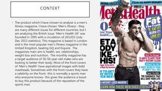
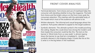
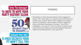
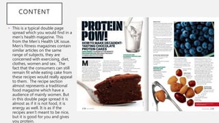
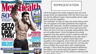
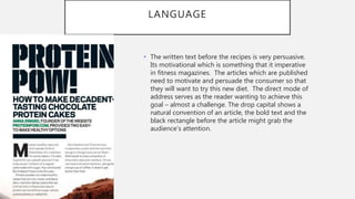
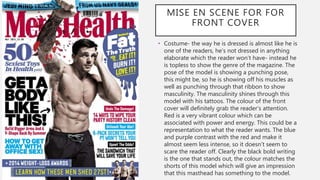
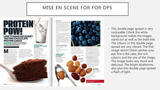
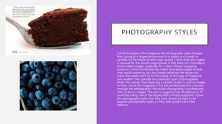
SlideShare a Scribd company logo
THEORY TASK 2
Hannah Flowers
CONTEXT
• The product which I have chosen to analyse is a men’s
fitness magazine. I have chosen ‘Men’s fitness’- they
are many different issues for different countries, but I
am analysing the British issue. ‘Men’s Health UK’ was
founded in 1995 with a circulation of 203,053 (July-
Dec 2013 statistics). This magazine is based in London
and is the most popular men’s fitness magazine in the
United Kingdom, beating GQ and Esquire. The
magazines main aim is health, sex, relationships,
weight loss and nutrition. The monthly magazine has
a target audience of 30-50-year-old males who are
looking to better their body. Most of the front covers
of ’Men’s Health’ have aspirational images with bold
mastheads. Sometimes with the front covers they have
a celebrity on the front- this is normally a sports man
who everyone knows- this gives the audience a boost
to buy this product because of the reputation of the
sports man.
FRONT COVER ANALYSIS
• Technical elements- Font choice and use of masthead helps the
consumer with deciding whether to buy the magazine. The bold
font choice and the bright colours on the front cover grab the
consumers attention. This matches with the admirable body of
the model which most of the audience will admire to be.
• Written elements- The informal and casual language attract the
audience. Pull quotes selected to appeal to the target audience.
• Symbolic elements- The ultimate symbol is the model punching
the ceiling. Maybe this could show how strong the model is and
that maybe the consumer could be like this. The text on the
banner is ‘Mind tricks from us navy seals!’ is almost ripping
down the banner to say that he's completed it. Another
symbolic element is the dripping shape. It looks like fat as this
is what is in the big letters in the masthead.
THEMES
• The obvious it seems the main theme of this magazine is
fitness. This is very clear as it is all you see on the front cover
is fitness tips. Another theme of this magazine is numbers.
There is an obsession with numbers in fitness magazines,
there are at least 4 examples of numbers. One of the
mastheads is “14 ways to”- this is a very low number which
would entice the audience to buy the magazine because it
might be something which is very easy to do.
CONTENT
• This is a typical double page
spread which you would find in a
men's health magazine. This
from the Men’s Health UK issue.
Men’s fitness magazines contain
similar articles on the same
range of subjects, they are
concerned with exercising, diet,
clothes, women and sex. The
fact that the consumers can still
remain fit while eating cake from
these recipes would really appeal
to them. The recipe section
almost represents a traditional
food magazine which have a
audience of mainly women. But
in this double page spread it is
almost as if it is not food, it is
energy as well. It is as if the
recipes aren’t meant to be nice,
but it is good for you and gives
you protein.
REPRESENTATION
I think throughout the whole magazine they are a few
groups which are represented. From the front cover you
can see the different types of personalities which might
want to buy this magazine.
The masthead “14 ways to wipe your party history clean”.
This can appeal to the older generation who might be
dealing with ‘dad bods’. Another masthead which would
attract another group would be ‘How to get away with
office sex’ this is more for a younger male audience who
are not settled down. I think throughout this whole
magazine; the main generic group is males but with the
different articles they are appealing to any age range. I
also think that there is a generic social status and
sexuality to this magazine, most of the men who read this
will be down to earth men in their late 30+ but they will
have a middle-class social status with a heterosexual
sexuality. I don’t think the group should be defined by
the religion, but I would say by the generic models on
the front cover that most of the audience’s ethnicity will
LANGUAGE
• The written text before the recipes is very persuasive.
Its motivational which is something that it imperative
in fitness magazines. The articles which are published
need to motivate and persuade the consumer so that
they will want to try this new diet. The direct mode of
address serves as the reader wanting to achieve this
goal – almost a challenge. The drop capital shows a
natural convention of an article, the bold text and the
black rectangle before the article might grab the
audience’s attention.
MISE EN SCENE FOR FOR
FRONT COVER
• Costume- the way he is dressed is almost like he is
one of the readers, he's not dressed in anything
elaborate which the reader won’t have- instead he
is topless to show the genre of the magazine. The
pose of the model is showing a punching pose,
this might be, so he is showing off his muscles as
well as punching through that ribbon to show
masculinity. The masculinity shines through this
model with his tattoos. The colour of the front
cover will definitely grab the reader’s attention.
Red is a very vibrant colour which can be
associated with power and energy. This could be a
representation to what the reader wants. The blue
and purple contrast with the red and make it
almost seem less intense, so it doesn’t seem to
scare the reader off. Clearly the black bold writing
is the one that stands out, the colour matches the
shorts of this model which will give an impression
that this masthead has something to the model.
• This double page spread is very
noticeable. I think the white
background makes the images
stand out as well as the bold title.
The colours in this double page
spread are very vibrant. The first
image which I think catches your
eye first is the cake, the rich
colours and the size of the image.
The image looks very moist and
delicious. The bright blueberries
also give this double page spread
a flash of light.
MISE EN SCENE FOR FOR DPS
USE OF CAMERA/EDITING
Whenever I look in a magazine the first thing I notice is the images
and how the camera has adapted to the surroundings and if the
image is attractive to me as a reader. Throughout this men’s health
magazine there are various images which look as though they have
been taken to simply attract the reader. The front cover is an
example of this, the angle is at a low angle which might make the
reader feel as though the model is more superior, if they get fit like
him then they might be on the same level. The angle of the camera
makes the reader look directly at the model’s abs- this could make
the reader jealous of the model’s physique. The lighting in the front
cover is very bright and compliments the fitness model. The
medium long shot is a great shot to show the body of the model-
the main aim for a fitness magazine is to get fit, by having a fitness
model who is a ‘dream body’ for other males out there and to
show them in a medium long shot it gives the full idea of the
fitness model. I think the editing of the photos is very minimal. I
think only in certain aspects there have been edited, the double
page spread might have been edited in a few ways. I think the
shots have been put together to contrast with each other. The
blueberries in the double page spread contrast with the brown
colour of the cake- it almost shows a contrast of healthiness from
PHOTOGRAPHY STYLES
• I think throughout the magazine the photography style changes,
from going to a staged photoshoot in a studio to a couple on
candids on the recipe double page spread. I think what also makes
it unusual for the double page spread is that there isn’t normally a
studio taken images, especially for a men's fitness magazine.
However, I think the blueberries might have been staged to look
that mouth-watering, but the images advertise the recipe and
make the reader want to try this recipe. In this type of magazine,
you wouldn’t see typically any paparazzi type of photography
shots. You would most likely see a candid, studio or portrait image
in here. I think this magazine is fun but professional this is shown
through the photographs; the studio photography is professional
with no blurry images. This men's magazine has 40 editions in 47
countries being one of the largest men's fitness magazine, I think
the photography styles that they have chosen to have to be
popular photography styles, so they look good in all of the
editions.
TYPOGRAPHY
• A front cover is something which should attract the reader as soon as
they lay eyes on it. The typography is one of the main factors which
helps with the attraction. As soon as you look at a front cover the first
thing you notice is the bold large text ‘get a body like this’. The fact that
it is the only black text on the front cover is the main masthead, this is
the thing that will attract the reader the most. The front cover is quite
crammed with different mastheads, the red and blue contrast with the
white background this makes the mastheads stand out. There are quite
a lot of different fonts on the front cover which can be awfully confusing
for the reader. For the double page spread, the text is very small
compared to the front cover. The drops cap is something which is seen
on most articles, but the bold font stands out- it almost makes it seem
like it is a more important because of the bold font.
BIBLIOGRAPHY
•
.. (.). .. Available: http://karenhaller.co.uk/press.htm. Last accessed
12/09/2019. (front cover)
• .. (.). .. Available: https://proteinpow.com/press. Last accessed
11/09/2019.
• (double page spread)

More Related Content

What's hot

Keiron bradbury
Keiron bradburyKeiron bradbury
Keiron bradburyafrench14
 
Evaluation
EvaluationEvaluation
Evaluationtay_
 
Magazine Evaluation
Magazine EvaluationMagazine Evaluation
Magazine Evaluationguest04a5fa
 
Emma Gregory Magazine Evaluation
Emma Gregory Magazine EvaluationEmma Gregory Magazine Evaluation
Emma Gregory Magazine Evaluationguest986f9f
 
Media evaluation questions
Media evaluation questionsMedia evaluation questions
Media evaluation questions
ninofrattolillo
 
Evaluation of media magazine
Evaluation of media magazineEvaluation of media magazine
Evaluation of media magazineBhavik Zayne
 
Evaluation
EvaluationEvaluation
Evaluation
amiesteele
 
Evaluation question 5
Evaluation question 5 Evaluation question 5
Evaluation question 5
050564k
 
Media evaluation part 5
Media evaluation part 5Media evaluation part 5
Media evaluation part 5bethbowyer
 
Question 5
Question 5Question 5
Question 5ghrg
 
Evaluation of magazine matt waites
Evaluation of magazine   matt waitesEvaluation of magazine   matt waites
Evaluation of magazine matt waitesmightykits
 
Evaluation – question 4 & 5
Evaluation – question 4 & 5Evaluation – question 4 & 5
Evaluation – question 4 & 5
india smith
 

What's hot (16)

Evaluation
EvaluationEvaluation
Evaluation
 
Evaluation 5
Evaluation 5Evaluation 5
Evaluation 5
 
As powerpoint
As powerpointAs powerpoint
As powerpoint
 
Keiron bradbury
Keiron bradburyKeiron bradbury
Keiron bradbury
 
Evaluation
EvaluationEvaluation
Evaluation
 
Magazine Evaluation
Magazine EvaluationMagazine Evaluation
Magazine Evaluation
 
Emma Gregory Magazine Evaluation
Emma Gregory Magazine EvaluationEmma Gregory Magazine Evaluation
Emma Gregory Magazine Evaluation
 
Media evaluation questions
Media evaluation questionsMedia evaluation questions
Media evaluation questions
 
Evaluation of media magazine
Evaluation of media magazineEvaluation of media magazine
Evaluation of media magazine
 
Evaluation
EvaluationEvaluation
Evaluation
 
Evaluation question 5
Evaluation question 5 Evaluation question 5
Evaluation question 5
 
Media evaluation part 5
Media evaluation part 5Media evaluation part 5
Media evaluation part 5
 
Question 5
Question 5Question 5
Question 5
 
Bethany fox
Bethany foxBethany fox
Bethany fox
 
Evaluation of magazine matt waites
Evaluation of magazine   matt waitesEvaluation of magazine   matt waites
Evaluation of magazine matt waites
 
Evaluation – question 4 & 5
Evaluation – question 4 & 5Evaluation – question 4 & 5
Evaluation – question 4 & 5
 

Similar to Theory task 2

Critical Approaches 2.1
Critical Approaches 2.1Critical Approaches 2.1
Critical Approaches 2.1
Jamie Mellors
 
Mens health
Mens healthMens health
Mens health
willydavisj
 
Critical Approaches 2
Critical Approaches 2Critical Approaches 2
Critical Approaches 2
Jamie Mellors
 
Task 2 resub
Task 2 resubTask 2 resub
Task 2 resub
Jordan Bohill
 
Mens Fitness - Case Study
Mens Fitness - Case StudyMens Fitness - Case Study
Mens Fitness - Case Study
albertotruji
 
AS Level Media Pitch presentation
AS Level Media Pitch presentationAS Level Media Pitch presentation
AS Level Media Pitch presentation
rosstclrichardson
 
world of fitness 2
world of fitness 2world of fitness 2
world of fitness 2
Kelly Kemp
 
Magazine genre representation
Magazine genre representationMagazine genre representation
Magazine genre representationJoe Gough
 
World Of Fitness
World Of FitnessWorld Of Fitness
World Of Fitness
Kelly Kemp
 
Aaron Liffen AS Media evaluation
Aaron Liffen AS Media evaluationAaron Liffen AS Media evaluation
Aaron Liffen AS Media evaluationAnne Horne
 
As media studies task
As media studies taskAs media studies task
As media studies task
rosstclrichardson
 
3. fmp research powerpoint
3. fmp research powerpoint3. fmp research powerpoint
3. fmp research powerpoint
thomasmoore143
 
Research
ResearchResearch
Research
Emma Garthwaite
 
Research
ResearchResearch
2. proposal(1)
2. proposal(1)2. proposal(1)
2. proposal(1)
jackedwardsz
 
2. proposal(1)
2. proposal(1)2. proposal(1)
2. proposal(1)
jackedwardsz
 
planning production.pptx
planning production.pptxplanning production.pptx
planning production.pptx
FfionCalnan
 
Magazine production log
Magazine production logMagazine production log
Magazine production log
holliejoice
 
Portfolio Task Evaluation
Portfolio Task EvaluationPortfolio Task Evaluation
Portfolio Task Evaluation
rosstclrichardson
 

Similar to Theory task 2 (20)

Critical Approaches 2.1
Critical Approaches 2.1Critical Approaches 2.1
Critical Approaches 2.1
 
Mens health
Mens healthMens health
Mens health
 
Critical Approaches 2
Critical Approaches 2Critical Approaches 2
Critical Approaches 2
 
Task 2 resub
Task 2 resubTask 2 resub
Task 2 resub
 
Critical
Critical Critical
Critical
 
Mens Fitness - Case Study
Mens Fitness - Case StudyMens Fitness - Case Study
Mens Fitness - Case Study
 
AS Level Media Pitch presentation
AS Level Media Pitch presentationAS Level Media Pitch presentation
AS Level Media Pitch presentation
 
world of fitness 2
world of fitness 2world of fitness 2
world of fitness 2
 
Magazine genre representation
Magazine genre representationMagazine genre representation
Magazine genre representation
 
World Of Fitness
World Of FitnessWorld Of Fitness
World Of Fitness
 
Aaron Liffen AS Media evaluation
Aaron Liffen AS Media evaluationAaron Liffen AS Media evaluation
Aaron Liffen AS Media evaluation
 
As media studies task
As media studies taskAs media studies task
As media studies task
 
3. fmp research powerpoint
3. fmp research powerpoint3. fmp research powerpoint
3. fmp research powerpoint
 
Research
ResearchResearch
Research
 
Research
ResearchResearch
Research
 
2. proposal(1)
2. proposal(1)2. proposal(1)
2. proposal(1)
 
2. proposal(1)
2. proposal(1)2. proposal(1)
2. proposal(1)
 
planning production.pptx
planning production.pptxplanning production.pptx
planning production.pptx
 
Magazine production log
Magazine production logMagazine production log
Magazine production log
 
Portfolio Task Evaluation
Portfolio Task EvaluationPortfolio Task Evaluation
Portfolio Task Evaluation
 

More from Hannah Palfreeman

Presentation 2
Presentation 2Presentation 2
Presentation 2
Hannah Palfreeman
 
How did i get my work out there?
How did i get my work out there?How did i get my work out there?
How did i get my work out there?
Hannah Palfreeman
 
Proposal
ProposalProposal
Presentation
PresentationPresentation
Presentation
Hannah Palfreeman
 
Feedback
FeedbackFeedback
Feedback
FeedbackFeedback
Development diary
Development diaryDevelopment diary
Development diary
Hannah Palfreeman
 
Planning
PlanningPlanning
Problem solving
Problem solvingProblem solving
Problem solving
Hannah Palfreeman
 
Problem solving
Problem solvingProblem solving
Problem solving
Hannah Palfreeman
 
Production
Production Production
Production
Hannah Palfreeman
 
Developed products
Developed productsDeveloped products
Developed products
Hannah Palfreeman
 
Evaluation
EvaluationEvaluation
Evaluation
Hannah Palfreeman
 
Proposal
ProposalProposal
Developed products
Developed productsDeveloped products
Developed products
Hannah Palfreeman
 
Research 3rd Draft
Research 3rd DraftResearch 3rd Draft
Research 3rd Draft
Hannah Palfreeman
 
Development diary
Development diaryDevelopment diary
Development diary
Hannah Palfreeman
 
UCAS Application
UCAS ApplicationUCAS Application
UCAS Application
Hannah Palfreeman
 
Trip Reflections
Trip ReflectionsTrip Reflections
Trip Reflections
Hannah Palfreeman
 

More from Hannah Palfreeman (20)

Presentation 2
Presentation 2Presentation 2
Presentation 2
 
How did i get my work out there?
How did i get my work out there?How did i get my work out there?
How did i get my work out there?
 
Proposal
ProposalProposal
Proposal
 
Presentation
PresentationPresentation
Presentation
 
Feedback
FeedbackFeedback
Feedback
 
Feedback
FeedbackFeedback
Feedback
 
Development diary
Development diaryDevelopment diary
Development diary
 
Planning
PlanningPlanning
Planning
 
Problem solving
Problem solvingProblem solving
Problem solving
 
Problem solving
Problem solvingProblem solving
Problem solving
 
Production
Production Production
Production
 
Developed products
Developed productsDeveloped products
Developed products
 
Evaluation
EvaluationEvaluation
Evaluation
 
Proposal
ProposalProposal
Proposal
 
Developed products
Developed productsDeveloped products
Developed products
 
Research 3rd Draft
Research 3rd DraftResearch 3rd Draft
Research 3rd Draft
 
Development diary
Development diaryDevelopment diary
Development diary
 
CV
CVCV
CV
 
UCAS Application
UCAS ApplicationUCAS Application
UCAS Application
 
Trip Reflections
Trip ReflectionsTrip Reflections
Trip Reflections
 

Recently uploaded

Memory Rental Store - The Chase (Storyboard)
Memory Rental Store - The Chase (Storyboard)Memory Rental Store - The Chase (Storyboard)
Memory Rental Store - The Chase (Storyboard)
SuryaKalyan3
 
Caffeinated Pitch Bible- developed by Claire Wilson
Caffeinated Pitch Bible- developed by Claire WilsonCaffeinated Pitch Bible- developed by Claire Wilson
Caffeinated Pitch Bible- developed by Claire Wilson
ClaireWilson398082
 
acting board rough title here lolaaaaaaa
acting board rough title here lolaaaaaaaacting board rough title here lolaaaaaaa
acting board rough title here lolaaaaaaa
angelicafronda7
 
ART FORMS OF KERALA: TRADITIONAL AND OTHERS
ART FORMS OF KERALA: TRADITIONAL AND OTHERSART FORMS OF KERALA: TRADITIONAL AND OTHERS
ART FORMS OF KERALA: TRADITIONAL AND OTHERS
Sandhya J.Nair
 
Inter-Dimensional Girl Boards Segment (Act 3)
Inter-Dimensional Girl Boards Segment (Act 3)Inter-Dimensional Girl Boards Segment (Act 3)
Inter-Dimensional Girl Boards Segment (Act 3)
CristianMestre
 
thGAP - BAbyss in Moderno!! Transgenic Human Germline Alternatives Project
thGAP - BAbyss in Moderno!!  Transgenic Human Germline Alternatives ProjectthGAP - BAbyss in Moderno!!  Transgenic Human Germline Alternatives Project
thGAP - BAbyss in Moderno!! Transgenic Human Germline Alternatives Project
Marc Dusseiller Dusjagr
 
2137ad Merindol Colony Interiors where refugee try to build a seemengly norm...
2137ad  Merindol Colony Interiors where refugee try to build a seemengly norm...2137ad  Merindol Colony Interiors where refugee try to build a seemengly norm...
2137ad Merindol Colony Interiors where refugee try to build a seemengly norm...
luforfor
 
一比一原版(DU毕业证)迪肯大学毕业证成绩单
一比一原版(DU毕业证)迪肯大学毕业证成绩单一比一原版(DU毕业证)迪肯大学毕业证成绩单
一比一原版(DU毕业证)迪肯大学毕业证成绩单
zvaywau
 
ashokathegreat project class 12 presentation
ashokathegreat project class 12 presentationashokathegreat project class 12 presentation
ashokathegreat project class 12 presentation
aditiyad2020
 
一比一原版(GU毕业证)格里菲斯大学毕业证成绩单
一比一原版(GU毕业证)格里菲斯大学毕业证成绩单一比一原版(GU毕业证)格里菲斯大学毕业证成绩单
一比一原版(GU毕业证)格里菲斯大学毕业证成绩单
zvaywau
 
一比一原版(qut毕业证)昆士兰科技大学毕业证如何办理
一比一原版(qut毕业证)昆士兰科技大学毕业证如何办理一比一原版(qut毕业证)昆士兰科技大学毕业证如何办理
一比一原版(qut毕业证)昆士兰科技大学毕业证如何办理
taqyed
 
Sundabet | Slot gacor dan terpercaya mudah menang
Sundabet | Slot gacor dan terpercaya mudah menangSundabet | Slot gacor dan terpercaya mudah menang
Sundabet | Slot gacor dan terpercaya mudah menang
Sundabet | Situs Slot gacor dan terpercaya
 
IrishWritersCtrsPersonalEssaysMay29.pptx
IrishWritersCtrsPersonalEssaysMay29.pptxIrishWritersCtrsPersonalEssaysMay29.pptx
IrishWritersCtrsPersonalEssaysMay29.pptx
Aine Greaney Ellrott
 
2137ad - Characters that live in Merindol and are at the center of main stories
2137ad - Characters that live in Merindol and are at the center of main stories2137ad - Characters that live in Merindol and are at the center of main stories
2137ad - Characters that live in Merindol and are at the center of main stories
luforfor
 
一比一原版UPenn毕业证宾夕法尼亚大学毕业证成绩单如何办理
一比一原版UPenn毕业证宾夕法尼亚大学毕业证成绩单如何办理一比一原版UPenn毕业证宾夕法尼亚大学毕业证成绩单如何办理
一比一原版UPenn毕业证宾夕法尼亚大学毕业证成绩单如何办理
beduwt
 
The Legacy of Breton In A New Age by Master Terrance Lindall
The Legacy of Breton In A New Age by Master Terrance LindallThe Legacy of Breton In A New Age by Master Terrance Lindall
The Legacy of Breton In A New Age by Master Terrance Lindall
BBaez1
 
Memory Rental Store - The Ending(Storyboard)
Memory Rental Store - The Ending(Storyboard)Memory Rental Store - The Ending(Storyboard)
Memory Rental Store - The Ending(Storyboard)
SuryaKalyan3
 
The Last Polymath: Muntadher Saleh‎‎‎‎‎‎‎‎‎‎‎‎
The Last Polymath: Muntadher Saleh‎‎‎‎‎‎‎‎‎‎‎‎The Last Polymath: Muntadher Saleh‎‎‎‎‎‎‎‎‎‎‎‎
The Last Polymath: Muntadher Saleh‎‎‎‎‎‎‎‎‎‎‎‎
iraqartsandculture
 
Codes n Conventionss copy (2).pptx new new
Codes n Conventionss copy (2).pptx new newCodes n Conventionss copy (2).pptx new new
Codes n Conventionss copy (2).pptx new new
ZackSpencer3
 

Recently uploaded (20)

Memory Rental Store - The Chase (Storyboard)
Memory Rental Store - The Chase (Storyboard)Memory Rental Store - The Chase (Storyboard)
Memory Rental Store - The Chase (Storyboard)
 
Caffeinated Pitch Bible- developed by Claire Wilson
Caffeinated Pitch Bible- developed by Claire WilsonCaffeinated Pitch Bible- developed by Claire Wilson
Caffeinated Pitch Bible- developed by Claire Wilson
 
acting board rough title here lolaaaaaaa
acting board rough title here lolaaaaaaaacting board rough title here lolaaaaaaa
acting board rough title here lolaaaaaaa
 
ART FORMS OF KERALA: TRADITIONAL AND OTHERS
ART FORMS OF KERALA: TRADITIONAL AND OTHERSART FORMS OF KERALA: TRADITIONAL AND OTHERS
ART FORMS OF KERALA: TRADITIONAL AND OTHERS
 
Inter-Dimensional Girl Boards Segment (Act 3)
Inter-Dimensional Girl Boards Segment (Act 3)Inter-Dimensional Girl Boards Segment (Act 3)
Inter-Dimensional Girl Boards Segment (Act 3)
 
thGAP - BAbyss in Moderno!! Transgenic Human Germline Alternatives Project
thGAP - BAbyss in Moderno!!  Transgenic Human Germline Alternatives ProjectthGAP - BAbyss in Moderno!!  Transgenic Human Germline Alternatives Project
thGAP - BAbyss in Moderno!! Transgenic Human Germline Alternatives Project
 
2137ad Merindol Colony Interiors where refugee try to build a seemengly norm...
2137ad  Merindol Colony Interiors where refugee try to build a seemengly norm...2137ad  Merindol Colony Interiors where refugee try to build a seemengly norm...
2137ad Merindol Colony Interiors where refugee try to build a seemengly norm...
 
一比一原版(DU毕业证)迪肯大学毕业证成绩单
一比一原版(DU毕业证)迪肯大学毕业证成绩单一比一原版(DU毕业证)迪肯大学毕业证成绩单
一比一原版(DU毕业证)迪肯大学毕业证成绩单
 
European Cybersecurity Skills Framework Role Profiles.pdf
European Cybersecurity Skills Framework Role Profiles.pdfEuropean Cybersecurity Skills Framework Role Profiles.pdf
European Cybersecurity Skills Framework Role Profiles.pdf
 
ashokathegreat project class 12 presentation
ashokathegreat project class 12 presentationashokathegreat project class 12 presentation
ashokathegreat project class 12 presentation
 
一比一原版(GU毕业证)格里菲斯大学毕业证成绩单
一比一原版(GU毕业证)格里菲斯大学毕业证成绩单一比一原版(GU毕业证)格里菲斯大学毕业证成绩单
一比一原版(GU毕业证)格里菲斯大学毕业证成绩单
 
一比一原版(qut毕业证)昆士兰科技大学毕业证如何办理
一比一原版(qut毕业证)昆士兰科技大学毕业证如何办理一比一原版(qut毕业证)昆士兰科技大学毕业证如何办理
一比一原版(qut毕业证)昆士兰科技大学毕业证如何办理
 
Sundabet | Slot gacor dan terpercaya mudah menang
Sundabet | Slot gacor dan terpercaya mudah menangSundabet | Slot gacor dan terpercaya mudah menang
Sundabet | Slot gacor dan terpercaya mudah menang
 
IrishWritersCtrsPersonalEssaysMay29.pptx
IrishWritersCtrsPersonalEssaysMay29.pptxIrishWritersCtrsPersonalEssaysMay29.pptx
IrishWritersCtrsPersonalEssaysMay29.pptx
 
2137ad - Characters that live in Merindol and are at the center of main stories
2137ad - Characters that live in Merindol and are at the center of main stories2137ad - Characters that live in Merindol and are at the center of main stories
2137ad - Characters that live in Merindol and are at the center of main stories
 
一比一原版UPenn毕业证宾夕法尼亚大学毕业证成绩单如何办理
一比一原版UPenn毕业证宾夕法尼亚大学毕业证成绩单如何办理一比一原版UPenn毕业证宾夕法尼亚大学毕业证成绩单如何办理
一比一原版UPenn毕业证宾夕法尼亚大学毕业证成绩单如何办理
 
The Legacy of Breton In A New Age by Master Terrance Lindall
The Legacy of Breton In A New Age by Master Terrance LindallThe Legacy of Breton In A New Age by Master Terrance Lindall
The Legacy of Breton In A New Age by Master Terrance Lindall
 
Memory Rental Store - The Ending(Storyboard)
Memory Rental Store - The Ending(Storyboard)Memory Rental Store - The Ending(Storyboard)
Memory Rental Store - The Ending(Storyboard)
 
The Last Polymath: Muntadher Saleh‎‎‎‎‎‎‎‎‎‎‎‎
The Last Polymath: Muntadher Saleh‎‎‎‎‎‎‎‎‎‎‎‎The Last Polymath: Muntadher Saleh‎‎‎‎‎‎‎‎‎‎‎‎
The Last Polymath: Muntadher Saleh‎‎‎‎‎‎‎‎‎‎‎‎
 
Codes n Conventionss copy (2).pptx new new
Codes n Conventionss copy (2).pptx new newCodes n Conventionss copy (2).pptx new new
Codes n Conventionss copy (2).pptx new new
 

Theory task 2

  • 2. CONTEXT • The product which I have chosen to analyse is a men’s fitness magazine. I have chosen ‘Men’s fitness’- they are many different issues for different countries, but I am analysing the British issue. ‘Men’s Health UK’ was founded in 1995 with a circulation of 203,053 (July- Dec 2013 statistics). This magazine is based in London and is the most popular men’s fitness magazine in the United Kingdom, beating GQ and Esquire. The magazines main aim is health, sex, relationships, weight loss and nutrition. The monthly magazine has a target audience of 30-50-year-old males who are looking to better their body. Most of the front covers of ’Men’s Health’ have aspirational images with bold mastheads. Sometimes with the front covers they have a celebrity on the front- this is normally a sports man who everyone knows- this gives the audience a boost to buy this product because of the reputation of the sports man.
  • 3. FRONT COVER ANALYSIS • Technical elements- Font choice and use of masthead helps the consumer with deciding whether to buy the magazine. The bold font choice and the bright colours on the front cover grab the consumers attention. This matches with the admirable body of the model which most of the audience will admire to be. • Written elements- The informal and casual language attract the audience. Pull quotes selected to appeal to the target audience. • Symbolic elements- The ultimate symbol is the model punching the ceiling. Maybe this could show how strong the model is and that maybe the consumer could be like this. The text on the banner is ‘Mind tricks from us navy seals!’ is almost ripping down the banner to say that he's completed it. Another symbolic element is the dripping shape. It looks like fat as this is what is in the big letters in the masthead.
  • 4. THEMES • The obvious it seems the main theme of this magazine is fitness. This is very clear as it is all you see on the front cover is fitness tips. Another theme of this magazine is numbers. There is an obsession with numbers in fitness magazines, there are at least 4 examples of numbers. One of the mastheads is “14 ways to”- this is a very low number which would entice the audience to buy the magazine because it might be something which is very easy to do.
  • 5. CONTENT • This is a typical double page spread which you would find in a men's health magazine. This from the Men’s Health UK issue. Men’s fitness magazines contain similar articles on the same range of subjects, they are concerned with exercising, diet, clothes, women and sex. The fact that the consumers can still remain fit while eating cake from these recipes would really appeal to them. The recipe section almost represents a traditional food magazine which have a audience of mainly women. But in this double page spread it is almost as if it is not food, it is energy as well. It is as if the recipes aren’t meant to be nice, but it is good for you and gives you protein.
  • 6. REPRESENTATION I think throughout the whole magazine they are a few groups which are represented. From the front cover you can see the different types of personalities which might want to buy this magazine. The masthead “14 ways to wipe your party history clean”. This can appeal to the older generation who might be dealing with ‘dad bods’. Another masthead which would attract another group would be ‘How to get away with office sex’ this is more for a younger male audience who are not settled down. I think throughout this whole magazine; the main generic group is males but with the different articles they are appealing to any age range. I also think that there is a generic social status and sexuality to this magazine, most of the men who read this will be down to earth men in their late 30+ but they will have a middle-class social status with a heterosexual sexuality. I don’t think the group should be defined by the religion, but I would say by the generic models on the front cover that most of the audience’s ethnicity will
  • 7. LANGUAGE • The written text before the recipes is very persuasive. Its motivational which is something that it imperative in fitness magazines. The articles which are published need to motivate and persuade the consumer so that they will want to try this new diet. The direct mode of address serves as the reader wanting to achieve this goal – almost a challenge. The drop capital shows a natural convention of an article, the bold text and the black rectangle before the article might grab the audience’s attention.
  • 8. MISE EN SCENE FOR FOR FRONT COVER • Costume- the way he is dressed is almost like he is one of the readers, he's not dressed in anything elaborate which the reader won’t have- instead he is topless to show the genre of the magazine. The pose of the model is showing a punching pose, this might be, so he is showing off his muscles as well as punching through that ribbon to show masculinity. The masculinity shines through this model with his tattoos. The colour of the front cover will definitely grab the reader’s attention. Red is a very vibrant colour which can be associated with power and energy. This could be a representation to what the reader wants. The blue and purple contrast with the red and make it almost seem less intense, so it doesn’t seem to scare the reader off. Clearly the black bold writing is the one that stands out, the colour matches the shorts of this model which will give an impression that this masthead has something to the model.
  • 9. • This double page spread is very noticeable. I think the white background makes the images stand out as well as the bold title. The colours in this double page spread are very vibrant. The first image which I think catches your eye first is the cake, the rich colours and the size of the image. The image looks very moist and delicious. The bright blueberries also give this double page spread a flash of light. MISE EN SCENE FOR FOR DPS
  • 10. USE OF CAMERA/EDITING Whenever I look in a magazine the first thing I notice is the images and how the camera has adapted to the surroundings and if the image is attractive to me as a reader. Throughout this men’s health magazine there are various images which look as though they have been taken to simply attract the reader. The front cover is an example of this, the angle is at a low angle which might make the reader feel as though the model is more superior, if they get fit like him then they might be on the same level. The angle of the camera makes the reader look directly at the model’s abs- this could make the reader jealous of the model’s physique. The lighting in the front cover is very bright and compliments the fitness model. The medium long shot is a great shot to show the body of the model- the main aim for a fitness magazine is to get fit, by having a fitness model who is a ‘dream body’ for other males out there and to show them in a medium long shot it gives the full idea of the fitness model. I think the editing of the photos is very minimal. I think only in certain aspects there have been edited, the double page spread might have been edited in a few ways. I think the shots have been put together to contrast with each other. The blueberries in the double page spread contrast with the brown colour of the cake- it almost shows a contrast of healthiness from
  • 11. PHOTOGRAPHY STYLES • I think throughout the magazine the photography style changes, from going to a staged photoshoot in a studio to a couple on candids on the recipe double page spread. I think what also makes it unusual for the double page spread is that there isn’t normally a studio taken images, especially for a men's fitness magazine. However, I think the blueberries might have been staged to look that mouth-watering, but the images advertise the recipe and make the reader want to try this recipe. In this type of magazine, you wouldn’t see typically any paparazzi type of photography shots. You would most likely see a candid, studio or portrait image in here. I think this magazine is fun but professional this is shown through the photographs; the studio photography is professional with no blurry images. This men's magazine has 40 editions in 47 countries being one of the largest men's fitness magazine, I think the photography styles that they have chosen to have to be popular photography styles, so they look good in all of the editions.
  • 12. TYPOGRAPHY • A front cover is something which should attract the reader as soon as they lay eyes on it. The typography is one of the main factors which helps with the attraction. As soon as you look at a front cover the first thing you notice is the bold large text ‘get a body like this’. The fact that it is the only black text on the front cover is the main masthead, this is the thing that will attract the reader the most. The front cover is quite crammed with different mastheads, the red and blue contrast with the white background this makes the mastheads stand out. There are quite a lot of different fonts on the front cover which can be awfully confusing for the reader. For the double page spread, the text is very small compared to the front cover. The drops cap is something which is seen on most articles, but the bold font stands out- it almost makes it seem like it is a more important because of the bold font.
  • 13. BIBLIOGRAPHY • .. (.). .. Available: http://karenhaller.co.uk/press.htm. Last accessed 12/09/2019. (front cover) • .. (.). .. Available: https://proteinpow.com/press. Last accessed 11/09/2019. • (double page spread)

Editor's Notes

  1. https://en.wikipedia.org/wiki/Men%27s_Health_(British_magazine)
  2. What is the product really about? Explore subtext and discuss in detail with frequent reference to examples. How are these themes explored narratively? How are these themes explored visually?
  3. Use of camera angles, Editing, sound, language, photography styles, Mise en scene, typography & representation-