1. How effective is the combination of your main product with ancillary texts?
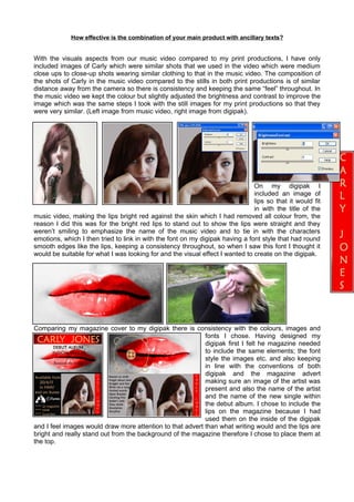
With the visuals aspects from our music video compared to my print productions, I have only
included images of Carly which were similar shots that we used in the video which were medium
close ups to close-up shots wearing similar clothing to that in the music video. The composition of
the shots of Carly in the music video compared to the stills in both print productions is of similar
distance away from the camera so there is consistency and keeping the same “feel” throughout. In
the music video we kept the colour but slightly adjusted the brightness and contrast to improve the
image which was the same steps I took with the still images for my print productions so that they
were very similar. (Left image from music video, right image from digipak).
On my digipak I
included an image of
lips so that it would fit
in with the title of the
music video, making the lips bright red against the skin which I had removed all colour from, the
reason I did this was for the bright red lips to stand out to show the lips were straight and they
weren’t smiling to emphasize the name of the music video and to tie in with the characters
emotions, which I then tried to link in with the font on my digipak having a font style that had round
smooth edges like the lips, keeping a consistency throughout, so when I saw this font I thought it
would be suitable for what I was looking for and the visual effect I wanted to create on the digipak.
Comparing my magazine cover to my digipak there is consistency with the colours, images and
fonts I chose. Having designed my
digipak first I felt he magazine needed
to include the same elements; the font
style the images etc. and also keeping
in line with the conventions of both
digipak and the magazine advert
making sure an image of the artist was
present and also the name of the artist
and the name of the new single within
the debut album. I chose to include the
lips on the magazine because I had
used them on the inside of the digipak
and I feel images would draw more attention to that advert than what writing would and the lips are
bright and really stand out from the background of the magazine therefore I chose to place them at
the top.