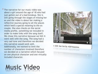
* The narrative for our music video was
about a girl around the age of 18 who had
just gotten out of a bad breakup. She is
still going through the stages of missing her
ex and the video is about her making a
reflective journey going to all the places
which held a special meaning to the ex
couple. She also checks on the social
media profile, something we included in
order to make links with the song itself.
We chose this narrative because we felt it
went well with the song. The song had a
very sad tone and therefore we decided
this narrative would work well.
Additionally, we wanted to limit the
number of characters involved therefore
we decided on a narrative which focused
on one physical character and one virtually
included character.
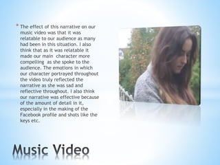
* The effect of this narrative on our
music video was that it was
relatable to our audience as many
had been in this situation. I also
think that as it was relatable it
made our main character more
compelling as she spoke to the
audience. The emotions in which
our character portrayed throughout
the video truly reflected the
narrative as she was sad and
reflective throughout. I also think
our narrative was effective because
of the amount of detail in it,
especially in the making of the
Facebook profile and shots like the
keys etc.
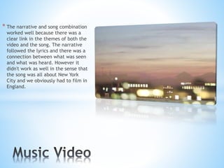
* The narrative and song combination
worked well because there was a
clear link in the themes of both the
video and the song. The narrative
followed the lyrics and there was a
connection between what was seen
and what was heard. However it
didn't work as well in the sense that
the song was all about New York
City and we obviously had to film in
England.
* We made the digipak to link with
the products because that is a key
thing we learnt about in the
research process. It was important
to make links between our products
as our audience needed to
recognise that the different
products all related to the same
artist and song. It was important to
have consistency throughout our
products. We used certain shots
from our music video as covers for
our digipak. We used the night shots
for the outside and the daylight
shots for the inside covers.
Additionally, when we researched
digipaks we noticed that the font
was consistent.
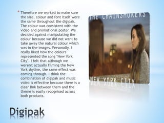
* Therefore we worked to make sure
the size, colour and font itself were
the same throughout the digipak.
The colour was consistent with the
video and promotional poster. We
decided against manipulating the
colour because we did not want to
take away the natural colour which
was in the images. Personally, I
really liked how the colours
represented the song "New York
City". I felt that although we
weren't actually filming the New
York skyline, the same effect was
coming through. I think the
combination of digipak and music
video is effective because there is a
clear link between them and the
theme is easily recognised across
both products.
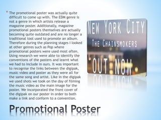
* The promotional poster was actually quite
difficult to come up with. The EDM genre is
not a genre in which artists release a
magazine poster. Additionally, magazine
promotional posters themselves are actually
becoming quite outdated and are no longer a
traditional tool used to promote an album.
Therefore during the planning stages I looked
at other genres such as Pop where
promotional posters were used most often.
Using research we were able to identify the
conventions of the posters and learnt what
we had to include in ours. It was important
to recognise the links between the digipak,
music video and poster as they were all for
the same song and artist. Like in the digipak
we used shots we took on the day of filming
the music video as the main image for the
poster. We incorporated the front cover of
the digipak on our poster in order to both
make a link and conform to a convention.
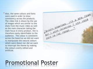
* Also, the same colours and fonts
were used in order to show
consistency across the products.
The video link is shown by the use
of images which are similar to the
shots from the music video as well
as the main character taking the
main focus in every product. She is
therefore easily identifiable to the
audience. The colour is consistent
across the board as we did not want
to manipulate the natural colours
which were shown nor did we want
to interrupt the theme by making
the colours overly edited and
artificial.
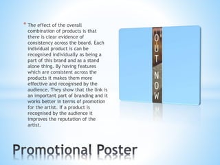
* The effect of the overall
combination of products is that
there is clear evidence of
consistency across the board. Each
individual product is can be
recognised individually as being a
part of this brand and as a stand
alone thing. By having features
which are consistent across the
products it makes them more
effective and recognised by the
audience. They show that the link is
an important part of branding and it
works better in terms of promotion
for the artist. If a product is
recognised by the audience it
improves the reputation of the
artist.
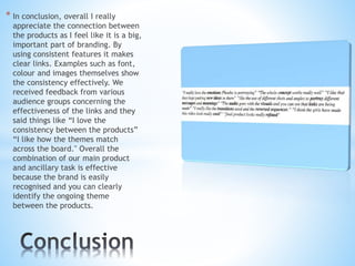
* In conclusion, overall I really
appreciate the connection between
the products as I feel like it is a big,
important part of branding. By
using consistent features it makes
clear links. Examples such as font,
colour and images themselves show
the consistency effectively. We
received feedback from various
audience groups concerning the
effectiveness of the links and they
said things like “I love the
consistency between the products”
“I like how the themes match
across the board." Overall the
combination of our main product
and ancillary task is effective
because the brand is easily
recognised and you can clearly
identify the ongoing theme
between the products.

Evaluation question 2

  • 2.
    * The narrativefor our music video was about a girl around the age of 18 who had just gotten out of a bad breakup. She is still going through the stages of missing her ex and the video is about her making a reflective journey going to all the places which held a special meaning to the ex couple. She also checks on the social media profile, something we included in order to make links with the song itself. We chose this narrative because we felt it went well with the song. The song had a very sad tone and therefore we decided this narrative would work well. Additionally, we wanted to limit the number of characters involved therefore we decided on a narrative which focused on one physical character and one virtually included character.
  • 3.
    * The effectof this narrative on our music video was that it was relatable to our audience as many had been in this situation. I also think that as it was relatable it made our main character more compelling as she spoke to the audience. The emotions in which our character portrayed throughout the video truly reflected the narrative as she was sad and reflective throughout. I also think our narrative was effective because of the amount of detail in it, especially in the making of the Facebook profile and shots like the keys etc.
  • 4.
    * The narrativeand song combination worked well because there was a clear link in the themes of both the video and the song. The narrative followed the lyrics and there was a connection between what was seen and what was heard. However it didn't work as well in the sense that the song was all about New York City and we obviously had to film in England.
  • 5.
    * We madethe digipak to link with the products because that is a key thing we learnt about in the research process. It was important to make links between our products as our audience needed to recognise that the different products all related to the same artist and song. It was important to have consistency throughout our products. We used certain shots from our music video as covers for our digipak. We used the night shots for the outside and the daylight shots for the inside covers. Additionally, when we researched digipaks we noticed that the font was consistent.
  • 6.
    * Therefore weworked to make sure the size, colour and font itself were the same throughout the digipak. The colour was consistent with the video and promotional poster. We decided against manipulating the colour because we did not want to take away the natural colour which was in the images. Personally, I really liked how the colours represented the song "New York City". I felt that although we weren't actually filming the New York skyline, the same effect was coming through. I think the combination of digipak and music video is effective because there is a clear link between them and the theme is easily recognised across both products.
  • 7.
    * The promotionalposter was actually quite difficult to come up with. The EDM genre is not a genre in which artists release a magazine poster. Additionally, magazine promotional posters themselves are actually becoming quite outdated and are no longer a traditional tool used to promote an album. Therefore during the planning stages I looked at other genres such as Pop where promotional posters were used most often. Using research we were able to identify the conventions of the posters and learnt what we had to include in ours. It was important to recognise the links between the digipak, music video and poster as they were all for the same song and artist. Like in the digipak we used shots we took on the day of filming the music video as the main image for the poster. We incorporated the front cover of the digipak on our poster in order to both make a link and conform to a convention.
  • 8.
    * Also, thesame colours and fonts were used in order to show consistency across the products. The video link is shown by the use of images which are similar to the shots from the music video as well as the main character taking the main focus in every product. She is therefore easily identifiable to the audience. The colour is consistent across the board as we did not want to manipulate the natural colours which were shown nor did we want to interrupt the theme by making the colours overly edited and artificial.
  • 9.
    * The effectof the overall combination of products is that there is clear evidence of consistency across the board. Each individual product is can be recognised individually as being a part of this brand and as a stand alone thing. By having features which are consistent across the products it makes them more effective and recognised by the audience. They show that the link is an important part of branding and it works better in terms of promotion for the artist. If a product is recognised by the audience it improves the reputation of the artist.
  • 10.
    * In conclusion,overall I really appreciate the connection between the products as I feel like it is a big, important part of branding. By using consistent features it makes clear links. Examples such as font, colour and images themselves show the consistency effectively. We received feedback from various audience groups concerning the effectiveness of the links and they said things like “I love the consistency between the products” “I like how the themes match across the board." Overall the combination of our main product and ancillary task is effective because the brand is easily recognised and you can clearly identify the ongoing theme between the products.