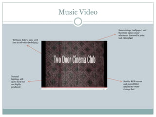
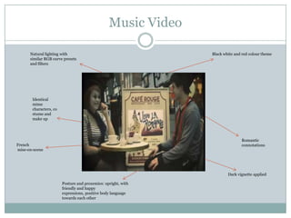
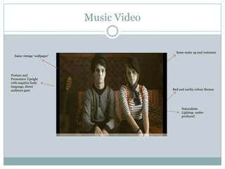
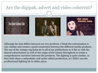
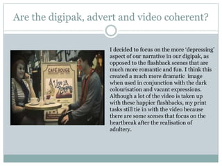
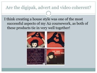
The document analyzes the coherence of the marketing package for a band, including a digipak, magazine advert, and music video.
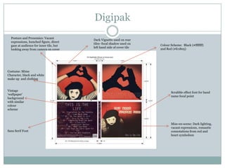
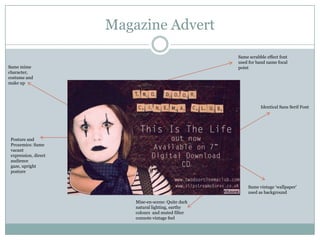
The summarizer notes several elements that create coherence across the materials: consistent use of fonts, similar color schemes incorporating black, red and earthy tones, identical vintage wallpaper background, same mime character and costume, similar lighting and production style aiming for a vintage feel. Feedback from others affirmed the continuity between pieces in terms of style and aesthetics. Although the narrative tone of the digipak is more depressing compared to romantic scenes in the video, both reference heartbreak to tie the pieces together. Overall the document evaluates that the house style was successfully coherent across the different media products.