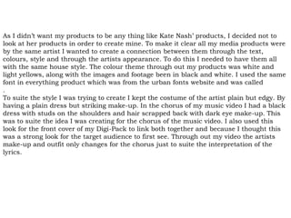
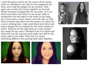
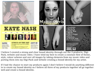
The combination of the artist's main products and ancillary texts was effective in establishing a clear brand identity. A consistent color theme of white and light yellows was used across the music video, digital pack cover, and website. The same font and similar imagery from the music video, such as the green screen shots and artist's makeup and outfit, were translated to the other products. This helped link all the products together and make the artist's look and style recognizable. The black and white and color schemes matched the different parts of the song. The products together created a strong, clear brand identity through a constant theme, style, and visual elements flowing throughout.